library(tidyverse)
library(ggplot2)

knitr::opts_chunk$set(echo = TRUE, warning=FALSE, message=FALSE)
Challenge 5
Challenge Overview
Today’s challenge is to:
- read in a data set, and describe the data set using both words and any supporting information (e.g., tables, etc)
- tidy data (as needed, including sanity checks)
- mutate variables as needed (including sanity checks)
- create at least two univariate visualizations
- try to make them “publication” ready
- Explain why you choose the specific graph type
- Create at least one bivariate visualization
- try to make them “publication” ready
- Explain why you choose the specific graph type
Read in data
ab = read_csv("_data/AB_NYC_2019.csv")
ab
#for when you are selecting columns with NA values: na.rm = TRUE
dim = ab %>%
dim()
dim[1] 48895 16col = ab %>%
colnames()
col [1] "id" "name"
[3] "host_id" "host_name"
[5] "neighbourhood_group" "neighbourhood"
[7] "latitude" "longitude"
[9] "room_type" "price"
[11] "minimum_nights" "number_of_reviews"
[13] "last_review" "reviews_per_month"
[15] "calculated_host_listings_count" "availability_365" Briefly describe the data
This data takes data from places that people can stay; it describes things such as the minimum number of nights people have stayed, the price to reserve the location, the reviews that the location receives, and much more.
Univariate Visualizations
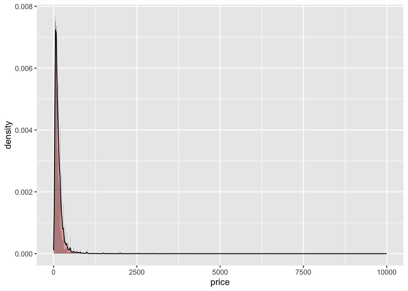
ggplot(ab, aes(price,na.rm=TRUE)) + geom_histogram(aes(y = ..density..),binwidth = 10, alpha = 0.5) + geom_density(alpha = 0.2, fill = "red")
Q = quantile(ab$price, probs=c(.25, .75), na.rm = TRUE) #finds quartiles for price column
iqr = IQR(ab$price) #finds IQR for price column
ab_clean = subset(ab, ab$price > (Q[1] - 1.5*iqr) & ab$price < (Q[2]+1.5*iqr)) #removes values that are not within low and high ranges

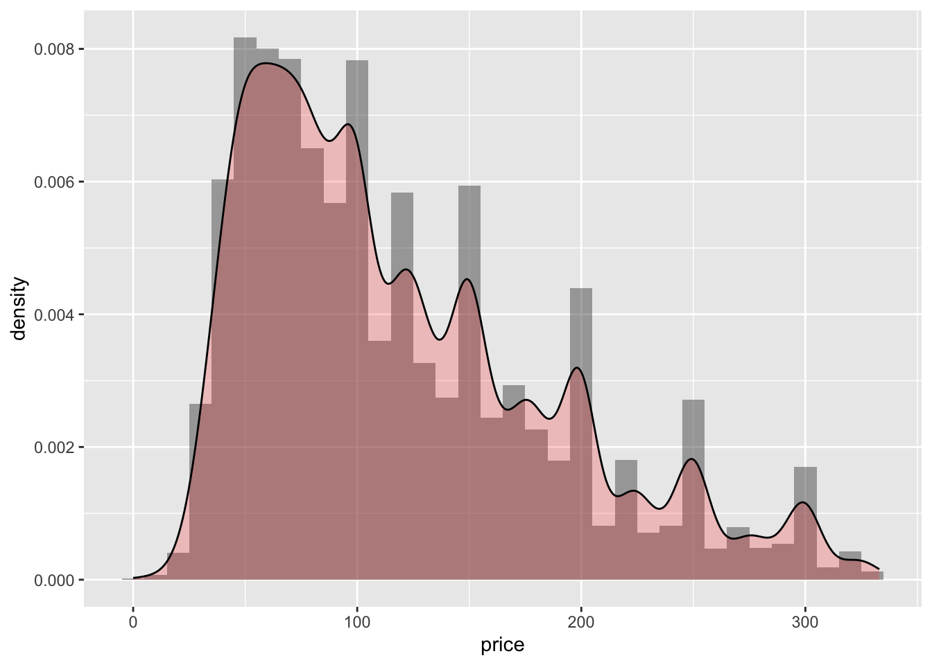
ggplot(ab_clean, aes(x=price, na.rm=TRUE)) + geom_histogram(aes(y = ..density..), binwidth = 10, alpha = 0.5) + geom_density(alpha = 0.2, fill = "red")
Describing Univariate Visuals
I chose to create a histogram for the prices that people charge for reserving their location. Using the ggplot() and geom_histogram() functions, I was able to create a histogram with the price values as the x-values. This first histogram was very large; you can see–using the geom_density() function–that there were outliers causing a skewness to the right. Initially, you can see most of the data is grouped below a price of 2,500. However, using statistical functions, I was able to reduce the data in the price column to only include data within the upper and lower outlier values. In the second visual, you can see most of the data was grouped within a price of 300.
Bivariate Visualization(s)
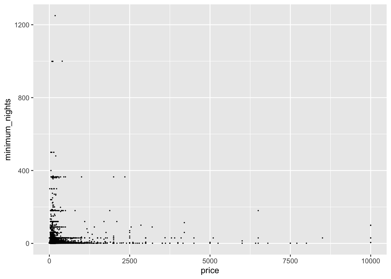
ggplot(ab, aes(x = price, y = minimum_nights, na.rm = TRUE)) + geom_point(size=0.1)
Q = quantile(ab$price, probs=c(.25, .75), na.rm = TRUE)
iqr = IQR(ab$price)
ab_clean = subset(ab, ab$price > (Q[1] - 1.5*iqr) & ab$price < (Q[2]+1.5*iqr))

Q1 = quantile(ab$minimum_nights, probs=c(.25, .75), na.rm = TRUE)
iqr1 = IQR(ab$minimum_nights)
ab_clean1 = subset(ab_clean, ab_clean$minimum_nights > (Q1[1] - 1.5*iqr1) & ab_clean$minimum_nights < (Q1[2]+1.5*iqr1))


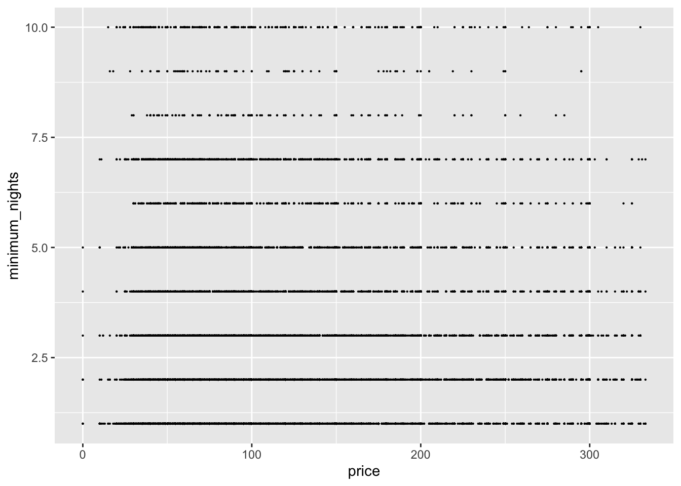
ggplot(ab_clean1, aes(x = price, y = minimum_nights ,na.rm = TRUE)) + geom_point(size=0.1)
Describing Bivariate Visuals
Using ggplot(), geom_point(), the price as the x-values, and the minimum number of nights stayed as the y-values, you can see that most scatter points are grouped below the price of 2,500 and the number of nights stayed below 400. Using the same methods as the univariate graph to remove outliers, I created the second visual; this second visual shows that the majority of people stay a minimum of 10 nights and prefer to pay around 300 for their reservation. Additionally, you can see that the scatter points in this plot dissipate as they get closer to the x-value of 300 and the y-value of 10, meaning less and less people reserve places to stay at these values.