library(tidyverse)
library(ggplot2)
library(lubridate)
knitr::opts_chunk$set(echo = TRUE, warning=FALSE, message=FALSE)Challenge 7
Read in data
This data represents people booking hotels; it provides information about when they arrive at their bookings, if they have cancelled their bookings, and how many people are coming along.
hotel = read_csv("_data/hotel_bookings.csv")
hotelTidy Data (as needed)
The data was changed to make the data frame appear more visually appealing to the viewer. Mutating the data by converting the date columns into one date allows the viewer to see the date of arrival. Furthermore, changing integer values for if they have cancelled or not makes it easier for the viewer to understand the data. After using these functions, I also removed the columns that were used in the process so that there wouldn’t be any repeated columns and values.
mutated.data = hotel %>%
mutate(arrival_date_month = case_when(
arrival_date_month == "January" ~ 1,
arrival_date_month == "February" ~ 2,
arrival_date_month == "March" ~ 3,
arrival_date_month == "April" ~ 4,
arrival_date_month == "May" ~ 5 ,
arrival_date_month == "June" ~ 6,
arrival_date_month == "July" ~ 7,
arrival_date_month == "August" ~ 8,
arrival_date_month == "September" ~ 9,
arrival_date_month == "October" ~ 10,
arrival_date_month == "November" ~ 11,
arrival_date_month == "December" ~ 12
), is_canceled = case_when( #using case_when to convert integers to strings in necessary columns
is_canceled == 0 ~ "no",
is_canceled == 1 ~ "yes",
TRUE ~ "Not Available"
), is_repeated_guest = case_when(
is_repeated_guest == 0 ~ "no",
is_repeated_guest == 1 ~ "yes",
TRUE ~ "Not Available"
)) #mutating data in month column to be integers rather than strings
new = mutated.data %>%
mutate(Arrival_Date = make_datetime(arrival_date_year, arrival_date_month, arrival_date_day_of_month)) %>% #converting columns into one column for Date
subset(select = -c(arrival_date_year, arrival_date_month, arrival_date_day_of_month)) %>% #removing columns that were used in conversion
relocate(Arrival_Date, .before=1, .after=NULL) %>% #relocating column
subset(select = -c(reservation_status, arrival_date_week_number)) #removing reservation status and week number columns
new #printing Visualization with Multiple Dimensions
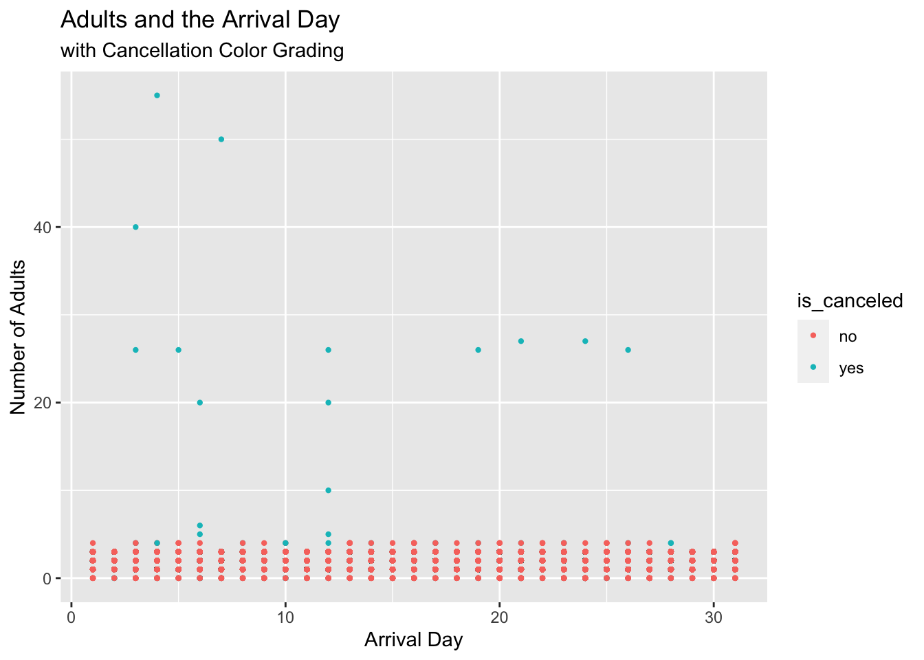
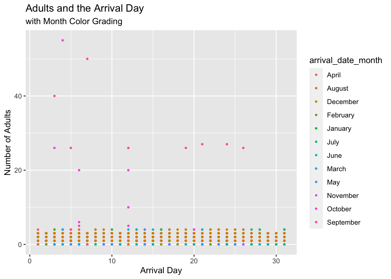
Using the cancellation and arrival month columns allowed me to add color to the plot. These columns being used as the color lets the viewer visualize when the number of adults arrived (what month) and if they cancelled their bookings (yes or no?). With this, the viewer is able to determine that bookings with higher amounts of adults cancelled their reservations, while bookings with lower amounts did not. It can also be noted that many of the reservations were made with the arrival dates in August, as shown by the color grading. Lastly, the plot shows that reservations had a majority of less than 10 adults and was an even spread across 30 days in a month.
mutated.data %>% #using mutated.data to use string values for color
fill(adults) %>%
ggplot(aes(x = arrival_date_day_of_month , y = adults, color = is_canceled)) + geom_point(size=0.8) + labs(title = "Adults and the Arrival Day", x = "Arrival Day", y = "Number of Adults", subtitle = "with Cancellation Color Grading")
hotel %>% #using original data for month values for color
fill(adults) %>%
ggplot(aes(x = arrival_date_day_of_month, y = adults, color = arrival_date_month)) + geom_point(size = 0.8) + labs(title = "Adults and the Arrival Day", x = "Arrival Day", y = "Number of Adults", subtitle = "with Month Color Grading")
Reading a Second Data Frame
Using a previous data set from earlier challenges, I was able to further show how adding color to the plots can provide additional information to the viewer.
fund = read_csv("_data/FedFundsRate.csv")
fundDescribing Second Data Frame Plot
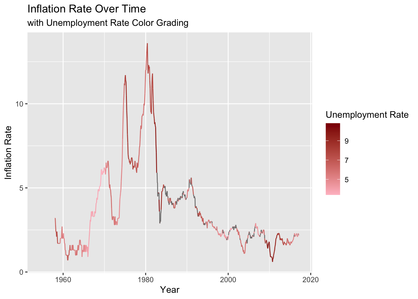
Using the dates as the x-values and the inflation rate as the y-values, you can see that the inflation rate changes over time. Additionally, adding the unemployment rate as a color grading value, you can see the difference in unemployment as the inflation rate changes. This allows the viewer to ask the question of whether or not inflation rates and unemployment rates have a connection.
Funds = fund %>%
mutate(Date = make_datetime(Year, Month, Day)) %>%
subset(select = -c(Year, Month, Day)) %>%
relocate(Date, .before=1, .after=NULL)
FundsFunds %>%
fill(`Inflation Rate`) %>% #had to add fill function to connect line graph -- was disconnected before adding fill
ggplot(aes(x = Date, y = `Inflation Rate`,na.rm = TRUE, color = `Unemployment Rate`)) + scale_color_gradient(low = 'pink', high = 'darkred') + geom_line() + labs(title = "Inflation Rate Over Time", x="Year", y = "Inflation Rate", subtitle = "with Unemployment Rate Color Grading")