Code
library(tidyverse)
library(ggplot2)
#install.packages("gridExtra")
library(gridExtra)

knitr::opts_chunk$set(echo = TRUE)Cristhian Barba Garzon
January 30, 2023
In 1958, C. David Keeling started recording CO2 levels in Mauna Loa, Hawaii at a facility run by the National Oceanic and Atmospheric Administration (“Trends in Atmospheric Carbon Dioxide”). The data was recorded over 60 years, ranging from 1958 to 2020, and it monitors CO2 levels, in parts per million (ppm), specifically in Hawaii for these 60 years. The data consists of monthly averages of CO2 levels, the years, and the months recorded.
This analysis will dive into the topic of pollution; specifically this paper will question if CO2 levels are on a constant rise. The importance of this question is immense; the world is in a state of panic as we now realize we are changing the global temperature and affecting natural environments.
This data was analyzed and manipulated using R-4.2.2 (“R for macOS”), tidyverse (“Tidyverse Packages”), ggplot2 (“ggplot2”), and gridExtra packages (Auguie).
The data was collected over the course of 60 years (1958 to 2020) in Mauna Loa, Hawaii, and it has about 761 total observations over 8 variables. The variables range from the year the data was recorded, the recorded CO2 levels, and the month it was recorded in. The data was loaded into R using the read_table function because the data was originally a text file. The variables that were the main focus on this analysis were the year, month, and monthly averages, so the data table was renamed and mutated to produce a new data set that was much cleaner.
── Column specification ────────────────────────────────────────────────────────
cols(
  `#` = col_character(),
  decimal = col_character(),
  monthly = col_character(),
  `de-season` = col_character(),
  `#days` = col_character(),
  st.dev = col_character(),
  unc. = col_character(),
  of = col_character()
)new = df %>%
rename("Year" = "#", "Month"="decimal", "Decimal Date" = "monthly", "Monthly Avg." = "de-season", "De-Seasonalized" = "#days", "# Days" = "st.dev", "St.Dev of Days." = "unc.", "Unc. of Mon. Mean" = "of") %>% #renaming columns to match data frame from website
slice(-1) #removes first row
#new #loading in new data frame, original was incorrectly formatted when loaded in
new1 <- new %>%
transform(Numeric_mon_avg = as.numeric(`Monthly Avg.`), numeric_year = as.numeric(Year), numeric_mon = as.numeric(Month), numeric_sea = as.numeric(`De-Seasonalized`), numeric_std = as.numeric(`St.Dev of Days.`))
#new1
new2 <- new1 %>%
select(-c(Year:Unc..of.Mon..Mean)) %>%
rename("Monthly Avg." = "Numeric_mon_avg",
"Year" = "numeric_year",
"Month" = "numeric_mon",
"De-Seasonalized" = "numeric_sea",
"St.Dev. of Days" = "numeric_std"
) %>%
relocate(Year, .before = 1) %>%
relocate(Month, .before = 2)
#new2
new_month <- new2 %>%
mutate(Month = case_when(
Month == 1 ~ "January" ,
Month == 2 ~"February" ,
Month == 3 ~"March" ,
Month == 4 ~"April" ,
Month == 5 ~"May" ,
Month == 6 ~"June" ,
Month == 7 ~"July" ,
Month == 8 ~"August" ,
Month == 9 ~ "September" ,
Month == 10 ~ "October" ,
Month == 11 ~ "November" ,
Month == 12 ~ "December"
))
new_monthFirstly, to begin answering the question of whether CO2 levels are rising or not in Mauna Loa, Hawaii, I plotted the initial data using ggplot2. The Year column was plotted as the x-values, and the Monthly averages were plotted as the y-values.
new2_plot <- new_month %>%
ggplot(aes(x = Year, y = `Monthly Avg.`)) +
geom_point(color = "red", size = 0.5) +
labs(x = "Years", y = expression(paste("Monthly Average ", "CO"[2], " Concentrations (ppm)")), title = expression(paste("CO"[2], " Concentrations in Hawaii (in Parts Per Million)"))) +
theme(panel.border = element_rect(color = "black", fill = NA, size = 1),
axis.text.x = element_text(angle = 45, hjust = 1))Warning: The `size` argument of `element_rect()` is deprecated as of ggplot2 3.4.0.
ℹ Please use the `linewidth` argument instead.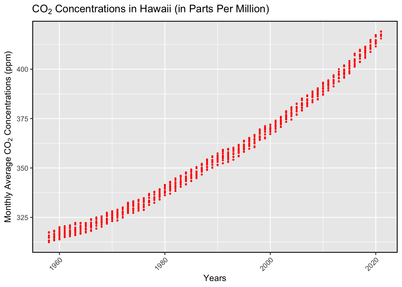
As shown above, the monthly average concentration from 1958 to 2020 has increased steadily. It is not a constant increase, but it is a steady increase–strengthening the idea that CO2 levels are on a rise within the last 60 years. The reason that this plot does not truly represent a constant increase is because there are oscillating values of CO2 within each year–depending on the month. We can focus on this piece of information further into the analysis. This realization of increasing concentration levels is important because it can begin the the course of action to further reduce the increasing levels.
The monthly averages plot shows an positive trend in the levels of CO2, but it shows oscillating values due to the monthly values within each year. Those oscillating values can be used for a much deeper analysis, specifically when we want to look at each individual year. To strictly focus on the years and their CO2 levels, we can calculate the yearly averages to provide a cleaner plot that shows us a much broader trend.
grouped_plot <- grouped_new %>%
ggplot(aes(x = Year, y = Yearly_Mean)) +
geom_point(aes(color = "Yearly Average"))+ #creates a scatter plot
geom_smooth(aes(color = "Linear Slope"),
method = "lm",
se = FALSE,
linetype = "solid") + #adds solid linear regression line
scale_color_manual(name = "", values = c("Yearly Average" = "red", "Linear Slope" = "blue")) +
labs(x = "Year",
y = expression(paste("Yearly Average ", "CO"[2], " Concentrations (ppm)")),
title = expression(paste("CO"[2], " Concentrations in Hawaii (in Parts Per Million)"))) + #adds labels
theme(panel.border = element_rect(color = "black", fill = NA, size = 1),
axis.text.x = element_text(angle = 45, hjust = 1))
grouped_plot`geom_smooth()` using formula = 'y ~ x'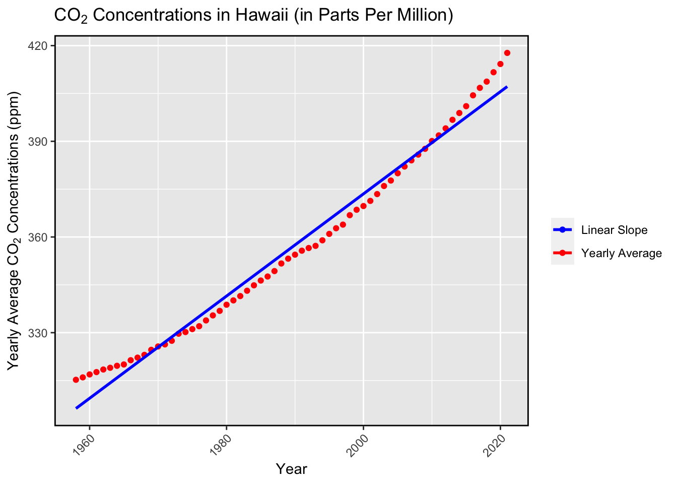
As shown above, the yearly averages from 1958 to 2020 were plotted along with a linear regression line to further prove the positive trend. The yearly averages were calculated by grouping the data by the distinct years and summarizing the data by calculating the mean of the monthly averages within each year. This provided the yearly average CO2 levels, thus producing the plot. Now that we have this broader plot, we can strengthen our initial idea that the CO2 levels are on a steady increase since 1958. The yearly average levels are clearly shown as a positive trend, where the concentration levels start at a minimum value of 315.232 ppm and end at a maximum value of 417.7129 ppm. This clearly shows rising CO2 levels, thus providing reason for humans to take action against reducing the rise. However, there may be some people that are against taking action because they may believe it has not affected them in recent years. This data can also visualize the rise in recent years.
To begin an analysis on the CO2 levels in the most recent years, I started with 2015 and focused on the monthly averages within that year.
plot_2015 <- new_month %>%
filter( Year == 2015) %>%
mutate(Month = factor(Month, levels = month.name, ordered = TRUE)) %>%
ggplot(aes(x = Month, y = `Monthly Avg.`)) +
geom_point(color = "orange", alpha = 5) +
labs(x = "Months", y = "Monthly Averages (ppm)", title = expression(paste("Monthly Average ", "CO"[2], " Concentrations in 2015"))) +
geom_text(aes(label = round(`Monthly Avg.`, 0.5)), size = 2.5, hjust = 0.5, vjust = 1.8) +
theme(panel.border = element_rect(color = "black", fill = NA, size = 1),
axis.text.x = element_text(angle = 45, hjust = 1))
plot_2015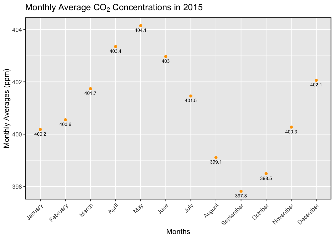
As shown in the plot, in the year 2015 there was a oscillating amount of CO2 levels from January to December. With the plotted values, we can see that the highest CO2 levels were recorded in the month of May–possibly due to the spring season. The lowest recorded levels were in the month of September–another possibility being the fall season. This oscillation in the levels of CO2 introduce a new question of whether or not CO2 levels are affected by seasonal factors. Backtracking to the previous topic of the rising CO2 levels in recent years, we can clearly see that it can reach a new maximum throughout the years than when the year first started. The maximum amount of CO2 in this year was about 404.15 ppm. Additionally, we can examine 2018 and 2020 to look at more recent years and their CO2 levels.
Filtering through the data to only focus on the year 2018, the monthly averages were plotted to further strengthen the idea that CO2 levels were on the rise in the most recent years.
plot_2018 <- new_month %>%
filter( Year == 2018) %>%
mutate(Month = factor(Month, levels = month.name, ordered = TRUE)) %>%
ggplot(aes(x = Month, y = `Monthly Avg.`)) +
geom_point(alpha = 1.5, color = "red") +
labs(x = "Months", y = "Monthly Averages (ppm)", title = expression(paste("Monthly Average ", "CO"[2], " Concentrations in 2018"))) +
geom_text(aes(label = round(`Monthly Avg.`, 0.5)), size = 2.5, hjust = 0.5, vjust = 1.8) +
theme(panel.border = element_rect(color = "black", fill = NA, size = 1),
axis.text.x = element_text(angle = 45, hjust = 1))
plot_2018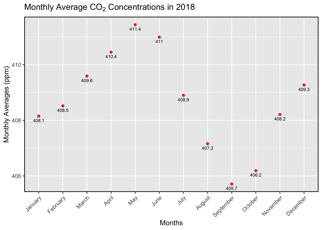
As the plot clearly shows, there is now a new maximum in the CO2 levels when compared to the plot for the year 2015. This difference in the maximum values, 404.1 ppm in 2015 and 411.4 ppm in 2018, can begin to convince the average non-believer that CO2 levels are on the rise in the most recent years. The oscillating trend in levels throughout the months continue to beg the question of if the CO2 levels are affected by seasonal factors (economic downtime, low employment, etc).
Looking at the most recent year, 2020, we can strengthen the idea that CO2 levels are on the rise in the most recent years based on the data table.
plot_2020 <- new_month %>%
filter( Year == 2020) %>%
mutate(Month = factor(Month, levels = month.name, ordered = TRUE)) %>%
ggplot(aes(x = Month, y = `Monthly Avg.`)) +
geom_point(color = "blue") +
labs(x = "Months", y = "Monthly Averages (ppm)", title = expression(paste("Monthly Average ", "CO"[2], " Concentrations in 2020"))) +
geom_text(aes(label = round(`Monthly Avg.`, 0.5)), size = 2.5, hjust = 0.5, vjust = 1.8) +
theme(panel.border = element_rect(color = "black", fill = NA, size = 1),
axis.text.x = element_text(angle = 45, hjust = 1))
plot_2020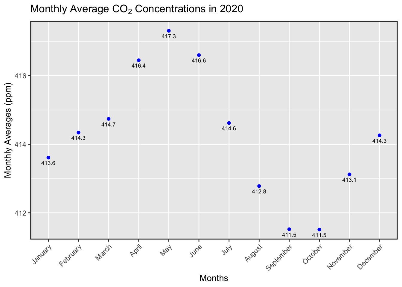
As clearly shown, the data in the year 2020 strengthens the idea of the rise in CO2 levels; in 2020, there was a new maximum value of 417.3 ppm compared to the previous maximum of 411.4 ppm in 2018. Starting from 2015 and ending at 2020, you can clearly see that the CO2 levels in Mauna Loa have been steadily increasing–and each month it may oscillate due to the certain outside factors. This is a very recent rise in levels, and it should induce a little bit of worry into people because there is currently no decrease in the levels shown in data set and the plots.
Now, we can compare the data from 1980 and 2020–a 40 year difference–to analyze the change in CO2 levels and view the oscillating pattern.
plot_1980 <- new_month %>%
filter( Year == 1980) %>%
mutate(Month = factor(Month, levels = month.name, ordered = TRUE)) %>%
ggplot(aes(x = Month, y = `Monthly Avg.`)) +
geom_point(color = "brown") +
labs(x = "Months", y = "Monthly Averages (ppm)",title = expression(paste("Monthly Average ", "CO"[2], " in 1980"))) +
geom_text(aes(label = round(`Monthly Avg.`, 0.5)), size = 2.5, hjust = 0.5, vjust = 1.8) +
theme(panel.border = element_rect(color = "black", fill = NA, size = 1),
axis.text.x = element_text(angle = 45, hjust = 1))
plot_2020 <- new_month %>%
filter( Year == 2020) %>%
mutate(Month = factor(Month, levels = month.name, ordered = TRUE)) %>%
ggplot(aes(x = Month, y = `Monthly Avg.`)) +
geom_point(color = "blue") +
labs(x = "Months", y = "Monthly Averages (ppm)", title = expression(paste("Monthly Average ", "CO"[2], " in 2020")))+
geom_text(aes(label = round(`Monthly Avg.`, 0.5)), size = 2.5 , hjust = 0.5, vjust = 1.8) +
theme(panel.border = element_rect(color = "black", fill = NA, size = 1),
axis.text.x = element_text(angle = 45, hjust = 1))
compare <- grid.arrange(plot_1980, plot_2020, ncol = 2)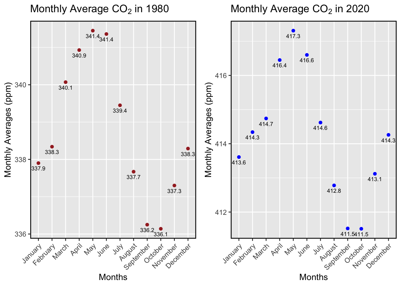
In 1980, the plot shows a maximum value of 341.4 ppm and a minimum value of 336.1 ppm; in 2020, the plot shows a maximum value of 417.3 ppm and a minimum value of 411.5 ppm. The difference between the maximum and minimum values is outstanding, and it shows that Mauna Loa is suffering from an increase in CO2 levels. The fact that the levels rose to new heights in 40 years presents the idea that in the next 40 years it can continue to reach new heights. Additionally, the oscillating pattern of CO2 levels in each month show that in the much colder time of year there is a decrease in CO2 levels; there are questions to be asked regarding this oscillating pattern. This oscillating pattern may show decreasing CO2 levels in each year, but if we look at it on a much broader scale, it may just show that CO2 levels are still increasing throughout the years.
What if I chose to view the increase in CO2 in each month? I plotted the monthly averages, but the plots were divided into subplots of each month; the increase in each month is much more simpler to analyze. Before, you could see that each month was oscillating within the year, which may have been a product of changing temperatures and weather, and now you can see that the the concentration levels for each month is still increasing at a steady rate–even though it may not seem like it in the previous plots.
facet_plot <- new_month %>%
mutate(Month = factor(Month, levels = month.name, ordered = TRUE)) %>%
ggplot(aes(x = Year, y = `Monthly Avg.`)) +
geom_line(color = "purple")+
facet_wrap(~ Month, ncol = 3, scales = "free_y", labeller = label_wrap_gen(multi_line=TRUE)) +
labs(x = "Year", y = expression(paste("Monthly Average ", "CO"[2])), title = expression(paste("CO"[2], " Averages in Each Month")))
facet_plot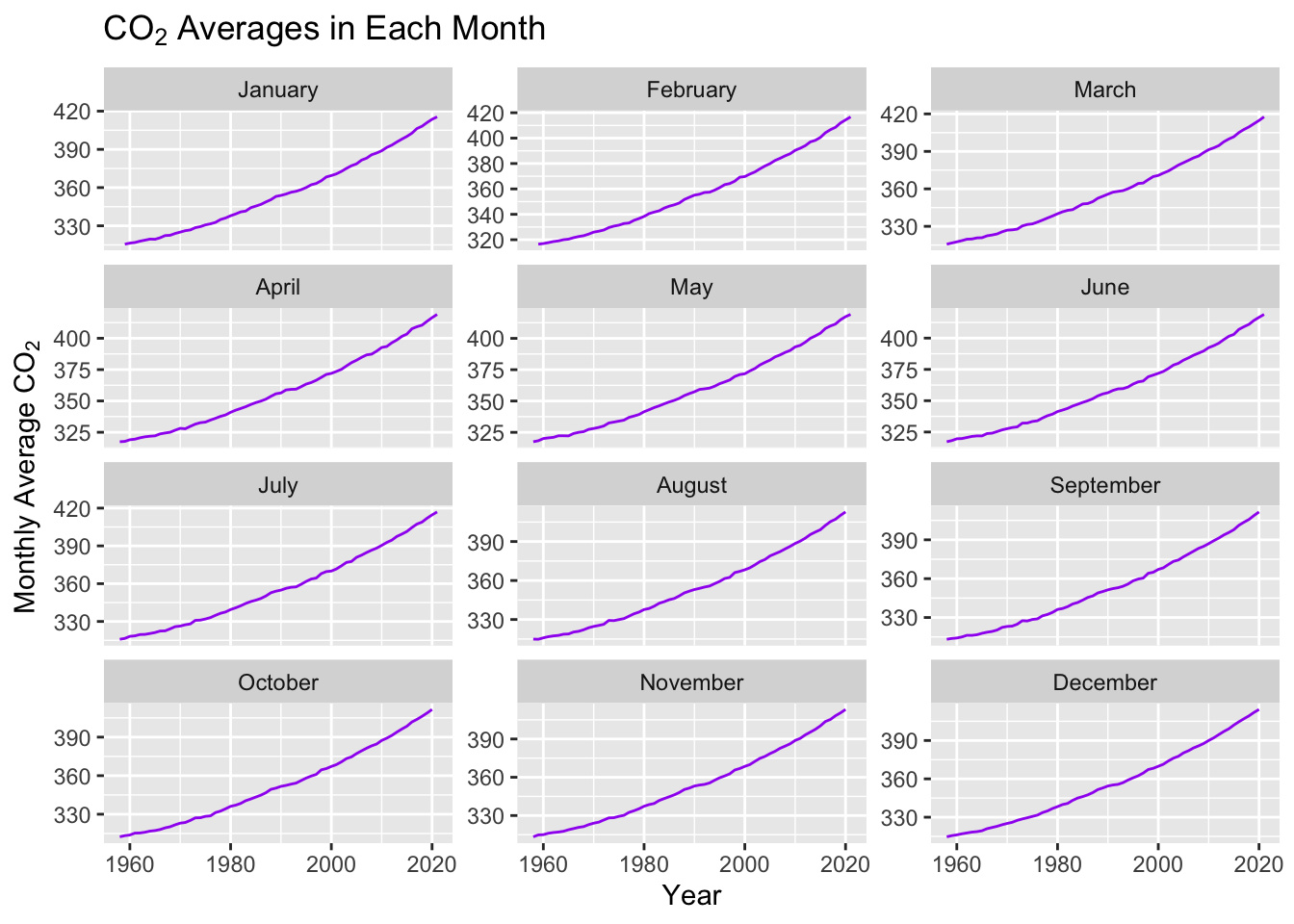
Previously, we can see that colder months had lower CO2 levels when compared to warmer months. Now we can see that the overall CO2 levels were constantly increasing regardless of the months. This plot set is great for viewing the changing CO2 levels in each month, and the previous plots were great for showing the varying levels within the year. Each plot has their own strengths. Seasonal factors may affect levels in each year, but overall the levels for each month are rising–showing no sign of decreasing effects.
Additionally, with a bar graph of the decade groups, the 1990’s and the 2010’s–but with calculated yearly averages instead of monthly averages–we can strengthen the idea that the CO2 levels have had their constant rising rate since the 90s.
sub_90_2000 <- new_month[new_month$Year >= 1990 & new_month$Year < 2000,]
sub_10_2020 <- new_month[new_month$Year >= 2010 & new_month$Year <=2020,]
plot_90_2000 <- sub_90_2000 %>%
group_by(Year) %>%
summarize(mean_year = mean(`Monthly Avg.`)) %>%
ggplot(aes(x = Year, y = mean_year)) +
geom_bar(stat = "identity", fill = "orangered") +
labs(x = "Years", y = "Yearly Average", title = expression(paste("CO"[2], " Concentrations (ppm) in Years")))
#plot_90_2000
plot_10_2020 <- sub_10_2020 %>%
group_by(Year) %>%
summarize(mean_year = mean(`Monthly Avg.`)) %>%
ggplot(aes(x = Year, y = mean_year)) +
geom_bar(stat = "identity", fill = "blue") +
labs(x = "Years", y = "Yearly Average", title = expression(paste("CO"[2], " Concentrations (ppm) in Years")))
#plot_10_2020
side_by_side = grid.arrange(plot_90_2000, plot_10_2020, ncol=2)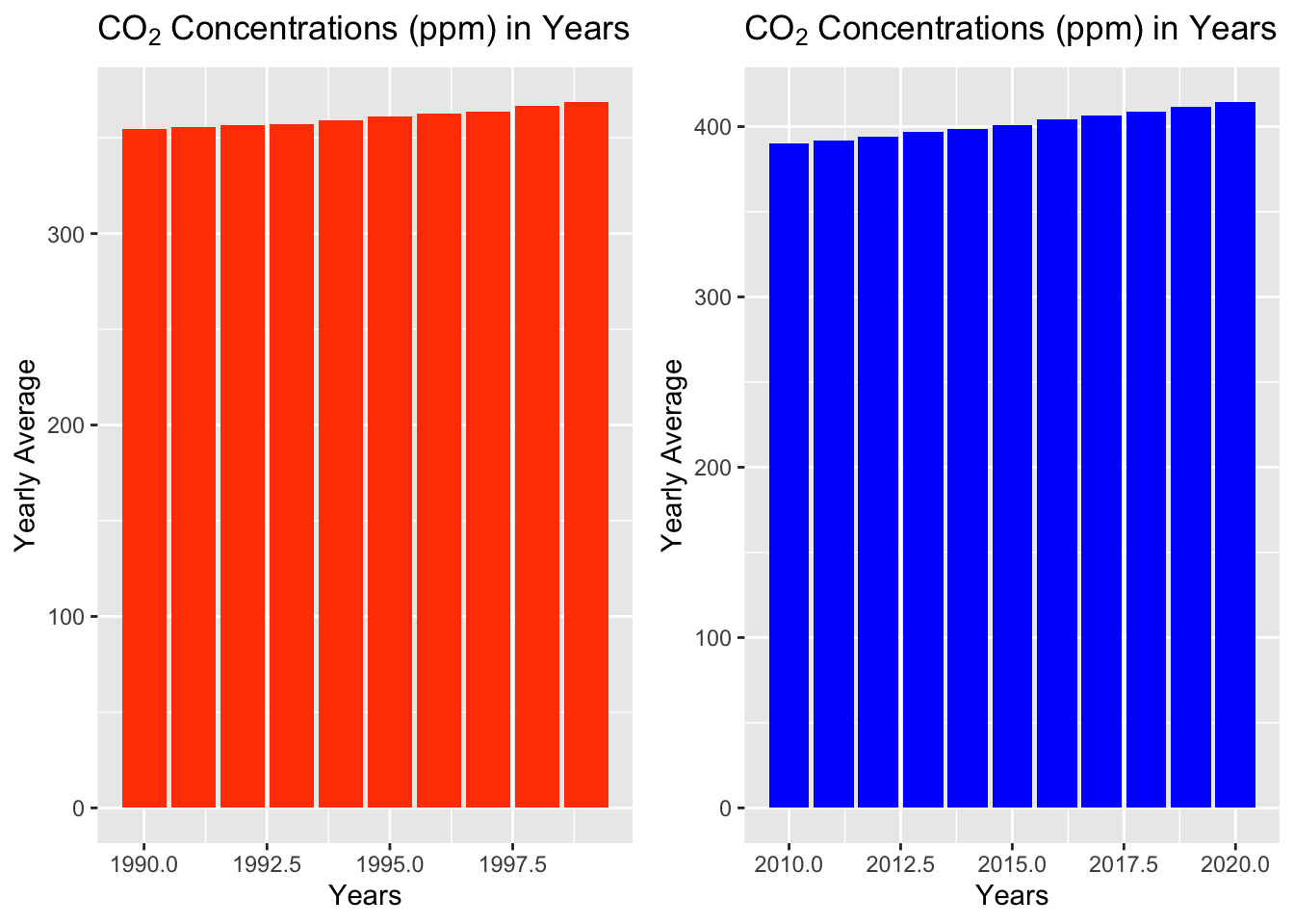
TableGrob (1 x 2) "arrange": 2 grobs
z cells name grob
1 1 (1-1,1-1) arrange gtable[layout]
2 2 (1-1,2-2) arrange gtable[layout]These bar graphs portray the 1990’s and the 2010’s, and they are using the calculated yearly averages using the monthly averages in each year. These graphs show that the yearly averages are on a steady increase. The reason the yearly averages were used in these plots was to reduce the oscillating pattern shown in the monthly averages, and this is similar to the original scatter plots above. As you can see, the bar values rise in a positive slope, and there is almost no change in the amount the bars rise from start to end; this further proves that CO2 levels have been on the rise, with no sign of decreasing in the near future.
In the beginning of analyzing this data set, the idea of producing a paper that accurately portrays the current climate crisis was always on my mind. I wanted to provide a paper that could enlighten people on the rising pollution in our world, even if they did not believe in these ideas of pollution and climate change.
The rising levels of CO2 in Mauna Loa, Hawaii was just the beginning of necessary observations in rising pollution levels. The starting point from the year 1958 was a great choice by C. David Keeling because it provided a wide range of data that new generations could analyze the trend in pollution levels.
With this data set, I was able to provide clean visualizations of the positive trends in CO2 levels. Beginning with the monthly averages from 1958 to 2020, there was a clear rise in concentration levels; the scatter plot was a great choice to portray this trend because it shows that each year there was an increase, and it also showed oscillating values within each year. This opened the door for further analysis as I could dive deeper into viewing and plotting the monthly averages in individual years. But before I dove into that aspect of this data, I decided to completely ignore the oscillating monthly averages; I chose to do this because I wanted to focus on the initial question: are CO2 levels on the rise since 1958? To focus on this question, I ignored the oscillating monthly averages by taking those values and creating a new column of the yearly averages; I calculated the yearly averages by grouping the data by the year and then summarizing the data using the mean function for the monthly averages. This took all the monthly values in each individual year and calculated the yearly averages. These new values were then plotted across the range of years, providing a much cleaner look at the positive trend in CO2 levels. The maximum and minimum concentration levels in this plot were calculated using the max and min functions within summarize, and it provided important details for the plot. The maximum value of CO2 levels was 417.729 ppm with a minimum value of 315.232 ppm. This difference was large, and it shows that the pollution levels were on the rise throughout this data set range.
After this initial analysis was completed, I wanted to look at individual years and visualize the changing CO2 levels from month to month. This was an important aspect to look at because it could show how CO2 levels change depending on the month, and it could bring up new questions as to why CO2 levels change from month to month. To start off, I filtered the data to specifically select years that I wanted, then I mutated the data to portray the months in chronological order. Afterwards, the plots were created along with showing the numeric values of each point. The plots focused on the oscillating points that were previously mentioned–and ignored–and the reason for the shift in focus to these plots was to analyze CO2 levels based on the months. Considering the values in colder months were much lower than values in the warmer months, this brings up the question of whether or not there are seasonal effects to the CO2 levels. With this data, I can conclude that there are some effects to the CO2 levels in each year, but I cannot determine what those effects are or where they come from. Some possibilities of why the CO2 levels oscillate depending on the month are economic downturns, location, and even tourism. However, with the data I currently have, I cannot create visualizations that portray a relationship between these possibilities. For the moment, I can only support the idea that the changing temperatures and weather in each month are what cause this oscillating pattern in the years presented. Finally, I compared the monthly values from 1980 and from 2020. This comparison was done to show how the values of CO2 changed in a 40 year time period; the difference in values was drastic, and this was a great discovery as it proved the idea that CO2 levels were on the rise. Additionally, this comparison plot also showed that the oscillating pattern was a constant pattern throughout each year, further strengthening the idea that the changing temperatures and weather affect the CO2 concentration levels in Mauna Loa, Hawaii.
The oscillating pattern was very interesting to analyze, but I also decided to view each individual month and their CO2 levels. The plots for each year showed that some months had lower levels, but that could lead people to believe that colder months may completely decrease CO2 levels. However, looking at each individual month was a great way to show that although the concentration levels vary within the year, there is still an increase in levels for each month. Each month may have had lower concentration levels when compared to other months, but throughout the years the levels had an increase for each month, showing that there is no sign of a decrease at all in this data set. None of the plots showed any sign of decreasing CO2 levels, which is worrysome because if this positive trend continues for the next 60 years, the effects may be too drastic to reverse.
Looking at the monthly averages and also calculating the yearly averages for CO2 concentrations were a great exercise in this analysis paper. I was very intrigued with the data, and I was shocked to see such a prevalent pattern in the increasing concentration levels throughout the years–especially since the increase was nearly constant. Looking at this data, I can easily conclude that CO2 is on the rise and will continue to rise if nothing is done to prevent it. This brings up many questions that cannot be answered by looking at this data alone: what are the main reasons CO2 levels are on the rise? what countries are the most affected? what can be done to reduce this rise? The data and visualizations can introduce the CO2 problem to newcomers who were not aware to the pollution we cause, and they can inspire individuals to seek out more information and infer new ideas on their own. Throughout this analysis I wanted to provide detailed visualizations for people to understand the need to take action against climate pollution. We all contribute in some way to this growing problem; everyone drives cars, flies in airplanes, purchases clothes, and more. We don’t know that most of the daily activities we do are contributing to rising CO2 levels. This is why it is important to view these types of data sets. It is important to see trends in climate pollution, whether it be the varying concentration levels in each year or in each month. We can all benefit from viewing this data and trying to reduce the increasing levels for our own futures. That is the best part of analyzing a data set–you can present new information and introduce new questions to others and yourself.
Auguie, Baptiste. “Arranging Multiple Grobs on a Page.” Cran.r-Project, 9 Sept. 2017, https://cran.r-project.org/web/packages/gridExtra/vignettes/arrangeGrob.html.
“ggplot2.” ggplot2.Tidyverse, https://ggplot2.tidyverse.org/.
Holtz, Yan. “Treemap.” The R Graph Gallery, https://r-graph-gallery.com/treemap.html#:~:text=A%20Treemap%20displays%20hierarchical%20data,a%20R%20implementation%2C%20see%20below.
Kumar, Gottumukkala Sravan. “R Convert DataFrame Column to Numeric Type.” Spark By {Examples}, 9 June 2022, https://sparkbyexamples.com/r-programming/convert-dataframe-column-to-numeric-type-in-r/#:~:text=Type%20using%20as.-,numeric(),type%20from%20the%20character%20type.
“R For MacOS.” Cran.r-Project, https://cran.r-project.org/bin/macosx/.
“Tidyverse Packages.” Tidyverse, https://www.tidyverse.org/packages/.
“Trends in Atmospheric Carbon Dioxide.” GML, NOAA, https://gml.noaa.gov/ccgg/trends/mlo.html.
:::
---
title: "Final Project"
author: "Cristhian Barba Garzon"
desription: "Creating Visuals for CO2 Concentrations"
date: "01/30/23"
format:
html:
df-print: paged
toc: true
code-fold: true
code-copy: true
code-tools: true
categories:
- final project
- co2_mm_mlo.csv
---
```{r}
#| label: setup
#| warning: false
library(tidyverse)
library(ggplot2)
#install.packages("gridExtra")
library(gridExtra)
knitr::opts_chunk$set(echo = TRUE)
```
## Introduction to Data and Research
In 1958, C. David Keeling started recording CO2 levels in Mauna Loa, Hawaii at a facility run by the National Oceanic and Atmospheric Administration ("Trends in Atmospheric Carbon Dioxide"). The data was recorded over 60 years, ranging from 1958 to 2020, and it monitors CO2 levels, in parts per million (ppm), specifically in Hawaii for these 60 years. The data consists of monthly averages of CO2 levels, the years, and the months recorded.
This analysis will dive into the topic of pollution; specifically this paper will question if CO2 levels are on a constant rise. The importance of this question is immense; the world is in a state of panic as we now realize we are changing the global temperature and affecting natural environments.
## Reading in and Describing Data
This data was analyzed and manipulated using R-4.2.2 ("R for macOS"), tidyverse ("Tidyverse Packages"), ggplot2 ("ggplot2"), and gridExtra packages (Auguie).
The data was collected over the course of 60 years (1958 to 2020) in Mauna Loa, Hawaii, and it has about 761 total observations over 8 variables. The variables range from the year the data was recorded, the recorded CO2 levels, and the month it was recorded in. The data was loaded into R using the read_table function because the data was originally a text file. The variables that were the main focus on this analysis were the year, month, and monthly averages, so the data table was renamed and mutated to produce a new data set that was much cleaner.
```{r}
df = read_table("_data/co2_data.txt")
df
new = df %>%
  rename("Year" = "#", "Month"="decimal", "Decimal Date" = "monthly", "Monthly Avg." = "de-season", "De-Seasonalized" = "#days", "# Days" = "st.dev", "St.Dev of Days." = "unc.", "Unc. of Mon. Mean" = "of") %>% #renaming columns to match data frame from website
  slice(-1)  #removes first row

#new #loading in new data frame, original was incorrectly formatted when loaded in

new1 <- new %>%
  transform(Numeric_mon_avg = as.numeric(`Monthly Avg.`), numeric_year = as.numeric(Year), numeric_mon = as.numeric(Month), numeric_sea = as.numeric(`De-Seasonalized`), numeric_std = as.numeric(`St.Dev of Days.`))
#new1

new2 <- new1 %>%
  select(-c(Year:Unc..of.Mon..Mean)) %>%
  rename("Monthly Avg." = "Numeric_mon_avg",
         "Year" = "numeric_year",
         "Month" = "numeric_mon",
         "De-Seasonalized" = "numeric_sea",
         "St.Dev. of Days" = "numeric_std"
        ) %>%
  relocate(Year, .before = 1) %>%
  relocate(Month, .before = 2)
#new2


new_month <- new2 %>%
   mutate(Month = case_when(
    Month == 1 ~ "January" ,
    Month == 2 ~"February" ,
    Month == 3 ~"March" ,
    Month == 4 ~"April" ,
    Month == 5 ~"May" ,
    Month == 6 ~"June" ,
    Month == 7 ~"July" ,
    Month == 8 ~"August" ,
    Month == 9 ~ "September" ,
    Month == 10 ~ "October" ,
    Month == 11 ~ "November" ,
    Month == 12 ~ "December"
   ))
new_month
```
## Monthly Average CO2 Concentrations from 1958 to 2020
Firstly, to begin answering the question of whether CO2 levels are rising or not in Mauna Loa, Hawaii, I plotted the initial data using ggplot2. The Year column was plotted as the x-values, and the Monthly averages were plotted as the y-values.
```{r}
new2_plot <- new_month %>%
  ggplot(aes(x = Year, y = `Monthly Avg.`)) +
  geom_point(color = "red", size = 0.5) +
  labs(x = "Years", y = expression(paste("Monthly Average ", "CO"[2], " Concentrations (ppm)")), title = expression(paste("CO"[2], " Concentrations in Hawaii (in Parts Per Million)"))) +
    theme(panel.border = element_rect(color = "black", fill = NA, size = 1),
        axis.text.x = element_text(angle = 45, hjust = 1))
new2_plot
```
As shown above, the monthly average concentration from 1958 to 2020 has increased steadily. It is not a constant increase, but it is a steady increase--strengthening the idea that CO2 levels are on a rise within the last 60 years. The reason that this plot does not truly represent a constant increase is because there are oscillating values of CO2 within each year--depending on the month. We can focus on this piece of information further into the analysis. This realization of increasing concentration levels is important because it can begin the the course of action to further reduce the increasing levels.
## Yearly Average of CO2 Concentrations from 1958 to 2020
The monthly averages plot shows an positive trend in the levels of CO2, but it shows oscillating values due to the monthly values within each year. Those oscillating values can be used for a much deeper analysis, specifically when we want to look at each individual year. To strictly focus on the years and their CO2 levels, we can calculate the yearly averages to provide a cleaner plot that shows us a much broader trend.
```{r}
grouped_new <- new_month %>%
  group_by(Year) %>%
  summarize(Yearly_Mean = mean(`Monthly Avg.`))
grouped_new
grouped_plot <- grouped_new %>%
  ggplot(aes(x = Year, y = Yearly_Mean)) +
  geom_point(aes(color = "Yearly Average"))+ #creates a scatter plot
  geom_smooth(aes(color = "Linear Slope"),
              method = "lm",
              se = FALSE,
              linetype = "solid") +  #adds solid linear regression line
  scale_color_manual(name = "", values = c("Yearly Average" = "red", "Linear Slope" = "blue")) +
  labs(x = "Year",
       y = expression(paste("Yearly Average ", "CO"[2], " Concentrations (ppm)")),
       title =  expression(paste("CO"[2], " Concentrations in Hawaii (in Parts Per Million)")))  + #adds labels
  theme(panel.border = element_rect(color = "black", fill = NA, size = 1),
        axis.text.x = element_text(angle = 45, hjust = 1))


grouped_plot
grouped_new %>%
 summarize(max(Yearly_Mean), min(Yearly_Mean))
```
As shown above, the yearly averages from 1958 to 2020 were plotted along with a linear regression line to further prove the positive trend. The yearly averages were calculated by grouping the data by the distinct years and summarizing the data by calculating the mean of the monthly averages within each year. This provided the yearly average CO2 levels, thus producing the plot. Now that we have this broader plot, we can strengthen our initial idea that the CO2 levels are on a steady increase since 1958. The yearly average levels are clearly shown as a positive trend, where the concentration levels start at a minimum value of 315.232 ppm and end at a maximum value of 417.7129 ppm. This clearly shows rising CO2 levels, thus providing reason for humans to take action against reducing the rise. However, there may be some people that are against taking action because they may believe it has not affected them in recent years. This data can also visualize the rise in recent years.
## Focusing on 2015
To begin an analysis on the CO2 levels in the most recent years, I started with 2015 and focused on the monthly averages within that year.
```{r}
new_month
plot_2015 <- new_month %>%
  filter( Year == 2015) %>%
  mutate(Month = factor(Month, levels = month.name, ordered = TRUE)) %>%
  ggplot(aes(x = Month, y = `Monthly Avg.`)) +
  geom_point(color = "orange", alpha = 5) +
  labs(x = "Months", y = "Monthly Averages (ppm)", title = expression(paste("Monthly Average ", "CO"[2], " Concentrations in 2015"))) +
  geom_text(aes(label = round(`Monthly Avg.`, 0.5)), size = 2.5, hjust = 0.5, vjust = 1.8) +
  theme(panel.border = element_rect(color = "black", fill = NA, size = 1),
        axis.text.x = element_text(angle = 45, hjust = 1))

plot_2015
max_2015 <- new_month %>%
  filter( Year == 2015) %>%
  summarize(Max_co2 = max(`Monthly Avg.`))
max_2015
```
As shown in the plot, in the year 2015 there was a oscillating amount of CO2 levels from January to December. With the plotted values, we can see that the highest CO2 levels were recorded in the month of May--possibly due to the spring season. The lowest recorded levels were in the month of September--another possibility being the fall season. This oscillation in the levels of CO2 introduce a new question of whether or not CO2 levels are affected by seasonal factors. Backtracking to the previous topic of the rising CO2 levels in recent years, we can clearly see that it can reach a new maximum throughout the years than when the year first started. The maximum amount of CO2 in this year was about 404.15 ppm. Additionally, we can examine 2018 and 2020 to look at more recent years and their CO2 levels.
## Focusing on 2018
Filtering through the data to only focus on the year 2018, the monthly averages were plotted to further strengthen the idea that CO2 levels were on the rise in the most recent years.
```{r}
new_month
plot_2018 <- new_month %>%
  filter( Year == 2018) %>%
  mutate(Month = factor(Month, levels = month.name, ordered = TRUE)) %>%
  ggplot(aes(x = Month, y = `Monthly Avg.`)) +
  geom_point(alpha = 1.5, color = "red") +
  labs(x = "Months", y = "Monthly Averages (ppm)", title = expression(paste("Monthly Average ", "CO"[2], " Concentrations in 2018"))) +
  geom_text(aes(label = round(`Monthly Avg.`, 0.5)), size = 2.5, hjust = 0.5, vjust = 1.8) +
  theme(panel.border = element_rect(color = "black", fill = NA, size = 1),
        axis.text.x = element_text(angle = 45, hjust = 1))


plot_2018
max_2018 <- new_month %>%
  filter( Year == 2018) %>%
  summarize(Max_co2 = max(`Monthly Avg.`))
max_2018
```
As the plot clearly shows, there is now a new maximum in the CO2 levels when compared to the plot for the year 2015. This difference in the maximum values, 404.1 ppm in 2015 and 411.4 ppm in 2018, can begin to convince the average non-believer that CO2 levels are on the rise in the most recent years. The oscillating trend in levels throughout the months continue to beg the question of if the CO2 levels are affected by seasonal factors (economic downtime, low employment, etc).
## Focusing on 2020
Looking at the most recent year, 2020, we can strengthen the idea that CO2 levels are on the rise in the most recent years based on the data table.
```{r}
plot_2020 <- new_month %>%
  filter( Year == 2020) %>%
  mutate(Month = factor(Month, levels = month.name, ordered = TRUE)) %>%
  ggplot(aes(x = Month, y = `Monthly Avg.`)) +
  geom_point(color = "blue") +
  labs(x = "Months", y = "Monthly Averages (ppm)", title = expression(paste("Monthly Average ", "CO"[2], " Concentrations in 2020"))) +
  geom_text(aes(label = round(`Monthly Avg.`, 0.5)), size = 2.5, hjust = 0.5, vjust = 1.8) +
  theme(panel.border = element_rect(color = "black", fill = NA, size = 1),
        axis.text.x = element_text(angle = 45, hjust = 1))

plot_2020
max_2020 <- new_month %>%
  filter( Year == 2020) %>%
  summarize(Max_co2 = max(`Monthly Avg.`))
max_2020
```
As clearly shown, the data in the year 2020 strengthens the idea of the rise in CO2 levels; in 2020, there was a new maximum value of 417.3 ppm compared to the previous maximum of 411.4 ppm in 2018. Starting from 2015 and ending at 2020, you can clearly see that the CO2 levels in Mauna Loa have been steadily increasing--and each month it may oscillate due to the certain outside factors. This is a very recent rise in levels, and it should induce a little bit of worry into people because there is currently no decrease in the levels shown in data set and the plots.
## Comparing CO2 from 1980 to 2020
Now, we can compare the data from 1980 and 2020--a 40 year difference--to analyze the change in CO2 levels and view the oscillating pattern.
```{r}
plot_1980 <- new_month %>%
  filter( Year == 1980) %>%
  mutate(Month = factor(Month, levels = month.name, ordered = TRUE)) %>%
  ggplot(aes(x = Month, y = `Monthly Avg.`)) +
  geom_point(color = "brown") +
  labs(x = "Months", y = "Monthly Averages (ppm)",title = expression(paste("Monthly Average ", "CO"[2], " in 1980"))) +
  geom_text(aes(label = round(`Monthly Avg.`, 0.5)), size = 2.5, hjust = 0.5, vjust = 1.8) +
  theme(panel.border = element_rect(color = "black", fill = NA, size = 1),
        axis.text.x = element_text(angle = 45, hjust = 1))

plot_2020 <- new_month %>%
  filter( Year == 2020) %>%
  mutate(Month = factor(Month, levels = month.name, ordered = TRUE)) %>%
  ggplot(aes(x = Month, y = `Monthly Avg.`)) +
  geom_point(color = "blue") +
  labs(x = "Months", y = "Monthly Averages (ppm)", title = expression(paste("Monthly Average ", "CO"[2], " in 2020")))+
  geom_text(aes(label = round(`Monthly Avg.`, 0.5)), size = 2.5 , hjust = 0.5, vjust = 1.8) +
  theme(panel.border = element_rect(color = "black", fill = NA, size = 1),
        axis.text.x = element_text(angle = 45, hjust = 1))

compare <- grid.arrange(plot_1980, plot_2020, ncol = 2)
```
In 1980, the plot shows a maximum value of 341.4 ppm and a minimum value of 336.1 ppm; in 2020, the plot shows a maximum value of 417.3 ppm and a minimum value of 411.5 ppm. The difference between the maximum and minimum values is outstanding, and it shows that Mauna Loa is suffering from an increase in CO2 levels. The fact that the levels rose to new heights in 40 years presents the idea that in the next 40 years it can continue to reach new heights. Additionally, the oscillating pattern of CO2 levels in each month show that in the much colder time of year there is a decrease in CO2 levels; there are questions to be asked regarding this oscillating pattern. This oscillating pattern may show decreasing CO2 levels in each year, but if we look at it on a much broader scale, it may just show that CO2 levels are still increasing throughout the years.
## Looking at Each Month Increase
What if I chose to view the increase in CO2 in each month? I plotted the monthly averages, but the plots were divided into subplots of each month; the increase in each month is much more simpler to analyze. Before, you could see that each month was oscillating within the year, which may have been a product of changing temperatures and weather, and now you can see that the the concentration levels for each month is still increasing at a steady rate--even though it may not seem like it in the previous plots.
```{r}
facet_plot <- new_month %>%
  mutate(Month = factor(Month, levels = month.name, ordered = TRUE)) %>%
  ggplot(aes(x = Year, y = `Monthly Avg.`)) +
  geom_line(color = "purple")+
  facet_wrap(~ Month, ncol = 3, scales = "free_y", labeller = label_wrap_gen(multi_line=TRUE)) +
  labs(x = "Year", y = expression(paste("Monthly Average ", "CO"[2])), title = expression(paste("CO"[2], " Averages in Each Month")))
facet_plot
```
Previously, we can see that colder months had lower CO2 levels when compared to warmer months. Now we can see that the overall CO2 levels were constantly increasing regardless of the months. This plot set is great for viewing the changing CO2 levels in each month, and the previous plots were great for showing the varying levels within the year. Each plot has their own strengths. Seasonal factors may affect levels in each year, but overall the levels for each month are rising--showing no sign of decreasing effects.
## Yearly Averages of 10-Year Groups
Additionally, with a bar graph of the decade groups, the 1990's and the 2010's--but with calculated yearly averages instead of monthly averages--we can strengthen the idea that the CO2 levels have had their constant rising rate since the 90s.
```{r}
 sub_90_2000 <- new_month[new_month$Year >= 1990 & new_month$Year < 2000,]
 sub_10_2020 <- new_month[new_month$Year >= 2010 & new_month$Year <=2020,]

 plot_90_2000 <- sub_90_2000 %>%
   group_by(Year) %>%
   summarize(mean_year = mean(`Monthly Avg.`)) %>%
   ggplot(aes(x = Year, y = mean_year)) +
   geom_bar(stat = "identity", fill = "orangered") +
   labs(x = "Years", y = "Yearly Average", title = expression(paste("CO"[2], " Concentrations (ppm) in Years")))

 #plot_90_2000

 plot_10_2020 <- sub_10_2020 %>%
   group_by(Year) %>%
   summarize(mean_year = mean(`Monthly Avg.`)) %>%
   ggplot(aes(x = Year, y = mean_year)) +
   geom_bar(stat = "identity", fill = "blue") +
   labs(x = "Years", y = "Yearly Average", title = expression(paste("CO"[2], " Concentrations (ppm) in Years")))

 #plot_10_2020

 side_by_side = grid.arrange(plot_90_2000, plot_10_2020, ncol=2)
side_by_side
```
These bar graphs portray the 1990's and the 2010's, and they are using the calculated yearly averages using the monthly averages in each year. These graphs show that the yearly averages are on a steady increase. The reason the yearly averages were used in these plots was to reduce the oscillating pattern shown in the monthly averages, and this is similar to the original scatter plots above. As you can see, the bar values rise in a positive slope, and there is almost no change in the amount the bars rise from start to end; this further proves that CO2 levels have been on the rise, with no sign of decreasing in the near future.
## Critical Anaylsis and Reflection
In the beginning of analyzing this data set, the idea of producing a paper that accurately portrays the current climate crisis was always on my mind. I wanted to provide a paper that could enlighten people on the rising pollution in our world, even if they did not believe in these ideas of pollution and climate change.
The rising levels of CO2 in Mauna Loa, Hawaii was just the beginning of necessary observations in rising pollution levels. The starting point from the year 1958 was a great choice by C. David Keeling because it provided a wide range of data that new generations could analyze the trend in pollution levels.
With this data set, I was able to provide clean visualizations of the positive trends in CO2 levels. Beginning with the monthly averages from 1958 to 2020, there was a clear rise in concentration levels; the scatter plot was a great choice to portray this trend because it shows that each year there was an increase, and it also showed oscillating values within each year. This opened the door for further analysis as I could dive deeper into viewing and plotting the monthly averages in individual years. But before I dove into that aspect of this data, I decided to completely ignore the oscillating monthly averages; I chose to do this because I wanted to focus on the initial question: are CO2 levels on the rise since 1958? To focus on this question, I ignored the oscillating monthly averages by taking those values and creating a new column of the yearly averages; I calculated the yearly averages by grouping the data by the year and then summarizing the data using the mean function for the monthly averages. This took all the monthly values in each individual year and calculated the yearly averages. These new values were then plotted across the range of years, providing a much cleaner look at the positive trend in CO2 levels. The maximum and minimum concentration levels in this plot were calculated using the max and min functions within summarize, and it provided important details for the plot. The maximum value of CO2 levels was 417.729 ppm with a minimum value of 315.232 ppm. This difference was large, and it shows that the pollution levels were on the rise throughout this data set range.
After this initial analysis was completed, I wanted to look at individual years and visualize the changing CO2 levels from month to month. This was an important aspect to look at because it could show how CO2 levels change depending on the month, and it could bring up new questions as to why CO2 levels change from month to month. To start off, I filtered the data to specifically select years that I wanted, then I mutated the data to portray the months in chronological order. Afterwards, the plots were created along with showing the numeric values of each point. The plots focused on the oscillating points that were previously mentioned--and ignored--and the reason for the shift in focus to these plots was to analyze CO2 levels based on the months. Considering the values in colder months were much lower than values in the warmer months, this brings up the question of whether or not there are seasonal effects to the CO2 levels. With this data, I can conclude that there are some effects to the CO2 levels in each year, but I cannot determine what those effects are or where they come from. Some possibilities of why the CO2 levels oscillate depending on the month are economic downturns, location, and even tourism. However, with the data I currently have, I cannot create visualizations that portray a relationship between these possibilities. For the moment, I can only support the idea that the changing temperatures and weather in each month are what cause this oscillating pattern in the years presented. Finally, I compared the monthly values from 1980 and from 2020. This comparison was done to show how the values of CO2 changed in a 40 year time period; the difference in values was drastic, and this was a great discovery as it proved the idea that CO2 levels were on the rise. Additionally, this comparison plot also showed that the oscillating pattern was a constant pattern throughout each year, further strengthening the idea that the changing temperatures and weather affect the CO2 concentration levels in Mauna Loa, Hawaii.
The oscillating pattern was very interesting to analyze, but I also decided to view each individual month and their CO2 levels. The plots for each year showed that some months had lower levels, but that could lead people to believe that colder months may completely decrease CO2 levels. However, looking at each individual month was a great way to show that although the concentration levels vary within the year, there is still an increase in levels for each month. Each month may have had lower concentration levels when compared to other months, but throughout the years the levels had an increase for each month, showing that there is no sign of a decrease at all in this data set. None of the plots showed any sign of decreasing CO2 levels, which is worrysome because if this positive trend continues for the next 60 years, the effects may be too drastic to reverse.
Looking at the monthly averages and also calculating the yearly averages for CO2 concentrations were a great exercise in this analysis paper. I was very intrigued with the data, and I was shocked to see such a prevalent pattern in the increasing concentration levels throughout the years--especially since the increase was nearly constant. Looking at this data, I can easily conclude that CO2 is on the rise and will continue to rise if nothing is done to prevent it. This brings up many questions that cannot be answered by looking at this data alone: what are the main reasons CO2 levels are on the rise? what countries are the most affected? what can be done to reduce this rise? The data and visualizations can introduce the CO2 problem to newcomers who were not aware to the pollution we cause, and they can inspire individuals to seek out more information and infer new ideas on their own. Throughout this analysis I wanted to provide detailed visualizations for people to understand the need to take action against climate pollution. We all contribute in some way to this growing problem; everyone drives cars, flies in airplanes, purchases clothes, and more. We don't know that most of the daily activities we do are contributing to rising CO2 levels. This is why it is important to view these types of data sets. It is important to see trends in climate pollution, whether it be the varying concentration levels in each year or in each month. We can all benefit from viewing this data and trying to reduce the increasing levels for our own futures. That is the best part of analyzing a data set--you can present new information and introduce new questions to others and yourself.
## Bibliography
Auguie, Baptiste. “Arranging Multiple Grobs on a Page.” Cran.r-Project, 9 Sept. 2017, https://cran.r-project.org/web/packages/gridExtra/vignettes/arrangeGrob.html.
“ggplot2.” ggplot2.Tidyverse, https://ggplot2.tidyverse.org/.
Holtz, Yan. “Treemap.” The R Graph Gallery, https://r-graph-gallery.com/treemap.html#:~:text=A%20Treemap%20displays%20hierarchical%20data,a%20R%20implementation%2C%20see%20below.
Kumar, Gottumukkala Sravan. “R Convert DataFrame Column to Numeric Type.” Spark By {Examples}, 9 June 2022, https://sparkbyexamples.com/r-programming/convert-dataframe-column-to-numeric-type-in-r/#:~:text=Type%20using%20as.-,numeric(),type%20from%20the%20character%20type.
“R For MacOS.” Cran.r-Project, https://cran.r-project.org/bin/macosx/.
“Tidyverse Packages.” Tidyverse, https://www.tidyverse.org/packages/.
“Trends in Atmospheric Carbon Dioxide.” GML, NOAA, https://gml.noaa.gov/ccgg/trends/mlo.html.
:::