Code
#install.packages("dyplr")
library(tidyverse)
library(dplyr)
library(ggplot2)
library(readxl)
library(treemap)
library(lubridate)
knitr::opts_chunk$set(echo = TRUE)Cristhian Barba Garzon
January 23, 2023
This data provides about 32 different variables and a total of 119,390 observations relating to how many people reserve hotels, when they reserve their hotels, when they check-out, if they had previous cancellations and much more information. We can also see that this data was taken from the years 2015, 2016, and 2017.
Rows: 119390 Columns: 32
── Column specification ────────────────────────────────────────────────────────
Delimiter: ","
chr (13): hotel, arrival_date_month, meal, country, market_segment, distrib...
dbl (18): is_canceled, lead_time, arrival_date_year, arrival_date_week_numb...
date (1): reservation_status_date
ℹ Use `spec()` to retrieve the full column specification for this data.
ℹ Specify the column types or set `show_col_types = FALSE` to quiet this message.The way I tidied the data was by mutating the data to change observation values and variable names; I also removed some variables. I mutated the months to become numerical values, and this was done by using the lubridate function, make_datetime(), to create one column of the arrival dates. Afterwards, I removed the original date columns to make space on the data set. Additionally, I changed the numerical values of 0 and 1, in the cancellations column, to character values of “no” and “yes”, respectively. Finally, the relocate function was used to move around variables deemed the most important to look at.
mutated.data = data %>%
mutate(arrival_date_month = case_when(
arrival_date_month == "January" ~ 1,
arrival_date_month == "February" ~ 2,
arrival_date_month == "March" ~ 3,
arrival_date_month == "April" ~ 4,
arrival_date_month == "May" ~ 5 ,
arrival_date_month == "June" ~ 6,
arrival_date_month == "July" ~ 7,
arrival_date_month == "August" ~ 8,
arrival_date_month == "September" ~ 9,
arrival_date_month == "October" ~ 10,
arrival_date_month == "November" ~ 11,
arrival_date_month == "December" ~ 12
))
mutated.data %>%
arrange(arrival_date_month)new = mutated.data %>%
mutate(is_canceled = case_when(
is_canceled == 0 ~ "no",
is_canceled == 1 ~ "yes",
TRUE ~ "Not Available"
), is_repeated_guest = case_when(
is_repeated_guest == 0 ~ "no",
is_repeated_guest == 1 ~ "yes",
TRUE ~ "Not Available"
),
Arrival_date = make_datetime(arrival_date_year, arrival_date_month, arrival_date_day_of_month)
) %>% #adds new column Date with the vector dates from for-loop
subset(select = -c(arrival_date_year, arrival_date_month, arrival_date_day_of_month)) %>% #drops Year and Month columns so new date column will replace
relocate(Arrival_date,.before = 2, .after = NULL) %>%
relocate(reservation_status_date, .before = 2, .after = NULL) %>% #moves the column to the left hand side
relocate(reservation_status, .before = 3, .after = NULL) %>%
rename("Arrival Week #"="arrival_date_week_number","Weekend Nights"= "stays_in_weekend_nights","Week Nights"= "stays_in_week_nights")
newUsing the grouping function, I grouped the data by the hotel type in order to then tally the amount of total reservations that were cancelled and not cancelled. Afterwards, the average amount of nights spent in a week and a weekend were calculated using the summarize function. I also found the maximum and minimum nights stayed during the week and weekend. These were the most important observations because it tells you how long people stay at these hotels.
mean_weekend = new %>%
group_by(hotel) %>%
summarize(`Mean of Weekend Nights` = mean(`Weekend Nights`,na.rm=TRUE),
`Median Weekend Nights` = median(`Weekend Nights`, na.rm=TRUE),
`Min Weekend Nights` = min(`Weekend Nights`, na.rm = TRUE),
`Max Weekend Nights` = max(`Weekend Nights`, na.rm = TRUE))
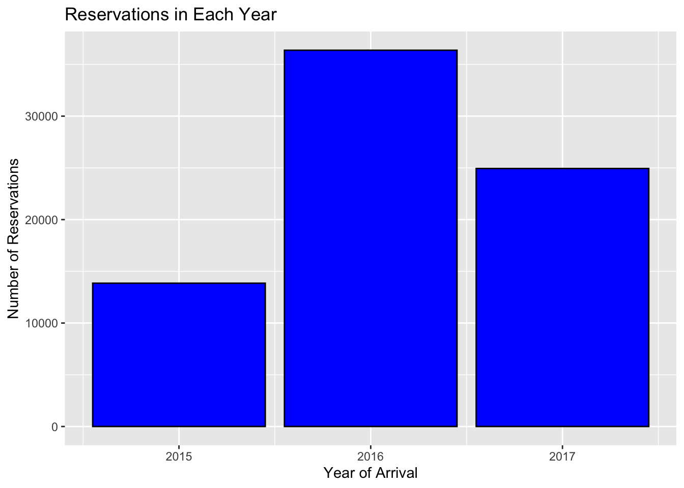
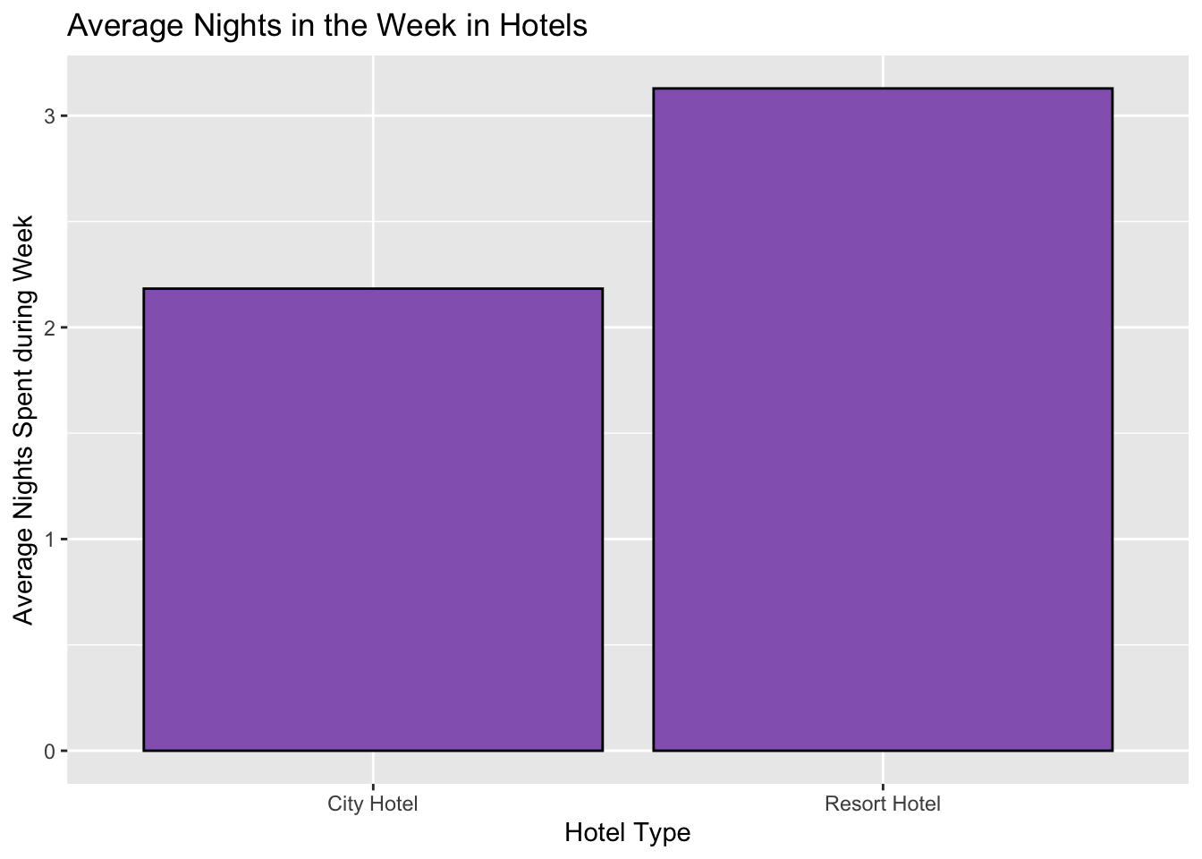
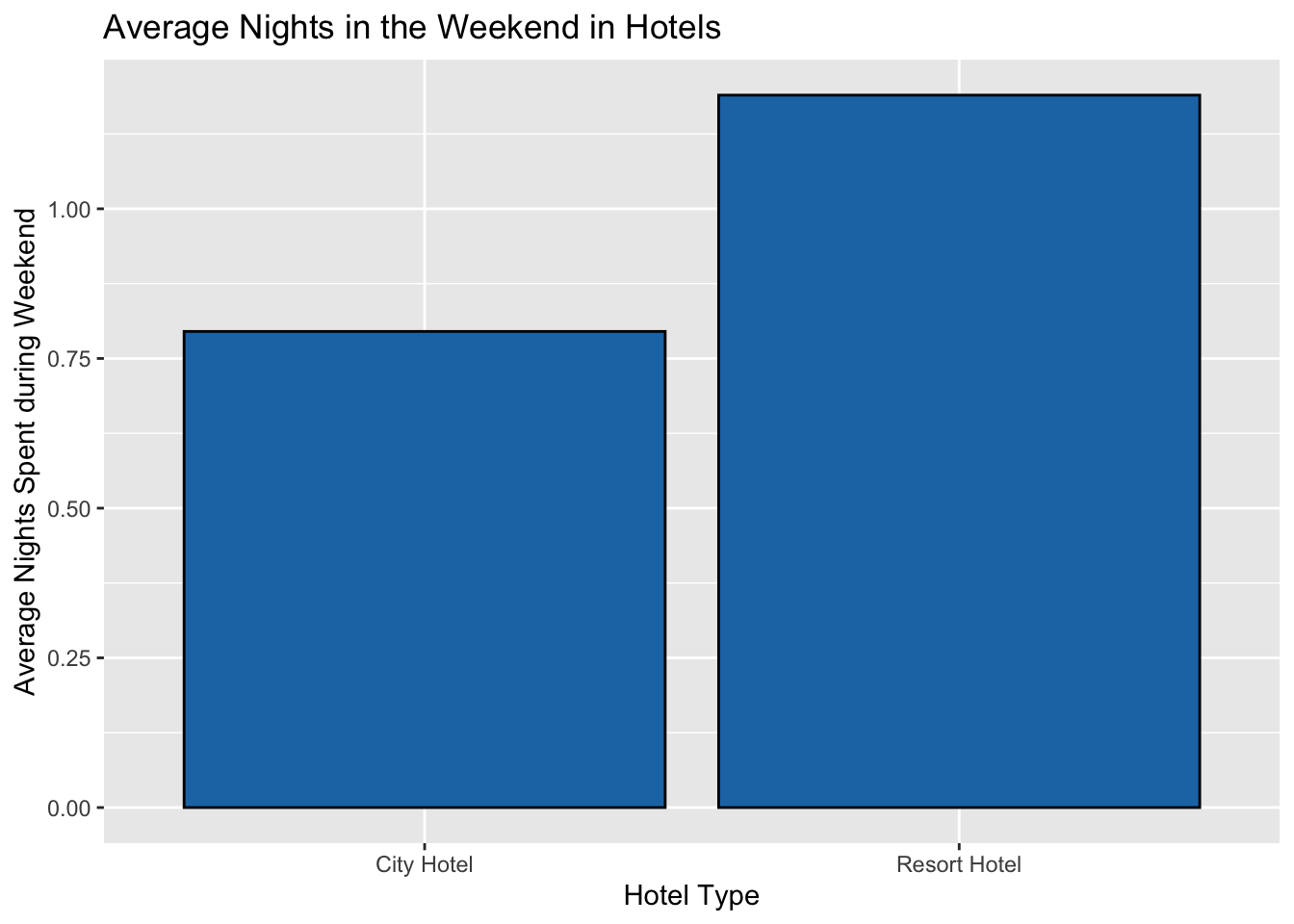
mean_weekendThis data was plotted using bar graphs and treemaps. In the first plot, you can see the three different years that the data was recorded from, and you can see which year had the most amount of reservations that were not cancelled–as previously filtered in the code. In the remaining graphs, I compared the difference between the average amount of nights stayed during the week and weekend in both hotel types. The treemaps are very similar to the bar graphs.
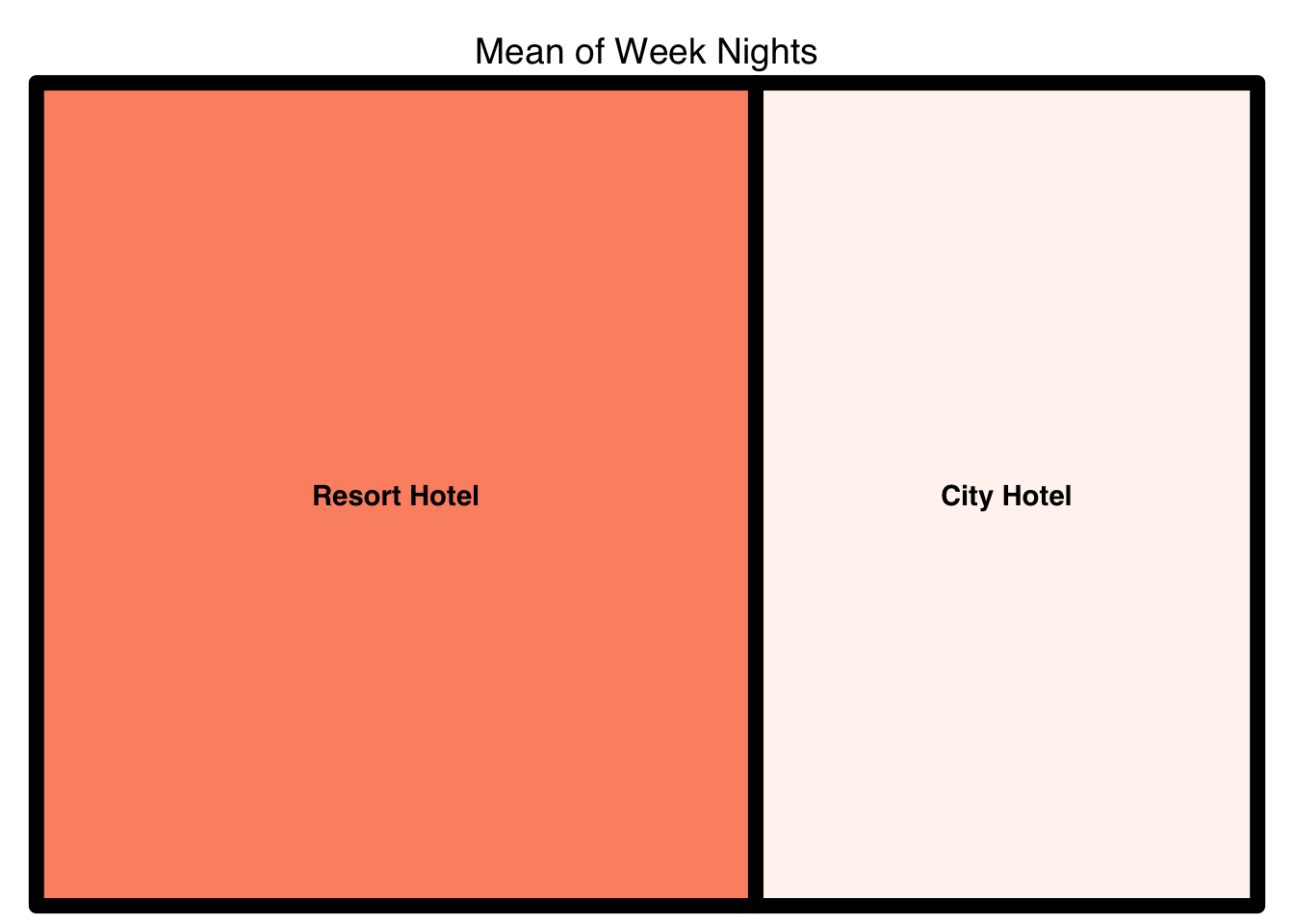
All graphs were customized using the various filling, coloring, and labeling features. All graphs had their axes labelled correctly to show what data was being represented, and the titles were created to summarize that. Different colors were used in the treemaps to distinguish between portions of the maps, and with this the viewer is able to compare the average amounts of nights stayed during the week and weekend in each hotel type. Colors were created using hexadecimals to try and input distinguishing colors for the graphs. Additionally, the borders were enlarged to create a more bold look. In the last treemap, the labels in the subgroups were colored differently to distinguish between group and subgroup–the subgroup determines whether or not the reservation was cancelled.
$tm
hotel vSize vColor stdErr vColorValue level x0 y0
1 City Hotel 2.182957 1 2.182957 NA 1 0.5890277 0
2 Resort Hotel 3.128732 1 3.128732 NA 1 0.0000000 0
w h color
1 0.4109723 1 #FFF5F0
2 0.5890277 1 #FC9272
$type
[1] "index"
$vSize
[1] "Mean of Week Nights"
$vColor
[1] NA
$stdErr
[1] "Mean of Week Nights"
$algorithm
[1] "pivotSize"
$vpCoorX
[1] 0.02812148 0.97187852
$vpCoorY
[1] 0.01968504 0.91031496
$aspRatio
[1] 1.483512
$range
[1] NA
$mapping
[1] NA NA NA
$draw
[1] TRUE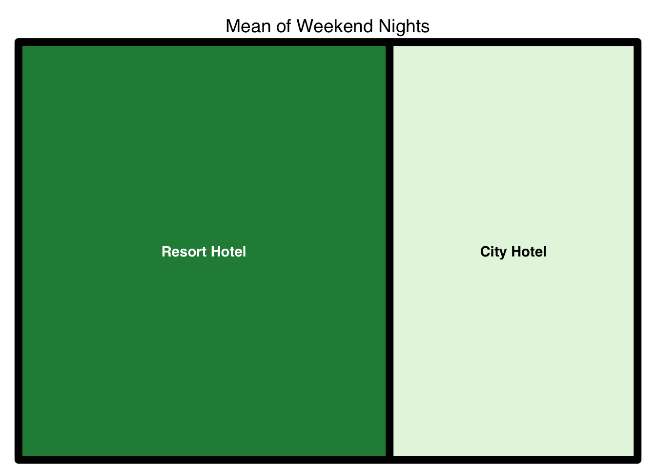
$tm
hotel vSize vColor stdErr vColorValue level x0 y0
1 City Hotel 0.7951847 1 0.7951847 NA 1 0.5994032 0
2 Resort Hotel 1.1898153 1 1.1898153 NA 1 0.0000000 0
w h color
1 0.4005968 1 #E5F5E0
2 0.5994032 1 #238B45
$type
[1] "index"
$vSize
[1] "Mean of Weekend Nights"
$vColor
[1] NA
$stdErr
[1] "Mean of Weekend Nights"
$algorithm
[1] "pivotSize"
$vpCoorX
[1] 0.02812148 0.97187852
$vpCoorY
[1] 0.01968504 0.91031496
$aspRatio
[1] 1.483512
$range
[1] NA
$mapping
[1] NA NA NA
$draw
[1] TRUEhotel_tree3 = new %>%
group_by(hotel, is_canceled) %>%
summarize(`Average Week Nights` = mean(`Week Nights`)) %>%
treemap(index = c("hotel", "is_canceled") ,
vSize = "Average Week Nights",
type = "index",
palette = c("#e78ac3", "#fc8d62"),
border.col=c("black","grey"),
border.lwds=c(8,4),
fontsize.labels = c(18,15),
fontcolor.labels = c("#1f77b4","black"),
title = "Average Week Nights in Hotels and if They are Cancelled",
fontsize.title = 15
)`summarise()` has grouped output by 'hotel'. You can override using the
`.groups` argument.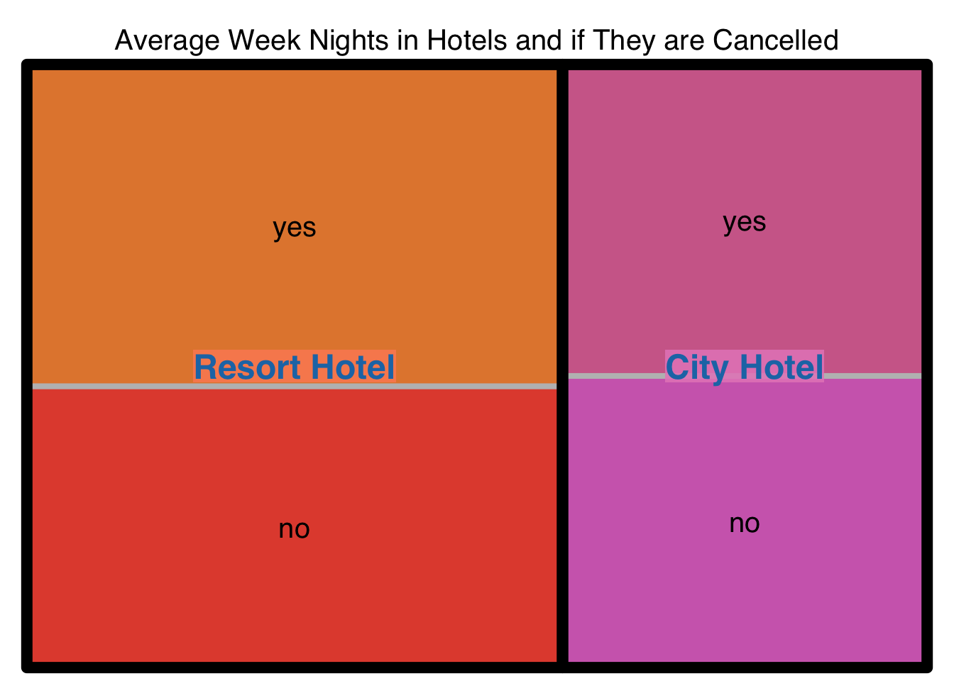
$tm
hotel is_canceled vSize vColor stdErr vColorValue level x0
1 City Hotel <NA> 4.389716 2 4.389716 NA 1 0.5950073
2 City Hotel no 2.122934 1 2.122934 NA 2 0.5950073
3 City Hotel yes 2.266781 1 2.266781 NA 2 0.5950073
4 Resort Hotel <NA> 6.449283 2 6.449283 NA 1 0.0000000
5 Resort Hotel no 3.008985 1 3.008985 NA 2 0.0000000
6 Resort Hotel yes 3.440299 1 3.440299 NA 2 0.0000000
y0 w h color
1 0.0000000 0.4049927 1.0000000 #E78AC3
2 0.0000000 0.4049927 0.4836154 #D06BBA
3 0.4836154 0.4049927 0.5163846 #D06B98
4 0.0000000 0.5950073 1.0000000 #FC8D62
5 0.0000000 0.5950073 0.4665611 #E34F3C
6 0.4665611 0.5950073 0.5334389 #E3873C
$type
[1] "index"
$vSize
[1] "Average Week Nights"
$vColor
[1] NA
$stdErr
[1] "Average Week Nights"
$algorithm
[1] "pivotSize"
$vpCoorX
[1] 0.02812148 0.97187852
$vpCoorY
[1] 0.01968504 0.90531496
$aspRatio
[1] 1.491887
$range
[1] NA
$mapping
[1] NA NA NA
$draw
[1] TRUEThese graphs look visually appealing and they inform the viewer of the differences in the dataset. However, there are limitations as to what the viewer can infer from these plots. As seen in the treemaps, there is a difference in the average amounts of nights stayed in hotels, but sometimes the difference is not large enough to distinguish–like in the bar graphs; looking at the treemaps for the mean of weekend nights and week nights, there is a slight difference but a viewer can miss this difference. Additionally, in the final treemap where there are subgroups of whether or not the reservations were cancelled, you may think the subgroups in the city hotel portion are exactly the same. This can confuse the viewer. The viewer may want to see the maximum amount of nights stayed, or the minimum, and these bar graphs do not show that because they only show the average. A box and whisker plot may better represent that for the viewer rather than a bar graph or a treemap.
---
title: "Homework 3"
author: "Cristhian Barba Garzon"
desription: "Descriptive Statistics and Visualizing"
date: "01/23/2023"
format:
html:
df-print: paged
toc: true
code-fold: true
code-copy: true
code-tools: true
categories:
- hw3
- hotel_bookings.csv
---
```{r}
#| label: setup
#| warning: false
#install.packages("dyplr")
library(tidyverse)
library(dplyr)
library(ggplot2)
library(readxl)
library(treemap)
library(lubridate)
knitr::opts_chunk$set(echo = TRUE)
```
## Reading in and Describing Data
This data provides about 32 different variables and a total of 119,390 observations relating to how many people reserve hotels, when they reserve their hotels, when they check-out, if they had previous cancellations and much more information. We can also see that this data was taken from the years 2015, 2016, and 2017.
```{r}
data = read_csv("_data/hotel_bookings.csv")
data
data %>%
distinct(arrival_date_year) %>% #chooses distinct value of the years (only recorded over 3 years)
arrange(desc(arrival_date_year)) #sets most recent year as most recent to view
data %>%
distinct(arrival_date_month) #recorded over 12 months in each year
data %>%
distinct(hotel)
```
## Tidying Data
The way I tidied the data was by mutating the data to change observation values and variable names; I also removed some variables. I mutated the months to become numerical values, and this was done by using the lubridate function, make_datetime(), to create one column of the arrival dates. Afterwards, I removed the original date columns to make space on the data set. Additionally, I changed the numerical values of 0 and 1, in the cancellations column, to character values of "no" and "yes", respectively. Finally, the relocate function was used to move around variables deemed the most important to look at.
```{r}
mutated.data = data %>%
mutate(arrival_date_month = case_when(
arrival_date_month == "January" ~ 1,
arrival_date_month == "February" ~ 2,
arrival_date_month == "March" ~ 3,
arrival_date_month == "April" ~ 4,
arrival_date_month == "May" ~ 5 ,
arrival_date_month == "June" ~ 6,
arrival_date_month == "July" ~ 7,
arrival_date_month == "August" ~ 8,
arrival_date_month == "September" ~ 9,
arrival_date_month == "October" ~ 10,
arrival_date_month == "November" ~ 11,
arrival_date_month == "December" ~ 12
))
mutated.data %>%
arrange(arrival_date_month)
new = mutated.data %>%
mutate(is_canceled = case_when(
is_canceled == 0 ~ "no",
is_canceled == 1 ~ "yes",
TRUE ~ "Not Available"
), is_repeated_guest = case_when(
is_repeated_guest == 0 ~ "no",
is_repeated_guest == 1 ~ "yes",
TRUE ~ "Not Available"
),
Arrival_date = make_datetime(arrival_date_year, arrival_date_month, arrival_date_day_of_month)
) %>% #adds new column Date with the vector dates from for-loop
subset(select = -c(arrival_date_year, arrival_date_month, arrival_date_day_of_month)) %>% #drops Year and Month columns so new date column will replace
relocate(Arrival_date,.before = 2, .after = NULL) %>%
relocate(reservation_status_date, .before = 2, .after = NULL) %>% #moves the column to the left hand side
relocate(reservation_status, .before = 3, .after = NULL) %>%
rename("Arrival Week #"="arrival_date_week_number","Weekend Nights"= "stays_in_weekend_nights","Week Nights"= "stays_in_week_nights")
new
```
## Descriptive Statistics
Using the grouping function, I grouped the data by the hotel type in order to then tally the amount of total reservations that were cancelled and not cancelled. Afterwards, the average amount of nights spent in a week and a weekend were calculated using the summarize function. I also found the maximum and minimum nights stayed during the week and weekend. These were the most important observations because it tells you how long people stay at these hotels.
```{r}
tallied_cancellations = new %>%
group_by(hotel,is_canceled) %>% #grouping by type of hotel, and whether or not reservation is cancelled
tally()
tallied_cancellations #provides a table of the cancellations
mean_week = new %>%
group_by(hotel) %>%
summarize(`Mean of Week Nights` = mean(`Week Nights`, na.rm = TRUE),
`Median Week Nights` = median(`Week Nights`, na.rm = TRUE),
`Min Week Nights` = min(`Week Nights`, na.rm = TRUE),
`Max Week Nights` = max(`Week Nights`, na.rm = TRUE))
mean_week
mean_weekend = new %>%
group_by(hotel) %>%
summarize(`Mean of Weekend Nights` = mean(`Weekend Nights`,na.rm=TRUE),
`Median Weekend Nights` = median(`Weekend Nights`, na.rm=TRUE),
`Min Weekend Nights` = min(`Weekend Nights`, na.rm = TRUE),
`Max Weekend Nights` = max(`Weekend Nights`, na.rm = TRUE))
mean_weekend
plot = data %>%
group_by(arrival_date_year) %>% #grouped by the arrival year using original data
filter(is_canceled == 0) %>% #filtered the cancellations to when the reservations is not cancelled
summarize(res = n()) #counted amount of reservations
plot
```
## Visualizing and Customizing Data
This data was plotted using bar graphs and treemaps. In the first plot, you can see the three different years that the data was recorded from, and you can see which year had the most amount of reservations that were not cancelled--as previously filtered in the code. In the remaining graphs, I compared the difference between the average amount of nights stayed during the week and weekend in both hotel types. The treemaps are very similar to the bar graphs.
All graphs were customized using the various filling, coloring, and labeling features. All graphs had their axes labelled correctly to show what data was being represented, and the titles were created to summarize that. Different colors were used in the treemaps to distinguish between portions of the maps, and with this the viewer is able to compare the average amounts of nights stayed during the week and weekend in each hotel type. Colors were created using hexadecimals to try and input distinguishing colors for the graphs. Additionally, the borders were enlarged to create a more bold look. In the last treemap, the labels in the subgroups were colored differently to distinguish between group and subgroup--the subgroup determines whether or not the reservation was cancelled.
```{r}
plotted = plot %>%
ggplot(aes(x = arrival_date_year, y = res)) + geom_bar(fill="blue", color ="black", stat = "identity") +
labs(x = "Year of Arrival", y ="Number of Reservations", title = "Reservations in Each Year")
plotted
mean_week_bar = mean_week %>%
ggplot(aes(x = hotel, y = `Mean of Week Nights`)) +
geom_bar(fill="#9467bd",
color = "black",
stat = "identity") +
labs(x = "Hotel Type",
y = "Average Nights Spent during Week",
title = "Average Nights in the Week in Hotels")
mean_week_bar
mean_weekend_bar = mean_weekend %>%
ggplot(aes(x = hotel, y = `Mean of Weekend Nights`)) +
geom_bar(fill = "#1f77b4",
color = "black",
stat = "identity") +
labs(x = "Hotel Type",
y = "Average Nights Spent during Weekend",
title = "Average Nights in the Weekend in Hotels")
mean_weekend_bar
hotel_tree = mean_week %>%
group_by(hotel) %>%
treemap(index = "hotel" ,
vSize = "Mean of Week Nights",
type = "index",
palette = c("#fff5f0", "#fc9272"),
border.col = "black",
border.lwds=8)
hotel_tree
hotel_tree2 = mean_weekend %>%
group_by(hotel) %>%
treemap(index = "hotel",
vSize = "Mean of Weekend Nights",
type = "index",
palette = c("#e5f5e0","#238b45"),
border.col = "black",
border.lwds=8)
hotel_tree2
hotel_tree3 = new %>%
group_by(hotel, is_canceled) %>%
summarize(`Average Week Nights` = mean(`Week Nights`)) %>%
treemap(index = c("hotel", "is_canceled") ,
vSize = "Average Week Nights",
type = "index",
palette = c("#e78ac3", "#fc8d62"),
border.col=c("black","grey"),
border.lwds=c(8,4),
fontsize.labels = c(18,15),
fontcolor.labels = c("#1f77b4","black"),
title = "Average Week Nights in Hotels and if They are Cancelled",
fontsize.title = 15
)
hotel_tree3
```
## Limitations of Visualizations
These graphs look visually appealing and they inform the viewer of the differences in the dataset. However, there are limitations as to what the viewer can infer from these plots. As seen in the treemaps, there is a difference in the average amounts of nights stayed in hotels, but sometimes the difference is not large enough to distinguish--like in the bar graphs; looking at the treemaps for the mean of weekend nights and week nights, there is a slight difference but a viewer can miss this difference. Additionally, in the final treemap where there are subgroups of whether or not the reservations were cancelled, you may think the subgroups in the city hotel portion are exactly the same. This can confuse the viewer. The viewer may want to see the maximum amount of nights stayed, or the minimum, and these bar graphs do not show that because they only show the average. A box and whisker plot may better represent that for the viewer rather than a bar graph or a treemap.