library(tidyverse)
library(ggplot2)
#install.packages("lubridate")
library(lubridate)
#install.packages("treemap")
library(treemap)

knitr::opts_chunk$set(echo = TRUE, warning=FALSE, message=FALSE)Challenge 6
Read in data
- FedFundsRate.csv
fund = read_csv("_data/FedFundsRate.csv")
fund
Briefly describe the data
Tidy Data (as needed)
This data was already nearly tidy; all columns had values that were appropriate to them; I mutated the data to combine the columns that represented times–day,month, and year. This was done to make the data more readable to the viewer. I also relocated the new column–the new dates–to be presented in the beginning of the data.
Funds = fund %>%
    mutate(Date = make_datetime(Year, Month, Day)) %>%
    subset(select = -c(Year, Month, Day)) %>%
    relocate(Date, .before=1, .after=NULL)

Funds
Time Dependent Visualization
I created plots using the dates as the x-values and the inflation rates, and the real GDP, as the y-values. This allows the viewer to visualize the changing GDP and inflation rates throughout the years. In the first plot you can see there were some outliers in the GDP values, so using the statistical functions in R, I was able to eliminate outliers from the data set and visualize them using ggplot. Geom_point was used to create the scatter plot for the changing GDP rates, and geom_line was used to create a line plot for the inflation rates. Both visuals show how the rates vary in time.
Time Dependent Visualization
ggplot(Funds, aes(x=Date, y = `Real GDP (Percent Change)` )) + geom_point(size = 0.2) + labs(title = "Real GDP Over Time", x="Year", y = "Real GDP")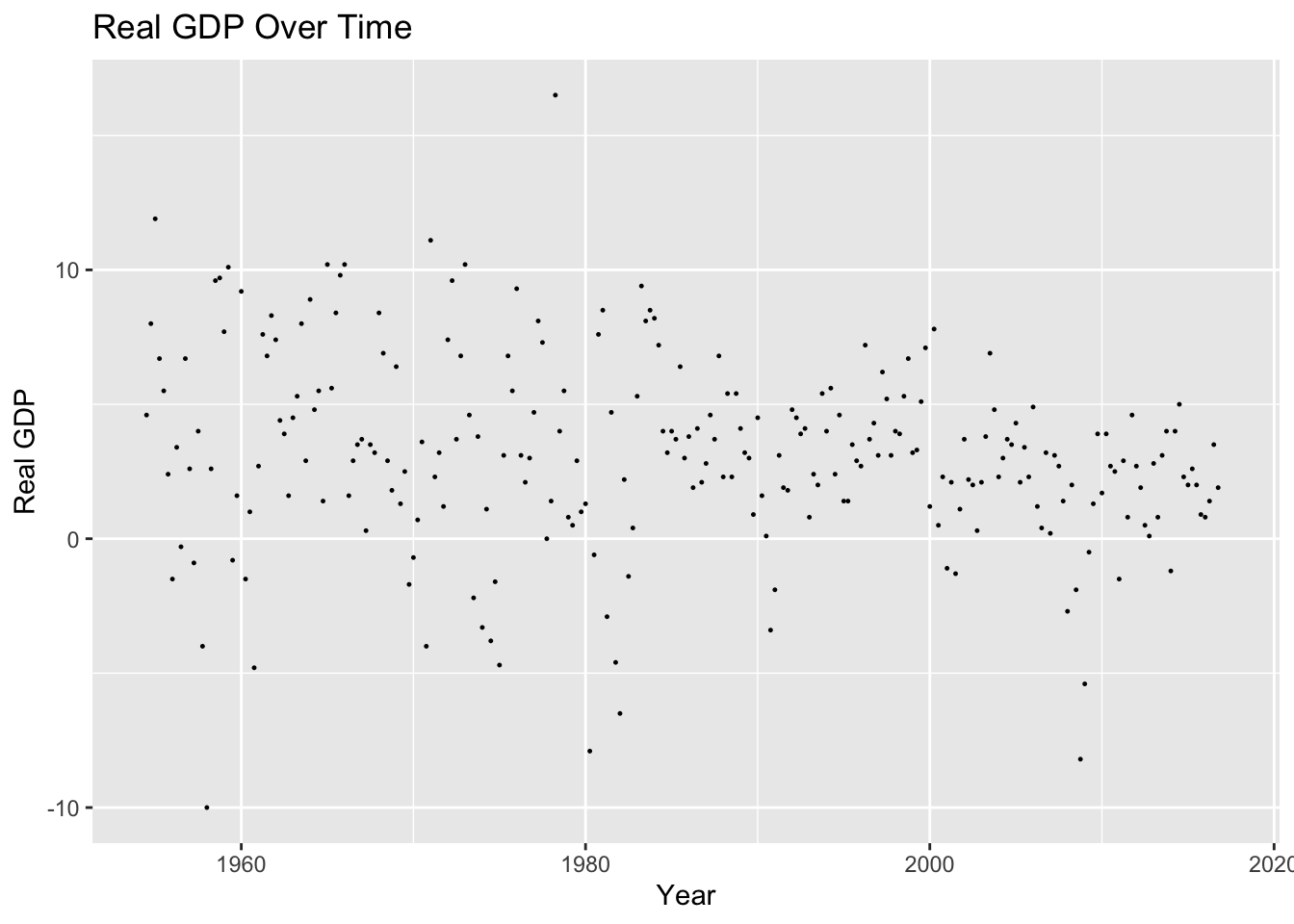
Q = quantile(Funds$`Real GDP (Percent Change)`, probs=c(.25, .75), na.rm = TRUE) #finds quartiles for price column
iqr = IQR(Funds$`Real GDP (Percent Change)`, na.rm = TRUE) #finds IQR for price column
Funds_clean = subset(Funds, Funds$`Real GDP (Percent Change)` > (Q[1] - 1.5*iqr) & Funds$`Real GDP (Percent Change)` < (Q[2]+1.5*iqr))

ggplot(Funds_clean, aes(x = Date, y =`Real GDP (Percent Change)` )) + geom_point(size=0.5) + labs(title = "Real GDP Over Time without Outliers", x="Year", y = "Real GDP")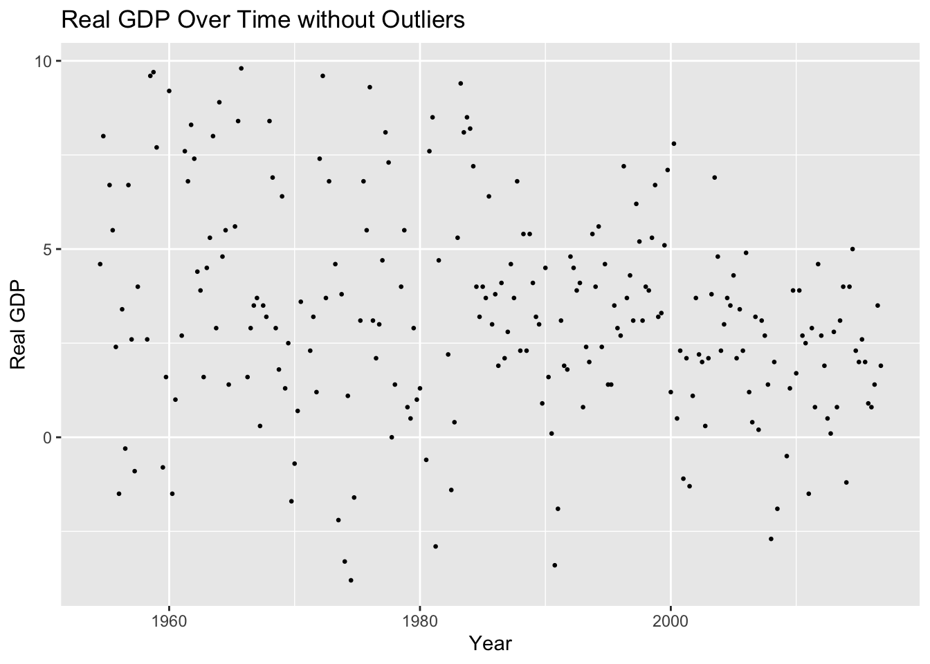
ggplot(Funds_clean, aes(x = Date, y =`Real GDP (Percent Change)` )) + geom_line() + labs(title = "Real GDP Over Time", x="Year", y = "Real GDP")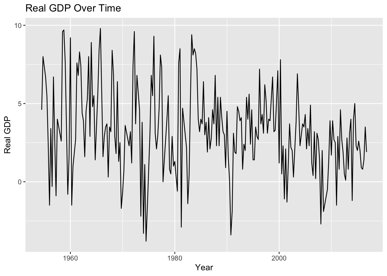
Funds %>%
  fill(`Inflation Rate`) %>% #had to add fill function to connect line graph -- was disconnected before adding fill
ggplot(aes(x = Date, y = `Inflation Rate`,na.rm = TRUE)) + geom_line() + labs(title = "Inflation Rate Over Time", x="Year", y = "Inflation Rate")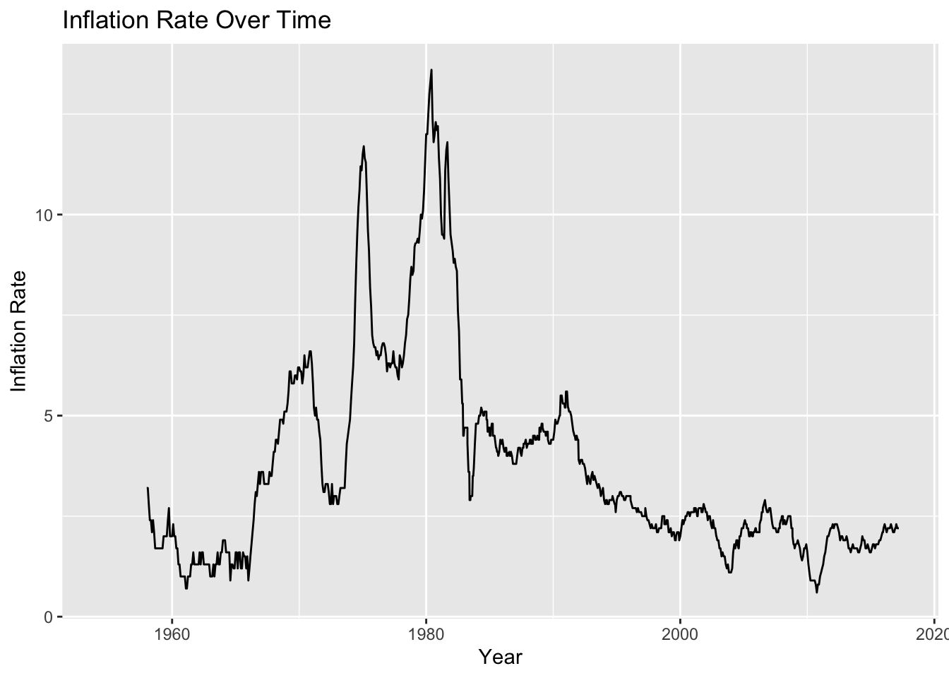
Visualizing Part-Whole Relationships.
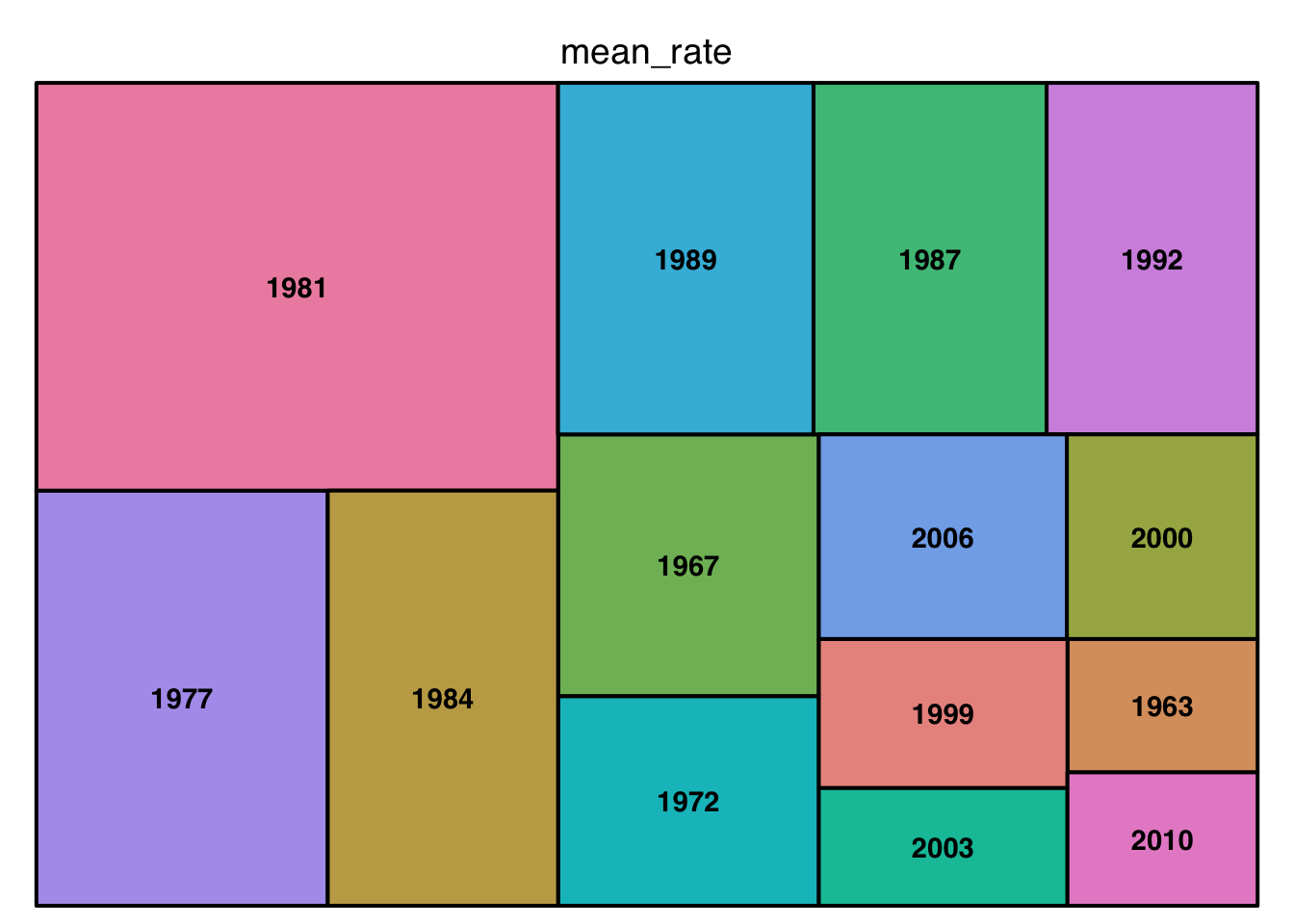
Using the provided link in the instructions, the treemap representation was the best choice to visualize the mean inflation rates in each year. A range of about 50 years was selected to see what year had the largest mean inflation. In the treemap, you can see that the year 1981 has the largest mean inflation rate. The treemap visual can also be compared to the line plot from earlier–both had 1981 as the times with largest inflation rates.
Visualizing Part-Whole Relationships
fund %>% #creating a treemap for the mean of the inflation rate for each year in the original data set
  filter(Year == 1960:2010) %>% #all days would have made the tree map less readable--filtering allows you to choose what section of the Year to view and analyze
  group_by(Year) %>% #will group the columns by the year, and then summarize them with the mean of their inflation rate
  summarize(mean_rate = mean(`Inflation Rate`)) %>%
  treemap(index = "Year", vSize = "mean_rate", type = "index")