Code
library(tidyverse)
library("readxl")
library(lubridate)
knitr::opts_chunk$set(echo = TRUE)Surya Praneeth Reddy Chirasani
January 26, 2023
For this Challenge I am using debt dataset. This dataset has quarterly debt data of different categories in a household such as Mortgage, HE Revolving, Auto Loan, Credit Card, Student Loan and other kinds of debt from the first quarter of Year 2003 to second Quarter of Year 2021. It also has total debt data amount which is the sum of the above mentioned six different debt data
# A tibble: 74 × 8
`Year and Quarter` Mortgage HE Revolvin…¹ Auto …² Credi…³ Stude…⁴ Other Total
<chr> <dbl> <dbl> <dbl> <dbl> <dbl> <dbl> <dbl>
1 03:Q1 4.94 0.242 0.641 0.688 0.241 0.478 7.23
2 03:Q2 5.08 0.26 0.622 0.693 0.243 0.486 7.38
3 03:Q3 5.18 0.269 0.684 0.693 0.249 0.477 7.56
4 03:Q4 5.66 0.302 0.704 0.698 0.253 0.449 8.07
5 04:Q1 5.84 0.328 0.72 0.695 0.260 0.446 8.29
6 04:Q2 5.97 0.367 0.743 0.697 0.263 0.423 8.46
7 04:Q3 6.21 0.426 0.751 0.706 0.33 0.41 8.83
8 04:Q4 6.36 0.468 0.728 0.717 0.346 0.423 9.04
9 05:Q1 6.51 0.502 0.725 0.71 0.364 0.394 9.21
10 05:Q2 6.70 0.528 0.774 0.717 0.374 0.402 9.49
# … with 64 more rows, and abbreviated variable names ¹`HE Revolving`,
# ²`Auto Loan`, ³`Credit Card`, ⁴`Student Loan`For this, I am looking at total debt and how it is changing over time. So I am plotting debt on y-axis and time on x-axis and joining the points by line. Since this is a simple one dimension data changing with time, I have decided to use the follwing simple graph
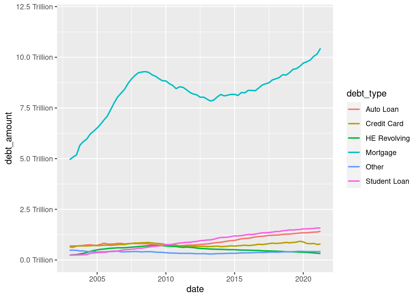
For showing the part-whole relationship, this time I am plotting individual break up debt amount(Auto Loan, Credit Card, HE Revolving, Mortgage, Other, Student Loan) of the total debt, each debt as a line plot, all in the same graph below
debt_tidy<-debt%>%
pivot_longer(cols = 2:7,
names_to = "debt_type",
values_to = "debt_amount") %>%
select(-Total)
ggplot(debt_tidy, aes(x=date, y=debt_amount, color=debt_type)) +
geom_line(linewidth=0.8) +
theme(legend.position = "right") +
scale_y_continuous(labels = scales::label_number(suffix = " Trillion"), limits=c(0,12))
---
title: "Challenge 6: Visualizing Time and Relationships"
author: "Surya Praneeth Reddy Chirasani"
description: ""
date: "01/26/2023"
format:
html:
toc: true
code-fold: true
code-copy: true
code-tools: true
categories:
- challenge_6
- debt
---
```{r}
#| label: setup
#| warning: false
library(tidyverse)
library("readxl")
library(lubridate)
knitr::opts_chunk$set(echo = TRUE)
```
## Data Description
For this Challenge I am using debt dataset. This dataset has quarterly debt data of different categories in a household such as Mortgage, HE Revolving, Auto Loan, Credit Card, Student Loan and other kinds of debt from the first quarter of Year 2003 to second Quarter of Year 2021. It also has total debt data amount which is the sum of the above mentioned six different debt data
```{r}
debt_data <-read_excel("_data/debt_in_trillions.xlsx")
debt_data
```
## Time Evolution Visualization
For this, I am looking at total debt and how it is changing over time. So I am plotting debt on y-axis and time on x-axis and joining the points by line. Since this is a simple one dimension data changing with time, I have decided to use the follwing simple graph
```{r}
debt <- debt_data%>%
        mutate(date = parse_date_time(`Year and Quarter`, orders="yq"))

ggplot(debt, aes(x=date, y=Total)) +
  geom_line()+
  scale_y_continuous(labels = scales::label_number(suffix = " Trillion"))
```
## Path-Whole realtionships Visualization
For showing the part-whole relationship, this time I am plotting individual break up debt amount(Auto Loan, Credit Card, HE Revolving, Mortgage, Other, Student Loan) of the total debt, each debt as a line plot, all in the same graph below
```{r}
debt_tidy<-debt%>%
  pivot_longer(cols = 2:7,
               names_to = "debt_type",
               values_to = "debt_amount") %>%
  select(-Total)

ggplot(debt_tidy, aes(x=date, y=debt_amount, color=debt_type)) +
  geom_line(linewidth=0.8) +
  theme(legend.position = "right") +
  scale_y_continuous(labels = scales::label_number(suffix = " Trillion"), limits=c(0,12))
```