Code
library(tidyverse)
library("readxl")
library(ggplot2)
library(lubridate)
knitr::opts_chunk$set(echo = TRUE)Surya Praneeth Reddy Chirasani
January 27, 2023
For this challenge, I have decided to work with eggs dataset. This dataset has monthly price amount of different sizes(large and extra large) of half dozen and dozen eggs.
Rows: 120 Columns: 6
── Column specification ────────────────────────────────────────────────────────
Delimiter: ","
chr (1): month
dbl (5): year, large_half_dozen, large_dozen, extra_large_half_dozen, extra_...

ℹ Use `spec()` to retrieve the full column specification for this data.
ℹ Specify the column types or set `show_col_types = FALSE` to quiet this message.# A tibble: 120 × 6
month year large_half_dozen large_dozen extra_large_half_dozen extra_l…¹
<chr> <dbl> <dbl> <dbl> <dbl> <dbl>
1 January 2004 126 230 132 230
2 February 2004 128. 226. 134. 230
3 March 2004 131 225 137 230
4 April 2004 131 225 137 234.
5 May 2004 131 225 137 236
6 June 2004 134. 231. 137 241
7 July 2004 134. 234. 137 241
8 August 2004 134. 234. 137 241
9 September 2004 130. 234. 136. 241
10 October 2004 128. 234. 136. 241
# … with 110 more rows, and abbreviated variable name ¹extra_large_dozenIn order to plot a graph of varying prices for different sizes and amount of eggs, I need to pivot the data longer and separate the data based on size and amount. This is done as follows
eggs_tidy <- eggs_data %>%
  pivot_longer(cols=3:6, names_to="type", values_to = "price") %>%
  mutate(type=str_replace(type,"extra_large","extra large"),
         type=str_replace(type,"half_dozen","half dozen")) %>%
  separate(type,into=c("size","amount"),sep="_") %>%
  mutate(date = str_c(year, month, sep=" ")) %>%
  mutate(date = ym(date))
eggs_tidy
# A tibble: 480 × 6
month year size amount price date
<chr> <dbl> <chr> <chr> <dbl> <date>
1 January 2004 large half dozen 126 2004-01-01
2 January 2004 large dozen 230 2004-01-01
3 January 2004 extra large half dozen 132 2004-01-01
4 January 2004 extra large dozen 230 2004-01-01
5 February 2004 large half dozen 128. 2004-02-01
6 February 2004 large dozen 226. 2004-02-01
7 February 2004 extra large half dozen 134. 2004-02-01
8 February 2004 extra large dozen 230 2004-02-01
9 March 2004 large half dozen 131 2004-03-01
10 March 2004 large dozen 225 2004-03-01
# … with 470 more rowsWarning: Using `size` aesthetic for lines was deprecated in ggplot2 3.4.0.
ℹ Please use `linewidth` instead.
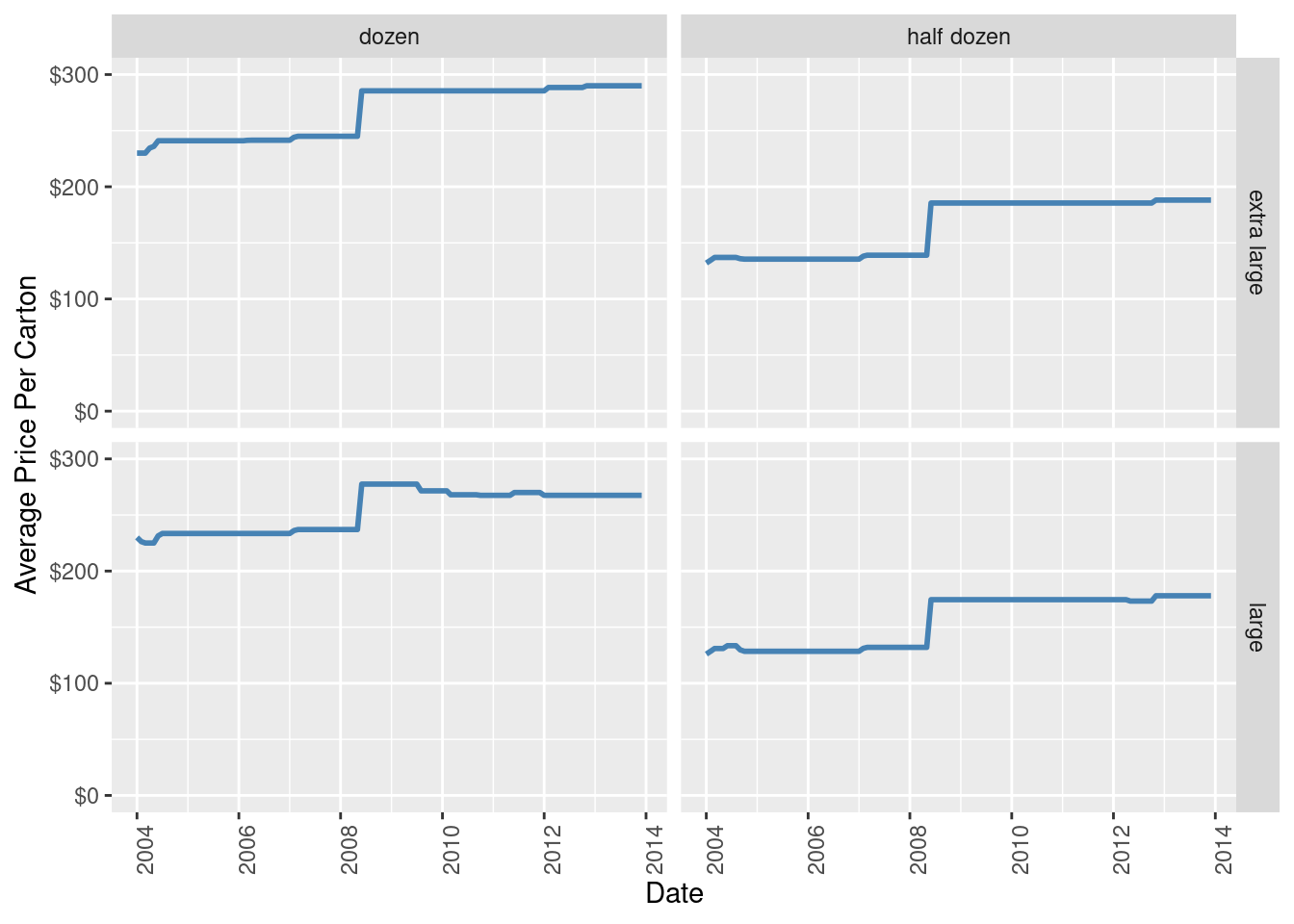
Since we are just trying to visualize variation of price with time for different sizes and amount, I decided to plot a simple line graph in a 4x4 grid, plotting all the four different kinds
---
title: "Challenge 7: Visualizing Multiple Dimensions"
author: "Surya Praneeth Reddy Chirasani"
description: ""
date: "01/27/2023"
format:
html:
toc: true
code-fold: true
code-copy: true
code-tools: true
categories:
- challenge_7
- eggs
---
```{r}
#| label: setup
#| warning: false
library(tidyverse)
library("readxl")
library(ggplot2)
library(lubridate)
knitr::opts_chunk$set(echo = TRUE)
```
## Data Description
For this challenge, I have decided to work with eggs dataset. This dataset has monthly price amount of different sizes(large and extra large) of half dozen and dozen eggs.
```{r}
eggs_data <-read_csv("_data/eggs_tidy.csv")
eggs_data
```
## Tidying Data
In order to plot a graph of varying prices for different sizes and amount of eggs, I need to pivot the data longer and separate the data based on size and amount. This is done as follows
```{r}
eggs_tidy <- eggs_data %>%
pivot_longer(cols=3:6, names_to="type", values_to = "price") %>%
mutate(type=str_replace(type,"extra_large","extra large"),
type=str_replace(type,"half_dozen","half dozen")) %>%
separate(type,into=c("size","amount"),sep="_") %>%
mutate(date = str_c(year, month, sep=" ")) %>%
mutate(date = ym(date))
eggs_tidy
```
```{r}
ggplot(eggs_tidy,aes(date,price)) +
  geom_line(color = "steelblue", size = 1)+
  scale_x_date()+
  scale_y_continuous(labels=scales::dollar_format(), limits=c(0,300)) +
  facet_grid(size ~ amount) +
  labs(x="Date",y="Average Price Per Carton")+
  theme(axis.text.x=element_text(angle=90))
```
Since we are just trying to visualize variation of price with time for different sizes and amount, I decided to plot a simple line graph in a 4x4 grid, plotting all the four different kinds