library(tidyverse)
library(ggplot2)
library(dplyr)

knitr::opts_chunk$set(echo = TRUE, warning=FALSE, message=FALSE)
Challenge 7 Submission
Challenge Overview
Today’s challenge is to:
- read in a data set, and describe the data set using both words and any supporting information (e.g., tables, etc)
- tidy data (as needed, including sanity checks)
- mutate variables as needed (including sanity checks)
- Recreate at least two graphs from previous exercises, but introduce at least one additional dimension that you omitted before using ggplot functionality (color, shape, line, facet, etc) The goal is not to create unneeded chart ink (Tufte), but to concisely capture variation in additional dimensions that were collapsed in your earlier 2 or 3 dimensional graphs.
- Explain why you choose the specific graph type
- If you haven’t tried in previous weeks, work this week to make your graphs “publication” ready with titles, captions, and pretty axis labels and other viewer-friendly features
R Graph Gallery is a good starting point for thinking about what information is conveyed in standard graph types, and includes example R code. And anyone not familiar with Edward Tufte should check out his fantastic books and courses on data visualizaton.
(be sure to only include the category tags for the data you use!)
Read in data
Read in one (or more) of the following datasets, using the correct R package and command.
- eggs ⭐
- abc_poll ⭐⭐
- australian_marriage ⭐⭐
- hotel_bookings ⭐⭐⭐
- air_bnb ⭐⭐⭐
- us_hh ⭐⭐⭐⭐
- faostat ⭐⭐⭐⭐⭐
I am using the same dataset as Challenge 6 so 1-3 are copied straight from there.
data = read_csv("_data/hotel_bookings.csv")

# We inspect the columns in this dataset using the head command
head(data)
Briefly describe the data
The dataset contains booking information for hotels, and includes information such as the time of booking, length of stay, the number of guests, cancellations, etc.
Tidy Data (as needed)
We look at the first few rows of the data to get a visual outline of the dataset and we observe that columns agent, company and country have a lot of NULL values. We can use the following to get a column-wise representation of all the garbage values.
data %>%
  summarize_all(list(~ sum(is.na(.))))
# we use the stringr package for this
library(stringr)
# get the null percentages
null_percentages <- sapply(data, function(x) sum(str_detect(x, "NULL"))/length(x))
# put it into a tibble and arrange it
null_percentages_tibble <- tibble(column = names(data), null_percentage = null_percentages)
null_percentages_tibble %>%
arrange(desc(null_percentage))Are there any variables that require mutation to be usable in your analysis stream? For example, do you need to calculate new values in order to graph them? Can string values be represented numerically? Do you need to turn any variables into factors and reorder for ease of graphics and visualization?
Document your work here.
Yes, I wish to plot the price of a room per night per person over the course of a year. I will first need to clean the data a little more, this would involve getting rid of garbage values, negative values, zeroes, etc.
replace_garbage <- c(country = "Unknown", agent = 0, company = 0)

# find indices that have `na`
na_indices <- which(is.na(data$children))
data$children[na_indices] <- 0.0

# Use a for loop to replace missing values in each column
for (col in names(replace_garbage)) {
  data[data[,col] == "NULL", col] <- replace_garbage[col]
}

# club the undefined meals with SC based on information about the dataset
data$meal <- replace(data$meal, data$meal == "Undefined", "SC")

# separate data by Hotel Type:
resort_hotel <- data %>% filter(hotel == "Resort Hotel" & is_canceled == 0)
city_hotel <- data %>% filter(hotel == "City Hotel" & is_canceled == 0)

# calculate room price per person
data <- data %>% filter(adults != 0 | children != 0 | babies != 0)
data <- data %>% filter(adr>0)
data$adr_norm <- data$adr / (data$adults + data$children)
data_uncancelled <- data[data$is_canceled == 0, ] # the ones didn't cancel
#room_prices <- data_uncancelled[, c("hotel", "reserved_room_type", "adr_norm")][order(data_uncancelled$reserved_room_type), ]
Visualization with Multiple Dimensions
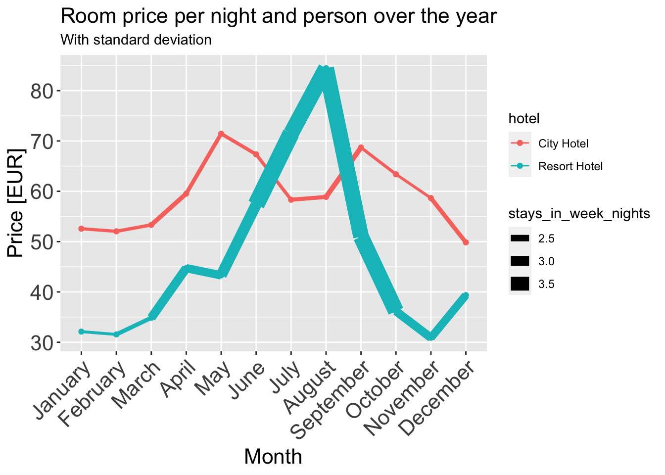
I am using a line plot with ribbons around them and grouping them by hotel (Hotel Type). A line plot conveys all the information about evolution of a quantity like adr (Average daily rate) over the course of a year. I convert the adr to a normalized version where we get one quantity that’s the mean price of that month per person across all the years. I also use ribbons to show the standard deviation of that price since mean is an aggressive aggregating function and loses a lot of information about the true trend if used in isolation.
Added a dimension:
I have added a dimension to the same plot, average length of stay by stays_in_week_nights is shown by the thickness of the line plot. I did have to get rid of the standard deviation ribbons since it’s hard to make it compatible with the plot. I would’ve used a different plot but the challenge constraints don’t allow it.
# grab data:
room_prices_monthly <- data_uncancelled[c("hotel", "arrival_date_month", "adr_norm", "stays_in_week_nights")][order(data_uncancelled$arrival_date_month),]

# order by month:
months <- c("January", "February", "March", "April", "May", "June",
          "July", "August", "September", "October", "November", "December")

room_prices_monthly$arrival_date_month <- factor(room_prices_monthly$arrival_date_month, levels=months, ordered=TRUE)


room_prices_monthly_agg <- room_prices_monthly %>%
  group_by(hotel, arrival_date_month) %>%
  summarise(adr_norm = mean(adr_norm),
  stays_in_week_nights = mean(stays_in_week_nights))

ggplot(data = room_prices_monthly_agg, aes(x = arrival_date_month, y = adr_norm, color = `hotel`, group = `hotel`)) +
  geom_line(aes(linewidth = stays_in_week_nights), size = 1) +
  geom_point() +
  scale_size(range = c(0.2, 10)) + # control the thickness range of the line
  ggtitle("Room price per night and person over the year", subtitle = "With standard deviation") +
  xlab("Month") +
  ylab("Price [EUR]") +
  theme(axis.text.x = element_text(angle = 45, hjust = 1),
        plot.title = element_text(size = 16),
        axis.text = element_text(size = 16),
        axis.title = element_text(size = 16))
room_prices_monthly_agg <- room_prices_monthly %>%
  group_by(hotel, arrival_date_month) %>%
  summarise(adr_norm = mean(adr_norm), los = mean(stays_in_week_nights))

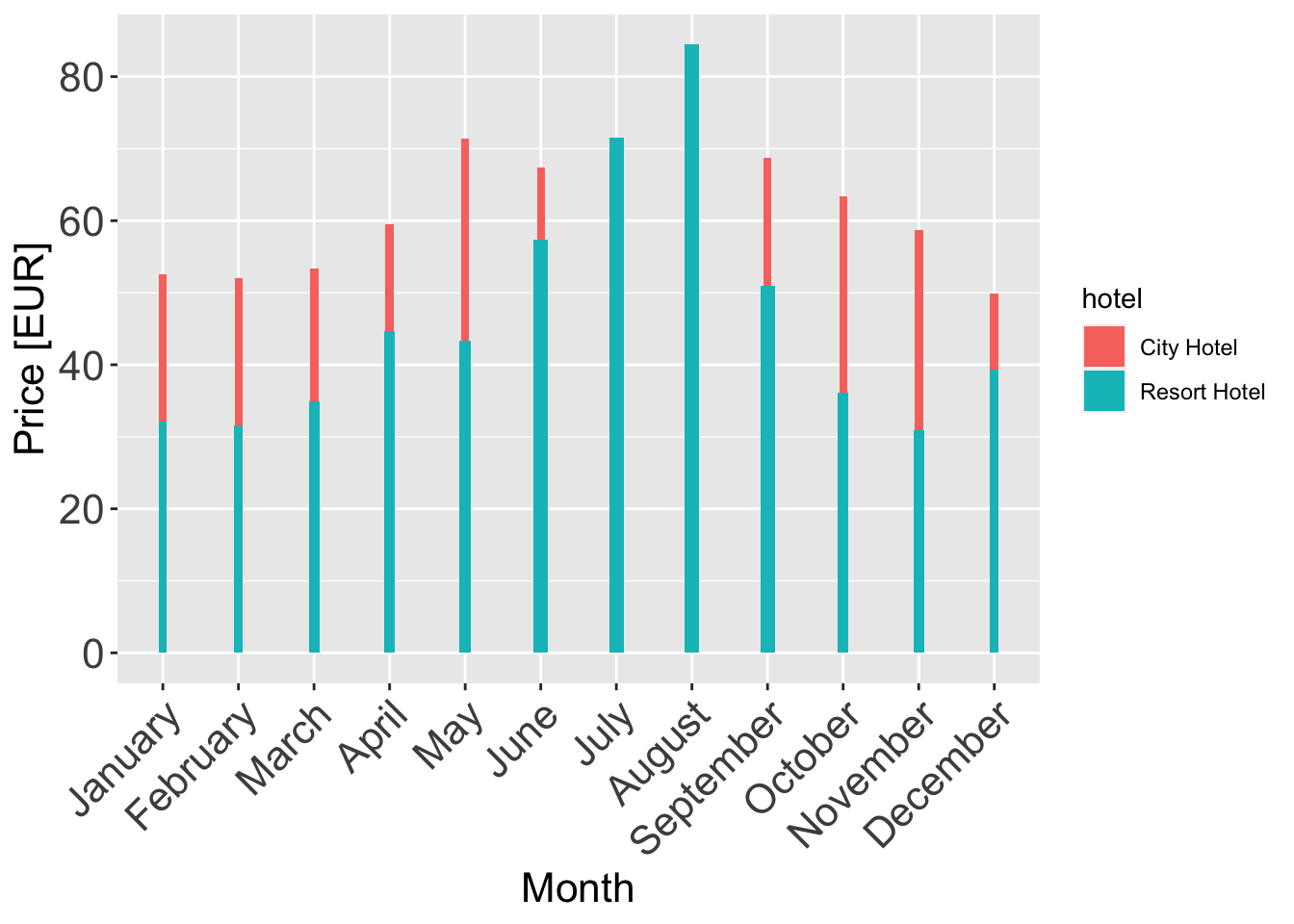
ggplot(data = room_prices_monthly_agg, aes(x = arrival_date_month, y = adr_norm, fill = hotel, width=los/20)) +
  geom_col() +
  xlab("Month") +
  ylab("Price [EUR]") +
  theme(axis.text.x = element_text(angle = 45, hjust = 1),
        plot.title = element_text(size = 16),
        axis.text = element_text(size = 16),
        axis.title = element_text(size = 16))
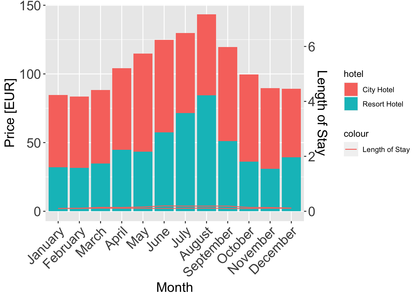
ggplot(data = room_prices_monthly_agg, aes(x = arrival_date_month, y = adr_norm, fill = hotel)) +
  geom_col() +
  geom_line(aes(y = los, group = hotel, color = "Length of Stay"), sec.axis = sec_axis(~./20, name = "Length of Stay")) +
  scale_y_continuous(sec.axis = sec_axis(~./20, name = "Length of Stay")) +
  xlab("Month") +
  ylab("Price [EUR]") +
  theme(axis.text.x = element_text(angle = 45, hjust = 1),
        plot.title = element_text(size = 16),
        axis.text = element_text(size = 16),
        axis.title = element_text(size = 16))