Code
library(tidyverse)
library(ggplot2)
library(here)

knitr::opts_chunk$set(echo = TRUE, warning=FALSE, message=FALSE)Daniel Manning
January 9, 2023
# A tibble: 20 × 4
Cereal Sodium Sugar Type
<chr> <dbl> <dbl> <chr>
1 Frosted Mini Wheats 0 11 A
2 Raisin Bran 340 18 A
3 All Bran 70 5 A
4 Apple Jacks 140 14 C
5 Captain Crunch 200 12 C
6 Cheerios 180 1 C
7 Cinnamon Toast Crunch 210 10 C
8 Crackling Oat Bran 150 16 A
9 Fiber One 100 0 A
10 Frosted Flakes 130 12 C
11 Froot Loops 140 14 C
12 Honey Bunches of Oats 180 7 A
13 Honey Nut Cheerios 190 9 C
14 Life 160 6 C
15 Rice Krispies 290 3 C
16 Honey Smacks 50 15 A
17 Special K 220 4 A
18 Wheaties 180 4 A
19 Corn Flakes 200 3 A
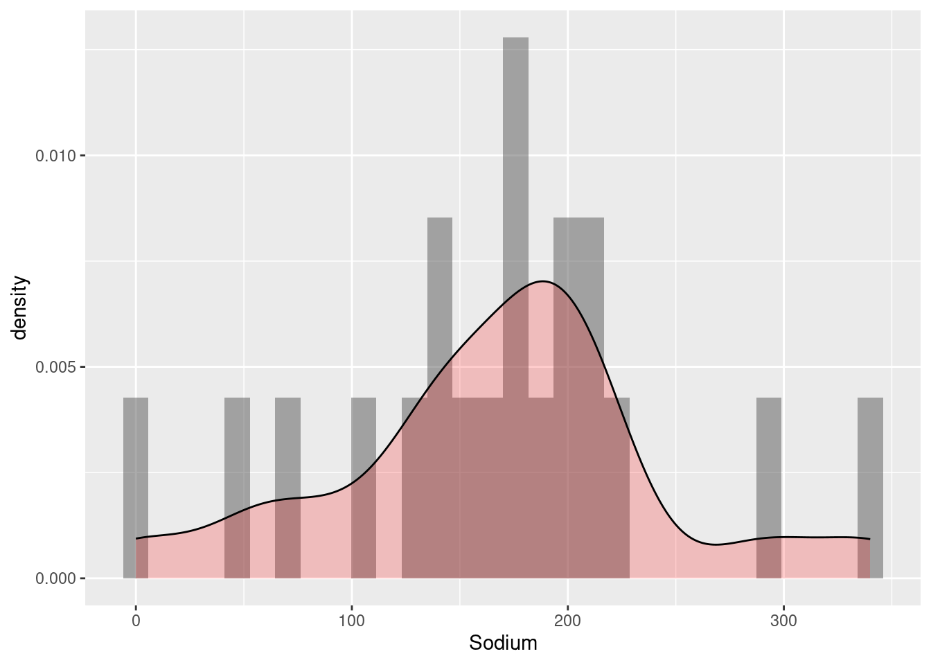
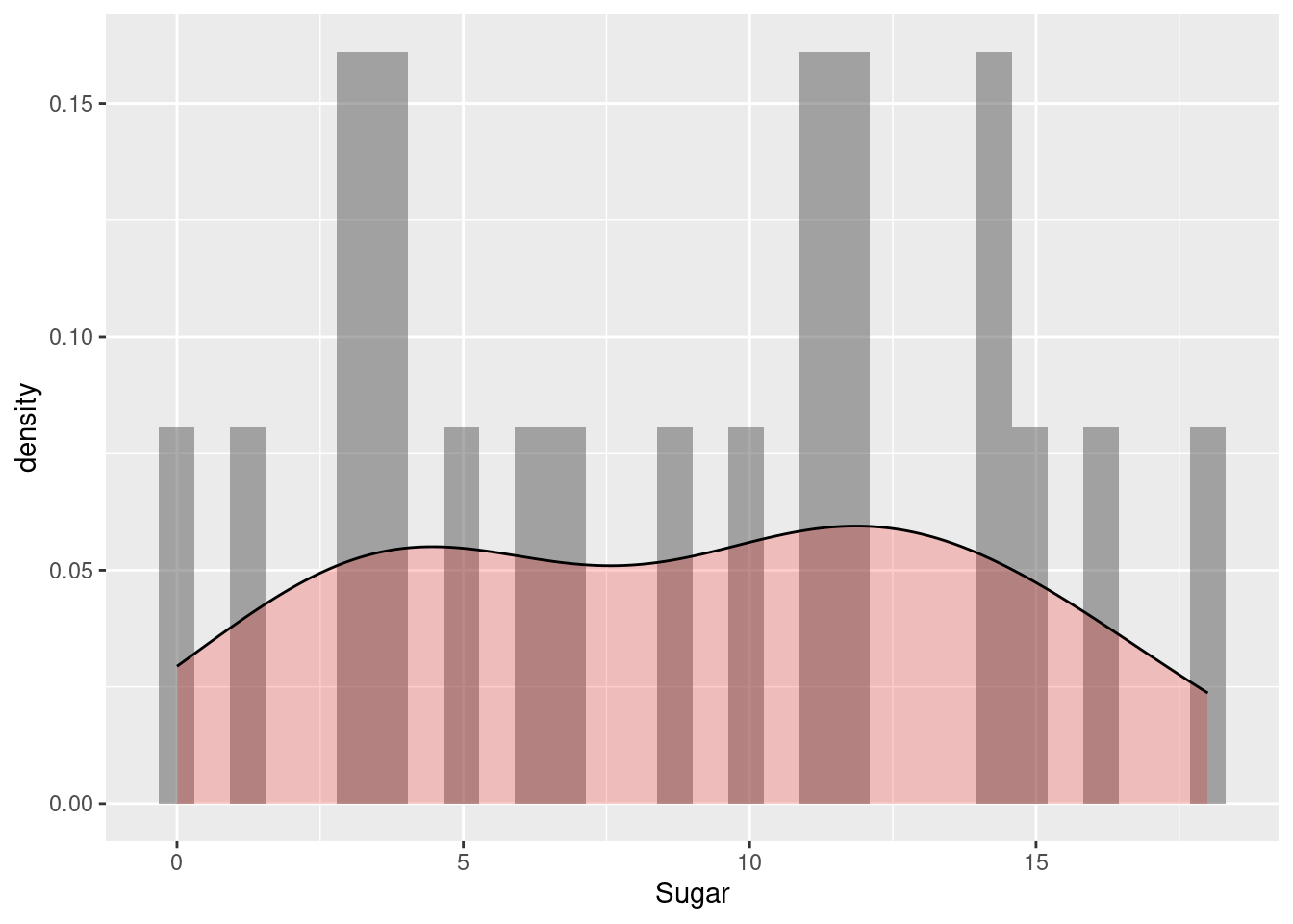
20 Honeycomb 210 11 C I chose to use two histograms to display the Sodium and Sugar content of various cereal brands because these are single numeric variables.

$x
[1] "Sodium"
$title
[1] "Sodium Content by Cereal Brand"
attr(,"class")
[1] "labels"
$x
[1] "Sugar"
$title
[1] "Sugar Content by Cereal Brand"
attr(,"class")
[1] "labels"I chose to use a scatterplot to display the Sodium by Sugar content of various cereal brands because these are numeric variables and the scatterplot can be used to reveal relationships between them.
---
title: "Challenge 5"
author: "Daniel Manning"
description: "Introduction to Visualization"
date: "1/9/2023"
format:
html:
toc: true
code-fold: true
code-copy: true
code-tools: true
categories:
- challenge_5
---
```{r}
#| label: setup
#| warning: false
#| message: false
library(tidyverse)
library(ggplot2)
library(here)
knitr::opts_chunk$set(echo = TRUE, warning=FALSE, message=FALSE)
```
## Read in data
```{r}
cereal <- here("posts","_data","cereal.csv")%>%
  read_csv()
cereal
```
## Univariate Visualization
I chose to use two histograms to display the Sodium and Sugar content of various cereal brands because these are single numeric variables.
```{r}
ggplot(cereal, aes(Sodium)) +
  geom_histogram(aes(y = ..density..), alpha = 0.5) +
  geom_density(alpha = 0.2, fill="red")
labs(title = "Sodium Content by Cereal Brand", x = "Sodium")
ggplot(cereal, aes(Sugar)) +
  geom_histogram(aes(y = ..density..), alpha = 0.5) +
  geom_density(alpha = 0.2, fill="red")
labs(title = "Sugar Content by Cereal Brand", x = "Sugar")
```
## Bivariate Visualization
I chose to use a scatterplot to display the Sodium by Sugar content of various cereal brands because these are numeric variables and the scatterplot can be used to reveal relationships between them.
```{r}
ggplot(cereal, aes(Sugar, Sodium)) + geom_point()
labs(title = "Sodium Content by Sugar for Cereal Brands", x = "Sugar", y = "Sodium")
```