library(tidyverse)
library(ggplot2)

knitr::opts_chunk$set(echo = TRUE, warning=FALSE, message=FALSE)
Challenge 5
Challenge Overview
Today’s challenge is to:
- read in a data set, and describe the data set using both words and any supporting information (e.g., tables, etc)
- tidy data (as needed, including sanity checks)
- mutate variables as needed (including sanity checks)
- create at least two univariate visualizations
- try to make them “publication” ready
- Explain why you choose the specific graph type
- Create at least one bivariate visualization
- try to make them “publication” ready
- Explain why you choose the specific graph type
R Graph Gallery is a good starting point for thinking about what information is conveyed in standard graph types, and includes example R code.
(be sure to only include the category tags for the data you use!)
Read in data
Read in one (or more) of the following datasets, using the correct R package and command.
- cereal ⭐
- pathogen cost ⭐
- Australian Marriage ⭐⭐
- AB_NYC_2019.csv ⭐⭐⭐
- railroads ⭐⭐⭐
- Public School Characteristics ⭐⭐⭐⭐
- USA Households ⭐⭐⭐⭐⭐
cereal <- read_csv("../posts/_data/cereal.csv")
head(cereal)
# A tibble: 6 × 4
Cereal Sodium Sugar Type
<chr> <dbl> <dbl> <chr>
1 Frosted Mini Wheats 0 11 A
2 Raisin Bran 340 18 A
3 All Bran 70 5 A
4 Apple Jacks 140 14 C
5 Captain Crunch 200 12 C
6 Cheerios 180 1 C Briefly describe the data
The data consists of different brands of cereal, some of their nutritional content like their sodium and sugar contents, and their “type” category. ## Tidy Data (as needed)
The data is mostly tidy, but there is definitely room for some visualisations to be made.
summary(cereal) Cereal Sodium Sugar Type
Length:20 Min. : 0.0 Min. : 0.00 Length:20
Class :character 1st Qu.:137.5 1st Qu.: 4.00 Class :character
Mode :character Median :180.0 Median : 9.50 Mode :character
Mean :167.0 Mean : 8.75
3rd Qu.:202.5 3rd Qu.:12.50
Max. :340.0 Max. :18.00 colnames(cereal)[1] "Cereal" "Sodium" "Sugar" "Type" Are there any variables that require mutation to be usable in your analysis stream? For example, do you need to calculate new values in order to graph them? Can string values be represented numerically? Do you need to turn any variables into factors and reorder for ease of graphics and visualization?
Yes, there is one unidentified category that is either “A” or “C” for every cereal: from my understanding, “A” represents “adult” cereals and “C” represents “children’s”. While I firmly disagree with the stance that Honey Nut Cheerios are a “children’s cereal”, that is besides the point. We must rename those variables to make it more clear for future viewers.
cereal <- mutate(cereal, `Type` = recode(`Type`, "A" = "Adults", "C" = "Children"))Univariate Visualizations
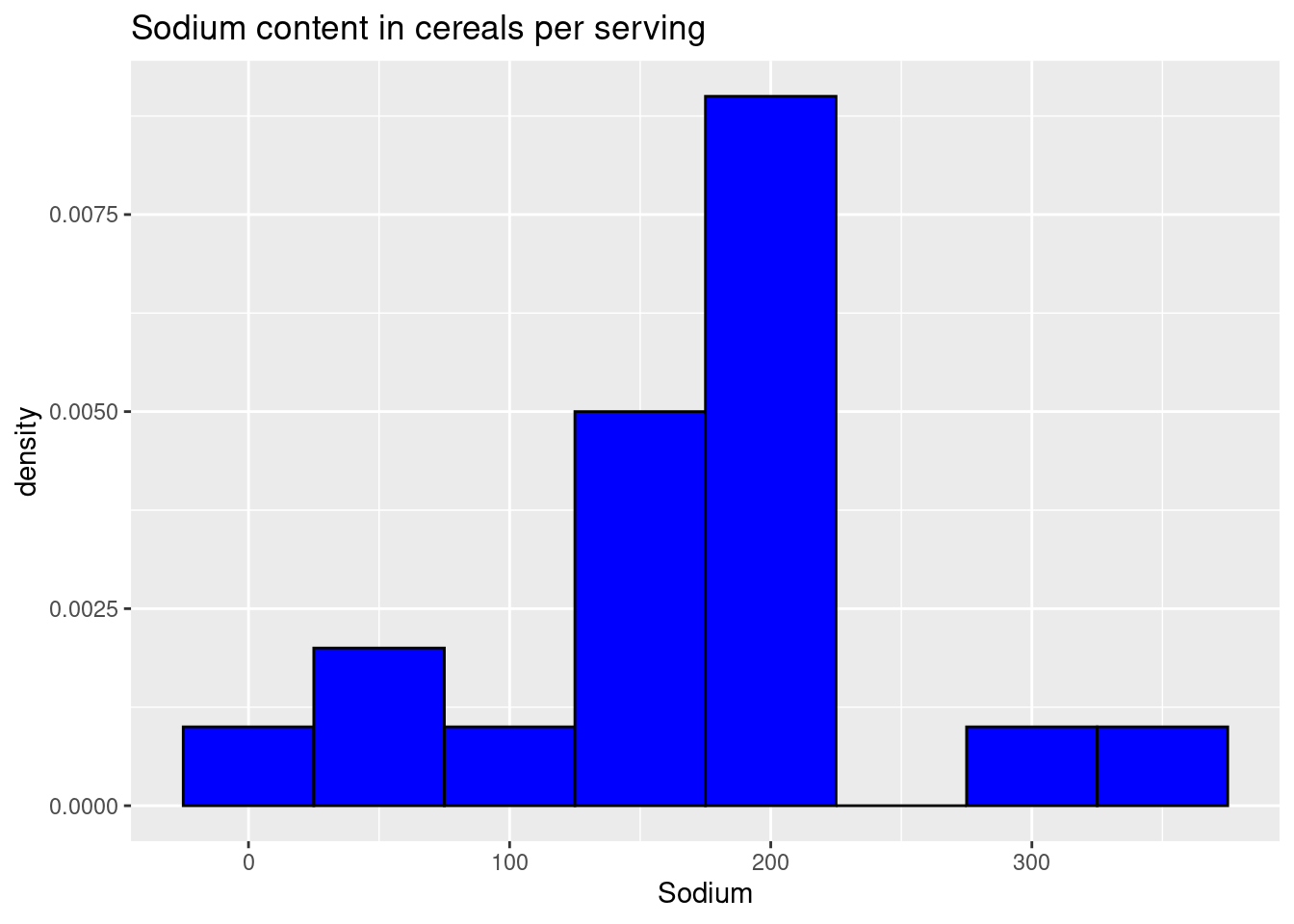
Now our variables are named properly, lets visualize some data. Considering the cereals are mostly being compared by their nutritional contents, it would be nice to throw the different brands in a histogram comparing something like their sodium contents, to get a broad view of the range of how the most and least healthy cereals compare in nutritional value.
ggplot(cereal, aes(Sodium)) +
   geom_histogram(binwidth = 50, aes(y = ..density..), colour = 1, fill = "blue") +
   labs(title = "Sodium content in cereals per serving")
We have created a bare, and pretty ugly histogram showing the distribution of cereals with certain sodium levels- it is a visualization, for sure, but not the best one. We want to be able to see more from this- types of cereals and what their specific sodium contents are- but for now this is a passing distribution, if you’re trying to see the data in a broad sense.
Bivariate Visualization(s)
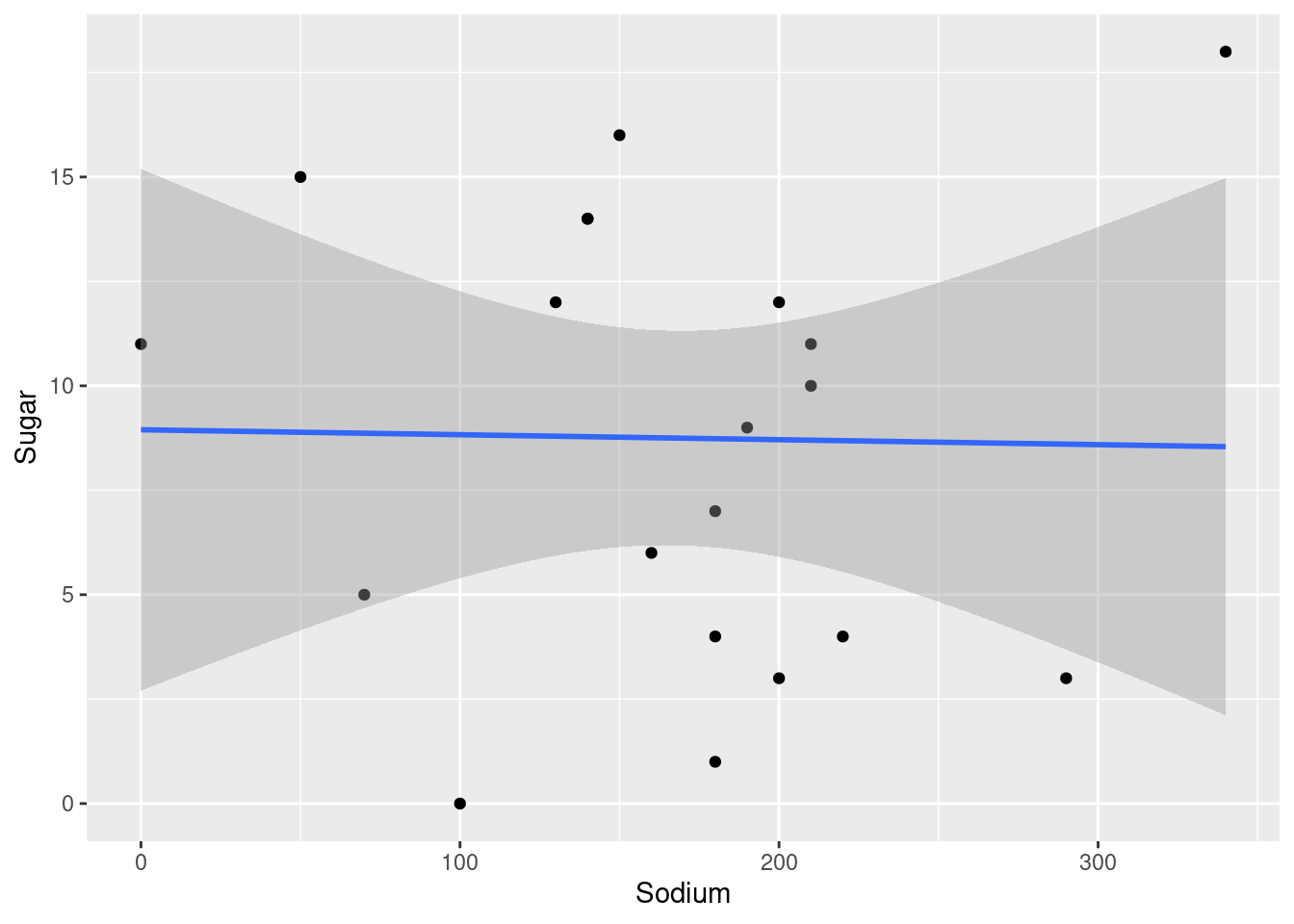
We can easily create a bivariate visualization in the form of a scatter plot using the handy “geom_point”. Here, we choose sodium to display on our x axis, so we can see if cereals with high sodium content are also likely to have high surgar contents.We also use “geom_smooth” to create a trend line for us to show if there is any positive or even negative correlation between the two.
ggplot(cereal, aes(x=Sodium, y=Sugar)) +
   geom_point() +
    geom_smooth(method=lm)
Here we can see that their is little to no correlation between sodium content in cereal and their sugar contents. If anything the plot line looks like it has a slightly negative slope, although definitely nothing conclusive.