Code
library(tidyverse)
library(ggplot2)
library(here)
library(lubridate)

knitr::opts_chunk$set(echo = TRUE, warning=FALSE, message=FALSE)Daniel Manning
January 13, 2023
# A tibble: 904 × 10
Year Month Day Federal F…¹ Feder…² Feder…³ Effec…⁴ Real …⁵ Unemp…⁶ Infla…⁷
<dbl> <dbl> <dbl> <dbl> <dbl> <dbl> <dbl> <dbl> <dbl> <dbl>
1 1954 7 1 NA NA NA 0.8 4.6 5.8 NA
2 1954 8 1 NA NA NA 1.22 NA 6 NA
3 1954 9 1 NA NA NA 1.06 NA 6.1 NA
4 1954 10 1 NA NA NA 0.85 8 5.7 NA
5 1954 11 1 NA NA NA 0.83 NA 5.3 NA
6 1954 12 1 NA NA NA 1.28 NA 5 NA
7 1955 1 1 NA NA NA 1.39 11.9 4.9 NA
8 1955 2 1 NA NA NA 1.29 NA 4.7 NA
9 1955 3 1 NA NA NA 1.35 NA 4.6 NA
10 1955 4 1 NA NA NA 1.43 6.7 4.7 NA
# … with 894 more rows, and abbreviated variable names
# ¹`Federal Funds Target Rate`, ²`Federal Funds Upper Target`,
# ³`Federal Funds Lower Target`, ⁴`Effective Federal Funds Rate`,
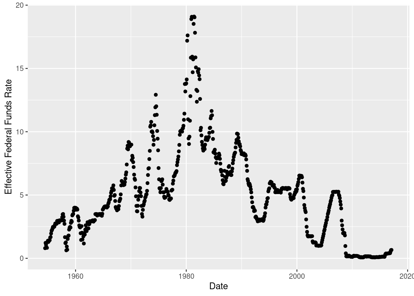
# ⁵`Real GDP (Percent Change)`, ⁶`Unemployment Rate`, ⁷`Inflation Rate`I chose to use a scatterplot to display the Effective Federal Funds Rate over time because these are numeric variables and the scatterplot can be used to reveal relationships between them. The scatterplot reveals peaks in Effective Federal Funds Rate during various years, such as 1970, 1975, and 1982.
# A tibble: 904 × 11
Year Month Day Federal F…¹ Feder…² Feder…³ Effec…⁴ Real …⁵ Unemp…⁶ Infla…⁷
<dbl> <dbl> <dbl> <dbl> <dbl> <dbl> <dbl> <dbl> <dbl> <dbl>
1 1954 7 1 NA NA NA 0.8 4.6 5.8 NA
2 1954 8 1 NA NA NA 1.22 NA 6 NA
3 1954 9 1 NA NA NA 1.06 NA 6.1 NA
4 1954 10 1 NA NA NA 0.85 8 5.7 NA
5 1954 11 1 NA NA NA 0.83 NA 5.3 NA
6 1954 12 1 NA NA NA 1.28 NA 5 NA
7 1955 1 1 NA NA NA 1.39 11.9 4.9 NA
8 1955 2 1 NA NA NA 1.29 NA 4.7 NA
9 1955 3 1 NA NA NA 1.35 NA 4.6 NA
10 1955 4 1 NA NA NA 1.43 6.7 4.7 NA
# … with 894 more rows, 1 more variable: Date <date>, and abbreviated variable
# names ¹`Federal Funds Target Rate`, ²`Federal Funds Upper Target`,
# ³`Federal Funds Lower Target`, ⁴`Effective Federal Funds Rate`,
# ⁵`Real GDP (Percent Change)`, ⁶`Unemployment Rate`, ⁷`Inflation Rate`
$x
[1] "Date"
$y
[1] "Effective Federal Funds Rate"
$title
[1] "Effective Federal Funds Rate by Date"
attr(,"class")
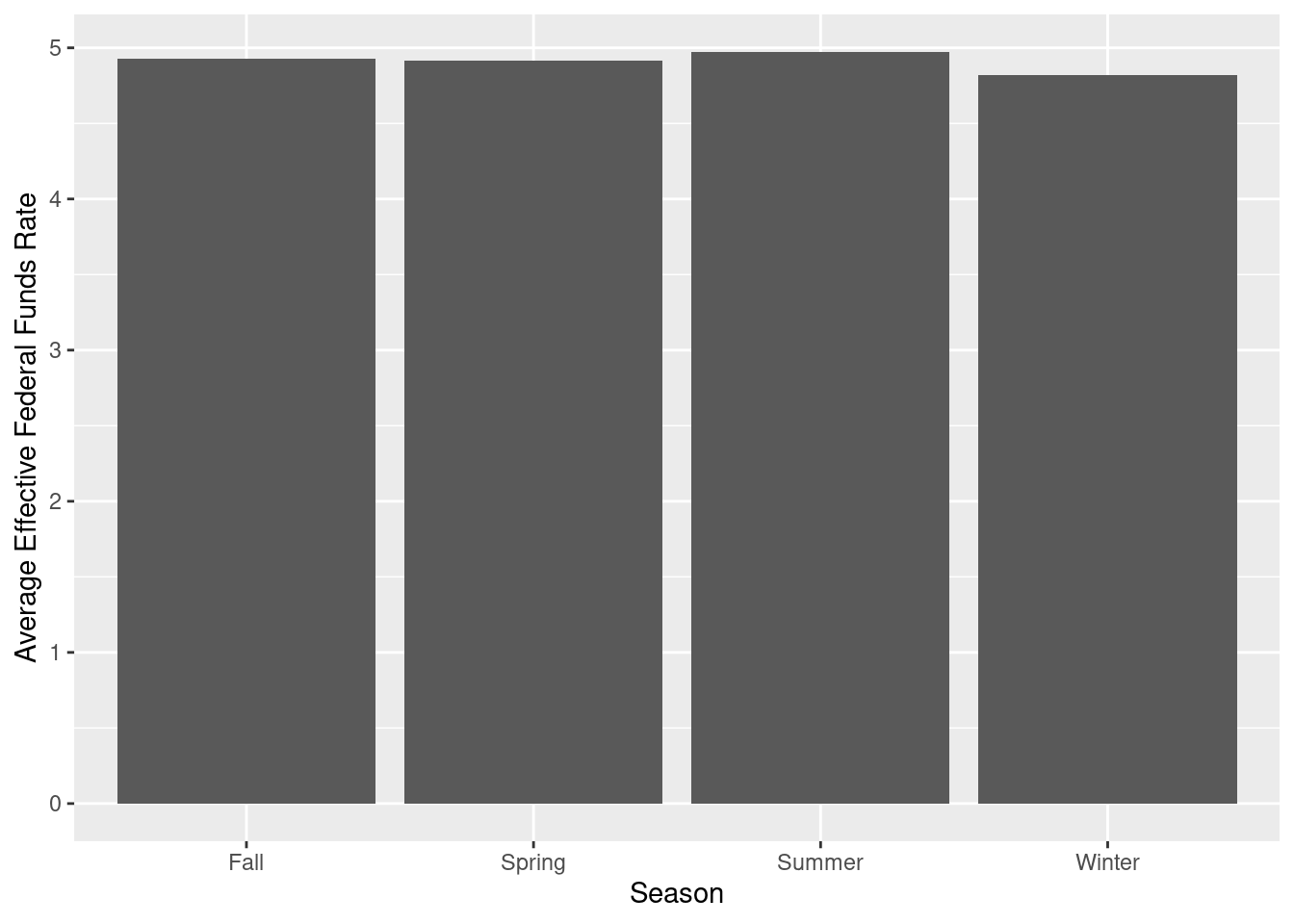
[1] "labels"I chose to use a bar chart with the Effective Federal Funds Rate values grouped by month of the year into Seasons in order to investigate any seasonal differences in this variable. Based on the plot, the averages of Effective Federal Funds Rate by season are relatively equal and all are just below 5.
# A tibble: 904 × 12
Year Month Day Federal F…¹ Feder…² Feder…³ Effec…⁴ Real …⁵ Unemp…⁶ Infla…⁷
<dbl> <dbl> <dbl> <dbl> <dbl> <dbl> <dbl> <dbl> <dbl> <dbl>
1 1954 7 1 NA NA NA 0.8 4.6 5.8 NA
2 1954 8 1 NA NA NA 1.22 NA 6 NA
3 1954 9 1 NA NA NA 1.06 NA 6.1 NA
4 1954 10 1 NA NA NA 0.85 8 5.7 NA
5 1954 11 1 NA NA NA 0.83 NA 5.3 NA
6 1954 12 1 NA NA NA 1.28 NA 5 NA
7 1955 1 1 NA NA NA 1.39 11.9 4.9 NA
8 1955 2 1 NA NA NA 1.29 NA 4.7 NA
9 1955 3 1 NA NA NA 1.35 NA 4.6 NA
10 1955 4 1 NA NA NA 1.43 6.7 4.7 NA
# … with 894 more rows, 2 more variables: Date <date>, Season <chr>, and
# abbreviated variable names ¹`Federal Funds Target Rate`,
# ²`Federal Funds Upper Target`, ³`Federal Funds Lower Target`,
# ⁴`Effective Federal Funds Rate`, ⁵`Real GDP (Percent Change)`,
# ⁶`Unemployment Rate`, ⁷`Inflation Rate`
---
title: "Challenge 6"
author: "Daniel Manning"
description: "Introduction to Visualization"
date: "1/13/2023"
format:
html:
toc: true
code-fold: true
code-copy: true
code-tools: true
categories:
- challenge_6
---
```{r}
#| label: setup
#| warning: false
#| message: false
library(tidyverse)
library(ggplot2)
library(here)
library(lubridate)
knitr::opts_chunk$set(echo = TRUE, warning=FALSE, message=FALSE)
```
## Read in data
```{r}
fedfunds <- here("posts","_data","FedFundsRate.csv")%>%
  read_csv()
fedfunds
```
## Time Dependent Visualization
I chose to use a scatterplot to display the Effective Federal Funds Rate over time because these are numeric variables and the scatterplot can be used to reveal relationships between them. The scatterplot reveals peaks in Effective Federal Funds Rate during various years, such as 1970, 1975, and 1982.
```{r}
fedfunds <- fedfunds %>%
  mutate(Date=str_c(Day,
                    Month,
                    Year, sep="/"),
         Date=dmy(Date))
fedfunds
ggplot(fedfunds, aes(Date, `Effective Federal Funds Rate`)) + geom_point()
labs(title = "Effective Federal Funds Rate by Date", x = "Date", y = "Effective Federal Funds Rate")
```
## Visualizing Part-Whole Relationships
I chose to use a bar chart with the Effective Federal Funds Rate values grouped by month of the year into Seasons in order to investigate any seasonal differences in this variable. Based on the plot, the averages of Effective Federal Funds Rate by season are relatively equal and all are just below 5.
```{r}
fedfunds <- fedfunds %>%
      mutate(Season =
              case_when(Month <= 2 | Month == 12 ~ "Winter",
                        Month >= 3 & Month <= 5 ~ "Spring",
                        Month >= 6 & Month <= 8 ~ "Summer",
                        Month >= 9 & Month <= 11 ~ "Fall"))
fedfunds
SeasonAverage <- fedfunds %>%
  group_by(Season) %>%
  summarise (`Average Effective Federal Funds Rate` = mean(`Effective Federal Funds Rate`, na.rm = TRUE))
ggplot(SeasonAverage, aes(x=Season,y=`Average Effective Federal Funds Rate`)) +
    geom_bar(stat = "identity")
```