library(tidyverse)
library(ggplot2)
library(readxl)
library(lubridate)

knitr::opts_chunk$set(echo = TRUE, warning=FALSE, message=FALSE)Challenge 6
challenge_6
hotel_bookings
air_bnb
fed_rate
debt
usa_hh
abc_poll
Visualizing Time and Relationships
Read in data
set.seed(42)
# read in the data using readr
debt_raw <- read_xlsx("_data/debt_in_trillions.xlsx")
head(debt_raw, 5)| Year and Quarter | Mortgage | HE Revolving | Auto Loan | Credit Card | Student Loan | Other | Total |
|---|---|---|---|---|---|---|---|
| 03:Q1 | 4.942 | 0.242 | 0.641 | 0.688 | 0.2407 | 0.4776 | 7.2313 |
| 03:Q2 | 5.080 | 0.260 | 0.622 | 0.693 | 0.2429 | 0.4860 | 7.3839 |
| 03:Q3 | 5.183 | 0.269 | 0.684 | 0.693 | 0.2488 | 0.4773 | 7.5551 |
| 03:Q4 | 5.660 | 0.302 | 0.704 | 0.698 | 0.2529 | 0.4486 | 8.0655 |
| 04:Q1 | 5.840 | 0.328 | 0.720 | 0.695 | 0.2598 | 0.4465 | 8.2893 |
Briefly describe the data
This dataset accounts for debt in trillions in various categories. The categories include Mortgage, Revolving, Auto, Credit, Student, and other debt. The dataset also accounts for the total debt. The timescale of this dataset is per-quarter.
Tidy Data (as needed)
The main thing that needs to be changed is how the date is stored. Currently it is YY:QQ, where YY is the last two digits of the year, and QQ indicates the quarter.
debt <- debt_raw %>%
    mutate(date = parse_date_time(`Year and Quarter`, orders="yq"))
head(debt$date)
[1] "2003-01-01 UTC" "2003-04-01 UTC" "2003-07-01 UTC" "2003-10-01 UTC"
[5] "2004-01-01 UTC" "2004-04-01 UTC"Time Dependent Visualization
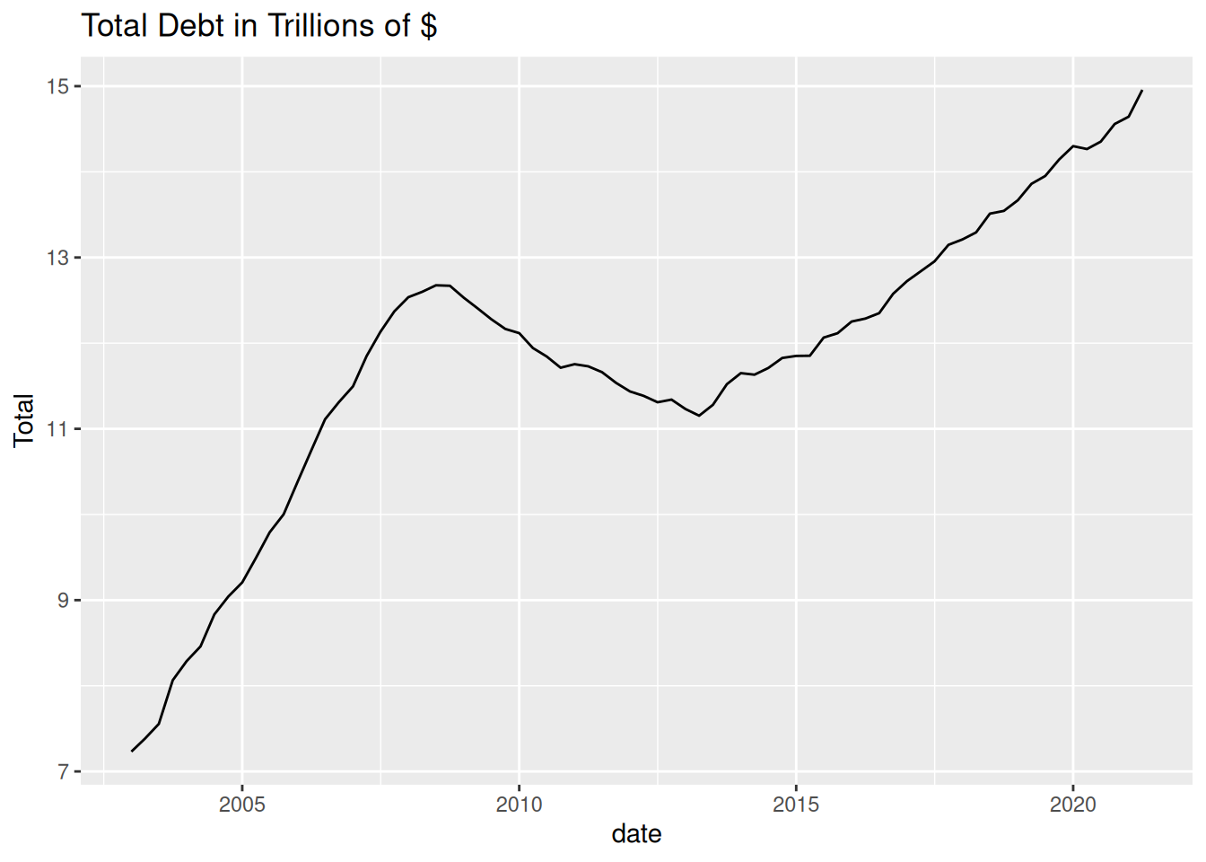
ggplot(debt, aes(x=date, y=Total)) +
    ggtitle('Total Debt in Trillions of $') +
    geom_line()
I chose this graph because Total is a metric of change over time.
Visualizing Part-Whole Relationships
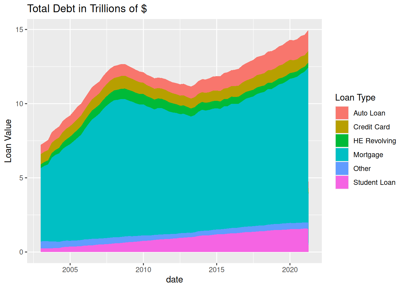
I want to create a stacked area plot to show each category of depth individually. To do this, I need to pivot the data so that one of the columns represents the type of debt.
debt_piv <- debt %>%
    pivot_longer(
        cols = c(`Mortgage`, `HE Revolving`, `Auto Loan`, `Credit Card`, `Student Loan`, `Other`),
        names_to = "Loan Type",
        values_to = "Loan Value"
    )
head(debt_piv)| Year and Quarter | Total | date | Loan Type | Loan Value |
|---|---|---|---|---|
| 03:Q1 | 7.2313 | 2003-01-01 | Mortgage | 4.9420 |
| 03:Q1 | 7.2313 | 2003-01-01 | HE Revolving | 0.2420 |
| 03:Q1 | 7.2313 | 2003-01-01 | Auto Loan | 0.6410 |
| 03:Q1 | 7.2313 | 2003-01-01 | Credit Card | 0.6880 |
| 03:Q1 | 7.2313 | 2003-01-01 | Student Loan | 0.2407 |
| 03:Q1 | 7.2313 | 2003-01-01 | Other | 0.4776 |
Now I can create the plot.
ggplot(debt_piv, aes(x=`date`, y=`Loan Value`, fill=`Loan Type`)) +
    ggtitle('Total Debt in Trillions of $') +
    geom_area()