Code
library(tidyverse)
library(ggplot2)
library(here)

knitr::opts_chunk$set(echo = TRUE, warning=FALSE, message=FALSE)Daniel Manning
January 16, 2023
# A tibble: 38,170 × 7
Area Element Item Year Unit Value Flag Descr…¹
<chr> <chr> <chr> <dbl> <chr> <dbl> <chr>
1 Afghanistan Laying Eggs, hen, in shell 1961 1000 Head 4000 FAO estimate
2 Afghanistan Yield Eggs, hen, in shell 1961 100mg/An 25000 Calculated …
3 Afghanistan Production Eggs, hen, in shell 1961 tonnes 10000 FAO estimate
4 Afghanistan Laying Eggs, hen, in shell 1962 1000 Head 4400 FAO estimate
5 Afghanistan Yield Eggs, hen, in shell 1962 100mg/An 25000 Calculated …
6 Afghanistan Production Eggs, hen, in shell 1962 tonnes 11000 FAO estimate
7 Afghanistan Laying Eggs, hen, in shell 1963 1000 Head 4600 FAO estimate
8 Afghanistan Yield Eggs, hen, in shell 1963 100mg/An 25000 Calculated …
9 Afghanistan Production Eggs, hen, in shell 1963 tonnes 11500 FAO estimate
10 Afghanistan Laying Eggs, hen, in shell 1964 1000 Head 4800 FAO estimate
# … with 38,160 more rows, and abbreviated variable name ¹`Flag Description`# A tibble: 12,840 × 7
Area Element Item Year Unit Value Flag Descript…¹
<chr> <chr> <chr> <dbl> <chr> <dbl> <chr>
1 Afghanistan Production Eggs, hen, in shell 1961 tonnes 10000 FAO estimate
2 Afghanistan Production Eggs, hen, in shell 1962 tonnes 11000 FAO estimate
3 Afghanistan Production Eggs, hen, in shell 1963 tonnes 11500 FAO estimate
4 Afghanistan Production Eggs, hen, in shell 1964 tonnes 12000 FAO estimate
5 Afghanistan Production Eggs, hen, in shell 1965 tonnes 12800 FAO estimate
6 Afghanistan Production Eggs, hen, in shell 1966 tonnes 13200 FAO estimate
7 Afghanistan Production Eggs, hen, in shell 1967 tonnes 15000 FAO estimate
8 Afghanistan Production Eggs, hen, in shell 1968 tonnes 13900 FAO estimate
9 Afghanistan Production Eggs, hen, in shell 1969 tonnes 15000 FAO estimate
10 Afghanistan Production Eggs, hen, in shell 1970 tonnes 13700 FAO estimate
# … with 12,830 more rows, and abbreviated variable name ¹`Flag Description`I chose to use a scatterplot to display the production value over time because these are numeric variables and the scatterplot can be used to reveal relationships between them. In addition, I added a color specification for “Flag Description” variable, which describes how the value was calculated/estimated. The scatterplot reveals that the production value of eggs increased from 1960 to 2020, with four countries experiencing much greater growth in production value than the others. In addition, the color specification reveals that the majority of values were calculated from unofficial data, making it difficult to discern if this variable had an effect.
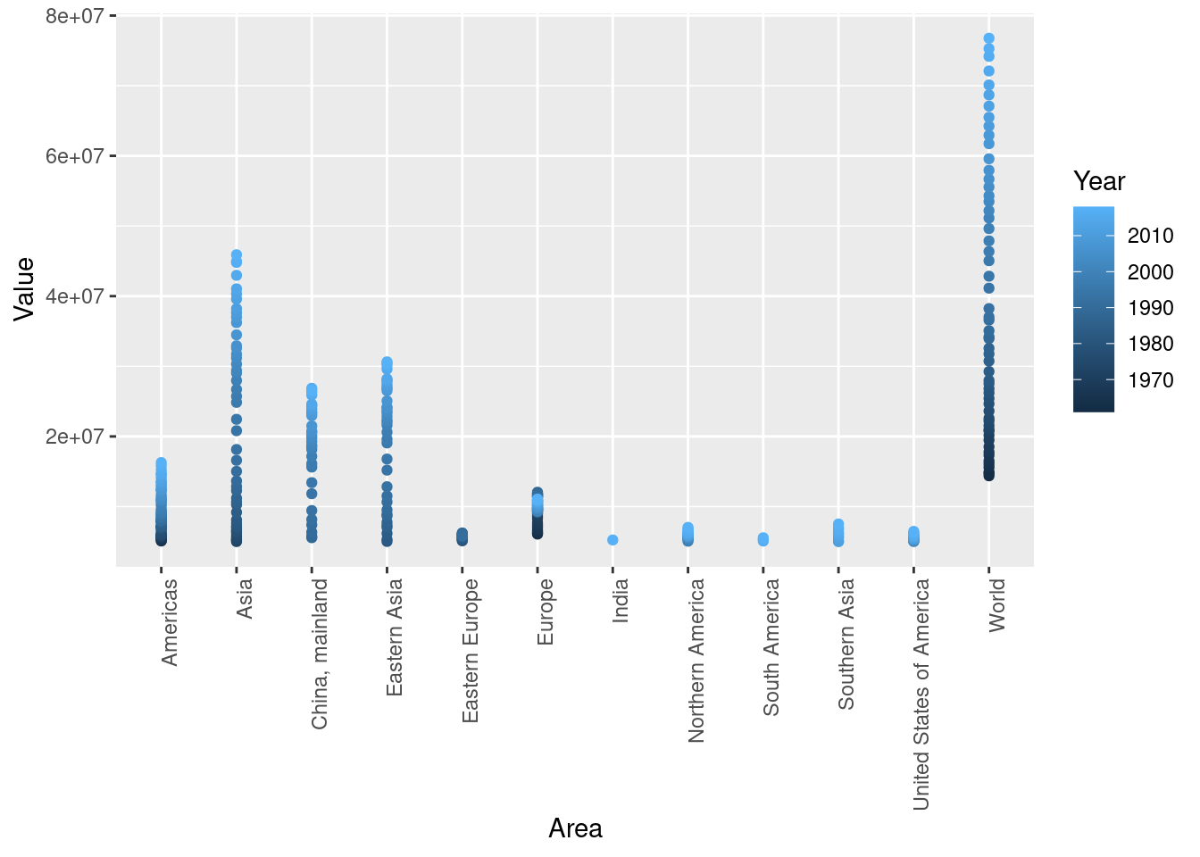
I chose to use a scatterplot with the production values of areas with values above 5,000,000 in order to compare the values of the largest producing areas. I used the color function to specify year in order to see the production value changed over time. This plot reveals that Asian regions, including “Asia”, “China, mainland”, and “Eastern Asia” experienced the greatest growth in egg production from 1960 to 2020.

$x
[1] "Area"
$y
[1] "Production (tonnes)"
$title
[1] "Production of Eggs by Year"
attr(,"class")
[1] "labels"---
title: "Challenge 7"
author: "Daniel Manning"
description: "Visualization in Multiple Dimensions"
date: "1/16/2023"
format:
html:
toc: true
code-fold: true
code-copy: true
code-tools: true
categories:
- challenge_7
---
```{r}
#| label: setup
#| warning: false
#| message: false
library(tidyverse)
library(ggplot2)
library(here)
knitr::opts_chunk$set(echo = TRUE, warning=FALSE, message=FALSE)
```
## Read in data
```{r}
egg <- here("posts","_data","FAOSTAT_egg_chicken.csv")%>%
  read_csv()
egg_new <- egg %>%
  select(-c("Domain Code", "Domain", "Area Code", "Element Code", "Item Code", "Year Code", "Flag"))
egg_new
egg_production <- egg_new[egg_new$Element == 'Production',]
egg_production
```
## Time Dependent Visualization
I chose to use a scatterplot to display the production value over time because these are numeric variables and the scatterplot can be used to reveal relationships between them. In addition, I added a color specification for "Flag Description" variable, which describes how the value was calculated/estimated. The scatterplot reveals that the production value of eggs increased from 1960 to 2020, with four countries experiencing much greater growth in production value than the others. In addition, the color specification reveals that the majority of values were calculated from unofficial data, making it difficult to discern if this variable had an effect.
```{r}
ggplot(egg_production, aes(x=Year, y=Value, color=`Flag Description`)) +
  geom_point(size=.5)+
  labs(title = "Production of Eggs by Year", x = "Year", y = "Production (tonnes)")
```
## Visualizing Part-Whole Relationships over Time
I chose to use a scatterplot with the production values of areas with values above 5,000,000 in order to compare the values of the largest producing areas. I used the color function to specify year in order to see the production value changed over time. This plot reveals that Asian regions, including "Asia", "China, mainland", and "Eastern Asia" experienced the greatest growth in egg production from 1960 to 2020.
```{r}
egg_new <- na.omit(egg_new)
egg_new <- egg_new[egg_new$Element == "Production",]
egg_large <- egg_new[egg_new$Value > 5000000,]
ggplot(egg_large, aes(x=Area,y=Value, color = Year)) +
    geom_point() +
    theme(axis.text.x = element_text(angle = 90, vjust = 1, hjust=1))
labs(title = "Production of Eggs by Year", x = "Area", y = "Production (tonnes)")
```