library(tidyverse)
library(ggplot2)
library(lubridate)

knitr::opts_chunk$set(echo = TRUE, warning=FALSE, message=FALSE)Challenge 7
Read in data
set.seed(42)
eggs_raw <- read_csv('_data/eggs_tidy.csv')
head(eggs_raw)| month | year | large_half_dozen | large_dozen | extra_large_half_dozen | extra_large_dozen |
|---|---|---|---|---|---|
| January | 2004 | 126.0 | 230.000 | 132.0 | 230.0 |
| February | 2004 | 128.5 | 226.250 | 134.5 | 230.0 |
| March | 2004 | 131.0 | 225.000 | 137.0 | 230.0 |
| April | 2004 | 131.0 | 225.000 | 137.0 | 234.5 |
| May | 2004 | 131.0 | 225.000 | 137.0 | 236.0 |
| June | 2004 | 133.5 | 231.375 | 137.0 | 241.0 |
Briefly describe the data
This dataset describes the average price for a carton of eggs given the month and year. There are four types of cartons: large half dozen, large dozen, extra large half dozen, extra large dozen.
Tidy Data (as needed)
I’m going to pivot this dataset to make visualization easier. Then, we have to convert the type of egg carton into two columns, size and whether it is half or full dozen. This will allow us to plot each attribute separately. We can do this by removing the ‘’ between extra_large and half_dozen. This way, there is only one ’’ in the name, between the size and the quantity. Then, we can separate them into two columns. Then we can convert the date into a proper date using lubridate.
eggs <- eggs_raw %>%
    pivot_longer(cols = c(`large_half_dozen`, `large_dozen`, `extra_large_half_dozen`, `extra_large_dozen`), values_to = "Price ($)") %>%
    mutate(name = str_replace(name, "extra_large", "Extra Large"), name = str_replace(name, "half_dozen", "Half Dozen"), name = str_replace(name, "dozen", "Dozen"), name = str_replace(name, "large", "Large")) %>%
    separate(name, into = c("Size", "Quantity"), sep = "_") %>%
    mutate(Date = ym(paste(`year`, `month`, sep = " ")))
head(eggs)| month | year | Size | Quantity | Price ($) | Date |
|---|---|---|---|---|---|
| January | 2004 | Large | Half Dozen | 126.00 | 2004-01-01 |
| January | 2004 | Large | Dozen | 230.00 | 2004-01-01 |
| January | 2004 | Extra Large | Half Dozen | 132.00 | 2004-01-01 |
| January | 2004 | Extra Large | Dozen | 230.00 | 2004-01-01 |
| February | 2004 | Large | Half Dozen | 128.50 | 2004-02-01 |
| February | 2004 | Large | Dozen | 226.25 | 2004-02-01 |
Visualization with Multiple Dimensions
ggplot(eggs, aes(Date, `Price ($)`, col = Size)) +
    ggtitle('Price of Half/Full Dozen Cartons of Eggs') +
    geom_line() +
    facet_wrap(vars(Quantity), scales = 'free_y')
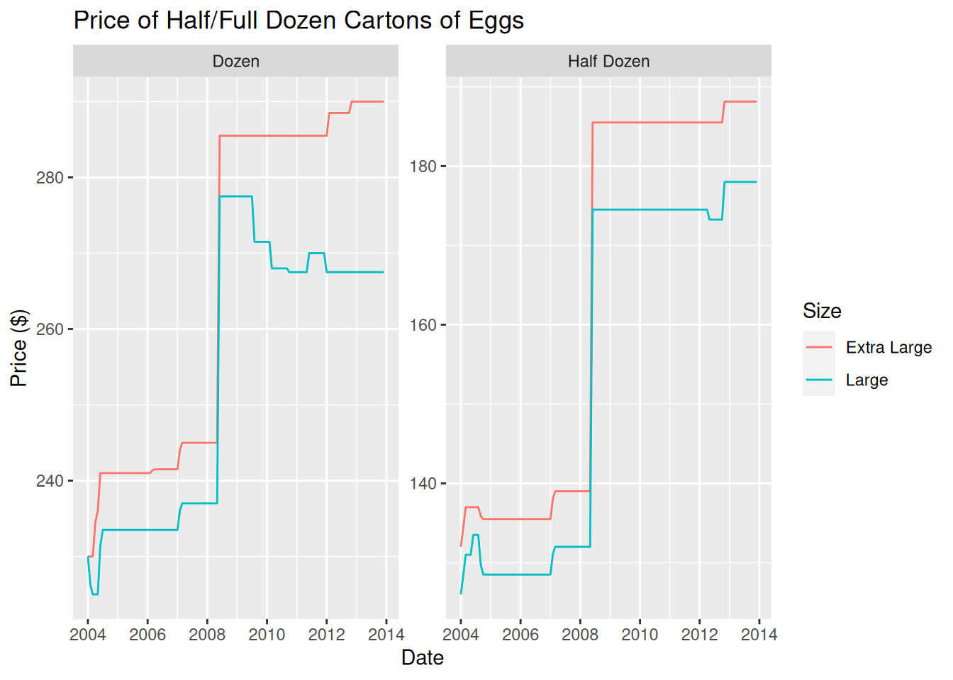
I chose this graph type because I wanted to compare the price of extra large and large eggs over time. Since prices are different based on carton size, I split the graph on that metric. As we can see, prices when sold by the dozen decreased for large eggs, while they increased when sold by the half dozen.
ggplot(eggs, aes(Date, `Price ($)`, fill = Quantity)) +
    ggtitle('Price of Large/Extra Large Cartons of Eggs') +
    geom_bar(position = "stack", stat = "identity") +
    facet_wrap(vars(Size))
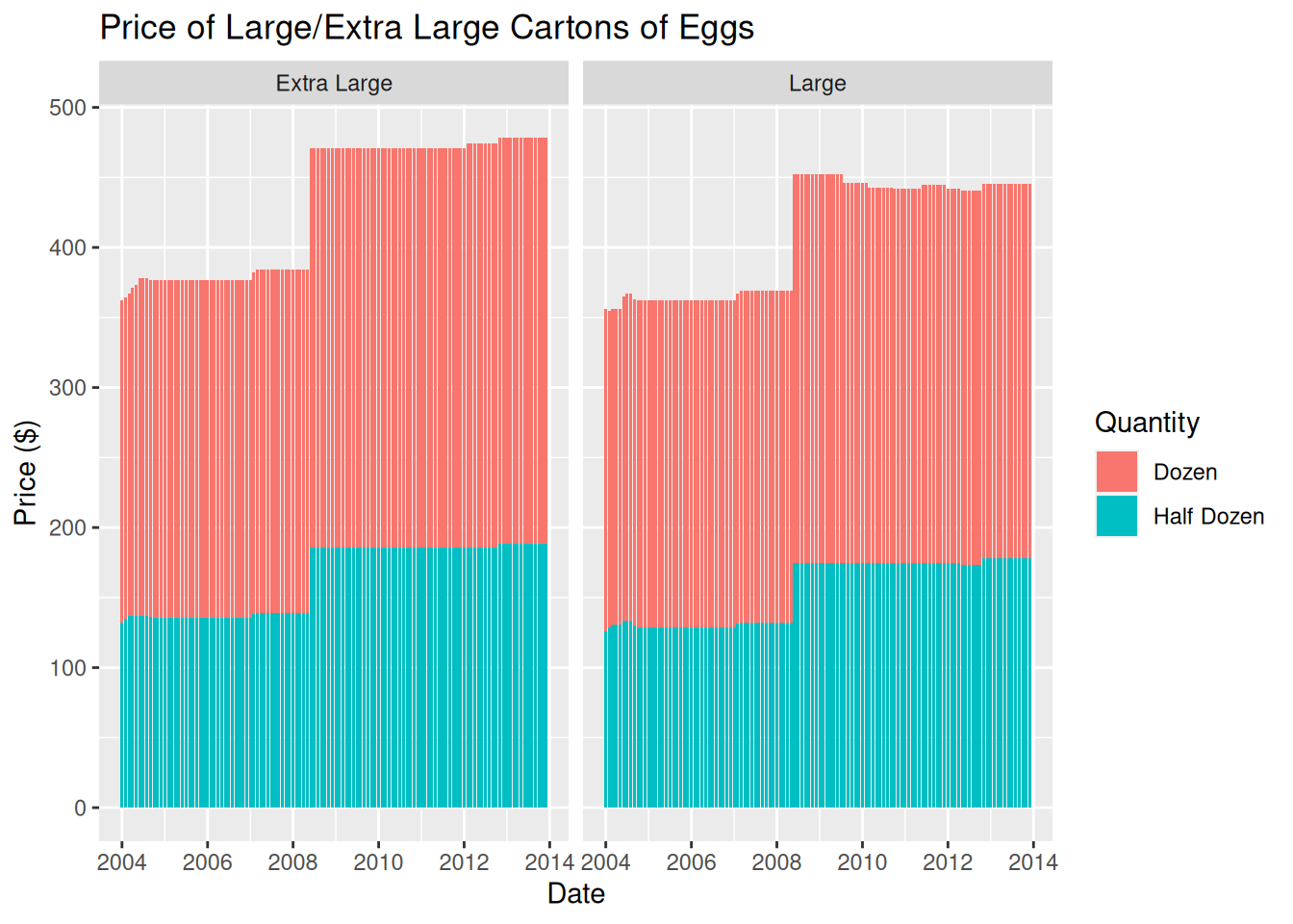
In this graph, I switched the group variable to the size of the eggs. Then, I stacked the price of both quantities. This allows us to see the overall change in price of the eggs dependent on the size of the eggs. From this graph we can see that large eggs are always cheaper than extra large eggs. We can also see that both sizes of eggs follow a similar trend over time.