Code
library(tidyverse)
library(lubridate)

knitr::opts_chunk$set(echo = TRUE, warning=FALSE, message=FALSE)Paarth Tandon
January 23, 2023
Disclaimer: This is a continuation of my HW 2 file, as it is cumulative. New content will start after my HW 2 content.
I will be using an emissions dataset for my homework. I downloaded it from this Kaggle page.
The poster of this dataset claims that it ranges from 2002-2022, but for some reason the data includes many samples from before this data (ranging all the way to 1750?!?). I am going to assume they claimed 2002 because that is when the data is accurate and complete. Because of this, I will drop any samples before 1750.
As you can see, there are many missing data points. This is most likely due to lack of reporting in those categories that year. I do not think that there is a blanket way to deal with this. It will be dealt with case by case when doing analysis on the data. One may ask: Why not set it to zero? Well, there are issues with doing that. For example, is it really fair to say a country had zero emissions in Coal just because they did not report it?
Another way to deal with the missing data problem is to sample from the total distribution in that category. For example, if we wanted to fill in the emissions due to Coal for KNA in 2012, we could fit a gaussian distribution onto all the data in the Coal category and sample from it. This method could also be problematic when doing analysis as it may misrepresent the data point, but is probably better than setting it to zero. Of course the gaussian distribution could also be replaced with other distributions, or even a simple mean/median.
Another common method is to drop rows containing missing data. This ranges in strictness. For example we could drop all rows that contain any missing data, or we could drop rows that contain a certain threshold amount. I don’t believe that I will be able to apply this strategy, as it will remove far too much crucial data.
In the end, it is difficult to deal with missing data, and each strategy will have downsides. It may be worth it to compare different methods to see how they affect the analysis. Nothing will be perfect and we can only try our best to replace the data. But hey thats the point of stats ¯\_(ツ)_/¯, estimation with reasoning.
This dataset presents us with carbon emission reports. You may be wondering: What are carbon emissions? According to the European Union: “Carbon dioxide emissions or CO2 emissions are emissions stemming from the burning of fossil fuels and the manufacture of cement; they include carbon dioxide produced during consumption of solid, liquid, and gas fuels as well as gas flaring.”
Our data presents this concept precisely, reporting emissions from coal, oil, gas, cement, flaring, and other sources. The data is presented per year and per country, and ranges from 2002 to 2022.
Country <chr>: Country from where emissions were reportedISO 3166-1 alpha-3 <chr>: 3 character code for the countryYear <dbl>: The year the emissions were reportedTotal <dbl>: Total emissions measured in ktCoal <dbl>: Emission from burning coal measured in ktOil <dbl>: Emission from burning oil measured in ktGas <dbl>: Emission from burning gas measured in ktCement <dbl>: Emission from cement manufacturing measured in ktFlaring <dbl>: Emission from flaring measured in kt
Other <dbl>: Emission from other causes measured in ktThis information will be useful for context and calculations later on.
In this section I will discuss the quality of reporting. In this situation, quality refers to the rate of missing data.
Here I will investigate the overall rate of missing data in this dataset over time. To do this I will group by the year, and then sum up the number of missing values in each column. I will also add up each column into a new column, which counts the total number of missing cells in the dataset for that year. Note that I am not including the other column, because there is very little reporting across the whole dataset.
na_count_all <- emissions_clean %>%
group_by(`Year`) %>%
summarise(
na_coal = sum(is.na(`Coal`)),
na_oil = sum(is.na(`Oil`)),
na_gas = sum(is.na(`Gas`)),
na_cement = sum(is.na(`Cement`)),
na_flaring = sum(is.na(`Flaring`))
) %>%
mutate(na_total = rowSums(across(c(
`na_coal`,
`na_oil`,
`na_gas`,
`na_cement`,
`na_flaring`
))))
na_count_all
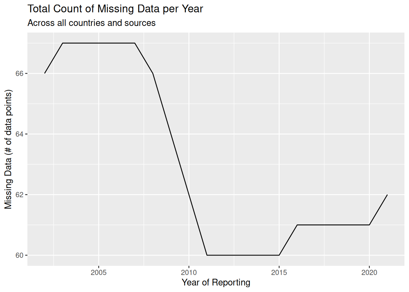
To better understand this plot, let me explain an example of missing data. Let’s say that in 2005 the United States did not report any CO2 emissions from coal. This does not mean that there were not emissions, but rather that for some reason or the other, the United States failed to report that metric. In total, 67 metrics were not reported in 2005, meaning when we account for every country and every source 67 values were missing in the data.
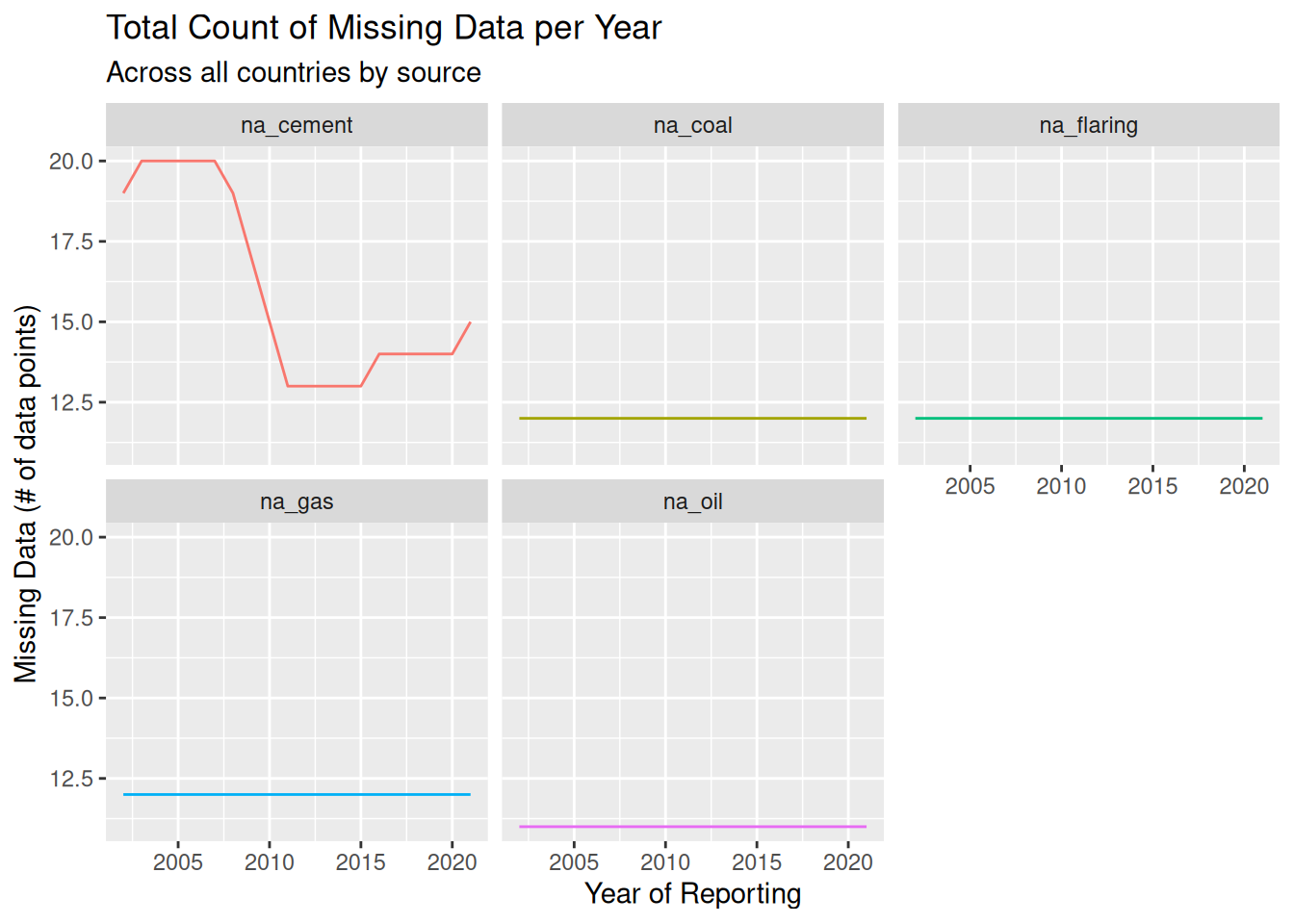
What I find strange about the previous plot is that we would expect reporting to improve every year, but instead we see that the rate of missing data increased from 2016 to 2021. Let’s plot each metric separately to see if any individual metric is causing this trend.
To do this I will first need to pivot the data, and then plot it.
ggplot(na_count_all_piv, aes(`Year`, `na_count`)) +
geom_line(aes(color = `source`)) +
labs(
title = 'Total Count of Missing Data per Year',
subtitle = 'Across all countries by source',
x = 'Year of Reporting',
y = 'Missing Data (# of data points)'
) +
facet_wrap(~ `source`) +
theme(legend.position="none")
Here we can see that the only source whose reporting actually changed was cement. All other sources are consistent. Coal, gas, and flaring are consistently at 12 missing reports. Oil is constantly at 11 missing reports.
Let’s investigate which countries are constantly failing to report in these categories. First, I will group the data by both year and country. Note that I will exclude cement. Cement will be investigated later. Then, I will filter to only keep countries that fail to report at least one source. Just as before, the table will need to be pivoted.
na_count_country <- emissions_clean %>%
group_by(`Year`, `Country`) %>%
summarise(
na_coal = sum(is.na(`Coal`)),
na_oil = sum(is.na(`Oil`)),
na_gas = sum(is.na(`Gas`)),
na_flaring = sum(is.na(`Flaring`))
) %>%
mutate(na_total = rowSums(across(c(
`na_coal`,
`na_oil`,
`na_gas`,
`na_flaring`
)))) %>%
filter(`na_total` != 0)
na_count_countrycbp2 <- c("#aee39a", "#38485e", "#b4726b", "#4f8c9d", "#bf3854", "#38f0ac", "#dacff1", "#b1e632", "#f4bb8f", "#7f7bc9", "#738c4e", "#be5cca", "#5cd6f4")
ggplot(na_count_country_piv, aes(`Year`, `na_count`, fill=`Country`)) +
geom_bar(position="stack", stat="identity") +
scale_fill_manual(values = cbp2) +
labs(
title = 'Total Count of Missing Data per Year',
subtitle = 'Accounting for Coal, Flaring, Gas, and Oil',
x = 'Year of Reporting',
y = 'Missing Data (# of data points)'
) +
facet_wrap(~ `source`)
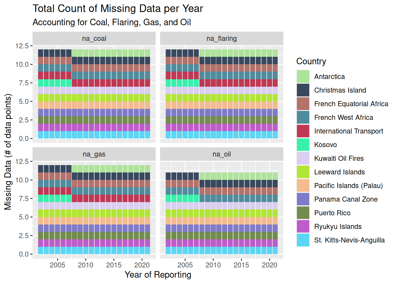
As we can see from this plot, there are 10 ‘countries’ that never report any of these metrics: Christmas Island, French Equatorial Africa, French West Africa, Kuwaiti Oil Fires, Leeward Islands, Pacific Islands (Palau), Panama Canal Zone, Puerto Rico, Ryukyu Islands, and St. Kitts-Nevis-Anguilla. As we can see from this list, most of these places are not countries but rather zones and other miscellaneous zones. Notable members of this list are the French African territories and Puerto Rico.
One country, Kosovo, was removed from the dataset starting in 2008. International Transport reports all of them besides Oil. Finally, Antarctica was added to the dataset in 2008 and has never reported any of these metrics.
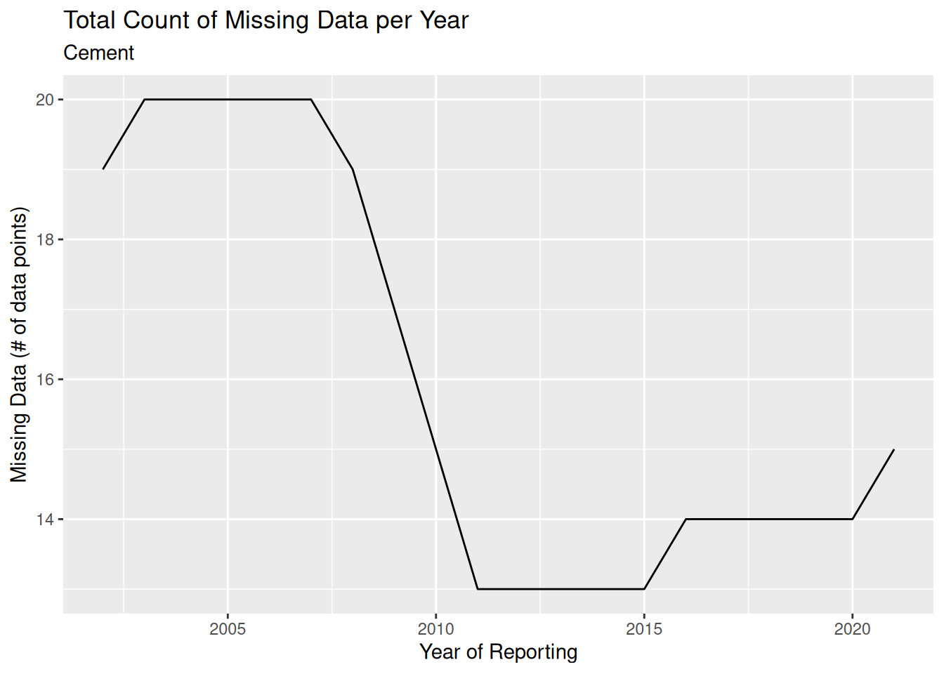
Let’s bring back the source based plot, but only focusing on Cement, as that is the reporting that changes the most over time.

I am specifically interested in the jump we see in 2016 and 2021, as we do not want to see reporting get worse over time. Let’s see which countries caused this change.
# A tibble: 27 × 3
# Groups: Year [2]
Year Country na_cement
<dbl> <chr> <int>
1 2015 Antarctica 1
2 2015 Christmas Island 1
3 2015 French Equatorial Africa 1
4 2015 French West Africa 1
5 2015 International Transport 1
6 2015 Kuwaiti Oil Fires 1
7 2015 Leeward Islands 1
8 2015 Pacific Islands (Palau) 1
9 2015 Panama Canal Zone 1
10 2015 Puerto Rico 1
11 2015 Ryukyu Islands 1
12 2015 Somalia 1
13 2015 St. Kitts-Nevis-Anguilla 1
14 2016 Antarctica 1
15 2016 Christmas Island 1
16 2016 French Equatorial Africa 1
17 2016 French West Africa 1
18 2016 International Transport 1
19 2016 Kuwaiti Oil Fires 1
20 2016 Leeward Islands 1
21 2016 Macao 1
22 2016 Pacific Islands (Palau) 1
23 2016 Panama Canal Zone 1
24 2016 Puerto Rico 1
25 2016 Ryukyu Islands 1
26 2016 Somalia 1
27 2016 St. Kitts-Nevis-Anguilla 1From this table you can see that, starting in 2016, Macao stopped reporting their cement based omissions. I double checked to make sure that they were reporting in the past, as opposed to being added to the dataset in 2016.
# A tibble: 29 × 3
# Groups: Year [2]
Year Country na_cement
<dbl> <chr> <int>
1 2020 Antarctica 1
2 2020 Christmas Island 1
3 2020 French Equatorial Africa 1
4 2020 French West Africa 1
5 2020 International Transport 1
6 2020 Kuwaiti Oil Fires 1
7 2020 Leeward Islands 1
8 2020 Macao 1
9 2020 Pacific Islands (Palau) 1
10 2020 Panama Canal Zone 1
11 2020 Puerto Rico 1
12 2020 Ryukyu Islands 1
13 2020 Somalia 1
14 2020 St. Kitts-Nevis-Anguilla 1
15 2021 Antarctica 1
16 2021 Christmas Island 1
17 2021 French Equatorial Africa 1
18 2021 French West Africa 1
19 2021 Iceland 1
20 2021 International Transport 1
21 2021 Kuwaiti Oil Fires 1
22 2021 Leeward Islands 1
23 2021 Macao 1
24 2021 Pacific Islands (Palau) 1
25 2021 Panama Canal Zone 1
26 2021 Puerto Rico 1
27 2021 Ryukyu Islands 1
28 2021 Somalia 1
29 2021 St. Kitts-Nevis-Anguilla 1From this table you can see that, starting in 2021, Iceland stopped reporting their cement based omissions. I double checked to make sure that they were reporting in the past, as opposed to being added to the dataset in 2021.
---
title: "HW 3"
author: "Paarth Tandon"
description: "Reading in Data"
date: "01/23/2023"
format:
html:
toc: true
code-fold: true
code-copy: true
code-tools: true
df-print: paged
categories:
- hw3
- emissions
---
```{r}
#| label: setup
#| warning: false
#| message: false
library(tidyverse)
library(lubridate)
knitr::opts_chunk$set(echo = TRUE, warning=FALSE, message=FALSE)
```
Disclaimer: This is a continuation of my HW 2 file, as it is cumulative. New content will start after my HW 2 content.
## Read in Data
I will be using an emissions dataset for my homework. I downloaded it from [this Kaggle page](https://www.kaggle.com/datasets/thedevastator/global-fossil-co2-emissions-by-country-2002-2022).
```{r}
# read in the data using readr
emissions <- read_csv("_data/emissions.csv")
emissions
```
## Clean Data
The poster of this dataset claims that it ranges from 2002-2022, but for some reason the data includes many samples from before this data (ranging all the way to 1750?!?). I am going to assume they claimed 2002 because that is when the data is accurate and complete. Because of this, I will drop any samples before 1750.
```{r}
set.seed(42)

# remove old samples
emissions_clean <- filter(emissions, Year >= 2002)

# sample a few data points
emissions_clean[sample(nrow(emissions_clean), 10), ]
```
As you can see, there are many missing data points. This is most likely due to lack of reporting in those categories that year. I do not think that there is a blanket way to deal with this. It will be dealt with case by case when doing analysis on the data. One may ask: Why not set it to zero? Well, there are issues with doing that. For example, is it really fair to say a country had zero emissions in Coal just because they did not report it?
Another way to deal with the missing data problem is to sample from the total distribution in that category. For example, if we wanted to fill in the emissions due to Coal for KNA in 2012, we could fit a gaussian distribution onto *all* the data in the Coal category and sample from it. This method could also be problematic when doing analysis as it may misrepresent the data point, but is probably better than setting it to zero. Of course the gaussian distribution could also be replaced with other distributions, or even a simple mean/median.
Another common method is to drop rows containing missing data. This ranges in strictness. For example we could drop all rows that contain *any* missing data, or we could drop rows that contain a certain threshold amount. I don't believe that I will be able to apply this strategy, as it will remove far too much crucial data.
In the end, it is difficult to deal with missing data, and each strategy will have downsides. It may be worth it to compare different methods to see how they affect the analysis. Nothing will be perfect and we can only try our best to replace the data. But hey thats the point of stats `¯\_(ツ)_/¯`, estimation with reasoning.
## Data Narrative
### Carbon Emissions
This dataset presents us with carbon emission reports. You may be wondering: What are carbon emissions? According to the European Union: "Carbon dioxide emissions or CO2 emissions are emissions stemming from the burning of fossil fuels and the manufacture of cement; they include carbon dioxide produced during consumption of solid, liquid, and gas fuels as well as gas flaring."
Our data presents this concept precisely, reporting emissions from coal, oil, gas, cement, flaring, and other sources. The data is presented per year and per country, and ranges from 2002 to 2022.
### Variables Explained
* `Country <chr>`: Country from where emissions were reported
* `ISO 3166-1 alpha-3 <chr>`: 3 character code for the country
* `Year <dbl>`: The year the emissions were reported
* `Total <dbl>`: Total emissions measured in kt
* `Coal <dbl>`: Emission from burning coal measured in kt
* `Oil <dbl>`: Emission from burning oil measured in kt
* `Gas <dbl>`: Emission from burning gas measured in kt
* `Cement <dbl>`: Emission from cement manufacturing measured in kt
* `Flaring <dbl>`: Emission from flaring measured in kt
* a flare is a gas combustion device used in places such as petroleum refineries, chemical plants and natural gas processing plants, oil or gas extraction sites having oil wells, gas wells, offshore oil and gas rigs and landfills. (Wikipedia)
* `Other <dbl>`: Emission from other causes measured in kt
## Potential Research Questions
* Quality of reporting?
* Which countries fail to report the most and how has it changed?
* How about overall reporting?
* Have there been significant changes in any specific types?
* In the past year, how do countries compare in emissions?
* Breakdown based on emission type and continent
* Compare countries using null hypothesis testing
* Have countries changed over time?
* Breakdown based on emission type and continent
* Compare countries using null hypothesis testing
* How do the different emission types compare overall?
* Over time and past year
* Compare using null hypothesis testing
## How many countries are there?
This information will be useful for context and calculations later on.
```{r}
n_distinct(emissions_clean$Country)
```
## Quality of Reporting
In this section I will discuss the quality of reporting. In this situation, quality refers to the rate of missing data.
### Overall Reporting
Here I will investigate the overall rate of missing data in this dataset over time. To do this I will group by the year, and then sum up the number of missing values in each column. I will also add up each column into a new column, which counts the total number of missing cells in the dataset for that year. Note that I am not including the other column, because there is very little reporting across the whole dataset.
```{r}
na_count_all <- emissions_clean %>%
    group_by(`Year`) %>%
    summarise(
        na_coal = sum(is.na(`Coal`)),
        na_oil = sum(is.na(`Oil`)),
        na_gas = sum(is.na(`Gas`)),
        na_cement = sum(is.na(`Cement`)),
        na_flaring = sum(is.na(`Flaring`))
    ) %>%
    mutate(na_total = rowSums(across(c(
        `na_coal`,
        `na_oil`,
        `na_gas`,
        `na_cement`,
        `na_flaring`
    ))))
na_count_all
```
```{r}
ggplot(na_count_all, aes(`Year`, `na_total`)) +
    geom_line() +
    labs(
        title = 'Total Count of Missing Data per Year',
        subtitle = 'Across all countries and sources',
        x = 'Year of Reporting',
        y = 'Missing Data (# of data points)'
    )
```
To better understand this plot, let me explain an example of missing data. Let's say that in 2005 the United States did not report any CO2 emissions from coal. This does not mean that there were not emissions, but rather that for some reason or the other, the United States failed to report that metric. In total, 67 metrics were not reported in 2005, meaning when we account for every country and every source 67 values were missing in the data.
### Reporting by Source
What I find strange about the previous plot is that we would expect reporting to improve every year, but instead we see that the rate of missing data increased from 2016 to 2021. Let's plot each metric separately to see if any individual metric is causing this trend.
To do this I will first need to pivot the data, and then plot it.
```{r}
na_count_all_piv <- na_count_all %>%
    pivot_longer(!c(`Year`, `na_total`), names_to = 'source', values_to = 'na_count')
na_count_all_piv
```
```{r}
ggplot(na_count_all_piv, aes(`Year`, `na_count`)) +
    geom_line(aes(color = `source`)) +
    labs(
        title = 'Total Count of Missing Data per Year',
        subtitle = 'Across all countries by source',
        x = 'Year of Reporting',
        y = 'Missing Data (# of data points)'
    ) +
    facet_wrap(~ `source`) +
    theme(legend.position="none")
```
Here we can see that the only source whose reporting actually changed was cement. All other sources are consistent. Coal, gas, and flaring are consistently at 12 missing reports. Oil is constantly at 11 missing reports.
### Some countries always fail to report
Let's investigate which countries are constantly failing to report in these categories. First, I will group the data by both year and country. Note that I will exclude cement. Cement will be investigated later. Then, I will filter to only keep countries that fail to report at least one source. Just as before, the table will need to be pivoted.
```{r}
na_count_country <- emissions_clean %>%
    group_by(`Year`, `Country`) %>%
    summarise(
        na_coal = sum(is.na(`Coal`)),
        na_oil = sum(is.na(`Oil`)),
        na_gas = sum(is.na(`Gas`)),
        na_flaring = sum(is.na(`Flaring`))
    ) %>%
    mutate(na_total = rowSums(across(c(
        `na_coal`,
        `na_oil`,
        `na_gas`,
        `na_flaring`
    )))) %>%
    filter(`na_total` != 0)
na_count_country
```
```{r}
na_count_country_piv <- na_count_country %>%
    pivot_longer(!c(`Year`, `Country`, `na_total`), names_to = 'source', values_to = 'na_count')
na_count_country_piv
```
```{r}
cbp2 <- c("#aee39a", "#38485e", "#b4726b", "#4f8c9d", "#bf3854", "#38f0ac", "#dacff1", "#b1e632", "#f4bb8f", "#7f7bc9", "#738c4e", "#be5cca", "#5cd6f4")

ggplot(na_count_country_piv, aes(`Year`, `na_count`, fill=`Country`)) +
    geom_bar(position="stack", stat="identity") +
    scale_fill_manual(values = cbp2) +
    labs(
        title = 'Total Count of Missing Data per Year',
        subtitle = 'Accounting for Coal, Flaring, Gas, and Oil',
        x = 'Year of Reporting',
        y = 'Missing Data (# of data points)'
    ) +
    facet_wrap(~ `source`)
```
As we can see from this plot, there are 10 'countries' that never report any of these metrics: Christmas Island, French Equatorial Africa, French West Africa, Kuwaiti Oil Fires, Leeward Islands, Pacific Islands (Palau), Panama Canal Zone, Puerto Rico, Ryukyu Islands, and St. Kitts-Nevis-Anguilla. As we can see from this list, most of these places are not countries but rather zones and other miscellaneous zones. Notable members of this list are the French African territories and Puerto Rico.
One country, Kosovo, was removed from the dataset starting in 2008. International Transport reports all of them besides Oil. Finally, Antarctica was added to the dataset in 2008 and has never reported any of these metrics.
### What's up with Cement?
Let's bring back the source based plot, but only focusing on Cement, as that is the reporting that changes the most over time.
```{r}
na_count_cement_piv <- na_count_all_piv %>%
    filter(`source` == 'na_cement')
na_count_cement_piv
```
```{r}
ggplot(na_count_cement_piv, aes(`Year`, `na_count`)) +
    geom_line() +
    labs(
        title = 'Total Count of Missing Data per Year',
        subtitle = 'Cement',
        x = 'Year of Reporting',
        y = 'Missing Data (# of data points)'
    )
```
I am specifically interested in the jump we see in 2016 and 2021, as we do not want to see reporting get worse over time. Let's see which countries caused this change.
```{r}
na_cement_country <- emissions_clean %>%
    group_by(`Year`, `Country`) %>%
    summarise(
        na_cement = sum(is.na(`Cement`))
    ) %>%
    filter(`na_cement` != 0)

na_cement_country %>%
    filter(
        `Year` == 2015 |
        `Year` == 2016
    ) %>%
    print(n = 30)
```
From this table you can see that, starting in 2016, Macao stopped reporting their cement based omissions. I double checked to make sure that they were reporting in the past, as opposed to being added to the dataset in 2016.
```{r}
na_cement_country %>%
    filter(
        `Year` == 2020 |
        `Year` == 2021
    ) %>%
    print(n = 30)
```
From this table you can see that, starting in 2021, Iceland stopped reporting their cement based omissions. I double checked to make sure that they were reporting in the past, as opposed to being added to the dataset in 2021.
## Plan for Final Submission
* Answer more research questions
* Mainly visualizations about actual CO2 amounts overall, by country, and by source
* My personal analysis