library(alr4)
library(smss)
library(ggplot2)Homework 3
Please check your answers against the solutions.
Question 1
Load the necessary packages.
Load data:
data(UN11)1.1.1
The predictor is ppgdp, i.e. GDP per capita. The response is fertility, the birth rate per 1000 women.
1.1.2.
ggplot(data = UN11, aes(x = ppgdp, y = fertility)) +
  geom_point()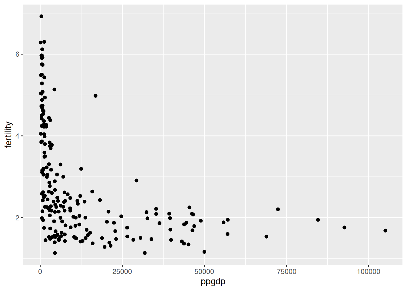
A straight line is not appropriate, because the relationship has an L-shaped structure (or the left half of a U-shape).
1.1.2
ggplot(data = UN11, aes(x = log(ppgdp), y = log(fertility))) +
  geom_point()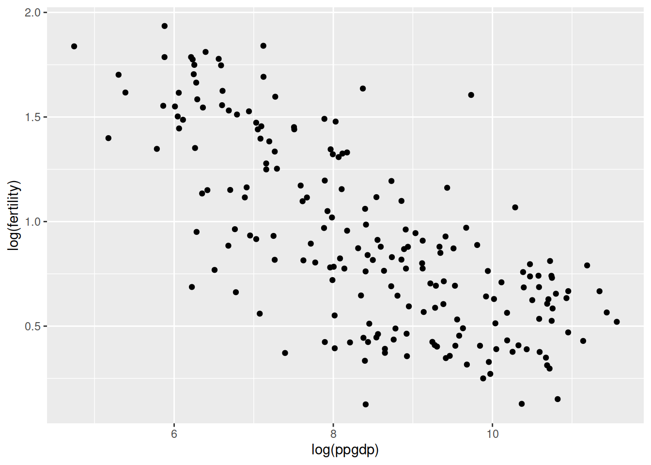
Yes, now a simple linear regression model is more plausible. We can imagine a negative-sloped straight line going through those points.
Question 2
(a)
The conversion from USD to British pound will mean the numerical value of the response will be divided by 1.33. To offset that, the slope will also become divided by 1.33.
(b)
Correlation will not change because it is a standardized measure that is not influenced by the unit of measurement.
Both outcomes can easily be shown via simulation.
Question 3
data(water)
pairs(water)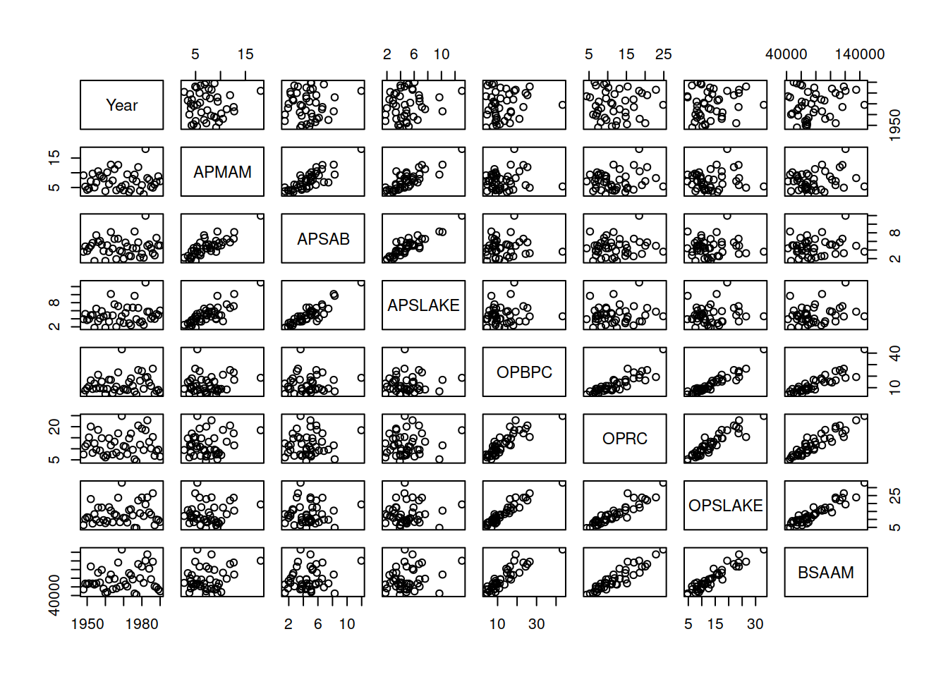
Yearappears to be largely unrelated to each of the other variables- The three variables starting with “O” seem to be correlated with each other, meaning that all the plot including two of these variables exhibit a dependence between the variables that is stronger than the dependence between the “O” variables and other variables. The three variables starting with “A” also seem to be another correlated group
BSAAMis more closely related to the “O” variables than the “A” variables
Question 4
data(Rateprof)
pairs(Rateprof[,c('quality', 'clarity', 'helpfulness',
                  'easiness', 'raterInterest')])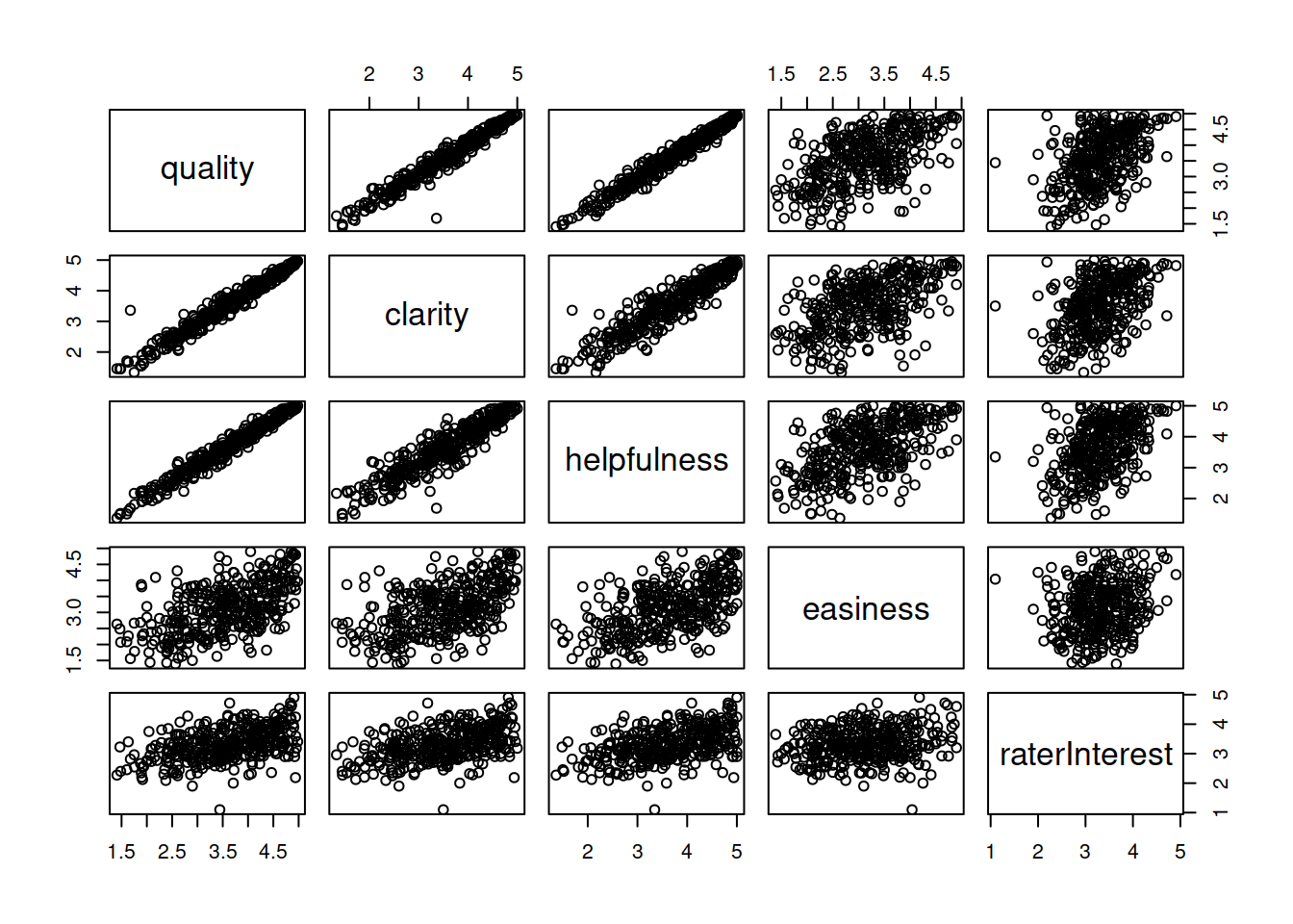
The very strong pair-wise correlation among quality, clarity, and helpfulness is very striking. easiness is also correlated fairly highly with the other three. raterInterest is also moderately correlated, but raters almost always say they are at least moderately interested in the subject. Overall, the results might show that people don’t necessarily distinguish all these dimensions very well in their minds—or that professors that do one in one dimension tend to do well on the others too.
Question 5
a
One way of visually representing the relationship between religiosity and political ideology is as follows (and there are other ways). As we go towards bars to the right (more religiousity), we see lighter colors pop up (more conservatism)
data(student.survey)
ggplot(data = student.survey, aes(x = re, fill = pi)) +
    geom_bar(position = "fill")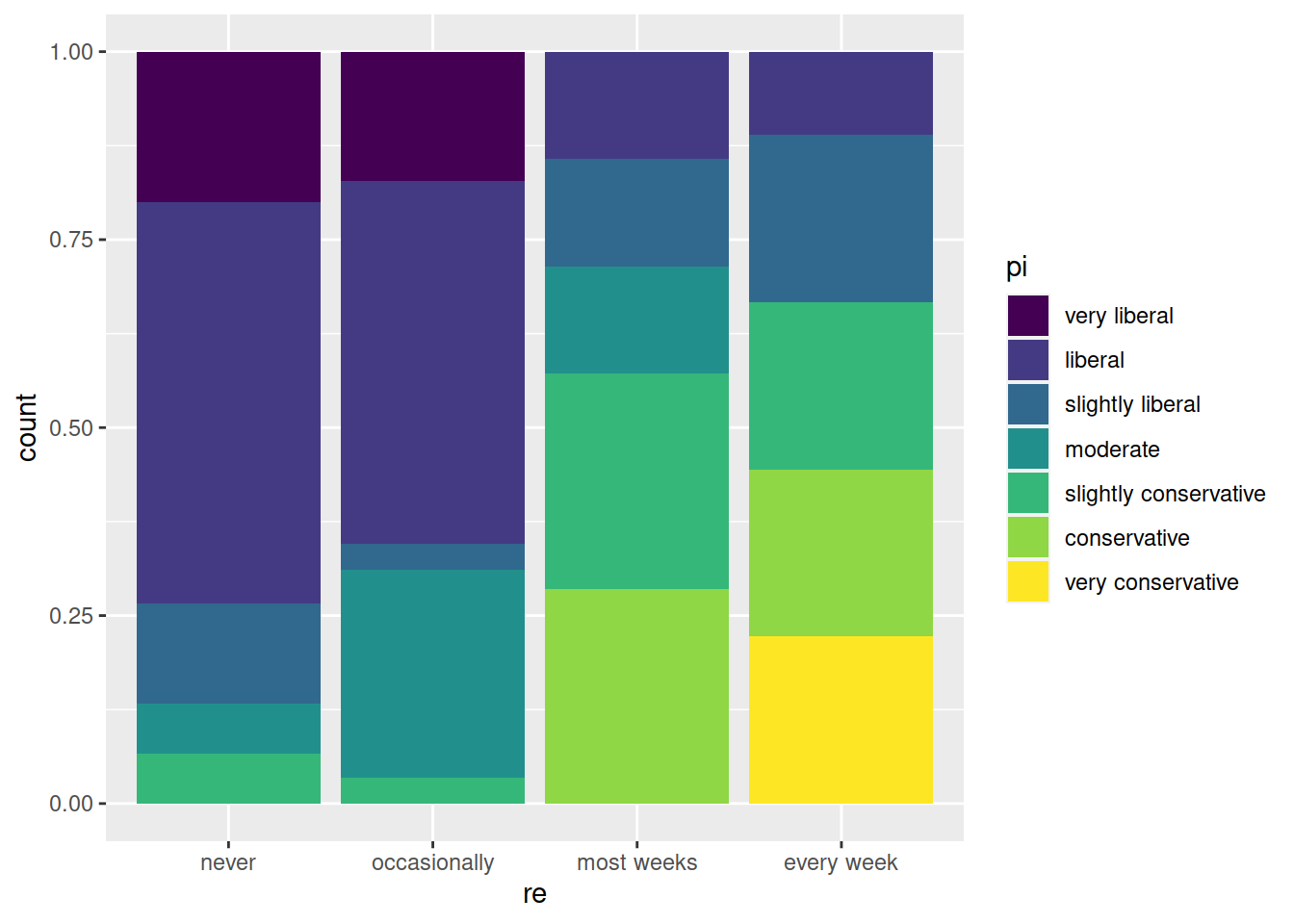
The relationship between high school GPA and hours of watching TV can be shown with a good old scatter plot.
ggplot(data = student.survey, aes(x = tv, y = hi)) +
geom_point() 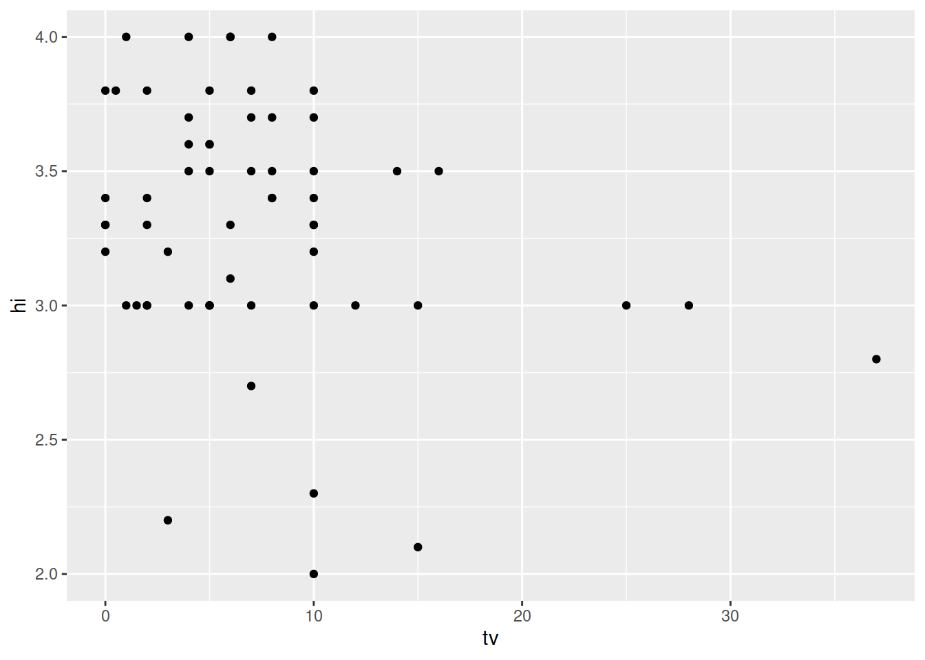
b
Dealing with ordinal variables in linear regression is a difficult problem. We’ll just go ahead and assume that we can just convert them to numeric and use them. This would be done for political ideology and religiosity. High school GPA and hours of TV are already continuous.
m1 <- lm(as.numeric(pi) ~ as.numeric(re),
         data = student.survey)
m2 <- lm(hi ~ tv, data = student.survey)
stargazer(m1, m2, type = 'text',
          dep.var.labels = c('Pol. Ideology', 'HS GPA'),
          covariate.labels = c('Religiosity', 'Hours of TV')
          )
Error in stargazer(m1, m2, type = "text", dep.var.labels = c("Pol. Ideology", : could not find function "stargazer"Religiosity is positively and statistically significantly (at the 0.01 significance level) associated with conservatism.
Hours of TV is negatively and statistically significantly (at the 0.05 significance level) associated with High School GPA. Watching an average of 1 more hour of TV per week is associated with a 0.018 decline in High School GPA.