Code
library(tidyverse)
library(alr4)
library(smss)

knitr::opts_chunk$set(echo = TRUE)Karen Detter
August 2, 2022
In this model, the predictor variable is ‘ppgdp’ ($ gross national product per person) and the response variable is ‘fertility’.
The relationship between fertility and ppgdp is not exactly linear because increasing gross national product only decreases birth rate until it nears about the 10,000 point; after that, the effect seems to disappear.

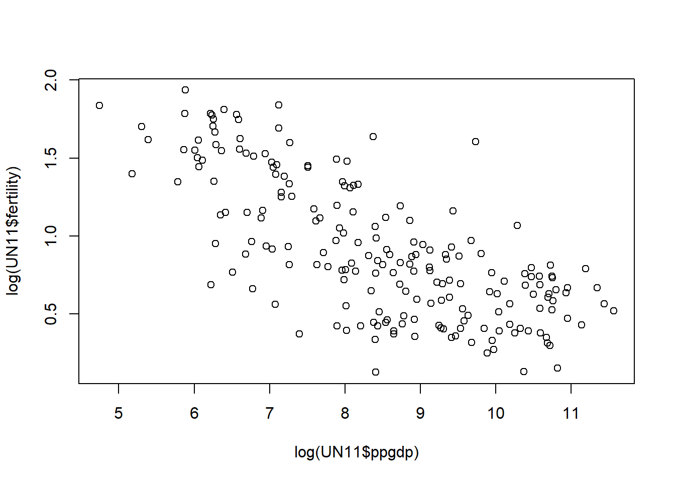
The log transformation scatterplot shows a relationship that looks much closer to that of the linear regression model.
Converting the currency from American dollars to British pounds causes the mean of the x-axis (explanatory variable) to increase while the mean of the y-axis (response variable) remains the same. As a result, the prediction equation line becomes less steep, as each value of x is increased for the identical corresponding y-value.
The currency conversion would not change the correlation, as the relative values of the variables remain unchanged.
These scatterplots show that when precipitation at OPBPC, OPRC, and OPSLAKE increases, the runoff volume at BSAAM goes up. Precipitation at the other three locations does not seem to have a strong linear relationship with stream runoff volume.
Also, precipitation rates at the first three sites seem to be somewhat intercorrelated, as do the rates at the last three sites, indicating that the sites in each set may be closer to each other or share similar geographic features.
##load data
data("Rateprof")
##draw scatterplot matrix of selected variables
pairs(~Rateprof$quality+Rateprof$helpfulness+Rateprof$clarity+Rateprof$easiness+Rateprof$raterInterest, lwd=2, labels = c("QUALITY", "HELPFULNESS", "CLARITY", "EASINESS", "Rater INTEREST"), pch=19, cex = 0.75, col = "blue")
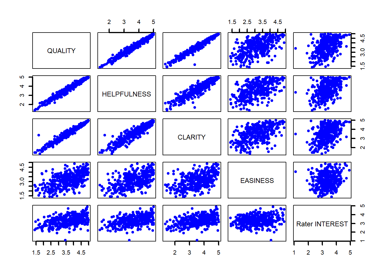
Surprisingly, it doesn’t seem that reviewers’ ratings of their interest in the subject or the easiness of the course correlate with ratings of the professor’s quality, helpfulness, or clarity. Ratings for those three traits, however, all seem to have linear relationships with each other.
Call:
lm(formula = pi_conv ~ re_conv, data = student.survey)
Residuals:
Min 1Q Median 3Q Max
-2.81243 -0.87160 0.09882 1.12840 3.09882
Coefficients:
Estimate Std. Error t value Pr(>|t|)
(Intercept) 0.9308 0.4252 2.189 0.0327 *
re_conv 0.9704 0.1792 5.416 1.22e-06 ***
---
Signif. codes: 0 '***' 0.001 '**' 0.01 '*' 0.05 '.' 0.1 ' ' 1
Residual standard error: 1.345 on 58 degrees of freedom
Multiple R-squared: 0.3359, Adjusted R-squared: 0.3244
F-statistic: 29.34 on 1 and 58 DF, p-value: 1.221e-06
Call:
lm(formula = hi ~ tv, data = student.survey)
Residuals:
Min 1Q Median 3Q Max
-1.2583 -0.2456 0.0417 0.3368 0.7051
Coefficients:
Estimate Std. Error t value Pr(>|t|)
(Intercept) 3.441353 0.085345 40.323 <2e-16 ***
tv -0.018305 0.008658 -2.114 0.0388 *
---
Signif. codes: 0 '***' 0.001 '**' 0.01 '*' 0.05 '.' 0.1 ' ' 1
Residual standard error: 0.4467 on 58 degrees of freedom
Multiple R-squared: 0.07156, Adjusted R-squared: 0.05555
F-statistic: 4.471 on 1 and 58 DF, p-value: 0.03879##visualize relationships in the two models with scatterplots
##include regression lines of coefficients
##use jitter plots due to small sample size of 60
ggplot(data = student.survey, aes(x = re, y = pi)) +
geom_jitter(color = "blue") +
geom_abline(intercept = .9308, slope = .9704) +
geom_smooth(method = 'lm')`geom_smooth()` using formula 'y ~ x'
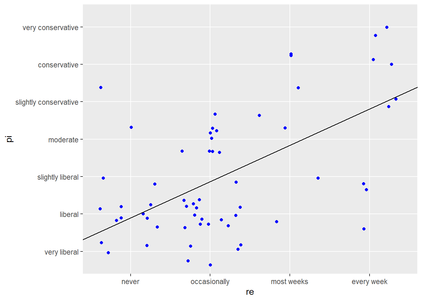
The first regression model shows evidence of a strong, statistically significant effect of religiousness on political ideology, with the p-value of .00000122 being well below the significance threshold of .05. As the level of religiousness increases, political ideology becomes more conservative, with religiousness explaining 34% of the variance in ideology. Because of the small number of observations (n=60), scatterplot points do not appear tightly aligned to the regression line, but there is a clear upward-moving trend.
`geom_smooth()` using formula 'y ~ x'
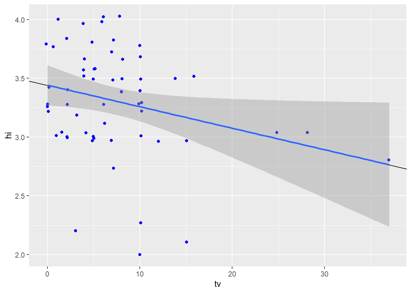
The effect of hours of tv watched on grade point average is not very strong, with the p-value of .0388 being just below the significance threshold. The relationship between the variables is inverse - mean gpa decreases by .02 for every increase in hours of tv watched. Hours of tv watched per week explain 7% of the variance in grade point averages. The scatterplot, again affected by small sample size, does show a slight trend of gpa decreasing as tv level increases.
---
title: "HW3"
author: "Karen Detter"
desription: "Homework 3 - Regression Analysis"
date: "08/02/2022"
format:
html:
toc: true
code-fold: true
code-copy: true
code-tools: true
categories:
- hw3
---
```{r}
#| label: setup
#| warning: false
library(tidyverse)
library(alr4)
library(smss)
knitr::opts_chunk$set(echo = TRUE)
```
## Q.1
```{r}
##load data
data(UN11)
```
### 1.1.1
In this model, the predictor variable is 'ppgdp' ($ gross national product per person) and the response variable is 'fertility'.
### 1.1.2
```{r}
##draw scatterplot
plot(x = UN11$ppgdp, y = UN11$fertility)
```
The relationship between fertility and ppgdp is not exactly linear because increasing gross national product only decreases birth rate until it nears about the 10,000 point; after that, the effect seems to disappear.
### 1.1.3
```{r}
##draw scatterplot with logs of both variables
plot(x = log(UN11$ppgdp), y = log(UN11$fertility))
```
The log transformation scatterplot shows a relationship that looks much closer to that of the linear regression model.
## Q.2
### (a)
Converting the currency from American dollars to British pounds causes the mean of the x-axis (explanatory variable) to increase while the mean of the y-axis (response variable) remains the same. As a result, the prediction equation line becomes less steep, as each value of x is increased for the identical corresponding y-value.
### (b)
The currency conversion would not change the correlation, as the *relative* values of the variables remain unchanged.
## Q.3
```{r}
##load data
data(water)
##draw scatterplot matrix
pairs(water)
```
These scatterplots show that when precipitation at OPBPC, OPRC, and OPSLAKE increases, the runoff volume at BSAAM goes up. Precipitation at the other three locations does not seem to have a strong linear relationship with stream runoff volume.
Also, precipitation rates at the first three sites seem to be somewhat intercorrelated, as do the rates at the last three sites, indicating that the sites in each set may be closer to each other or share similar geographic features.
## Q.4
```{r}
##load data
data("Rateprof")
##draw scatterplot matrix of selected variables
pairs(~Rateprof$quality+Rateprof$helpfulness+Rateprof$clarity+Rateprof$easiness+Rateprof$raterInterest, lwd=2, labels = c("QUALITY", "HELPFULNESS", "CLARITY", "EASINESS", "Rater INTEREST"), pch=19, cex = 0.75, col = "blue")
```
Surprisingly, it doesn't seem that reviewers' ratings of their interest in the subject or the easiness of the course correlate with ratings of the professor's quality, helpfulness, or clarity. Ratings for those three traits, however, all seem to have linear relationships with each other.
## Q.5
```{r}
##load data
data(student.survey)
```
### (i)
```{r}
##convert factor variables to numeric
pi_conv <- as.numeric(student.survey$pi)
re_conv <- as.numeric(student.survey$re)
##run regression analysis
model1 <- lm(pi_conv ~ re_conv, data = student.survey)
summary(model1)
```
### (ii)
```{r}
##run regression analysis
model2 <- lm(hi ~ tv, data = student.survey)
summary(model2)
```
### (a) & (b)
```{r}
##visualize relationships in the two models with scatterplots
##include regression lines of coefficients
##use jitter plots due to small sample size of 60
ggplot(data = student.survey, aes(x = re, y = pi)) +
  geom_jitter(color = "blue") +
    geom_abline(intercept = .9308, slope = .9704) +
  geom_smooth(method = 'lm')
```
The first regression model shows evidence of a strong, statistically significant effect of religiousness on political ideology, with the p-value of .00000122 being well below the significance threshold of .05. As the level of religiousness increases, political ideology becomes more conservative, with religiousness explaining 34% of the variance in ideology. Because of the small number of observations (n=60), scatterplot points do not appear tightly aligned to the regression line, but there is a clear upward-moving trend.
```{r}
ggplot(data = student.survey, aes(x = tv, y = hi)) +
  geom_jitter(color = "blue") +
  geom_abline(intercept = 3.441353, slope = -0.018305) +
  geom_smooth(method = 'lm')
```
The effect of hours of tv watched on grade point average is not very strong, with the p-value of .0388 being just below the significance threshold. The relationship between the variables is inverse - mean gpa decreases by .02 for every increase in hours of tv watched. Hours of tv watched per week explain 7% of the variance in grade point averages. The scatterplot, again affected by small sample size, does show a slight trend of gpa decreasing as tv level increases.