library(tidyverse)
library(ggplot2)
library(summarytools)
library(ggridges)

knitr::opts_chunk$set(echo = TRUE, warning = FALSE, message = FALSE)Challenge 6
challenge_6
air_bnb
tidyverse
ggplot2
summarytools
ggridges
Visualizing Time and Relationships
::: panel-tabset
Read in data
I’ll be working with the Airbnb dataset, since I’ve already worked on several of the other datasets on the list for today’s challenge.
airbnb <- read_csv("_data/AB_NYC_2019.csv", show_col_types = FALSE)
airbnb <- complete(airbnb)
print(dfSummary(airbnb, varnumbers = FALSE, plain.ascii = FALSE, graph.magnif = 0.30, style = "grid", valid.col = FALSE),
      method = 'render', table.classes = 'table-condensed')
Data Frame Summary
airbnb
Dimensions: 48895 x 16Duplicates: 0
| Variable | Stats / Values | Freqs (% of Valid) | Graph | Missing | |||||||||||||||||||||||||||||||||||||||||||||||||||||||
|---|---|---|---|---|---|---|---|---|---|---|---|---|---|---|---|---|---|---|---|---|---|---|---|---|---|---|---|---|---|---|---|---|---|---|---|---|---|---|---|---|---|---|---|---|---|---|---|---|---|---|---|---|---|---|---|---|---|---|---|
| id [numeric] |
|
48895 distinct values |  |
0 (0.0%) | |||||||||||||||||||||||||||||||||||||||||||||||||||||||
| name [character] |
|
|
 |
16 (0.0%) | |||||||||||||||||||||||||||||||||||||||||||||||||||||||
| host_id [numeric] |
|
37457 distinct values |  |
0 (0.0%) | |||||||||||||||||||||||||||||||||||||||||||||||||||||||
| host_name [character] |
|
|
 |
21 (0.0%) | |||||||||||||||||||||||||||||||||||||||||||||||||||||||
| neighbourhood_group [character] |
|
|
 |
0 (0.0%) | |||||||||||||||||||||||||||||||||||||||||||||||||||||||
| neighbourhood [character] |
|
|
 |
0 (0.0%) | |||||||||||||||||||||||||||||||||||||||||||||||||||||||
| latitude [numeric] |
|
19048 distinct values |  |
0 (0.0%) | |||||||||||||||||||||||||||||||||||||||||||||||||||||||
| longitude [numeric] |
|
14718 distinct values |  |
0 (0.0%) | |||||||||||||||||||||||||||||||||||||||||||||||||||||||
| room_type [character] |
|
|
 |
0 (0.0%) | |||||||||||||||||||||||||||||||||||||||||||||||||||||||
| price [numeric] |
|
674 distinct values |  |
0 (0.0%) | |||||||||||||||||||||||||||||||||||||||||||||||||||||||
| minimum_nights [numeric] |
|
109 distinct values |  |
0 (0.0%) | |||||||||||||||||||||||||||||||||||||||||||||||||||||||
| number_of_reviews [numeric] |
|
394 distinct values |  |
0 (0.0%) | |||||||||||||||||||||||||||||||||||||||||||||||||||||||
| last_review [Date] |
|
1764 distinct values |  |
10052 (20.6%) | |||||||||||||||||||||||||||||||||||||||||||||||||||||||
| reviews_per_month [numeric] |
|
937 distinct values |  |
10052 (20.6%) | |||||||||||||||||||||||||||||||||||||||||||||||||||||||
| calculated_host_listings_count [numeric] |
|
47 distinct values |  |
0 (0.0%) | |||||||||||||||||||||||||||||||||||||||||||||||||||||||
| availability_365 [numeric] |
|
366 distinct values |  |
0 (0.0%) |
Generated by summarytools 1.0.1 (R version 4.2.1)
2022-08-23
Briefly describe and tidy data
There are 16 columns and 48895 rows. The dataset describes Airbnb listings in NYC in 2019. Each row represents a listing with a unique ID and name, host ID and name, etc. I’ll tidy the dataset by converting neighbourhood_group, neighbourhood and room_type to factors.
# changing 3 columns to factors.
airbnb <- airbnb %>% mutate(neighbourhood_group = as.factor(neighbourhood_group), neighbourhood = as.factor(neighbourhood), room_type = as.factor(room_type))

# sanity check.
airbnb
Time Dependent Visualization
I want to visualize how last_review differs across neighbourhood_group - I’ll try out a histogram and a ridgeline plot.
# histogram - filter out NA values.
airbnb %>% filter(! is.na(last_review)) %>%
  filter(! is.na(neighbourhood_group)) %>%
  ggplot(aes(last_review, fill = neighbourhood_group)) +
  geom_histogram(aes(y = ..density..), alpha = 0.2, binwidth = 200) +
  geom_density(alpha = 0.9) +
  theme_minimal() +
  labs(title = "Last Review Date of Airbnb Listings in NYC (2019)") +
  facet_wrap(vars(neighbourhood_group)) +
  theme(axis.text.x=element_text(angle=90,hjust=1)) +
  scale_x_date(date_labels = "%m-%Y")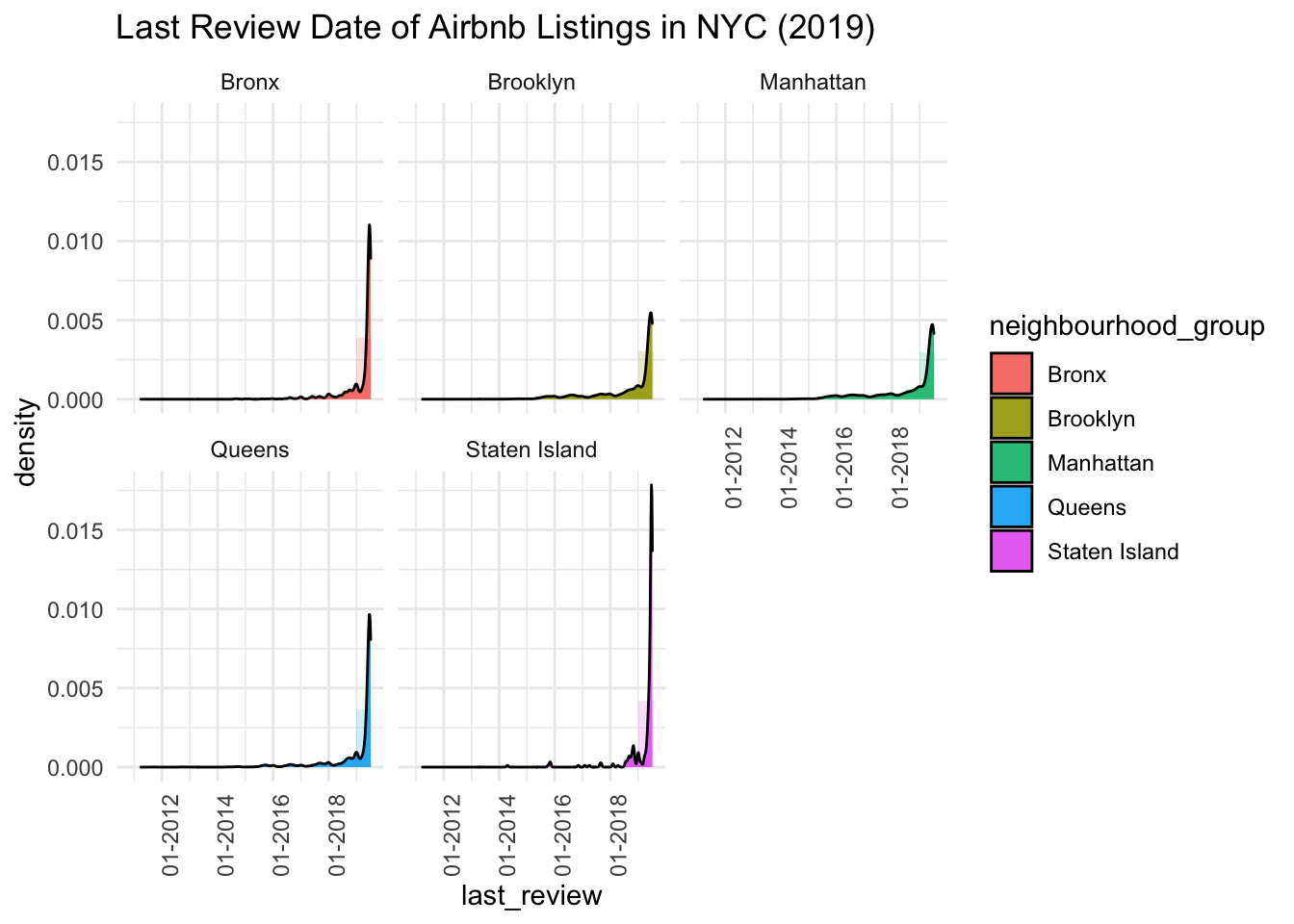
# ridgeline - filter out NA values.
airbnb %>% filter(! is.na(last_review)) %>%
  filter(! is.na(neighbourhood_group)) %>%
  ggplot(aes(last_review, neighbourhood_group, fill = neighbourhood_group)) +
  geom_density_ridges_gradient(scale = 2, rel_min_height = 0.02) +
  labs(title = "Last Review Date of Airbnb Listings in NYC (2019)") +
  theme_minimal()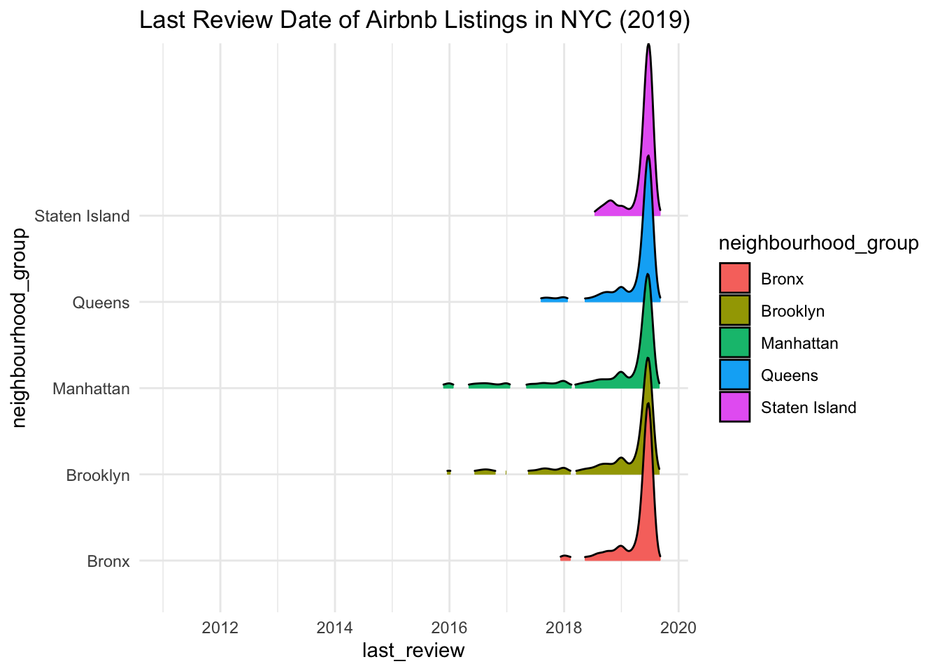
The ridgeline plot is easier to visualise, because we can see last_review for each neighbourhood_group stacked on top of one another (credit for the packages and code is here) - reviews for the listings tend to be quite recent across all neighbourhood groups. Manhattan has the oldest reviews, while Staten Island has the newest reviews.
Let’s see if a time series graph might also work (this time with reviews_per_month).
# time series - filter out NA values.
airbnb %>% filter(! is.na(last_review)) %>%
  ggplot(aes(x = last_review, y = reviews_per_month)) +
  geom_line() +
    labs(title = "Last Review Date of Airbnb Listings in NYC, 2019") +
  theme_minimal()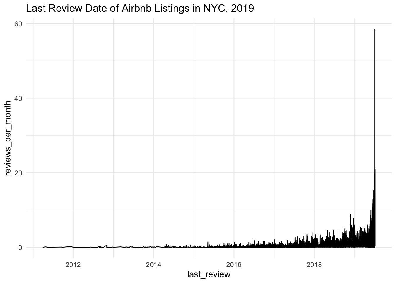
Generally, as reviews_per_month goes up, so does last_review (but it seems to shoot up during 2019).
Visualizing Part-Whole Relationships
I want to compare the differences in room_type between the priciest and cheapest neighbourhood_group (on average) using pie charts.
# group by neighbourhood_group, then calculate average airbnb price and find priciest neighbourhood_group.
airbnb %>% group_by(neighbourhood_group) %>%
  summarise(mean_price = mean(price, na.rm = TRUE)) %>%
  arrange(desc(mean_price)) %>% slice(1)
# find cheapest neighbourhood.
airbnb %>% group_by(neighbourhood_group) %>%
summarise(mean_price = mean(price, na.rm = TRUE)) %>%
arrange(mean_price) %>% slice(1)# create subset.
sub <- airbnb %>% select(id, neighbourhood_group, room_type,) %>%
filter(neighbourhood_group == "Manhattan" | neighbourhood_group == "Bronx") %>%
group_by(room_type, neighbourhood_group) %>%
summarise(id, n = n())
# remove id column, then remove duplicates.
sub <- subset (sub, select = -id)
sub <- unique(sub)Ok - the priciest neighbourhood_group is Manhattan, and the cheapest is the Bronx. We’ve also created a subset of the data that we need. Now let’s make the pie charts.
# creating pie chart 1.
sub_m <- sub %>% filter(`neighbourhood_group` == "Manhattan")
ggplot(sub_m, aes(x="", y=n, fill=room_type)) +
  geom_bar(stat="identity", width=1) +
  coord_polar("y", start=0) +
  theme_void() +
  scale_fill_brewer(palette="Set2") +
  labs(title = "Airbnb Room Types in Manhattan (2019)")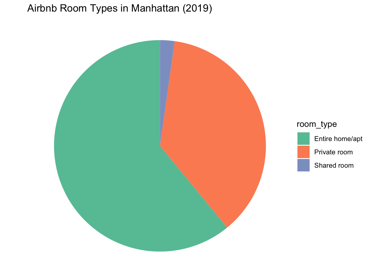
# creating pie chart 2.
sub_b <- sub %>% filter(`neighbourhood_group` == "Bronx")
ggplot(sub_b, aes(x="", y=n, fill=room_type)) +
  geom_bar(stat="identity", width=1) +
  coord_polar("y", start=0) +
  theme_void() +
  scale_fill_brewer(palette="Set2") +
  labs(title = "Airbnb Room Types in the Bronx (2019)")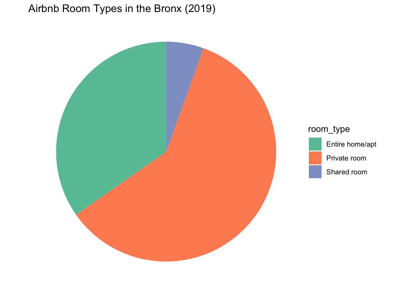
In Manhattan, listings for full apartments were most common, while listings in the Bronx were overwhelmingly for private rooms. Shared rooms seem to be the least common in both neighbourhoods.