library(tidyverse)
library(ggplot2)
library(skimr)
library(dplyr)

knitr::opts_chunk$set(echo = TRUE, warning=FALSE, message=FALSE)Challenge 5
challenge_5
air_bnb
Introduction to Visualization
Read in data
Reading in the ‘AB_NYC_2019.csv’ dataset.
airbnb <- read_csv("_data/AB_NYC_2019.csv")Briefly describe the data
skim(airbnb)| Name | airbnb |
| Number of rows | 48895 |
| Number of columns | 16 |
| _______________________ | |
| Column type frequency: | |
| character | 5 |
| Date | 1 |
| numeric | 10 |
| ________________________ | |
| Group variables | None |
Variable type: character
| skim_variable | n_missing | complete_rate | min | max | empty | n_unique | whitespace |
|---|---|---|---|---|---|---|---|
| name | 16 | 1 | 1 | 179 | 0 | 47894 | 0 |
| host_name | 21 | 1 | 1 | 35 | 0 | 11452 | 0 |
| neighbourhood_group | 0 | 1 | 5 | 13 | 0 | 5 | 0 |
| neighbourhood | 0 | 1 | 4 | 26 | 0 | 221 | 0 |
| room_type | 0 | 1 | 11 | 15 | 0 | 3 | 0 |
Variable type: Date
| skim_variable | n_missing | complete_rate | min | max | median | n_unique |
|---|---|---|---|---|---|---|
| last_review | 10052 | 0.79 | 2011-03-28 | 2019-07-08 | 2019-05-19 | 1764 |
Variable type: numeric
| skim_variable | n_missing | complete_rate | mean | sd | p0 | p25 | p50 | p75 | p100 | hist |
|---|---|---|---|---|---|---|---|---|---|---|
| id | 0 | 1.00 | 19017143.24 | 10983108.39 | 2539.00 | 9471945.00 | 19677284.00 | 29152178.50 | 36487245.00 | ▆▆▆▆▇ |
| host_id | 0 | 1.00 | 67620010.65 | 78610967.03 | 2438.00 | 7822033.00 | 30793816.00 | 107434423.00 | 274321313.00 | ▇▂▁▁▁ |
| latitude | 0 | 1.00 | 40.73 | 0.05 | 40.50 | 40.69 | 40.72 | 40.76 | 40.91 | ▁▁▇▅▁ |
| longitude | 0 | 1.00 | -73.95 | 0.05 | -74.24 | -73.98 | -73.96 | -73.94 | -73.71 | ▁▁▇▂▁ |
| price | 0 | 1.00 | 152.72 | 240.15 | 0.00 | 69.00 | 106.00 | 175.00 | 10000.00 | ▇▁▁▁▁ |
| minimum_nights | 0 | 1.00 | 7.03 | 20.51 | 1.00 | 1.00 | 3.00 | 5.00 | 1250.00 | ▇▁▁▁▁ |
| number_of_reviews | 0 | 1.00 | 23.27 | 44.55 | 0.00 | 1.00 | 5.00 | 24.00 | 629.00 | ▇▁▁▁▁ |
| reviews_per_month | 10052 | 0.79 | 1.37 | 1.68 | 0.01 | 0.19 | 0.72 | 2.02 | 58.50 | ▇▁▁▁▁ |
| calculated_host_listings_count | 0 | 1.00 | 7.14 | 32.95 | 1.00 | 1.00 | 1.00 | 2.00 | 327.00 | ▇▁▁▁▁ |
| availability_365 | 0 | 1.00 | 112.78 | 131.62 | 0.00 | 0.00 | 45.00 | 227.00 | 365.00 | ▇▂▁▁▂ |
table(distinct(airbnb,room_type))room_type
Entire home/apt Private room Shared room
1 1 1 The dimensions of this dataset are 48895 and 16. It has 5 character-type columns, 10 numeric type, and 1 date-type column. It describes the airbnbs available in the New York bouroughs: Bronx, Brooklyn, Manhattan, Queens, and Staten Island, along with information such as the hosts’ names, price, days available, type of room, and so on. The three room types are entire home, private room, and shared room. Some columns have missing values (name = 16, host_name = 21, reviews_per_month = 10052, last_review = 10052).
airbnb %>%
  select(neighbourhood_group)  %>%
  group_by(neighbourhood_group) %>%
  tally()
# A tibble: 5 × 2
neighbourhood_group n
<chr> <int>
1 Bronx 1091
2 Brooklyn 20104
3 Manhattan 21661
4 Queens 5666
5 Staten Island 373airbnb %>%
select(neighbourhood_group,neighbourhood) %>%
group_by(neighbourhood_group) %>%
count(neighbourhood) %>%
slice(which.max(n))# A tibble: 5 × 3
# Groups: neighbourhood_group [5]
neighbourhood_group neighbourhood n
<chr> <chr> <int>
1 Bronx Kingsbridge 70
2 Brooklyn Williamsburg 3920
3 Manhattan Harlem 2658
4 Queens Astoria 900
5 Staten Island St. George 48Manhattan has the highest number of airbnbs (21661) while Staten Island has the lowest (373). The neighbourhoods with the most airbnbs in the boroughs are: Kingsbridge in Bronx (70), Williamsburg in Brooklyn (3920), Harlem in Manhattan (2658), Astoria in Queens (900), and St. George in Staten Island (48).
airbnb %>%
  select(neighbourhood_group,neighbourhood, price)  %>%
  group_by(neighbourhood_group) %>%
  summarize(mean_price = mean(price))
# A tibble: 5 × 2
neighbourhood_group mean_price
<chr> <dbl>
1 Bronx 87.5
2 Brooklyn 124.
3 Manhattan 197.
4 Queens 99.5
5 Staten Island 115. This dataset suggests that the mean price of Manhattan airbnbs are the highest (196.875) and that of Bronx airbnbs are the lowest (87.497).
Univariate Visualizations
First, I want to visualize the number of airbnbs in each borough using a bar graph, since we’re interested in the frequency of certain categories in the data.
airbnb_grouped <- airbnb %>%
  select(neighbourhood_group)  %>%
  group_by(neighbourhood_group) %>%
  tally()

airbnb_grouped <- airbnb_grouped %>% mutate(percentage = scales::percent(n/sum(n), accuracy = .1, trim = FALSE))

ggplot(airbnb_grouped, aes(x = n, y = neighbourhood_group)) + geom_col(fill = "gray70") + geom_text(aes(label = percentage)) + labs(title = "Airbnb Distribution Across NYC Boroughs", x = "Borough", y = "Frequency") + theme_minimal()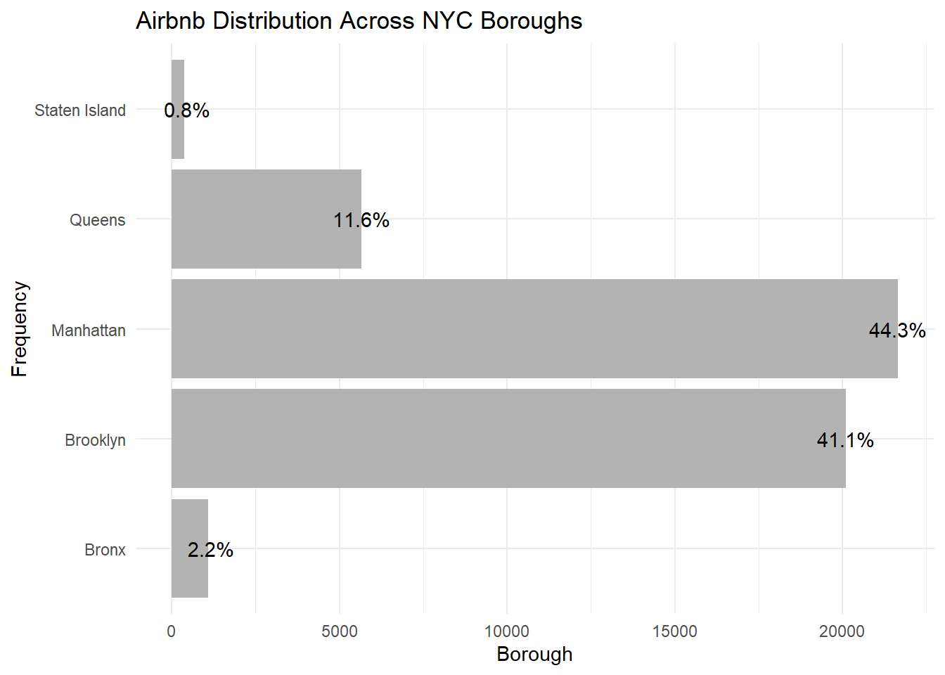
I also want to look at the distribution of prices in the dataset using a histogram because ‘price’ is a continuous variable.
ggplot(airbnb, aes(price)) + geom_histogram(binwidth=15) + labs(title = "NYC Airbnb Prices Distribution",x = "Price",y = "Frequency") + theme_minimal()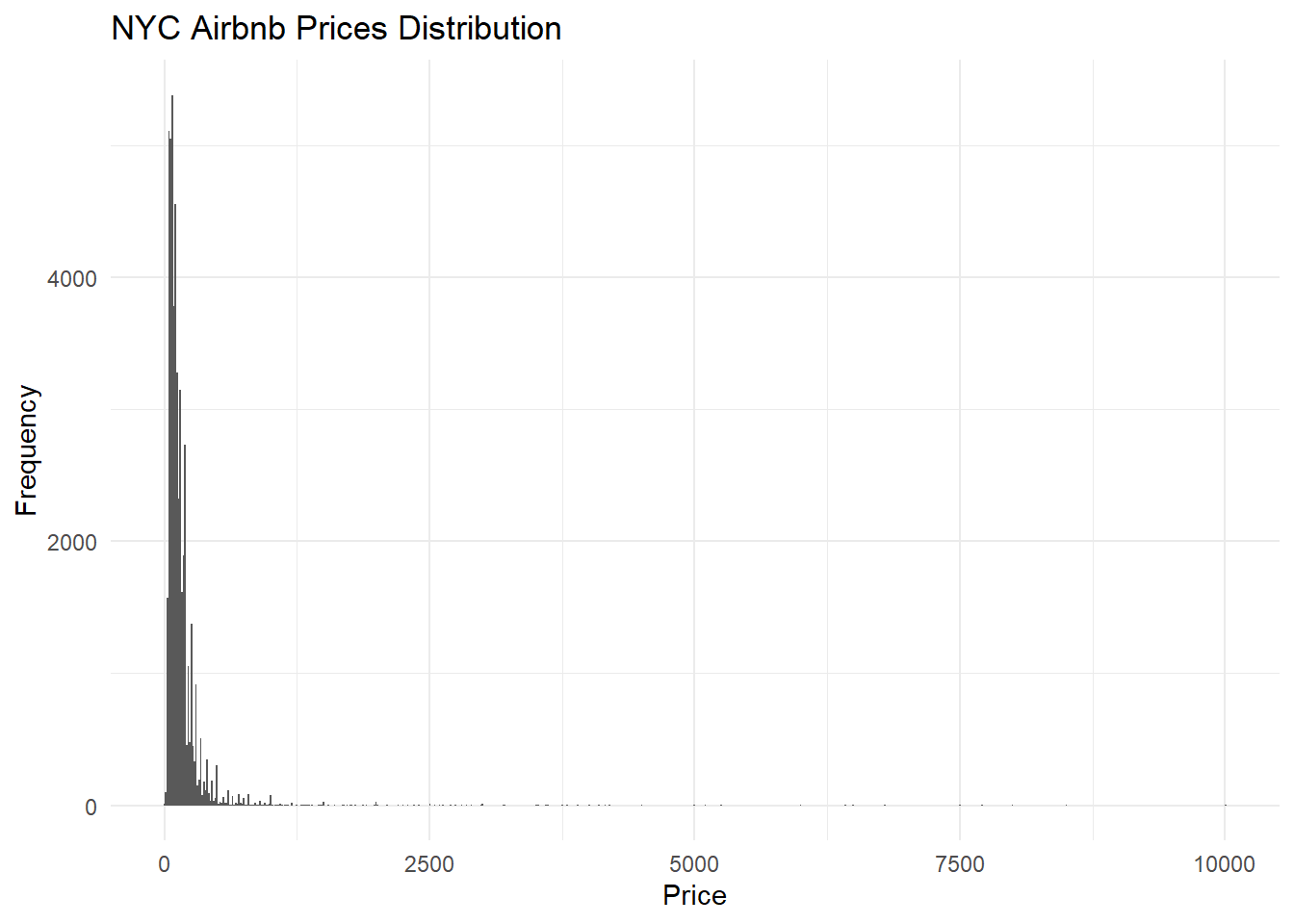
From this histogram, it’s clear that the prices are heavily skewed to the right, suggesting that there are a lot of airbnbs valued below around $500 per night.
I’m also interested in the frequency of the room types in the five boroughs.
airbnb_rooms <- airbnb %>%
  select(room_type)  %>%
  group_by(room_type) %>%
  tally()

airbnb_rooms <- airbnb_rooms %>% dplyr::mutate(percents = scales::percent(n/sum(n), accuracy = .1, trim = FALSE))

ggplot(airbnb_rooms,aes(x = n, y = room_type)) + geom_col(fill = "gray70") + geom_text(aes(label = percents)) + labs(title = "Airbnb Room Types Distribution", x = "Room Type", y = "Frequency") + theme_minimal()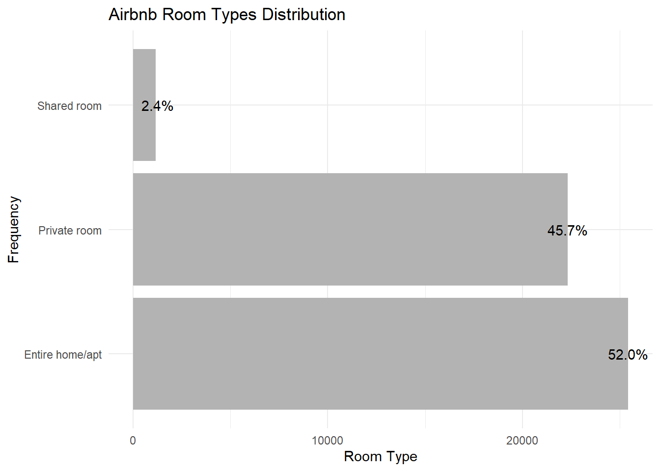
The most common airbnb type is the entire apartment/home (52%), followed by private room (45.7%) and shared room (2.4%).
Bivariate Visualization(s)
I’ll be looking at the distribution of airbnbs across the boroughs and the proportion of each room type in each. Here, the ‘fill’ parameter of the ggplot() function would allow me to incorporate the ‘room_type’ variable into the bar graph.
ggplot(airbnb, aes(y = neighbourhood_group)) + geom_bar(aes(fill = room_type), position = position_stack(reverse = TRUE)) + theme(legend.position = "right") + labs(title = "Room Types by Borough", x = "Frequency", y = "Borough") + theme_minimal() + scale_fill_grey()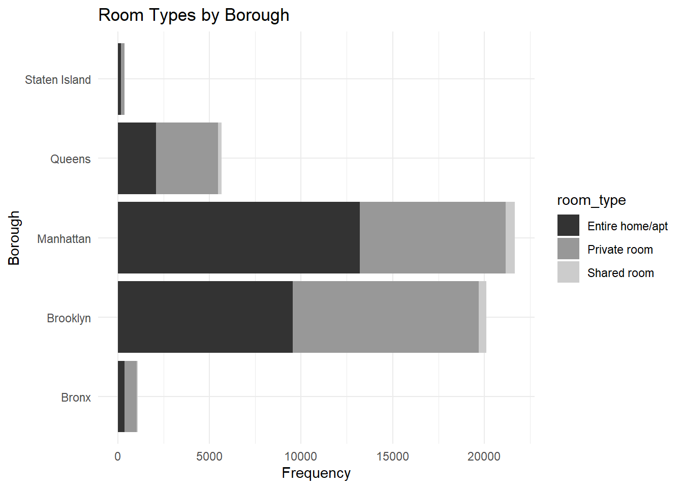
I wonder whether the minimum nights an airbnb is available varies with boroughs:
ggplot(data=airbnb) +
geom_point(mapping=aes(x=neighbourhood_group, y=minimum_nights)) + labs(title = "Airbnb Minimum Nights by Borough", x = "Borough", y = "Number of Nights") + theme_minimal()-1.png)
I used a point plot to show the variation of the numeric ‘minimum_nights’ variable by borough. (One airbnb in Manhattan offers more than 1200 days of stay!) The points are pretty clustered together here, so I’ll try a log transformation on the y-axis to make the distinction between points more clear.
ggplot(data=airbnb) +
geom_point(mapping=aes(x=neighbourhood_group, y=log(minimum_nights))) + labs(title = "Airbnb Minimum Nights by Borough", x = "Borough", y = "Number of Nights") + theme_minimal()-1.png)
The graph suggests that Brooklyn and Manhattan offered longer stays on average. Interestingly, all boroughs had airbnbs that were available for 0 nights.
For the last visualization, I’m interested in how airbnb prices vary by room types. I’ll be using a violin plot since I want to look at the distribution of numeric values across certain categories.
ggplot(airbnb, aes(room_type, price)) + geom_violin() + labs(title = "Prices by Room Type",x = "Room Type",y = "Price") + theme_minimal()-1.png)
Again, most of the values are not clearly visible in this graph, so I’ll perform a log transformation of the y-axis.
ggplot(airbnb, aes(room_type, log(price))) + geom_violin() + labs(title = "Prices by Room Type",x = "Room Type",y = "Price") + theme_minimal()-1.png)
This graph is clearer. As expected, the prices of entire homes are the highest, followed by private rooms, then shared rooms.