library(tidyverse)
library(ggplot2)
library(summarytools)
library(plotly)
library(stringr)
library(readxl)
knitr::opts_chunk$set(echo = TRUE, warning=FALSE, message=FALSE)
Challenge 5
challenge_5
usa_hh
Animesh Sengupta
Introduction to Visualization
Challenge Overview
Today’s challenge is to:
- read in a data set, and describe the data set using both words and any supporting information (e.g., tables, etc)
- tidy data (as needed, including sanity checks)
- mutate variables as needed (including sanity checks)
- create at least two univariate visualizations
- try to make them “publication” ready
- Explain why you choose the specific graph type
- Create at least one bivariate visualization
- try to make them “publication” ready
- Explain why you choose the specific graph type
R Graph Gallery is a good starting point for thinking about what information is conveyed in standard graph types, and includes example R code.
Read in data
- USA Households ⭐⭐⭐⭐⭐
#! label: Data loading
#| warning: false
US_household_data <- read_excel("../posts/_data/USA Households by Total Money Income, Race, and Hispanic Origin of Householder 1967 to 2019.xlsx",skip = 5, n_max = 353, col_names = c( "Year", "Number","Total","pd_<15000","pd_15000-24999","pd_25000-34999","pd_35000-49999","pd_50000-74999","pd_75000-99999","pd_100000-149999","pd_150000-199999","pd_>200000","median_income_estimate","median_income_moe","mean_income_estimate","mean_income_moe"))

head(US_household_data,5)
# A tibble: 5 × 16
Year Number Total pd_<1…¹ pd_15…² pd_25…³ pd_35…⁴ pd_50…⁵ pd_75…⁶ pd_10…⁷
<chr> <chr> <dbl> <dbl> <dbl> <dbl> <dbl> <dbl> <dbl> <dbl>
1 ALL RACES <NA> NA NA NA NA NA NA NA NA
2 2019 128451 100 9.1 8 8.3 11.7 16.5 12.3 15.5
3 2018 128579 100 10.1 8.8 8.7 12 17 12.5 15
4 2017 2 127669 100 10 9.1 9.2 12 16.4 12.4 14.7
5 2017 127586 100 10.1 9.1 9.2 11.9 16.3 12.6 14.8
# … with 6 more variables: `pd_150000-199999` <dbl>, `pd_>200000` <dbl>,
# median_income_estimate <dbl>, median_income_moe <dbl>,
# mean_income_estimate <chr>, mean_income_moe <chr>, and abbreviated variable
# names ¹`pd_<15000`, ²`pd_15000-24999`, ³`pd_25000-34999`,
# ⁴`pd_35000-49999`, ⁵`pd_50000-74999`, ⁶`pd_75000-99999`,
# ⁷`pd_100000-149999`Briefly describe the data
I have chosen USA households data which provides the income statistics of the US residents across different races over the years. The features of the US Household data include the percent distribution of various income range across multiple US Households. I have chosen this data because it portrays a very important and insightful economical trend for households over a time period.
##Data Tidy process
The US household data is anything but tidy. Here are the following few operations that have been performed to make it tidy: 1. Separating Race and Year from one column 2. Mutating dataframe to include race column 3. Removing trailing character from both race and column 4. Converting Number and Year Numerical columns from character to number. 5. pivoting percent distribution into 2 columns[income_Range and percent_distribution] from 9 different income range feature of data .
#! label: Data processing
#| warning: false
US_processed_data <- US_household_data%>%
  rowwise()%>% #to ensure the following operation runs row wise
  mutate(Race=case_when(
    is.na(Number) ~ Year
  ))%>%
  ungroup()%>% # to stop rowwise operation
  fill(Race,.direction = "down")%>%
  subset(!is.na(Number))%>%
  rowwise()%>%
  mutate(
    Year=strsplit(Year,' ')[[1]][1],
    Race=ifelse(grepl("[0-9]", Race ,perl=TRUE)[1],strsplit(Race," \\s*(?=[^ ]+$)",perl=TRUE)[[1]][1],Race),
    mean_income_estimate=as.numeric(mean_income_estimate),
    Number=as.numeric(Number),
    Year=as.numeric(Year)
  )%>%
  pivot_longer(
    cols = starts_with("pd"),
    names_to = "income_range",
    values_to = "percent_distribution",
    names_prefix="pd_"
  )
view(dfSummary(US_processed_data))
Document your work here.
One of the major problems in US Household data is to efficiently analyse the races. This is partially because the most of the races are not singular i.e. people may identify themselves as both White and Hispanic. To handle such situations, I had to bundle them into singular races as per the response data.
US_mean_income_data<-US_processed_data%>%
  select(Year,mean_income_estimate,Race)%>%
  group_by(Race,Year)%>%
  summarize(race_mean_income_estimate=mean(mean_income_estimate))

grouped_race<- US_mean_income_data%>%
  mutate(CombinedRace=case_when(
    str_detect(Race,"ASIAN")~"ASIAN",
    str_detect(Race,"BLACK")~"BLACK",
    str_detect(Race,"WHITE")~"WHITE",
    TRUE ~ Race
  ))
head(grouped_race,5)
# A tibble: 5 × 4
# Groups: Race [1]
Race Year race_mean_income_estimate CombinedRace
<chr> <dbl> <dbl> <chr>
1 ALL RACES 1967 53616 ALL RACES
2 ALL RACES 1968 56572 ALL RACES
3 ALL RACES 1969 59004 ALL RACES
4 ALL RACES 1970 58926 ALL RACES
5 ALL RACES 1971 58609 ALL RACES Univariate Visualizations
race_income_area <- ggplot(grouped_race%>%filter(CombinedRace=="ALL RACES"),aes(x=Year,y=race_mean_income_estimate,alpha=0.4,fill=Race)) +
  geom_area() +
  labs(title="All Races Income change across year",
   x="Year", y="Mean Income Estimate ($)")

ggplotly(race_income_area)
The above graph shows the change in mean income for all races combined over the years. I have plotted an area chart to efficiently visualize the change in income over the years. This chart is very easy to read and provides the necessary visual information instantly. In comparison to line chart choosing area chart, would help readers determine the change more efficiently.
All_race_income_data<-US_processed_data%>%
  select(Year,income_range,percent_distribution,Race)%>%
  filter(Race=="ALL RACES",Year==2019)


head(All_race_income_data)
# A tibble: 6 × 4
Year income_range percent_distribution Race
<dbl> <chr> <dbl> <chr>
1 2019 <15000 9.1 ALL RACES
2 2019 15000-24999 8 ALL RACES
3 2019 25000-34999 8.3 ALL RACES
4 2019 35000-49999 11.7 ALL RACES
5 2019 50000-74999 16.5 ALL RACES
6 2019 75000-99999 12.3 ALL RACESAll_race_income_data <- All_race_income_data%>%
arrange(desc(income_range)) %>%
mutate(prop = percent_distribution / sum(All_race_income_data$percent_distribution) *100) %>%
mutate(ypos = cumsum(prop)- 0.5*prop )
race_income_distribution <- ggplot(All_race_income_data,aes(x="",y=percent_distribution,fill=income_range)) +
geom_bar(stat="identity", width=1, color="white")+
coord_polar("y",start=0)+
theme_void()+
theme(legend.position="none") +
geom_text(aes(y = ypos, label = income_range), color = "black", size=2) +
scale_fill_brewer(palette="Set1")+
labs(title="Income Distribution($) for 'ALL Races' in 2019")
race_income_distribution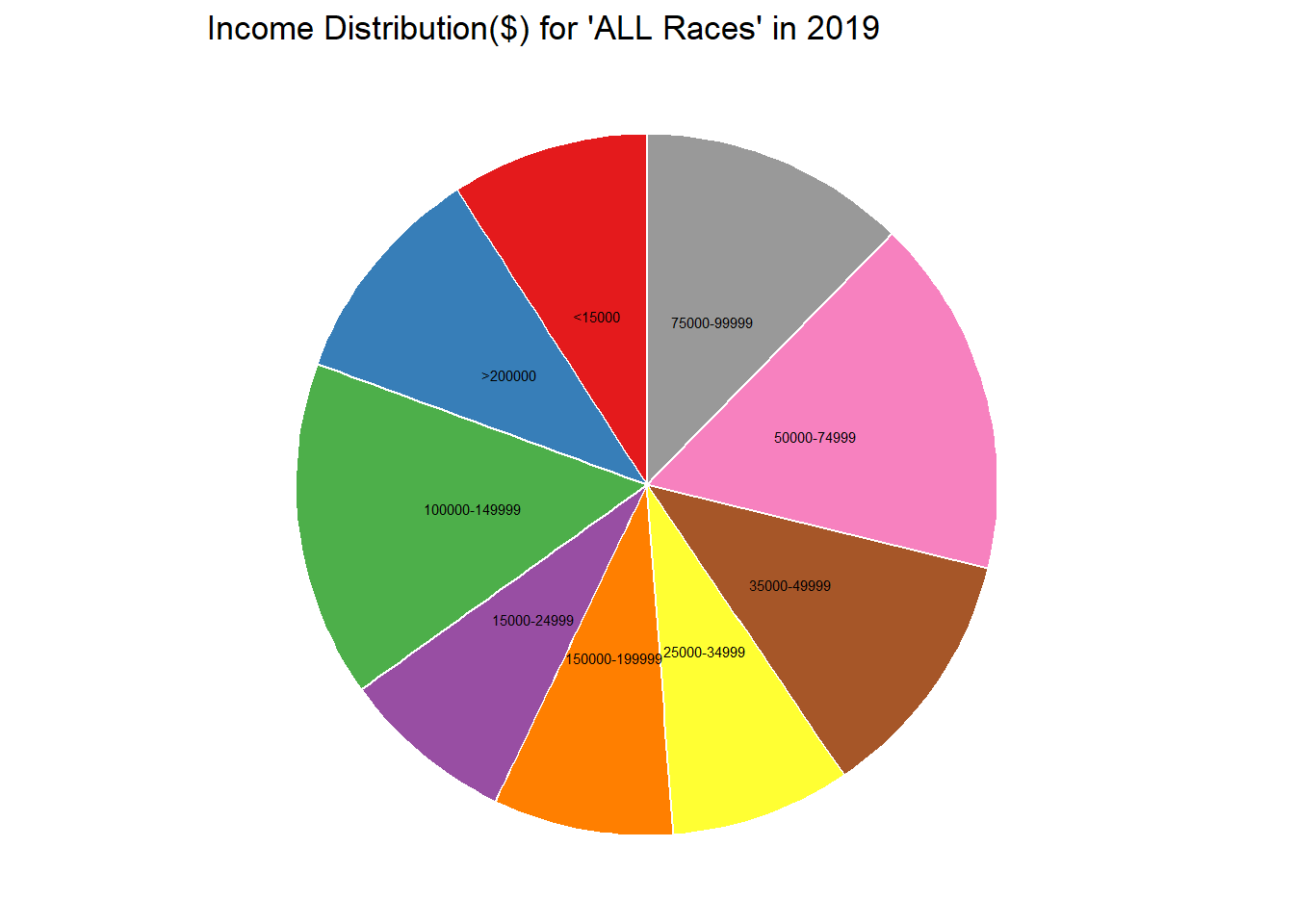
One of the many challenges I faced to bring univariate plot was to boil down to one feature for analysis. The best way to do that in a diverse dataset with multiple features was to isolate a subset of data using filter and select. For this dataset, I wanted to understand the recent household statistics for ALL Races , hence I chose the year for 2019. This way I can truly isolate one variable of income range and its percent distribution.
Bivariate Visualization(s)
race_income_line <- ggplot(grouped_race, aes(x=Year, y=race_mean_income_estimate, color=CombinedRace)) +
    geom_line() +
    facet_wrap(vars(CombinedRace))+
    labs(title="Income change across year for each race")
ggplotly(race_income_line)
For Bivariate data visualization, I chose to analyse the change of income across all the other races. As a sequential analysis from the previous data visualization of income change for All races across year, I plan to move on to the analyse the trend for other races group. One of the most simplest and most efficient visual analysis is line table, It optimally conveys the information across time series in a very easy and digestable manner. The simplicity and efficiency of line chart for time series data model was the main motivation behind choosing this.
Since the analysis is on a time scale, I would consider Year as an independent variable. While the mean income estimate and the races forms the part of bivariate analysis. Race was grouped as part of sanity checks as well.
One exciting trend as evident from the graph is Asian’s in particular has a steeper rise in mean household income especially after the 2011.