library(tidyverse)
library(ggplot2)

knitr::opts_chunk$set(echo = TRUE, warning=FALSE, message=FALSE)Challenge 5 Emma Rasmussen
challenge_5
air_bnb
Introduction to Visualization
###Read in data Reading in the data and saving a original copy of the dataset
library(readr)
AB_NYC_2019 <- read_csv("_data/AB_NYC_2019.csv")
AB_NYC_2019_Orig<-AB_NYC_2019

AB_NYC_2019
# A tibble: 48,895 × 16
id name host_id host_…¹ neigh…² neigh…³ latit…⁴ longi…⁵ room_…⁶ price
<dbl> <chr> <dbl> <chr> <chr> <chr> <dbl> <dbl> <chr> <dbl>
1 2539 Clean & … 2787 John Brookl… Kensin… 40.6 -74.0 Privat… 149
2 2595 Skylit M… 2845 Jennif… Manhat… Midtown 40.8 -74.0 Entire… 225
3 3647 THE VILL… 4632 Elisab… Manhat… Harlem 40.8 -73.9 Privat… 150
4 3831 Cozy Ent… 4869 LisaRo… Brookl… Clinto… 40.7 -74.0 Entire… 89
5 5022 Entire A… 7192 Laura Manhat… East H… 40.8 -73.9 Entire… 80
6 5099 Large Co… 7322 Chris Manhat… Murray… 40.7 -74.0 Entire… 200
7 5121 BlissArt… 7356 Garon Brookl… Bedfor… 40.7 -74.0 Privat… 60
8 5178 Large Fu… 8967 Shunic… Manhat… Hell's… 40.8 -74.0 Privat… 79
9 5203 Cozy Cle… 7490 MaryEl… Manhat… Upper … 40.8 -74.0 Privat… 79
10 5238 Cute & C… 7549 Ben Manhat… Chinat… 40.7 -74.0 Entire… 150
# … with 48,885 more rows, 6 more variables: minimum_nights <dbl>,
# number_of_reviews <dbl>, last_review <date>, reviews_per_month <dbl>,
# calculated_host_listings_count <dbl>, availability_365 <dbl>, and
# abbreviated variable names ¹host_name, ²neighbourhood_group,
# ³neighbourhood, ⁴latitude, ⁵longitude, ⁶room_type
# ℹ Use `print(n = ...)` to see more rows, and `colnames()` to see all variable namesBriefly describe the data
Data set appears to be taken from Airbnb listings in New York City. Each case is a Airbnb rental, at a particular location. Variables include price, minimum stay, number of reviews, reviews per month, how many days of the year it is available, etc.
Tidy Data (as needed)
I think the data is tidy? Each case has a row, each column is a variable, and each value has it’s own cell.
Looking at summary of variables/dimensions of data/distribution of certain variables
print(summarytools::dfSummary(AB_NYC_2019,
                        varnumbers = FALSE,
                        plain.ascii  = FALSE,
                        style        = "grid",
                        graph.magnif = 0.70,
                        valid.col    = FALSE),
      method = 'render',
      table.classes = 'table-condensed')
Data Frame Summary
AB_NYC_2019
Dimensions: 48895 x 16Duplicates: 0
| Variable | Stats / Values | Freqs (% of Valid) | Graph | Missing | |||||||||||||||||||||||||||||||||||||||||||||||||||||||
|---|---|---|---|---|---|---|---|---|---|---|---|---|---|---|---|---|---|---|---|---|---|---|---|---|---|---|---|---|---|---|---|---|---|---|---|---|---|---|---|---|---|---|---|---|---|---|---|---|---|---|---|---|---|---|---|---|---|---|---|
| id [numeric] |
|
48895 distinct values |  |
0 (0.0%) | |||||||||||||||||||||||||||||||||||||||||||||||||||||||
| name [character] |
|
|
 |
16 (0.0%) | |||||||||||||||||||||||||||||||||||||||||||||||||||||||
| host_id [numeric] |
|
37457 distinct values |  |
0 (0.0%) | |||||||||||||||||||||||||||||||||||||||||||||||||||||||
| host_name [character] |
|
|
 |
21 (0.0%) | |||||||||||||||||||||||||||||||||||||||||||||||||||||||
| neighbourhood_group [character] |
|
|
 |
0 (0.0%) | |||||||||||||||||||||||||||||||||||||||||||||||||||||||
| neighbourhood [character] |
|
|
 |
0 (0.0%) | |||||||||||||||||||||||||||||||||||||||||||||||||||||||
| latitude [numeric] |
|
19048 distinct values |  |
0 (0.0%) | |||||||||||||||||||||||||||||||||||||||||||||||||||||||
| longitude [numeric] |
|
14718 distinct values |  |
0 (0.0%) | |||||||||||||||||||||||||||||||||||||||||||||||||||||||
| room_type [character] |
|
|
 |
0 (0.0%) | |||||||||||||||||||||||||||||||||||||||||||||||||||||||
| price [numeric] |
|
674 distinct values |  |
0 (0.0%) | |||||||||||||||||||||||||||||||||||||||||||||||||||||||
| minimum_nights [numeric] |
|
109 distinct values |  |
0 (0.0%) | |||||||||||||||||||||||||||||||||||||||||||||||||||||||
| number_of_reviews [numeric] |
|
394 distinct values |  |
0 (0.0%) | |||||||||||||||||||||||||||||||||||||||||||||||||||||||
| last_review [Date] |
|
1764 distinct values |  |
10052 (20.6%) | |||||||||||||||||||||||||||||||||||||||||||||||||||||||
| reviews_per_month [numeric] |
|
937 distinct values |  |
10052 (20.6%) | |||||||||||||||||||||||||||||||||||||||||||||||||||||||
| calculated_host_listings_count [numeric] |
|
47 distinct values |  |
0 (0.0%) | |||||||||||||||||||||||||||||||||||||||||||||||||||||||
| availability_365 [numeric] |
|
366 distinct values |  |
0 (0.0%) |
Generated by summarytools 1.0.1 (R version 4.2.1)
2022-08-28
dim(AB_NYC_2019)[1] 48895 16prop.table(table(AB_NYC_2019$neighbourhood_group))
        Bronx      Brooklyn     Manhattan        Queens Staten Island
  0.022313120   0.411166786   0.443010533   0.115880969   0.007628592
Variables appear to be in usable form (ex- dates correct) for visualizations. Variable names and values make sense. While completing this assignment there were some variables I wanted to mutate/create a new column to display other subsets of data but it’s getting too late for that at this point and I already have a bunch of visuals
I am going to work with price and neighborhood group in the next graphs so I am looking at the distribution of values in these columns to figure out the best way to display the data. The first price histogram I made was not super readable (just a couple large columns at beginning of data set so I am filtering the data before graphing)
summarize(AB_NYC_2019, max(price), min(price), median(price), mean(price))# A tibble: 1 × 4
`max(price)` `min(price)` `median(price)` `mean(price)`
<dbl> <dbl> <dbl> <dbl>
1 10000 0 106 153.filter(AB_NYC_2019, price==0)#there are 11 listings where the cost is zero!# A tibble: 11 × 16
id name host_id host_…¹ neigh…² neigh…³ latit…⁴ longi…⁵ room_…⁶ price
<dbl> <chr> <dbl> <chr> <chr> <chr> <dbl> <dbl> <chr> <dbl>
1 18750597 Huge … 8.99e6 Kimber… Brookl… Bedfor… 40.7 -74.0 Privat… 0
2 20333471 ★Host… 1.32e8 Anisha Bronx East M… 40.8 -73.9 Privat… 0
3 20523843 MARTI… 1.58e7 Martia… Brookl… Bushwi… 40.7 -73.9 Privat… 0
4 20608117 Sunny… 1.64e6 Lauren Brookl… Greenp… 40.7 -73.9 Privat… 0
5 20624541 Moder… 1.01e7 Aymeric Brookl… Willia… 40.7 -73.9 Entire… 0
6 20639628 Spaci… 8.63e7 Adeyemi Brookl… Bedfor… 40.7 -73.9 Privat… 0
7 20639792 Conte… 8.63e7 Adeyemi Brookl… Bedfor… 40.7 -73.9 Privat… 0
8 20639914 Cozy … 8.63e7 Adeyemi Brookl… Bedfor… 40.7 -73.9 Privat… 0
9 20933849 the b… 1.37e7 Qiuchi Manhat… Murray… 40.8 -74.0 Entire… 0
10 21291569 Coliv… 1.02e8 Sergii Brookl… Bushwi… 40.7 -73.9 Shared… 0
11 21304320 Best … 1.02e8 Sergii Brookl… Bushwi… 40.7 -73.9 Shared… 0
# … with 6 more variables: minimum_nights <dbl>, number_of_reviews <dbl>,
# last_review <date>, reviews_per_month <dbl>,
# calculated_host_listings_count <dbl>, availability_365 <dbl>, and
# abbreviated variable names ¹host_name, ²neighbourhood_group,
# ³neighbourhood, ⁴latitude, ⁵longitude, ⁶room_type
# ℹ Use `colnames()` to see all variable namesfilter(AB_NYC_2019, price>1000)#only 239 listings over $1000# A tibble: 239 × 16
id name host_id host_…¹ neigh…² neigh…³ latit…⁴ longi…⁵ room_…⁶ price
<dbl> <chr> <dbl> <chr> <chr> <chr> <dbl> <dbl> <chr> <dbl>
1 174966 Luxury… 836168 Henry Manhat… Upper … 40.8 -74.0 Entire… 2000
2 273190 6 Bedr… 605463 West V… Manhat… West V… 40.7 -74.0 Entire… 1300
3 363673 Beauti… 256239 Tracey Manhat… Upper … 40.8 -74.0 Privat… 3000
4 468613 $ (Pho… 2325861 Cynthia Manhat… Lower … 40.7 -74.0 Privat… 1300
5 664047 Lux 2B… 836168 Henry Manhat… Upper … 40.8 -74.0 Entire… 2000
6 826690 Sunny,… 4289240 Lucy Brookl… Prospe… 40.7 -74.0 Entire… 4000
7 893413 Archit… 4751930 Martin Manhat… East V… 40.7 -74.0 Entire… 2500
8 1056256 Beauti… 462379 Loretta Brookl… Carrol… 40.7 -74.0 Entire… 1395
9 1300097 Marcel… 4069241 Shannon Brookl… Brookl… 40.7 -74.0 Privat… 1500
10 1301321 West V… 2214774 Ben An… Manhat… West V… 40.7 -74.0 Entire… 1899
# … with 229 more rows, 6 more variables: minimum_nights <dbl>,
# number_of_reviews <dbl>, last_review <date>, reviews_per_month <dbl>,
# calculated_host_listings_count <dbl>, availability_365 <dbl>, and
# abbreviated variable names ¹host_name, ²neighbourhood_group,
# ³neighbourhood, ⁴latitude, ⁵longitude, ⁶room_type
# ℹ Use `print(n = ...)` to see more rows, and `colnames()` to see all variable namesfilter(AB_NYC_2019, price>0 & price<1000) #most listings fall in this range, there are 48895 rows in total, and 48586 in this range# A tibble: 48,586 × 16
id name host_id host_…¹ neigh…² neigh…³ latit…⁴ longi…⁵ room_…⁶ price
<dbl> <chr> <dbl> <chr> <chr> <chr> <dbl> <dbl> <chr> <dbl>
1 2539 Clean & … 2787 John Brookl… Kensin… 40.6 -74.0 Privat… 149
2 2595 Skylit M… 2845 Jennif… Manhat… Midtown 40.8 -74.0 Entire… 225
3 3647 THE VILL… 4632 Elisab… Manhat… Harlem 40.8 -73.9 Privat… 150
4 3831 Cozy Ent… 4869 LisaRo… Brookl… Clinto… 40.7 -74.0 Entire… 89
5 5022 Entire A… 7192 Laura Manhat… East H… 40.8 -73.9 Entire… 80
6 5099 Large Co… 7322 Chris Manhat… Murray… 40.7 -74.0 Entire… 200
7 5121 BlissArt… 7356 Garon Brookl… Bedfor… 40.7 -74.0 Privat… 60
8 5178 Large Fu… 8967 Shunic… Manhat… Hell's… 40.8 -74.0 Privat… 79
9 5203 Cozy Cle… 7490 MaryEl… Manhat… Upper … 40.8 -74.0 Privat… 79
10 5238 Cute & C… 7549 Ben Manhat… Chinat… 40.7 -74.0 Entire… 150
# … with 48,576 more rows, 6 more variables: minimum_nights <dbl>,
# number_of_reviews <dbl>, last_review <date>, reviews_per_month <dbl>,
# calculated_host_listings_count <dbl>, availability_365 <dbl>, and
# abbreviated variable names ¹host_name, ²neighbourhood_group,
# ³neighbourhood, ⁴latitude, ⁵longitude, ⁶room_type
# ℹ Use `print(n = ...)` to see more rows, and `colnames()` to see all variable names#creating a new df with above filter
AB_NYC_2019_filter<-filter(AB_NYC_2019, price>0 & price<1000)Univariate Visualizations
#first histogram
ggplot(AB_NYC_2019, aes(price))+geom_histogram()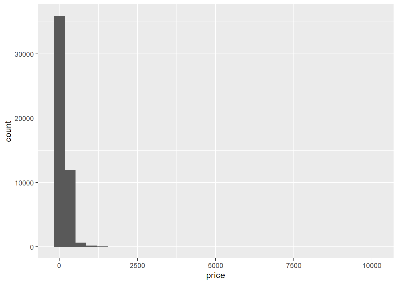
#second histogram
filter(AB_NYC_2019, price>0 & price<1000) %>%
  ggplot(aes(price))+
  geom_histogram(binwidth=10, alpha=0.6, color = 1)+
  labs(title="Cost of NYC Airbnbs (2019)*", caption="*Histogram excludes prices equal to $0 and greater than $1,000", x="Price in $", y="Frequency")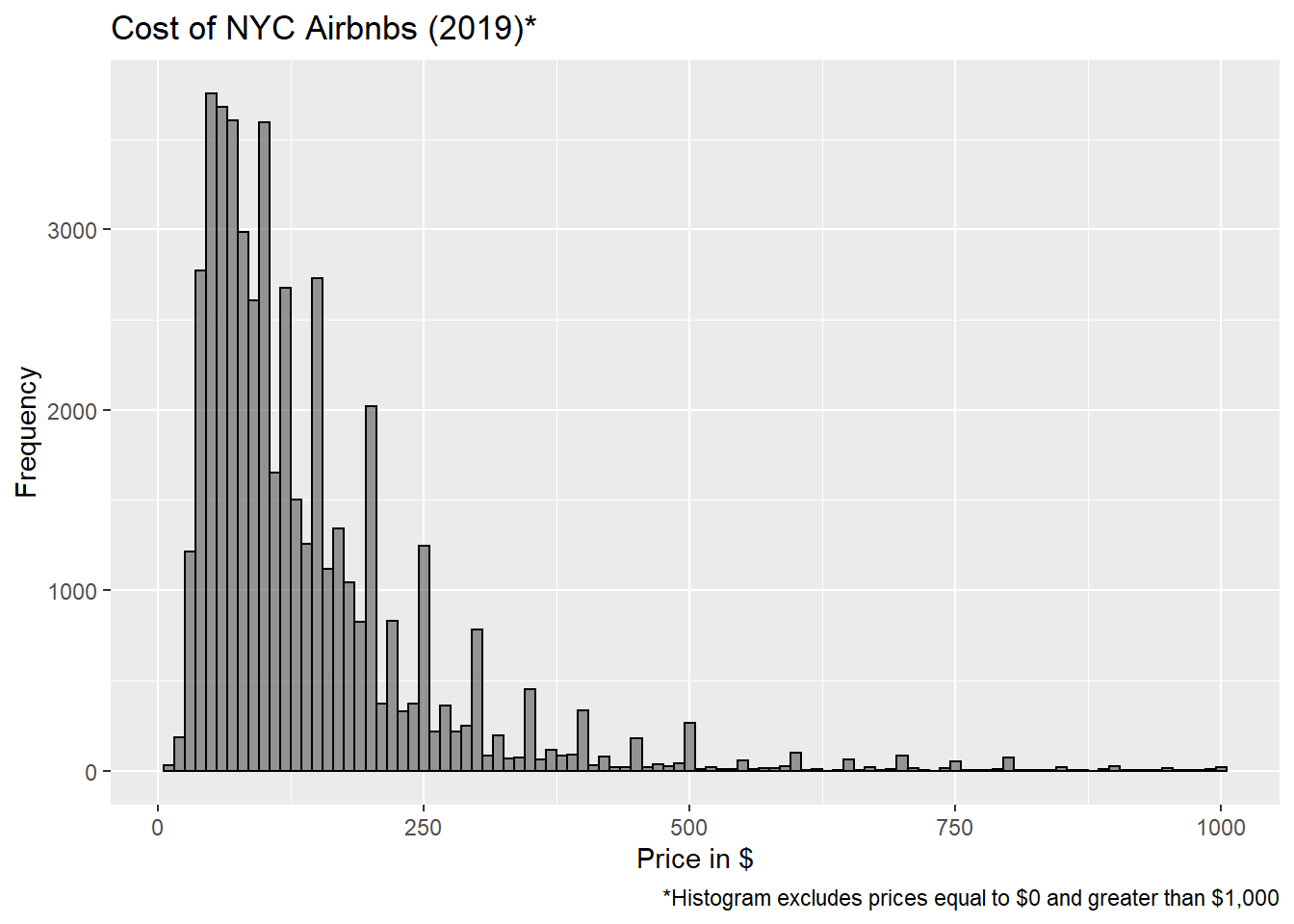
#pie chart
pie(table(AB_NYC_2019$neighbourhood_group), main= "Distribution of NYC Airbnbs by Neighborhood (%) (2019)", cex=0.8, labels=(prop.table(table(AB_NYC_2019$neighbourhood_group)))*100)
legend("left", c("Bronx", "Brooklyn", "Manhattan", "Queens", "Staten Island"))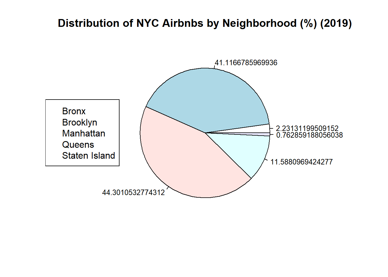
#I give up on adding values to this legend/fixing decimal points, everywhere says pie charts aren't super useful anyway so I will switch to a bar graph

#bar graph
ggplot(AB_NYC_2019, aes(neighbourhood_group))+
  geom_bar(alpha=0.85)+
  ggtitle("NYC Airbnbs by Neighborhood (2019)")+
  xlab("Neighborhood")+
  ylab("Number of Airbnbs")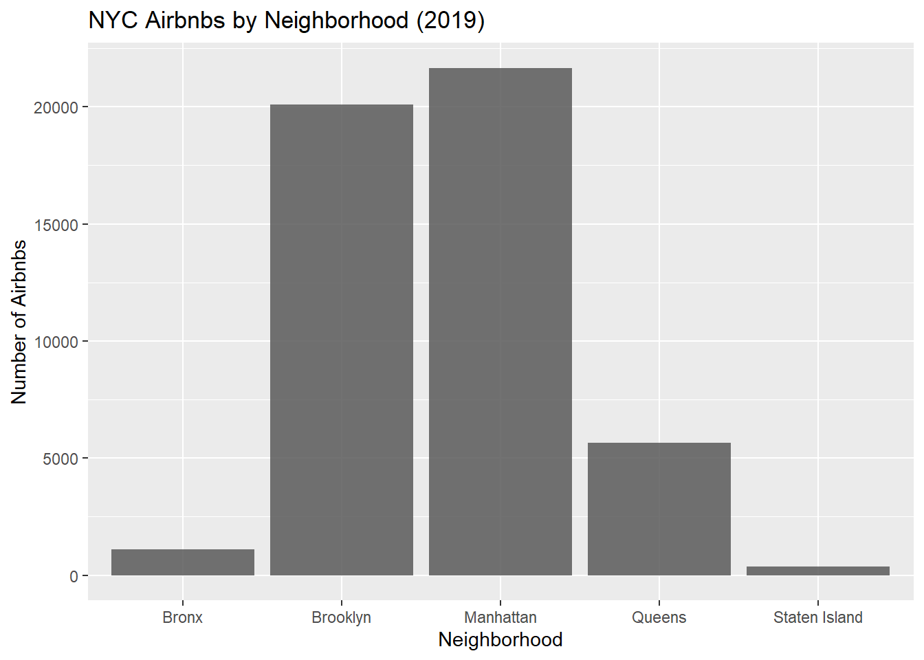
#First Histogram: Ignore this. Shows why I filtered the data before creating my edited histogram #Second Histogram: Here, I excluded prices of 0 dollars and over 1000. Surprisingly there were 11 listings with a cost=0. After a quick google I learned that Airbnb listers may set their price to 0 when renting to family/friends instead of marking it as unavailable. I figured it made sense to exclude this data from the histogram. The max listing cost was 10,000 dollars which stretched out the distribution making it nearly impossible to visualize the data so this histogram uses the filtered data set #PieChart: I tried. Everywhere I looked up to help said pie charts are criticized anyway. Did not want to spend any more time on it. #Bar Graph: Generally better for visualizing distribution of categorical variables than pie chart. Also took 5 min compared to maybe an 1 hour trying to format pie chart (pie() is not a ggplot function)
Bivariate Visualization(s)
#First boxplot (with unfiltered data)
ggplot(AB_NYC_2019, aes(neighbourhood_group, price))+
  geom_boxplot()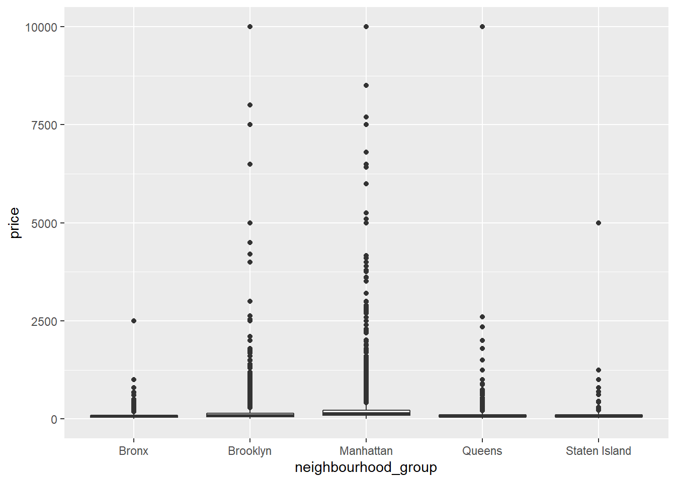
#Second boxplot (with filtered data)
ggplot(AB_NYC_2019_filter, aes(neighbourhood_group, price))+
  geom_boxplot()+
  labs(title="Cost of NYC Airbnbs by Neighborhood (2019)", x= "Neighborhood", y="Price ($)", caption="*Histogram excludes prices equal to $0 and greater than $1,000")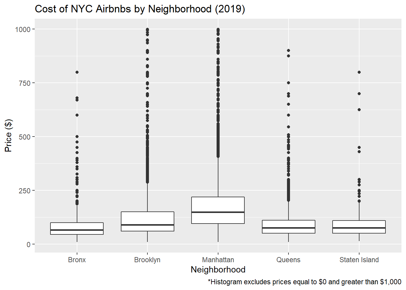
#Violin plot with filtered data
ggplot(AB_NYC_2019_filter, aes(room_type, price))+geom_violin()+
  labs(title="NYC Airbnb Price Based on Room Type (2019)*", x= "Room Type", y= "Price ($)", caption= "*Excludes listings where price is equal to $0 or greater than $1,000")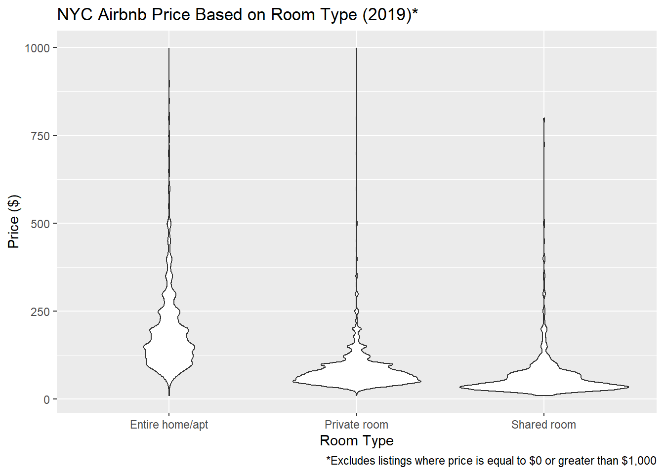
#First boxplot: Ignore this. Shows boxpplot distribution without filter. Not helpful. #Second boxplot: Gives us a better visual of the average price of Airbnbs by neighborhood. Brooklyn and Manhattan appear to have the most expensive Airbnbs including some costing 1000 or more. Bronx, Queens, and Staten Island Airbnbs don’t get quite as expensive. #Violin Plot Entire home/apt is on average most expensive (makes sense) but there is a lot of variability in the average. Interestingly, according to the chart, private rooms can cost 1000 dollars or more! I wonder what you get for that money. Shared rooms appear to have the lowest average price (also makes sense) and there seems to be a smaller IQR around the mean (if I am using that terminology correctly).