library(tidyverse)
library(ggplot2)

knitr::opts_chunk$set(echo = TRUE, warning=FALSE, message=FALSE)Challenge 5
challenge_5
australian_marriage
Introduction to Visualization
library(readr)
aus_marriage <- read_csv("_data/australian_marriage_tidy.csv")
print(aus_marriage)
# A tibble: 16 × 4
territory resp count percent
<chr> <chr> <dbl> <dbl>
1 New South Wales yes 2374362 57.8
2 New South Wales no 1736838 42.2
3 Victoria yes 2145629 64.9
4 Victoria no 1161098 35.1
5 Queensland yes 1487060 60.7
6 Queensland no 961015 39.3
7 South Australia yes 592528 62.5
8 South Australia no 356247 37.5
9 Western Australia yes 801575 63.7
10 Western Australia no 455924 36.3
11 Tasmania yes 191948 63.6
12 Tasmania no 109655 36.4
13 Northern Territory(b) yes 48686 60.6
14 Northern Territory(b) no 31690 39.4
15 Australian Capital Territory(c) yes 175459 74
16 Australian Capital Territory(c) no 61520 26 Briefly describe the data
Data set contains the results of the Australian Marriage Law Postal Survey (2017), designed to gauge support for legalizing same-sex marriage in Australia.
Tidy Data (as needed)
#simplify territory values
aus_marriage <- mutate(aus_marriage, territory = recode(territory, "New South Wales" = "NSW",
                                                                    "Victoria" = "Vic",
                                                                    "Queensland" = "Qld",
                                                                    "South Australia" = "SA",
                                                                    "Western Australia" = "WA",
                                                                    "Tasmania" = "Tas",
                                                                    "Northern Territory(b)" = "NT",
                                                                    "Australian Capital Territory(c)" = "ACT"))
aus_marriage
# A tibble: 16 × 4
territory resp count percent
<chr> <chr> <dbl> <dbl>
1 NSW yes 2374362 57.8
2 NSW no 1736838 42.2
3 Vic yes 2145629 64.9
4 Vic no 1161098 35.1
5 Qld yes 1487060 60.7
6 Qld no 961015 39.3
7 SA yes 592528 62.5
8 SA no 356247 37.5
9 WA yes 801575 63.7
10 WA no 455924 36.3
11 Tas yes 191948 63.6
12 Tas no 109655 36.4
13 NT yes 48686 60.6
14 NT no 31690 39.4
15 ACT yes 175459 74
16 ACT no 61520 26 Univariate Visualizations
The simplest univariate vizualization for this data set seems to be a bar graph. I decided to display the number of “yes” votes for each territory.
#top 10 territories voting "yes"
yes_vote <- aus_marriage %>% filter(resp == "yes")
ggplot(yes_vote, aes(x = reorder(territory, -count), y = count))+
  geom_bar(stat = "identity")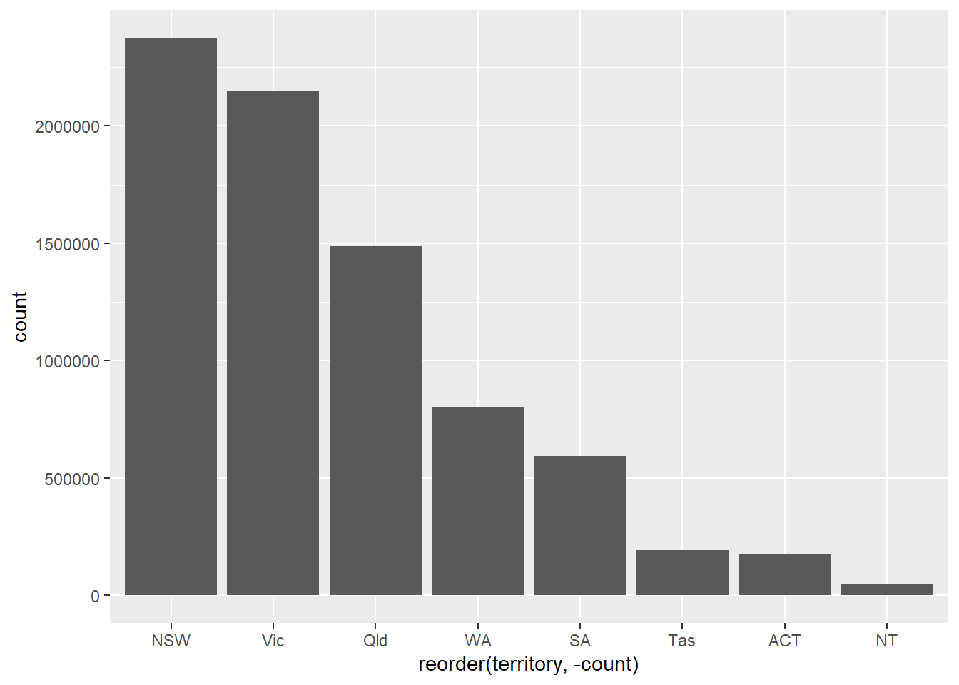
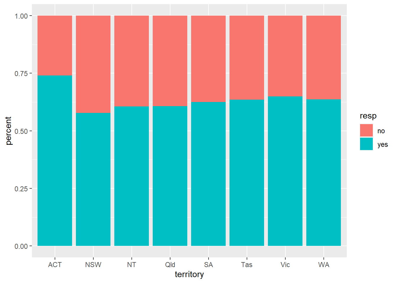
Bivariate Visualization(s)
For the bivariate visualization, I chose a stacked bar chart to show the proportion of yes to no votes in each territory.
#Stacked Bar Chart
ggplot(aus_marriage, aes(fill=resp, y=percent, x=territory)) +
  geom_bar(position = "fill", stat = "identity")