library(tidyverse)
library(ggplot2)

knitr::opts_chunk$set(echo = TRUE, warning=FALSE, message=FALSE)
Challenge 5 Will Munson
challenge_5
railroads
cereal
air_bnb
pathogen_cost
australian_marriage
public_schools
usa_hh
Introduction to Visualization
Challenge Overview
Today’s challenge is to:
- read in a data set, and describe the data set using both words and any supporting information (e.g., tables, etc)
- tidy data (as needed, including sanity checks)
- mutate variables as needed (including sanity checks)
- create at least two univariate visualizations
- try to make them “publication” ready
- Explain why you choose the specific graph type
- Create at least one bivariate visualization
- try to make them “publication” ready
- Explain why you choose the specific graph type
R Graph Gallery is a good starting point for thinking about what information is conveyed in standard graph types, and includes example R code.
(be sure to only include the category tags for the data you use!)
Read in data
Read in one (or more) of the following datasets, using the correct R package and command.
- cereal ⭐
- pathogen cost ⭐
- Australian Marriage ⭐⭐
- AB_NYC_2019.csv ⭐⭐⭐
- railroads ⭐⭐⭐
- Public School Characteristics ⭐⭐⭐⭐
- USA Households ⭐⭐⭐⭐⭐
Railroads <- read_csv("_data/railroad_2012_clean_county.csv", show_col_types = FALSE)Briefly describe the data
This dataset is based off of the number of railroad employees who work within each county of the United States. Surprisingly, the data looks incredibly tidy and might not need to be mutated. Tidy Data (as needed)
Is your data already tidy, or is there work to be done? Be sure to anticipate your end result to provide a sanity check, and document your work here.
I think the one thing that might be a little bit confusing here is the fact that the county names might correlate with multiple values.length(unique(Railroads$county))[1] 1709Railroads %>%
group_by(county) %>%
summarize(n = n())# A tibble: 1,709 × 2
county n
<chr> <int>
1 ABBEVILLE 1
2 ACADIA 1
3 ACCOMACK 1
4 ADA 1
5 ADAIR 4
6 ADAMS 12
7 ADDISON 1
8 AIKEN 1
9 AITKIN 1
10 ALACHUA 1
# … with 1,699 more rows
# ℹ Use `print(n = ...)` to see more rowsAre there any variables that require mutation to be usable in your analysis stream? For example, do you need to calculate new values in order to graph them? Can string values be represented numerically? Do you need to turn any variables into factors and reorder for ease of graphics and visualization?
Let's merge the state and county variables together. Document your work here.
Railroads <- Railroads %>%
  unite('State and County', county:state, remove = FALSE)
Univariate Visualizations
Railroads %>%
  group_by(state) %>%
  summarise(sum_emp = sum(total_employees)) %>%
  ggplot(aes(x = sum_emp)) +
  geom_histogram(bins = 20, alpha = 0.5, fill = "blue")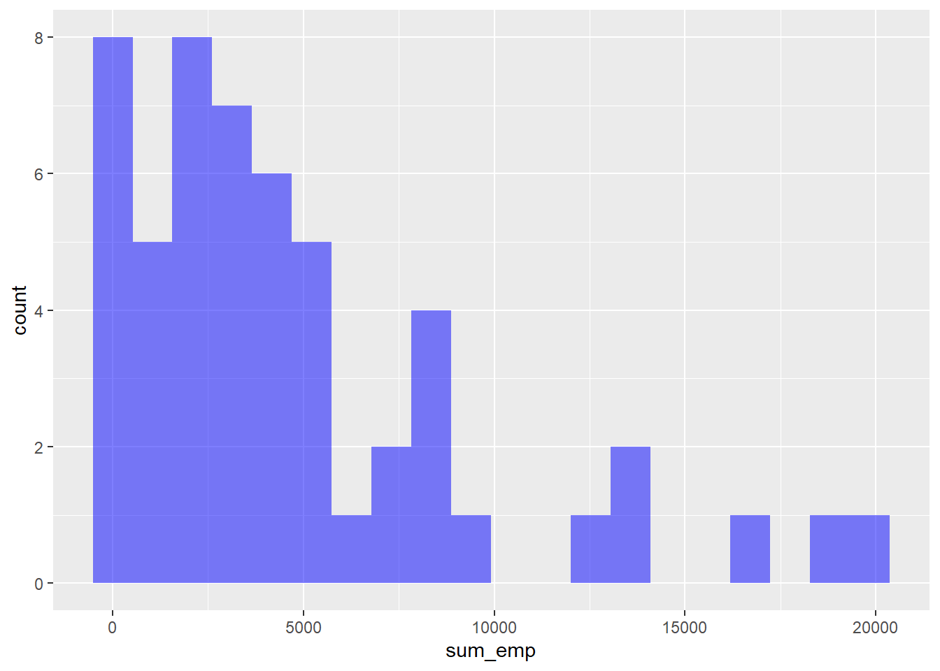
Bivariate Visualization(s)
Railroads %>%
  ggplot(aes(x = state, y = total_employees, fill = county)) +
  geom_bar(position = "fill")
Error in `f()`:
! stat_count() can only have an x or y aesthetic.
Any additional comments?
Apparently I'm having a little bit of trouble with the bivariate one. I'll get back to this later.