library(tidyverse)
library(ggplot2)
library(summarytools)

knitr::opts_chunk$set(echo = TRUE, warning=FALSE, message=FALSE)Challenge 5
challenge_5
railroads
boonstra
Introduction to Visualization
Read in data
rr_orig<-read_csv("_data/railroad_2012_clean_county.csv")

rr_orig
# A tibble: 2,930 × 3
state county total_employees
<chr> <chr> <dbl>
1 AE APO 2
2 AK ANCHORAGE 7
3 AK FAIRBANKS NORTH STAR 2
4 AK JUNEAU 3
5 AK MATANUSKA-SUSITNA 2
6 AK SITKA 1
7 AK SKAGWAY MUNICIPALITY 88
8 AL AUTAUGA 102
9 AL BALDWIN 143
10 AL BARBOUR 1
# … with 2,920 more rows
# ℹ Use `print(n = ...)` to see more rowsBriefly describe the data
This data set records railroad employment numbers in the U.S. (and certain overseas locations)
print(dfSummary(rr_orig, varnumbers = FALSE,
                        plain.ascii  = FALSE,
                        style        = "grid",
                        graph.magnif = 0.70,
                        valid.col    = FALSE),
      method = 'render',
      table.classes = 'table-condensed')
Data Frame Summary
rr_orig
Dimensions: 2930 x 3Duplicates: 0
| Variable | Stats / Values | Freqs (% of Valid) | Graph | Missing | |||||||||||||||||||||||||||||||||||||||||||||||||||||||
|---|---|---|---|---|---|---|---|---|---|---|---|---|---|---|---|---|---|---|---|---|---|---|---|---|---|---|---|---|---|---|---|---|---|---|---|---|---|---|---|---|---|---|---|---|---|---|---|---|---|---|---|---|---|---|---|---|---|---|---|
| state [character] |
|
|
 |
0 (0.0%) | |||||||||||||||||||||||||||||||||||||||||||||||||||||||
| county [character] |
|
|
 |
0 (0.0%) | |||||||||||||||||||||||||||||||||||||||||||||||||||||||
| total_employees [numeric] |
|
404 distinct values |  |
0 (0.0%) |
Generated by summarytools 1.0.1 (R version 4.2.1)
2022-08-28
One piece of information I was particularly curious about is how average employees per county compared across states:
rr_orig %>%
  group_by(state) %>%
  summarise(mean_emp=mean(total_employees,na.rm=T)) %>%
  arrange(desc(mean_emp)) %>%
  slice(1:10)
# A tibble: 10 × 2
state mean_emp
<chr> <dbl>
1 DE 498.
2 NJ 397.
3 CT 324
4 MA 282.
5 NY 280.
6 DC 279
7 CA 239.
8 AZ 210.
9 PA 196.
10 MD 196.The data show that Delaware has the highest number of average employees per county. This finding becomes even more interesting when investigating how many (or few) counties Delaware has:
rr_orig %>%
  filter(state=="DE")
# A tibble: 3 × 3
state county total_employees
<chr> <chr> <dbl>
1 DE KENT 158
2 DE NEW CASTLE 1275
3 DE SUSSEX 62Clearly, New Castle county does a lot to offset the mean, especially given that the state of Delaware only has three counties. However, this is not the highest employment in the country:
rr_orig %>%
  arrange(desc(total_employees)) %>%
  slice(1:10)
# A tibble: 10 × 3
state county total_employees
<chr> <chr> <dbl>
1 IL COOK 8207
2 TX TARRANT 4235
3 NE DOUGLAS 3797
4 NY SUFFOLK 3685
5 VA INDEPENDENT CITY 3249
6 FL DUVAL 3073
7 CA SAN BERNARDINO 2888
8 CA LOS ANGELES 2545
9 TX HARRIS 2535
10 NE LINCOLN 2289Perhaps unsurprisingly, Cook County, IL – home of a major transit center in Chicago – employs the most railroad workers of any county in the country. A bit more surprisingly, New Castle County’s 1,000+ employees are not actually enough for it to register in the top ten counties!
Tidy Data (as needed)
These data are already tidy!
Visualization
Using ggplot2, I was able to create a visualization overlaying a density function on top of a histogram of average number of employees per county, when grouped by state.
rr_orig %>%
  group_by(state) %>%
  summarise(mean_emp=mean(total_employees)) %>%
  ggplot(aes(x=mean_emp)) +
  geom_histogram(aes(y=..density..),bins=50,alpha=0.5,fill="red") +
  geom_density(fill="blue",alpha=0.2) +
  theme_bw() +
  labs(title="Average Number of Employees per County, by State",
       x="Number of Employees",
       y="Density")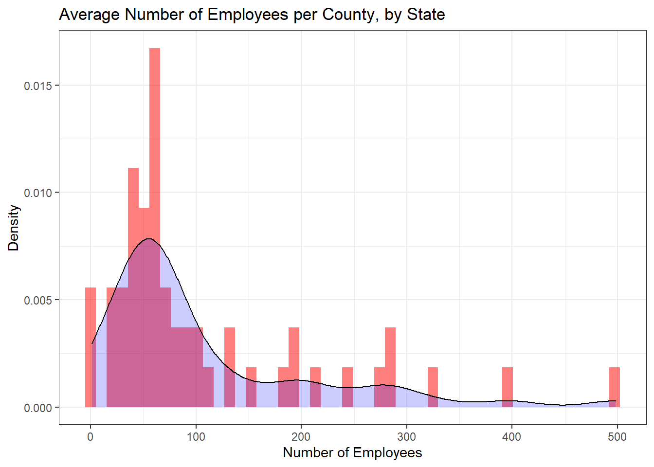
Because this data set only contains one value, I was not sure how I would create a bivariate visualization.