library(tidyverse)
library(ggplot2)
library(readxl)
library(skimr)
library(lubridate)
library(summarytools)

knitr::opts_chunk$set(echo = TRUE, warning=FALSE, message=FALSE)Challenge 6
challenge_6
debt
Visualizing Time and Relationships
Read in data
Reading in the ‘debt_in_trillions.xslx’ dataset.
debt <- read_excel("_data/debt_in_trillions.xlsx")Briefly describe the data
print(summarytools::dfSummary(debt, varnumbers = FALSE, plain.ascii = FALSE, graph.magnif = 0.50, style = "grid", valid.col = FALSE),
      method = 'render', table.classes = 'table-condensed')
Data Frame Summary
debt
Dimensions: 74 x 8Duplicates: 0
| Variable | Stats / Values | Freqs (% of Valid) | Graph | Missing | |||||||||||||||||||||||||||||||||||||||||||||||||||||||
|---|---|---|---|---|---|---|---|---|---|---|---|---|---|---|---|---|---|---|---|---|---|---|---|---|---|---|---|---|---|---|---|---|---|---|---|---|---|---|---|---|---|---|---|---|---|---|---|---|---|---|---|---|---|---|---|---|---|---|---|
| Year and Quarter [character] |
|
|
 |
0 (0.0%) | |||||||||||||||||||||||||||||||||||||||||||||||||||||||
| Mortgage [numeric] |
|
74 distinct values |  |
0 (0.0%) | |||||||||||||||||||||||||||||||||||||||||||||||||||||||
| HE Revolving [numeric] |
|
73 distinct values |  |
0 (0.0%) | |||||||||||||||||||||||||||||||||||||||||||||||||||||||
| Auto Loan [numeric] |
|
71 distinct values |  |
0 (0.0%) | |||||||||||||||||||||||||||||||||||||||||||||||||||||||
| Credit Card [numeric] |
|
69 distinct values |  |
0 (0.0%) | |||||||||||||||||||||||||||||||||||||||||||||||||||||||
| Student Loan [numeric] |
|
73 distinct values |  |
0 (0.0%) | |||||||||||||||||||||||||||||||||||||||||||||||||||||||
| Other [numeric] |
|
70 distinct values |  |
0 (0.0%) | |||||||||||||||||||||||||||||||||||||||||||||||||||||||
| Total [numeric] |
|
74 distinct values |  |
0 (0.0%) |
Generated by summarytools 1.0.1 (R version 4.2.1)
2022-08-28
This dataset gives us information on different loan amounts such as student loans, mortgage, and credit card through different years (2003-2021) and quarters. There are 74 rows and 8 columns, of which 1 is character type and 7 are numeric. There aren’t any missing values in the columns.
Tidy Data (as needed)
The ‘Year and Quarter’ column can be parsed into a date type column.
debt_final <-debt %>%
  mutate(date = parse_date_time(`Year and Quarter`,
                           orders="yq"))
Time Dependent Visualization
First, I want to look at how total debt varies with time.
ggplot(data=debt_final) +
  geom_line(aes(x=date, y=Total)) + labs(title = "Total debt increases with time", x = "Time", y = "Total Debt") + theme_minimal()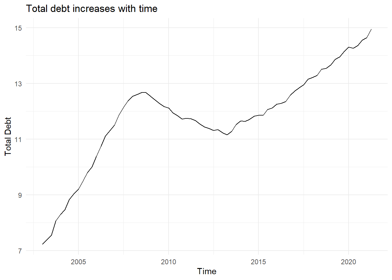
The graph shows a linear increase between 2003 to around 2007, with debt decreasing from 2007 to about 2014, and again increasing through 2021.
Now, looking specifically at how each loan type varies with time:
debt_long <- debt_final %>%
  pivot_longer(cols = Mortgage:Other, names_to = "loan_type", values_to = "totals") %>%
  select(-Total) %>% mutate(loan_type = as.factor(loan_type))

ggplot(debt_long, aes(x = date,y = log(totals),color = loan_type)) + geom_point() + facet_grid(rows = vars(loan_type)) + labs(title = "Debt Types over the Years", x = "Date", y = "Amount") + theme(strip.text = element_text(size = 6),
         panel.grid.minor = element_blank(), strip.background = element_blank())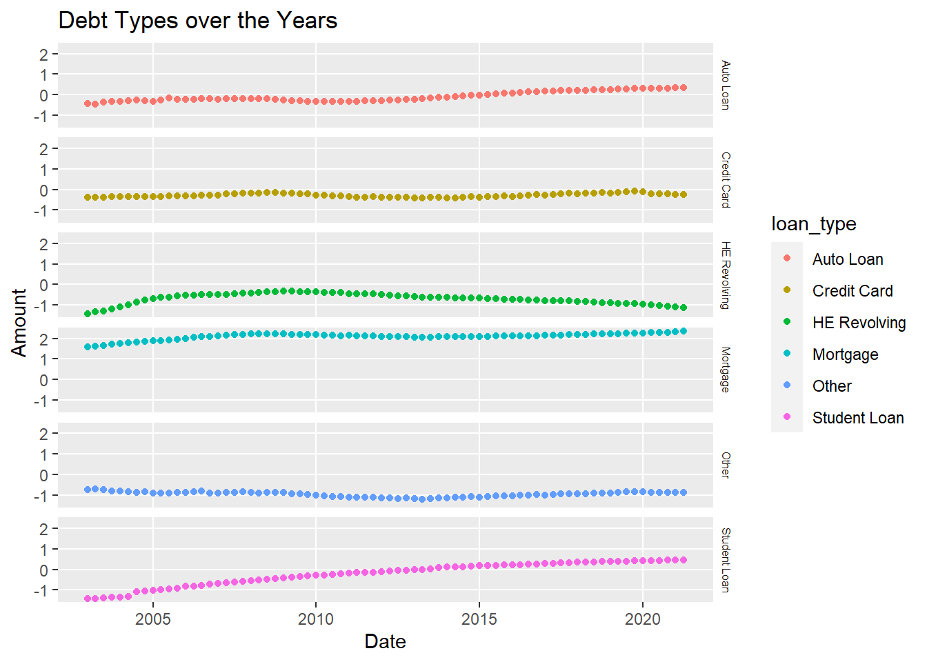
Mortgage in general is higher than any other loan type.
Visualizing Part-Whole Relationships
I want to visualize the proportion of each loan type as a whole using a pie chart.
debt_long %>%
  mutate(loan_type = fct_relevel(loan_type, "Mortgage", "HE Revolving",
                            "Auto Loan", "Student Loan",
                            "Credit Card","Other"))
# A tibble: 444 × 4
`Year and Quarter` date loan_type totals
<chr> <dttm> <fct> <dbl>
1 03:Q1 2003-01-01 00:00:00 Mortgage 4.94
2 03:Q1 2003-01-01 00:00:00 HE Revolving 0.242
3 03:Q1 2003-01-01 00:00:00 Auto Loan 0.641
4 03:Q1 2003-01-01 00:00:00 Credit Card 0.688
5 03:Q1 2003-01-01 00:00:00 Student Loan 0.241
6 03:Q1 2003-01-01 00:00:00 Other 0.478
7 03:Q2 2003-04-01 00:00:00 Mortgage 5.08
8 03:Q2 2003-04-01 00:00:00 HE Revolving 0.26
9 03:Q2 2003-04-01 00:00:00 Auto Loan 0.622
10 03:Q2 2003-04-01 00:00:00 Credit Card 0.693
# … with 434 more rows
# ℹ Use `print(n = ...)` to see more rowsdebt_grouped <- debt_long %>%
select(loan_type,totals) %>%
group_by(loan_type) %>%
summarize(loantotal = sum(totals)) %>%
mutate(perc = (loantotal/ sum(loantotal))*100)
ggplot(debt_grouped, aes(x="", y=perc, fill=loan_type)) +
geom_bar(stat="identity", width=1) +
coord_polar("y", start=0) + labs(title = "Proportion of Loan Types") + theme_void() + scale_fill_brewer(palette="Blues") + geom_text(aes(x = 1.6, label = paste0(round(perc), "%")), position = position_stack(vjust = 0.5))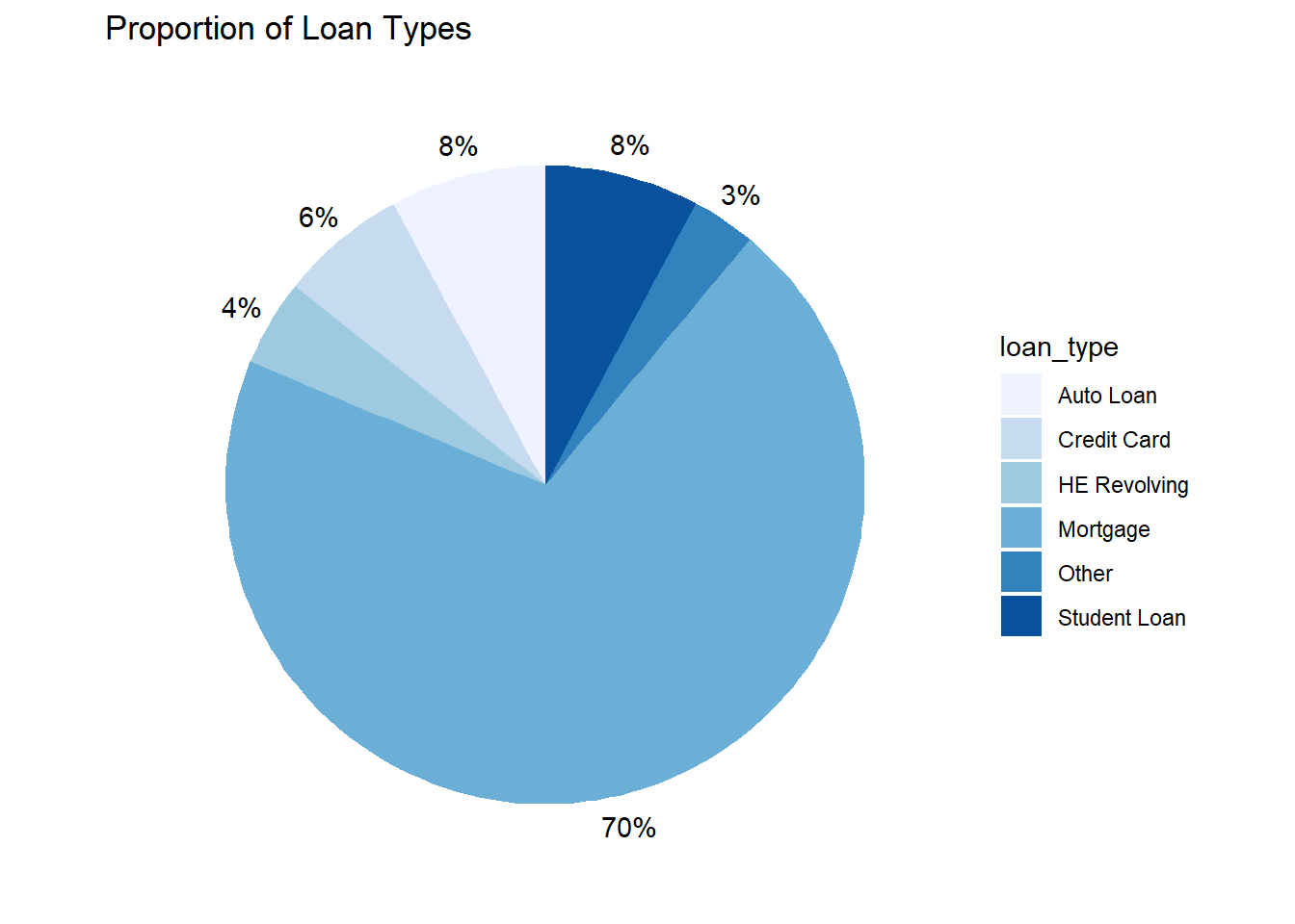
Mortgage takes up the most space proportionally.