library(tidyverse)
library(ggplot2)
library(lubridate)

knitr::opts_chunk$set(echo = TRUE, warning=FALSE, message=FALSE)Challenge 6
challenge_6
fed_rate
Visualizing Time and Relationships
Read in data
library(readr)
FedFundsRate <- read_csv("_data/FedFundsRate.csv")

FedFundsRate
# A tibble: 904 × 10
Year Month Day Federal F…¹ Feder…² Feder…³ Effec…⁴ Real …⁵ Unemp…⁶ Infla…⁷
<dbl> <dbl> <dbl> <dbl> <dbl> <dbl> <dbl> <dbl> <dbl> <dbl>
1 1954 7 1 NA NA NA 0.8 4.6 5.8 NA
2 1954 8 1 NA NA NA 1.22 NA 6 NA
3 1954 9 1 NA NA NA 1.06 NA 6.1 NA
4 1954 10 1 NA NA NA 0.85 8 5.7 NA
5 1954 11 1 NA NA NA 0.83 NA 5.3 NA
6 1954 12 1 NA NA NA 1.28 NA 5 NA
7 1955 1 1 NA NA NA 1.39 11.9 4.9 NA
8 1955 2 1 NA NA NA 1.29 NA 4.7 NA
9 1955 3 1 NA NA NA 1.35 NA 4.6 NA
10 1955 4 1 NA NA NA 1.43 6.7 4.7 NA
# … with 894 more rows, and abbreviated variable names
# ¹`Federal Funds Target Rate`, ²`Federal Funds Upper Target`,
# ³`Federal Funds Lower Target`, ⁴`Effective Federal Funds Rate`,
# ⁵`Real GDP (Percent Change)`, ⁶`Unemployment Rate`, ⁷`Inflation Rate`
# ℹ Use `print(n = ...)` to see more rowsBriefly describe the data
Tidy Data (as needed)
First I will rename the columns and add a new date column.
#rename columns
FedFundsRate <- rename(FedFundsRate,
                       "Target Rate" = "Federal Funds Target Rate",
                       "Upper Target" = "Federal Funds Upper Target",
                       "Lower Target" = "Federal Funds Lower Target",
                       "Effective Rate" = "Effective Federal Funds Rate",
                       "Real GDP Δ" = "Real GDP (Percent Change)",
                       "Unemployment" = "Unemployment Rate",
                       "Inflation" = "Inflation Rate")

#mutate to create a new date column
fed_rates_tidy <- FedFundsRate%>%
  mutate(Date = str_c(Year, Month, Day, sep = "-"),
         Date = ymd(Date))

#remove excess date columns
fed_rates_tidy <- fed_rates_tidy%>%
  select(-Year, -Month, -Day)

#move new date column to the front
fed_rates_tidy <- fed_rates_tidy%>%
  relocate(Date)

fed_rates_tidy
# A tibble: 904 × 8
Date `Target Rate` Upper Targ…¹ Lower…² Effec…³ Real …⁴ Unemp…⁵ Infla…⁶
<date> <dbl> <dbl> <dbl> <dbl> <dbl> <dbl> <dbl>
1 1954-07-01 NA NA NA 0.8 4.6 5.8 NA
2 1954-08-01 NA NA NA 1.22 NA 6 NA
3 1954-09-01 NA NA NA 1.06 NA 6.1 NA
4 1954-10-01 NA NA NA 0.85 8 5.7 NA
5 1954-11-01 NA NA NA 0.83 NA 5.3 NA
6 1954-12-01 NA NA NA 1.28 NA 5 NA
7 1955-01-01 NA NA NA 1.39 11.9 4.9 NA
8 1955-02-01 NA NA NA 1.29 NA 4.7 NA
9 1955-03-01 NA NA NA 1.35 NA 4.6 NA
10 1955-04-01 NA NA NA 1.43 6.7 4.7 NA
# … with 894 more rows, and abbreviated variable names ¹`Upper Target`,
# ²`Lower Target`, ³`Effective Rate`, ⁴`Real GDP Δ`, ⁵Unemployment,
# ⁶Inflation
# ℹ Use `print(n = ...)` to see more rowsTime Dependent Visualization
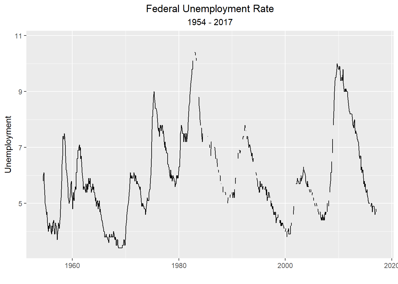
Plotting unemployment and inflation over time. I chose a line chart because I felt it most accurately displays change over time.
ggplot(fed_rates_tidy, aes(x=Date, y=Unemployment, group = 1))+
  geom_line()+
  xlab("")+
  ggtitle("Federal Unemployment Rate",
          subtitle = "1954 - 2017")+
  theme(plot.title = element_text(hjust = 0.5),
        plot.subtitle = element_text(hjust = 0.5))