library(tidyverse)
library(ggplot2)

knitr::opts_chunk$set(echo = TRUE, warning=FALSE, message=FALSE)
Challenge 6
challenge_6
air_bnb
Visualizing Time and Relationships
Challenge Overview
Today’s challenge is to:
- read in a data set, and describe the data set using both words and any supporting information (e.g., tables, etc)
- tidy data (as needed, including sanity checks)
- mutate variables as needed (including sanity checks)
- create at least one graph including time (evolution)
- try to make them “publication” ready (optional)
- Explain why you choose the specific graph type
- Create at least one graph depicting part-whole or flow relationships
- try to make them “publication” ready (optional)
- Explain why you choose the specific graph type
Read in data
air_bnb = read_csv("_data/AB_NYC_2019.csv", show_col_types = FALSE)Briefly describe the data
This is a dataset containing information about Airbnb listings in New York City. The variables include id and name of the listing, id and name of the host, neighborhood (including neighborhood group), latitude and longitude, room type, price, the minimum number of nights someone must book, number of reviews, last review date, reviews per month, the calculated count of host listings, and the availability (number out of 365/a year). Each row is a different listing.
#Replace in future with summarytools::dfSummary
summary(air_bnb)
id name host_id host_name
Min. : 2539 Length:48895 Min. : 2438 Length:48895
1st Qu.: 9471945 Class :character 1st Qu.: 7822033 Class :character
Median :19677284 Mode :character Median : 30793816 Mode :character
Mean :19017143 Mean : 67620011
3rd Qu.:29152178 3rd Qu.:107434423
Max. :36487245 Max. :274321313
neighbourhood_group neighbourhood latitude longitude
Length:48895 Length:48895 Min. :40.50 Min. :-74.24
Class :character Class :character 1st Qu.:40.69 1st Qu.:-73.98
Mode :character Mode :character Median :40.72 Median :-73.96
Mean :40.73 Mean :-73.95
3rd Qu.:40.76 3rd Qu.:-73.94
Max. :40.91 Max. :-73.71
room_type price minimum_nights number_of_reviews
Length:48895 Min. : 0.0 Min. : 1.00 Min. : 0.00
Class :character 1st Qu.: 69.0 1st Qu.: 1.00 1st Qu.: 1.00
Mode :character Median : 106.0 Median : 3.00 Median : 5.00
Mean : 152.7 Mean : 7.03 Mean : 23.27
3rd Qu.: 175.0 3rd Qu.: 5.00 3rd Qu.: 24.00
Max. :10000.0 Max. :1250.00 Max. :629.00
last_review reviews_per_month calculated_host_listings_count
Min. :2011-03-28 Min. : 0.010 Min. : 1.000
1st Qu.:2018-07-08 1st Qu.: 0.190 1st Qu.: 1.000
Median :2019-05-19 Median : 0.720 Median : 1.000
Mean :2018-10-04 Mean : 1.373 Mean : 7.144
3rd Qu.:2019-06-23 3rd Qu.: 2.020 3rd Qu.: 2.000
Max. :2019-07-08 Max. :58.500 Max. :327.000
NA's :10052 NA's :10052
availability_365
Min. : 0.0
1st Qu.: 0.0
Median : 45.0
Mean :112.8
3rd Qu.:227.0
Max. :365.0
Tidy Data
The dataset seems to be pretty tidy already, I won’t make any changes for now.
Time Dependent Visualizations
This first graph is a density graph which is good for looking at a time variable. This is a visualization of last_review, where there are 3 graphs (one for each room type). While each one isn’t too different, there are some small differences for example the peak density value highest point for entire home/apt is greater than the peak for the other two room types.
ggplot(air_bnb, aes(x = last_review, fill = room_type)) +
  geom_density(alpha = 0.2) +
  labs(title = "Last Review Date for Airbnb Listings by Room Type",
     x = "Date of Last Review", y = "Density", fill = guide_legend("Room Type")) +
  theme_bw() +
  facet_wrap(~ room_type, ncol = 2)
This next graph is also a density graph, since I am still looking at a time variable. This is a visualization of last_review, where there are 5 graphs (one for each neighborhood type). Similar to the last visualization, there are some small differences between each, like the shape and the highest density value reached (for example Staten Island reaches the highest point of almost 0.020, but Manhattan’s highest density point is only 0.005).
ggplot(air_bnb, aes(x = last_review, fill = neighbourhood_group)) +
  geom_density(alpha = 0.2) +
  labs(title = "Last Review Date for Airbnb Listings by Neighborhood Group",
     x = "Date of Last Review", y = "Density",
     fill = guide_legend("Neighborhood Group")) +
  theme_bw() +
  scale_x_date(limits = as.Date(c("2015-01-01","2019-07-08"))) +
  facet_wrap(~ neighbourhood_group, nrow = 3)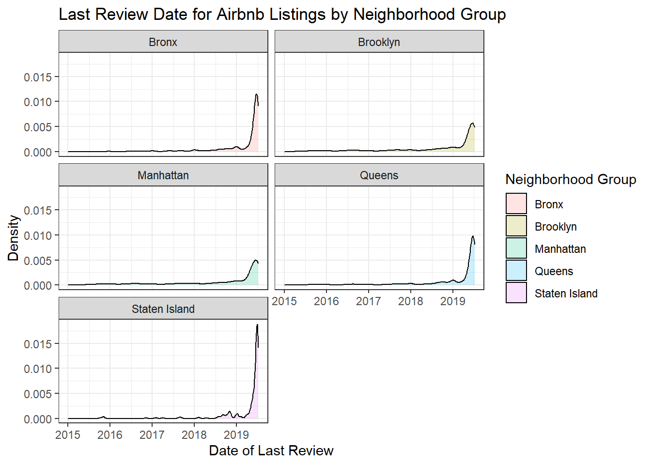
Visualizing Part-Whole Relationships
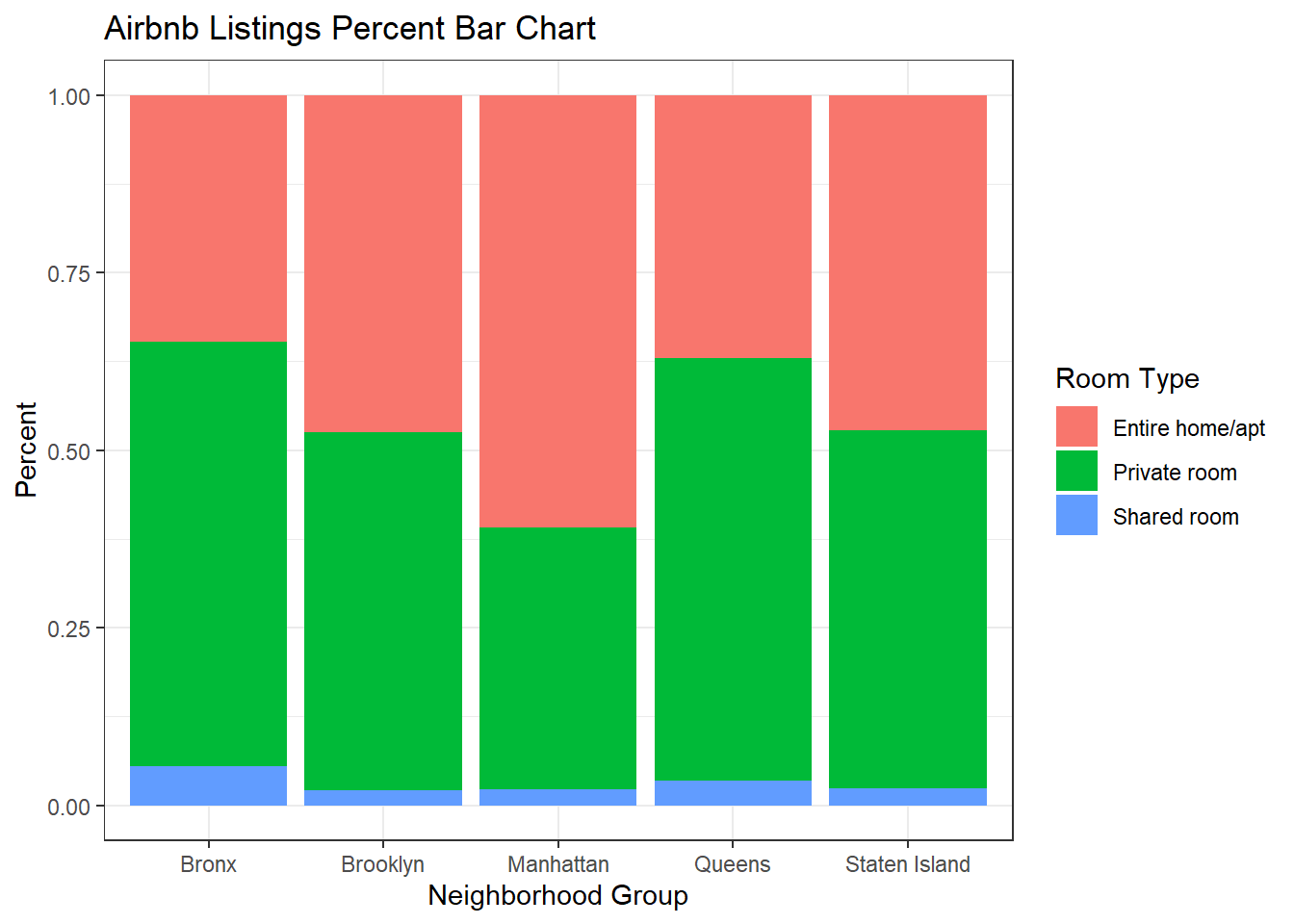
I wanted to show similar plots for the same variables. I thought it would be interesting to display some of the available options to see how they are similar and differ. I think the grouped bar chart and the percent bar chart are the most clear and useful for determining proportions and totals. The stacked bar chart is just a little harder to read and determine the proportions without looking closely at the numbers.
ggplot(air_bnb, aes(x = neighbourhood_group, fill = room_type)) +
  geom_bar(position = "dodge") +
  labs(title = "Airbnb Listings Grouped Bar Chart", x = "Neighborhood Group",
     y = "Frequency", fill = guide_legend("Room Type")) +
  theme_bw()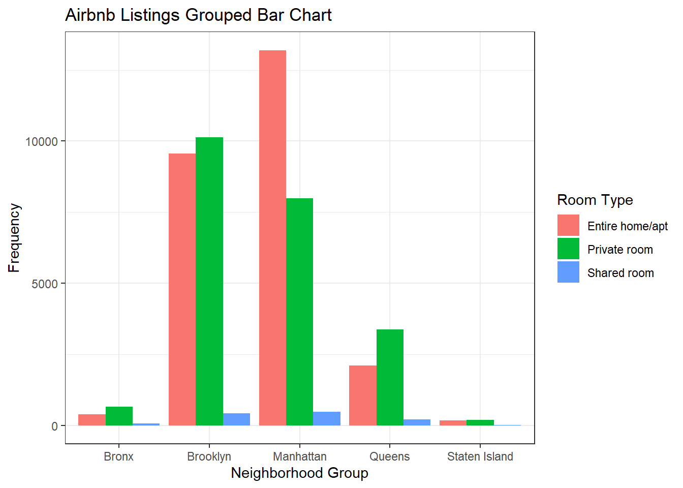
ggplot(air_bnb, aes(x = neighbourhood_group, fill = room_type)) +
  geom_bar(position = "stack") +
  labs(title = "Airbnb Listings Stacked Bar Chart", x = "Neighborhood Group",
     y = "Frequency ", fill = guide_legend("Room Type")) +
  theme_bw()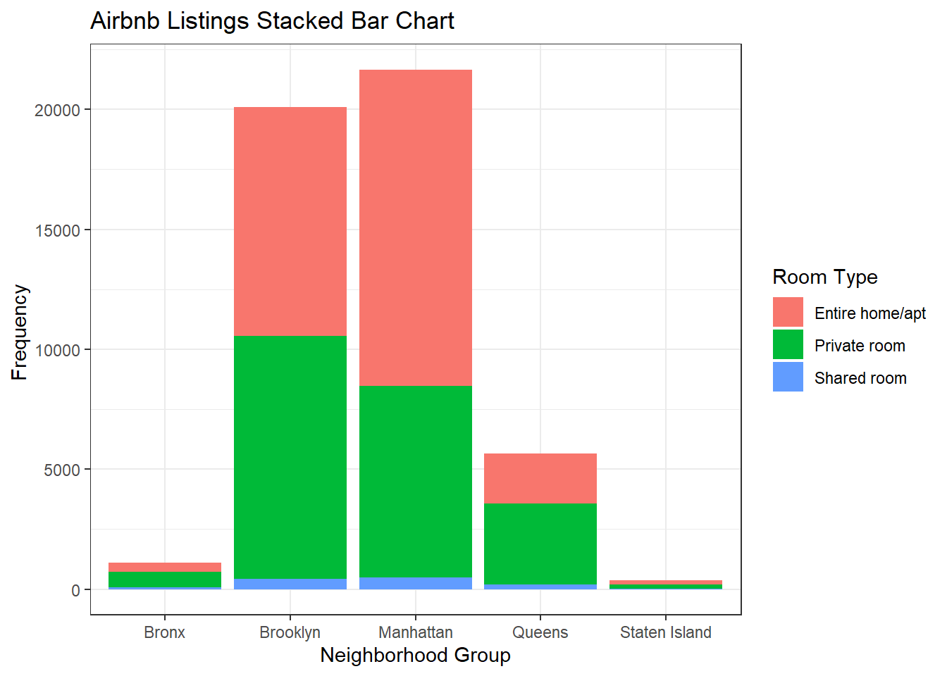
ggplot(air_bnb, aes(x = neighbourhood_group, fill = room_type)) +
  geom_bar(position = "fill") +
  labs(title = "Airbnb Listings Percent Bar Chart", x = "Neighborhood Group",
     y = "Percent", fill = guide_legend("Room Type")) +
  theme_bw()