library(tidyverse)
library(ggplot2)
library(dplyr)
library(hrbrthemes)
Error in library(hrbrthemes): there is no package called 'hrbrthemes'knitr::opts_chunk$set(echo = TRUE, warning=FALSE, message=FALSE)library(tidyverse)
library(ggplot2)
library(dplyr)
library(hrbrthemes)Error in library(hrbrthemes): there is no package called 'hrbrthemes'knitr::opts_chunk$set(echo = TRUE, warning=FALSE, message=FALSE)fedfundrate <- read_csv("_data/FedFundsRate.csv",
show_col_types = FALSE, col_names = c("Year", "Month", "Day", "federal_funds_target_rate", "federal_funds_upper_target", "federal_funds_lower_target", "effective_federal_funds_rate", "real_GDP_percent_change", "unemployment_rate", "inflation_rate"),
skip=1
)
fedfundrateThis data has been collected monthly since July 1st of 1954 and ended on march 16, 2017. There is a year-month-day combination that looks at 4 different Federal Funds Rates, while the other variables are indicators that effect the federal fund rate (inflation, unemployment and GDP changes). ## Tidy Data (as needed)
ffr_long <- fedfundrate %>%
  pivot_longer(cols = c( "federal_funds_target_rate", "federal_funds_upper_target", "federal_funds_lower_target", "effective_federal_funds_rate", "real_GDP_percent_change", "unemployment_rate", "inflation_rate"),
               names_to = "ffr_type",
               values_to = "value",
               values_drop_na = TRUE)
ffr_longggplot(data = ffr_long) +
geom_line(aes( x = Year, y = value, color = ffr_type)) +
theme_ipsum()Error in theme_ipsum(): could not find function "theme_ipsum"On the x-axis I put year and the y axis I put value so that the output would be the various types of federal fund type and other values that affect the federal fund like inflation, unemployment and GDP percent change. Though it is a little hard to read I thought a line chart is the easiest visual to see what is happening in the data set.
This graph shows great deal of fluctuation from 1954 through 2017, and makes it hard to read. I wanted to create a second graph that highlighted certain data points in order for it to be easier to read. I used the function mutate() to highlight specific outputs. I thought it would be interesting to highlight two outputs in order to better understand the relationship. However, I had a hard time highlighting more than one line.
ffr_long %>%
mutate( highlight = ifelse(ffr_type == "unemployment_rate", "unemployment_rate", "other")) %>%
ggplot( aes( x = Year, y = value, color = highlight, size = highlight)) +
geom_line() +
scale_color_manual(values = c("lightgrey", "#69b3a2")) +
scale_size_manual( values = c( 1.0, 0.5)) +
theme(legend.position = "none") +
ggtitle( "Different Federal Fund Types through 1954- 2017") +
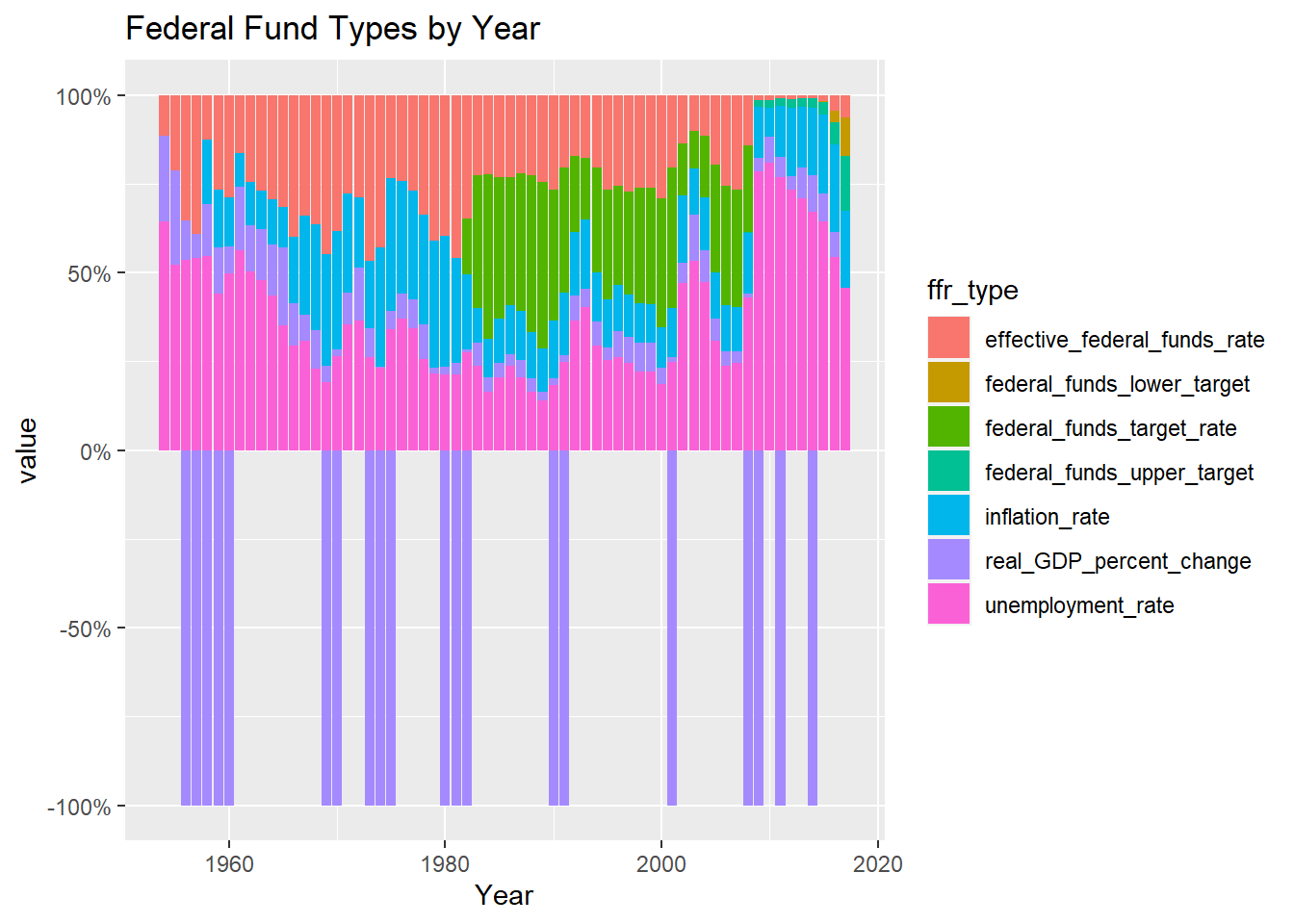
theme_ipsum()Error in theme_ipsum(): could not find function "theme_ipsum"ffr_long %>% ggplot(aes(fill = ffr_type, y = value, x = Year)) +
geom_bar( position = "fill", stat = "identity") +
labs( title = "Federal Fund Types by Year",
x = "Year",
y = "value") +
scale_y_continuous( labels = scales::percent)