Generated by summarytools 1.0.1 (R version 4.2.1) 2022-08-28
Briefly describe the data
After reading in the data I can tell I am dealing with NYC Air BnB data from 2019. To Tidy the data, I removed the id columns and rows with a value of 0 in them for number_of_reviews. The reason for this is that number_of_reivews will be a focal point of the analysis for this dataset. I want to compare number of reviews with other variables to see if reviews have any effect whether it is the independent or dependent variable. By looking at the summary table I could also investigate the number of reviews for each neighborhood_group and neighborhood. I will also be looking into the date-time variable to see if the other values change in comparison to it.
Time Dependent Visualization
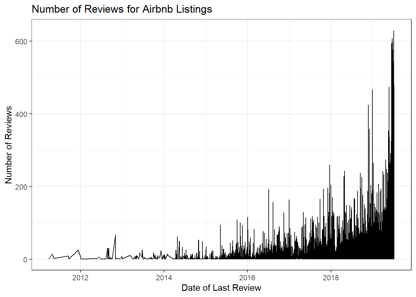
ggplot(AB, aes(x = last_review, y = number_of_reviews)) +geom_line() +labs(title ="Number of Reviews for Airbnb Listings", x ="Date of Last Review", y ="Number of Reviews") +theme_bw()
Here my graph shows the number of reviews over the dat of last review of all data instances. I can conclude from the graph that if the date of last review is closer to the present then it is more likely that it has more reviews than other data instances.
Visualizing Part-Whole Relationships
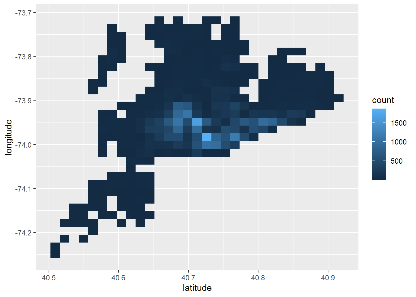
ggplot(AB) +geom_bin2d(mapping =aes(x = latitude, y = longitude))
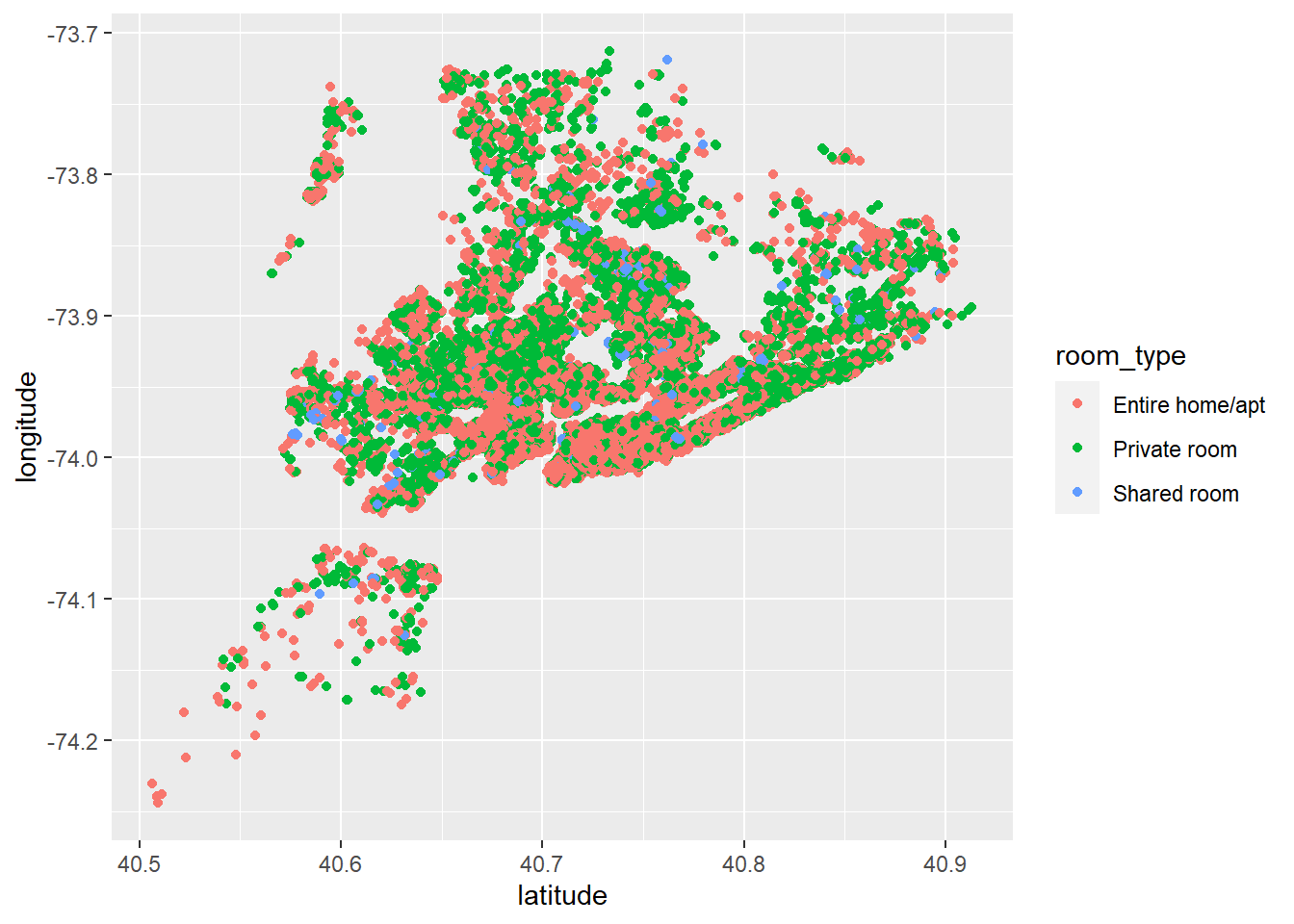
ggplot(AB) +geom_point(mapping =aes(x = latitude, y = longitude, color = room_type))
Here I have two graphs that both represent that latitude and longitude of each location. The first graph shows the density of the locations of the air BnBs. I can see that most of the Air Bnb locations are clustered around 40.7 latitude. The second graph shows within those densities which room type is most common. I can conclude that as longitude increases, the type of room becomes dominated by Private room. This could mean that as we move up north there should be more Private rooms.
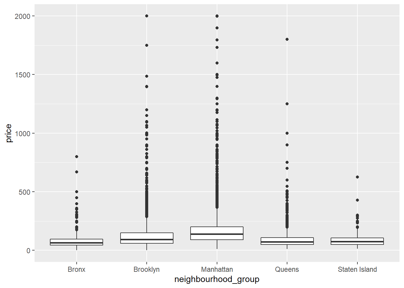
Here I created a boxplot for each neighborhood group and compared them with prices. I lowered the scale to 2000 so that the plot was more legible. Based on these plots I can conclude that Manhattan has the highest prices and most outliers. This can be a result of high end properties for rent.
Source Code
---title: "Challenge 6 "author: "Nayan Jani"description: "Visualizing Time and Relationships"date: "08/23/2022"format: html: df-print: paged toc: true code-copy: true code-tools: truecategories: - challenge_6 - air_bnb---```{r}#| label: setup#| warning: false#| message: falselibrary(tidyverse)library(ggplot2)library(summarytools)knitr::opts_chunk$set(echo =TRUE, warning=FALSE, message=FALSE)``````{r}AB <-read_csv("_data/AB_NYC_2019.csv", col_names =c("del", "name", "del", "host_name","neighbourhood_group", "neighbourhood", "latitude", "longitude", "room_type", "price", "minimum_nights", "number_of_reviews", "last_review", "reviews_per_month", "calculated_host_listings_count", "availability_365" ), skip=1) %>%select(!starts_with("del")) %>%drop_na(reviews_per_month)ABprint(dfSummary(AB, varnumbers =FALSE,plain.ascii =FALSE, style ="grid", graph.magnif =0.70, valid.col =FALSE),method ='render',table.classes ='table-condensed')```### Briefly describe the dataAfter reading in the data I can tell I am dealing with NYC Air BnB data from 2019. To Tidy the data, I removed the id columns and rows with a value of 0 in them for number_of_reviews. The reason for this is that number_of_reivews will be a focal point of the analysis for this dataset. I want to compare number of reviews with other variables to see if reviews have any effect whether it is the independent or dependent variable. By looking at the summary table I could also investigate the number of reviews for each neighborhood_group and neighborhood. I will also be looking into the date-time variable to see if the other values change in comparison to it.## Time Dependent Visualization```{r}ggplot(AB, aes(x = last_review, y = number_of_reviews)) +geom_line() +labs(title ="Number of Reviews for Airbnb Listings", x ="Date of Last Review", y ="Number of Reviews") +theme_bw()```Here my graph shows the number of reviews over the dat of last review of all data instances. I can conclude from the graph that if the date of last review is closer to the present then it is more likely that it has more reviews than other data instances. ## Visualizing Part-Whole Relationships```{r}ggplot(AB) +geom_bin2d(mapping =aes(x = latitude, y = longitude))ggplot(AB) +geom_point(mapping =aes(x = latitude, y = longitude, color = room_type))```Here I have two graphs that both represent that latitude and longitude of each location. The first graph shows the density of the locations of the air BnBs. I can see that most of the Air Bnb locations are clustered around 40.7 latitude. The second graph shows within those densities which room type is most common. I can conclude that as longitude increases, the type of room becomes dominated by Private room. This could mean that as we move up north there should be more Private rooms.```{r}ggplot(AB, mapping =aes(x = neighbourhood_group, y = price)) +geom_boxplot() +ylim(0, 2000)```Here I created a boxplot for each neighborhood group and compared them with prices. I lowered the scale to 2000 so that the plot was more legible. Based on these plots I can conclude that Manhattan has the highest prices and most outliers. This can be a result of high end properties for rent.