library(tidyverse)
library(ggplot2)
library(readxl)
library(lubridate)

source("umass_colors.R")
knitr::opts_chunk$set(echo = TRUE, warning=FALSE, message=FALSE)
Challenge 6 Solutions
challenge_6
hotel_bookings
air_bnb
fed_rate
debt
usa_hh
abc_poll
Visualizing Time and Relationships
Challenge Overview
Today’s challenge is to:
- create at least one graph including time (evolution)
- try to make them “publication” ready (optional)
- Explain why you choose the specific graph type
- Create at least one graph depicting part-whole or flow relationships
- try to make them “publication” ready (optional)
- Explain why you choose the specific graph type
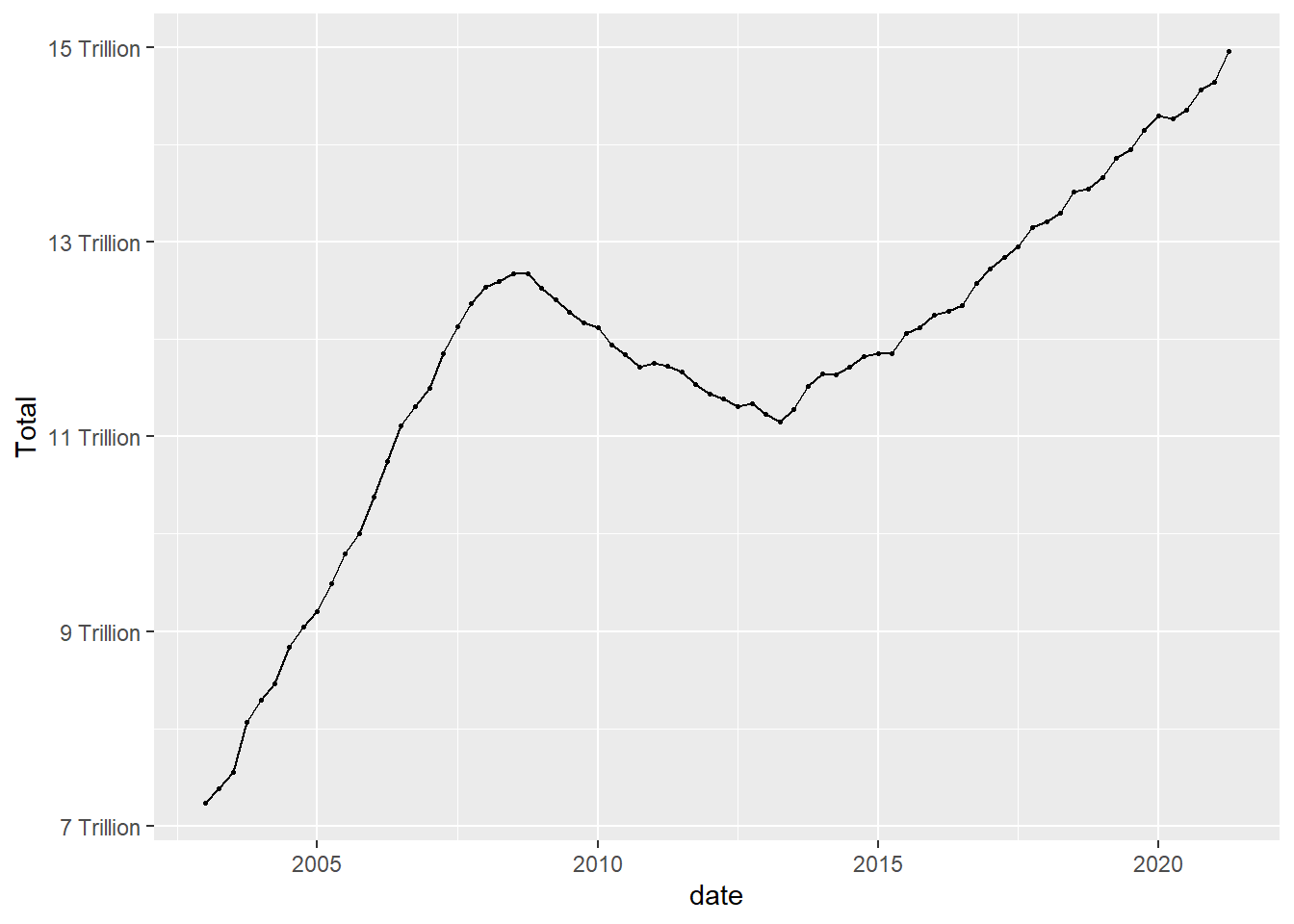
This data set runs from the first quarter of 2003 to the second quarter of 2021, and includes quarterly measures of the total amount of household debt associated with 6 different types of loans - mortgage,HE revolving, auto, credit card, student, and other - plus a total household debt including all 6 loan types. This is another fantastic macroeconomic data product from the New York Federal Reserve. See Challenge 4.
debt_orig<-read_excel("_data/debt_in_trillions.xlsx")
debt<-debt_orig%>%
  mutate(date = parse_date_time(`Year and Quarter`,
                           orders="yq"))
Time Dependent Visualization
Lets look at how debt changes over time.
ggplot(debt, aes(x=date, y=Total)) +
  geom_point()
ggplot(debt, aes(x=date, y=Total)) +
  geom_point(size=.5) +
  geom_line()+
  scale_y_continuous(labels = scales::label_number(suffix = " Trillion"))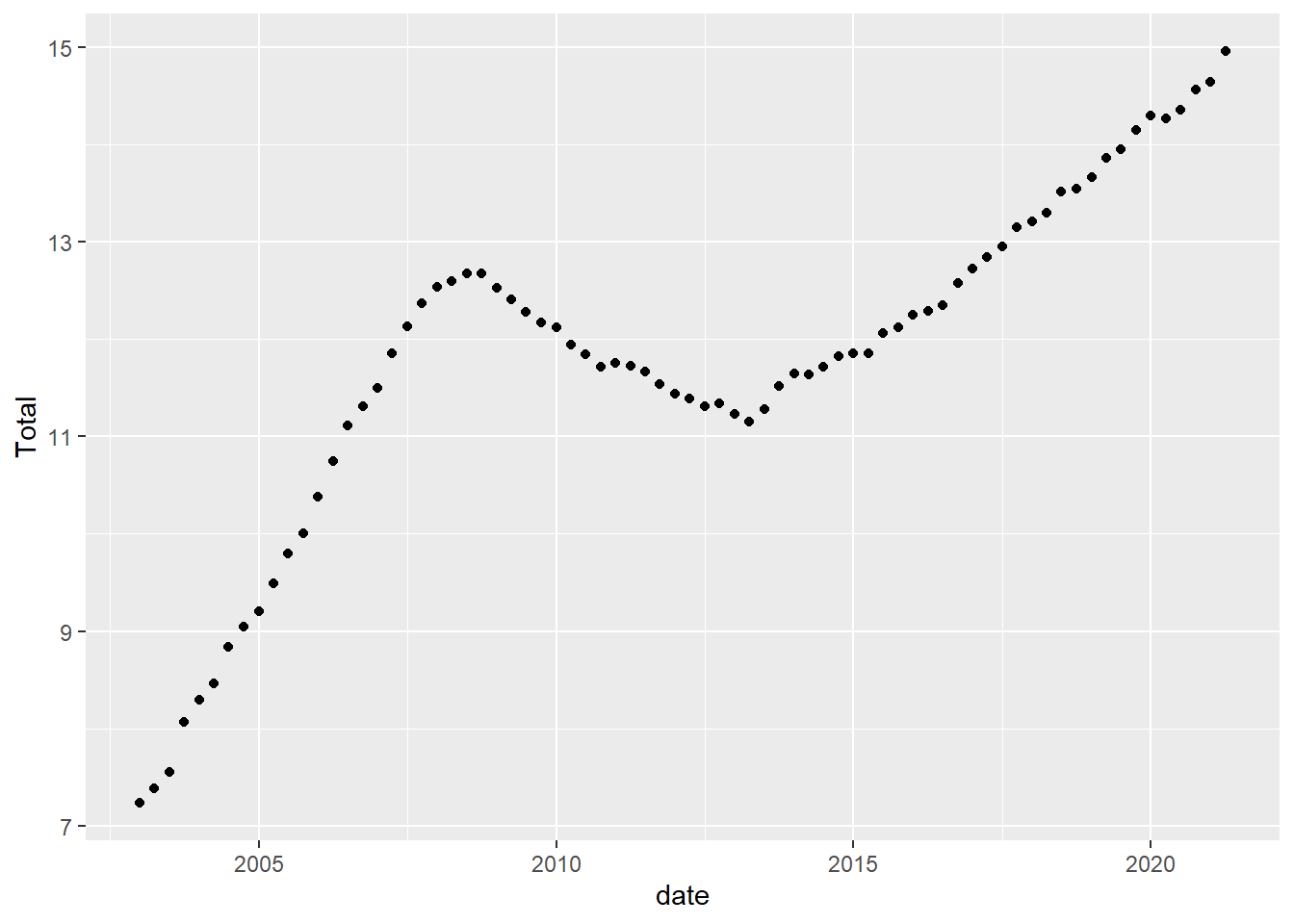
Visualizing Part-Whole Relationships
One thing to note is that it isn’t easy to include multiple lines on a single graph, that is because our data are not pivoted. Here is an example of how pivoting into tidy format makes things super easy.
umass_palette<-c("red", "green", "dark blue", "light blue", "orange",
                 "yellow")%>%
                   map(., get_umass_color)%>%
                   unlist(.)

debt_long<-debt%>%
  pivot_longer(cols = Mortgage:Other,
               names_to = "Loan",
               values_to = "total")%>%
  select(-Total)%>%
  mutate(Loan = as.factor(Loan))

ggplot(debt_long, aes(x=date, y=total, color=Loan)) +
  geom_point(size=.5) +
  geom_line() +
  theme(legend.position = "right") +
  scale_y_continuous(labels = scales::label_number(suffix = " Trillion")) +
  scale_colour_manual(values=umass_palette)
ggplot(debt_long, aes(x=date, y=total, fill=Loan)) +
  geom_bar(position="stack", stat="identity") +
  scale_y_continuous(labels = scales::label_number(suffix = " Trillion"))+
  theme(legend.position = "top") +
  guides(fill = guide_legend(nrow = 1)) +
  scale_fill_manual(labels =
                      str_replace(levels(debt_long$Loan), " ", "\n"),
                      values=umass_palette)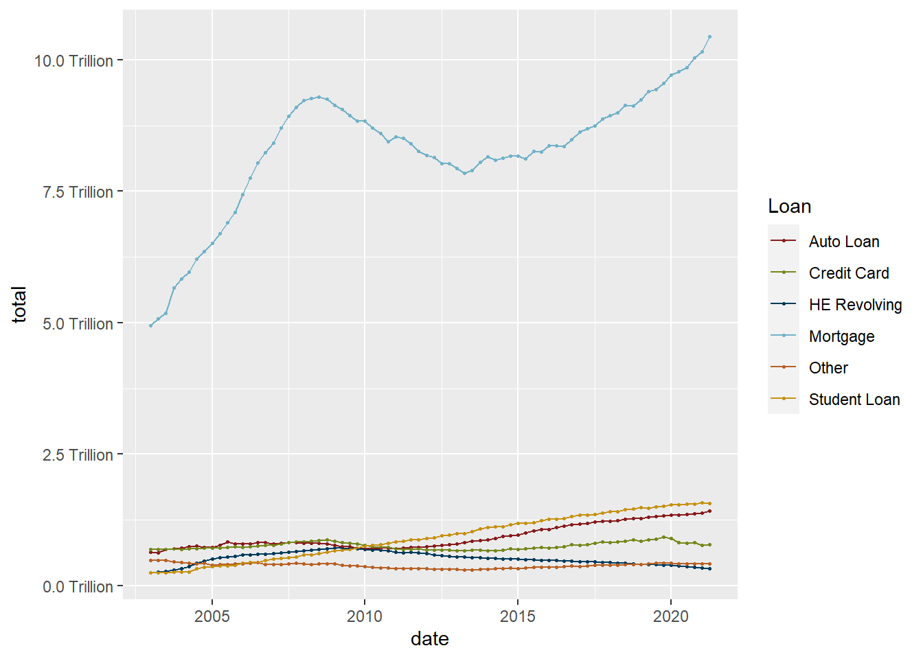
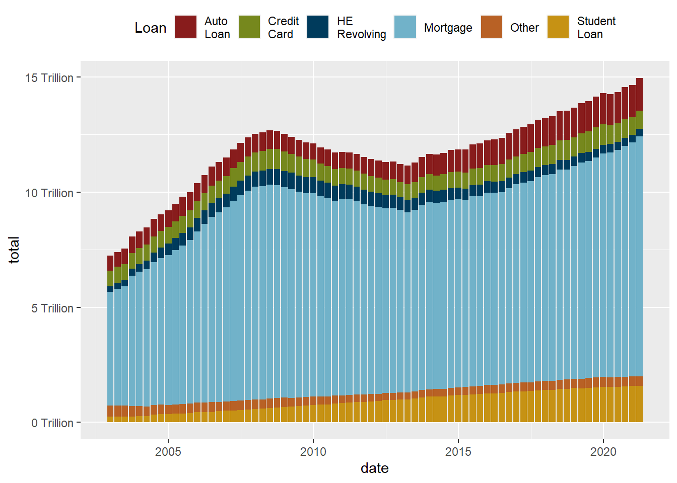
While the stacked chart might be easier to read in some respects, it is harder to follow individual trend lines. One solution is to reorder in order to preserve as much information as possible.
debt_long<-debt_long%>%
  mutate(Loan = fct_relevel(Loan, "Mortgage", "HE Revolving",
                            "Auto Loan", "Student Loan",
                            "Credit Card","Other"))

ggplot(debt_long, aes(x=date, y=total, fill=Loan)) +
  geom_bar(position="stack", stat="identity") +
  scale_y_continuous(labels = scales::label_number(suffix = " Trillion"))+
  theme(legend.position = "top") +
  guides(fill = guide_legend(nrow = 1)) +
  scale_fill_manual(labels=
                      str_replace(levels(debt_long$Loan), " ", "\n"),
                      values=umass_palette)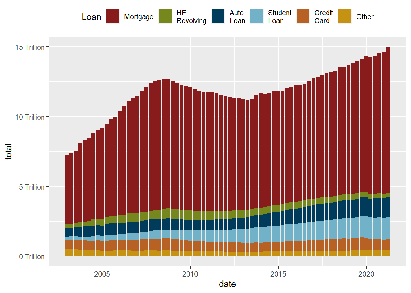
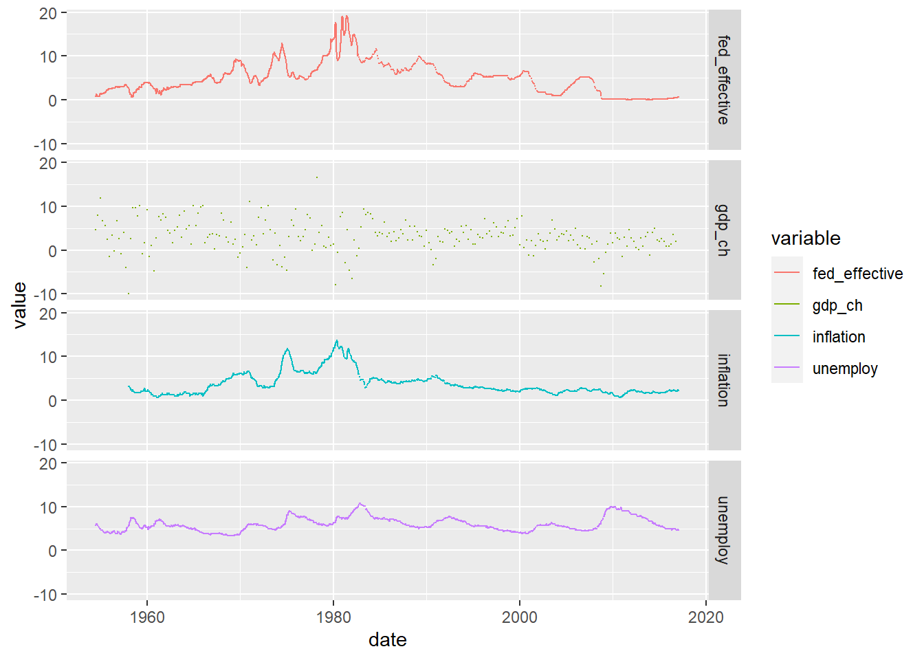
This data set runs from July 1954 to March 2017, and includes daily macroeconomic indicators related to the effective federal funds rate - or the interest rate at which banks lend money to each other in order to meet mandated reserve requirements. There are 7 variables besides the date: 4 values related to the federal funds rate (target, upper target, lower target, and effective), 3 are related macroeconomic indicators (inflation, GDP change, and unemployment rate.)
fed_rates_vars<-read_csv("_data/FedFundsRate.csv",
                         n_max = 1,
                         col_names = NULL)%>%
  select(-c(X1:X3))%>%
  unlist(.)

names(fed_rates_vars) <-c("fed_target", "fed_target_upper",
                         "fed_target_lower", "fed_effective",
                         "gdp_ch", "unemploy", "inflation")

fed_rates_orig<-read_csv("_data/FedFundsRate.csv",
                         skip=1,
                         col_names = c("Year", "Month", "Day",
                                       names(fed_rates_vars)))

fed_rates<-fed_rates_orig%>%
  mutate(date = make_date(Year, Month, Day))%>%
  select(-c(Year, Month, Day))

fed_rates <- fed_rates%>%
  pivot_longer(cols=-date,
               names_to = "variable",
               values_to = "value")
Now we can try to visualize the data over time, with care paid to missing data.
fed_rates%>%
  filter(str_starts(variable, "fed"))%>%
ggplot(., aes(x=date, y=value, color=variable))+
  geom_point(size=0)+
  geom_line()+
  scale_y_continuous(labels = scales::label_percent(scale = 1))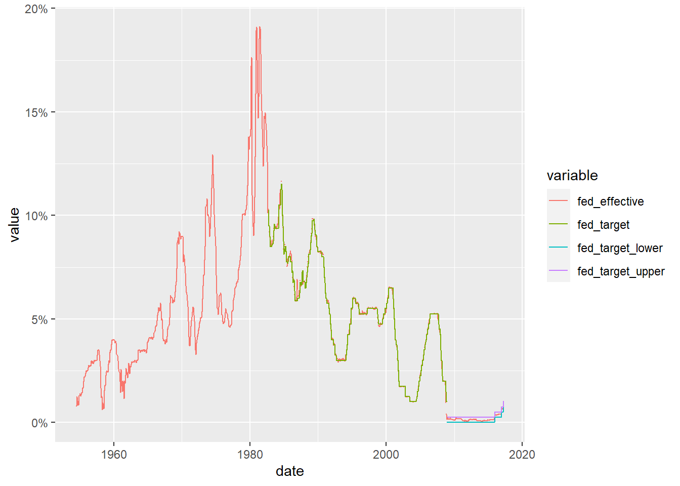
We can now see how closely the effective rate adheres to the target rate (and can see how the Fed changed the way it set it target rate around the time of the 2009 financial crash). Can we find out more by comparing the effective rate to one of the other macroeconomic indicators?
fed_rates%>%
  filter(variable%in%c("fed_effective", "gdp_ch",
                       "unemploy", "inflation"))%>%
ggplot(., aes(x=date, y=value, color=variable))+
  geom_point(size=0)+
  geom_line()+
  facet_grid(rows = vars(variable))