The air_bnb dataset is interesting but really does not provide a good foundation for time analysis. Its only time information is the most recent date a review was left. A review doesn’t necessarily have any bearing on when a place was rented [users can wait to submit for 14 days], and then you still only get one data point.
Much more potent for time analysis is the hotel_bookings dataset.
I covered this dataset in Challenge 2, so some of my analysis is already done.
The data was originally published in the journal Hospitality Management. It describes two hotels - one ‘city’ and one ‘resort’-style - in Portugal.
It is important to know that this dataset includes bookings that arrived and those which were canceled. Each row many observations about a single booking, including:
Customer information (Are they associated with a corporation or group? Do they bring kids?)
Booking information (How many times do they change their reservation?)
Rate information (What is the average daily rate, or ADR?)
…Along with much other information. The ADR is calculated by dividing the sum of all lodging transactions by the total number of staying nights:
\(ADR\) = \(\frac{Room Revenue}{Rooms Sold}\)
Using summarytools, we can see right away that:
The data was collected between 2015 and 2017
August is the most popular month
Guests bringing children are uncommon - less than 1%
With two date variables pulled out, I can now create intervals based on them. Sadly, time intervals are not well-supported in ggplot (or I’m just missing something.)
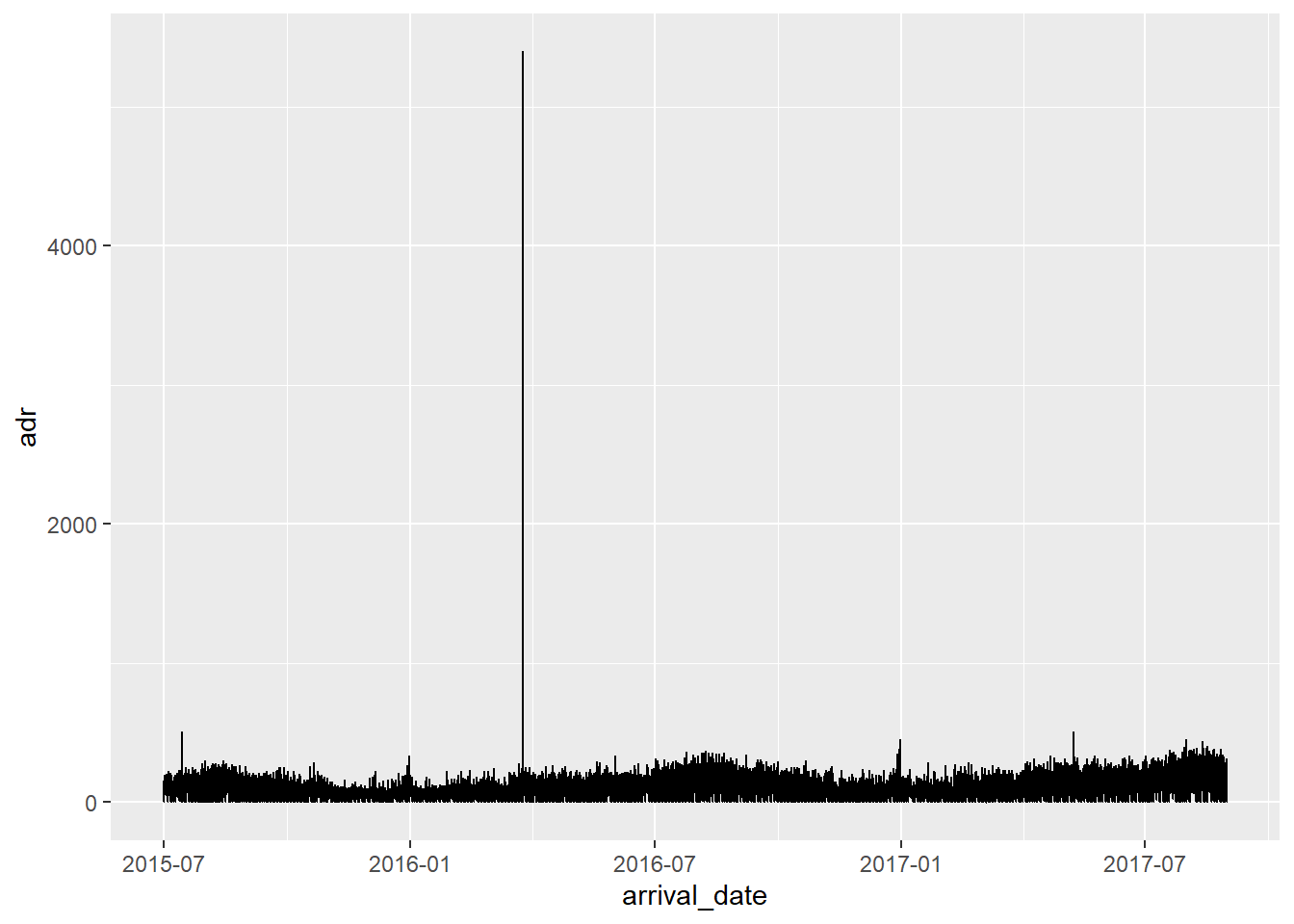
Obviously this graph is misleading. The hotel is filling tons of rooms at once. The graph looks to be plotting lines on top of each other, so we only get to see the largest single booking for any given day. That’s why the “one crazy night” outlier - the $4500 stay - is so prominently featured.
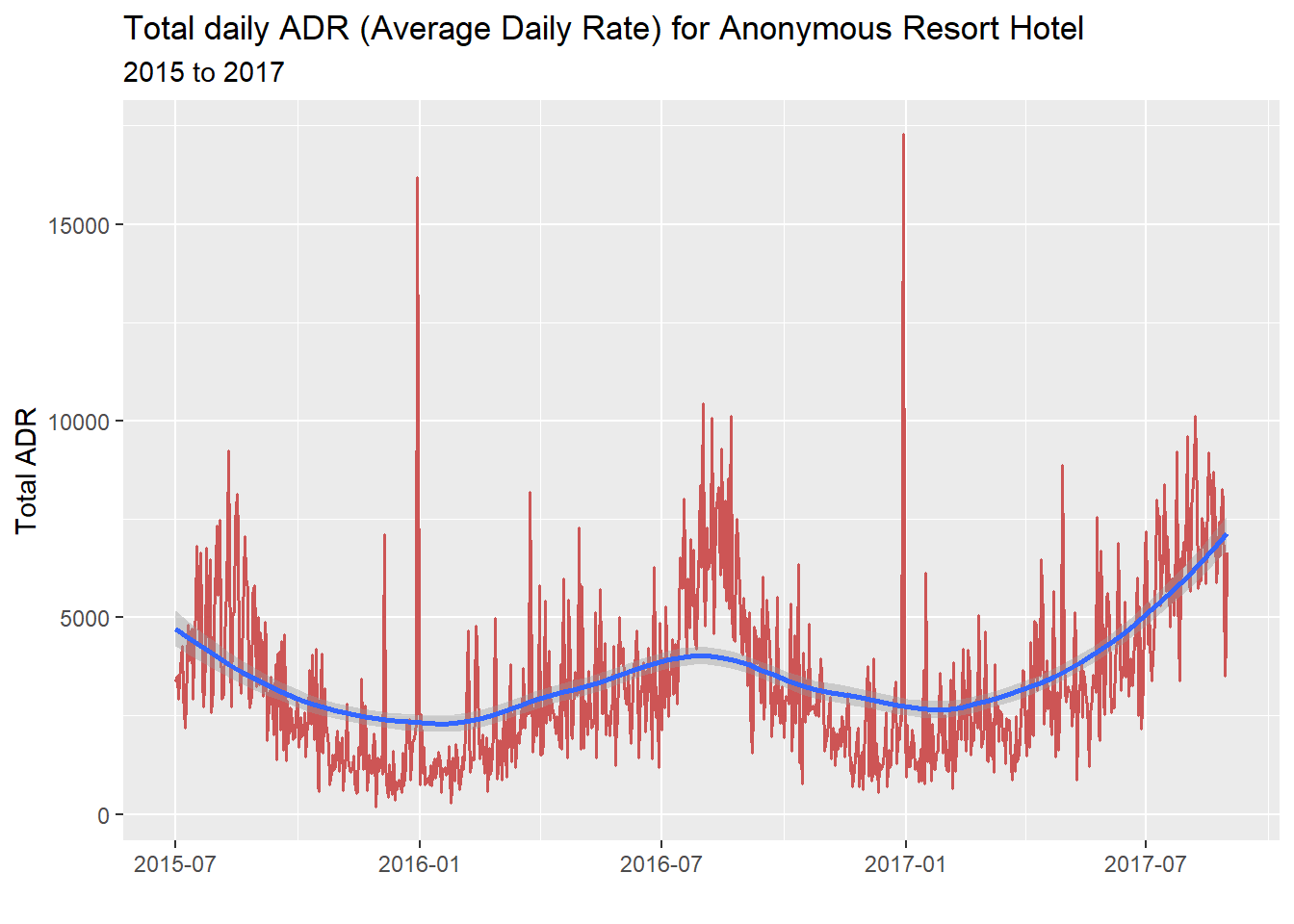
We also need to filter out everything except real “Check-Outs” to avoid looking at canceled reservations:
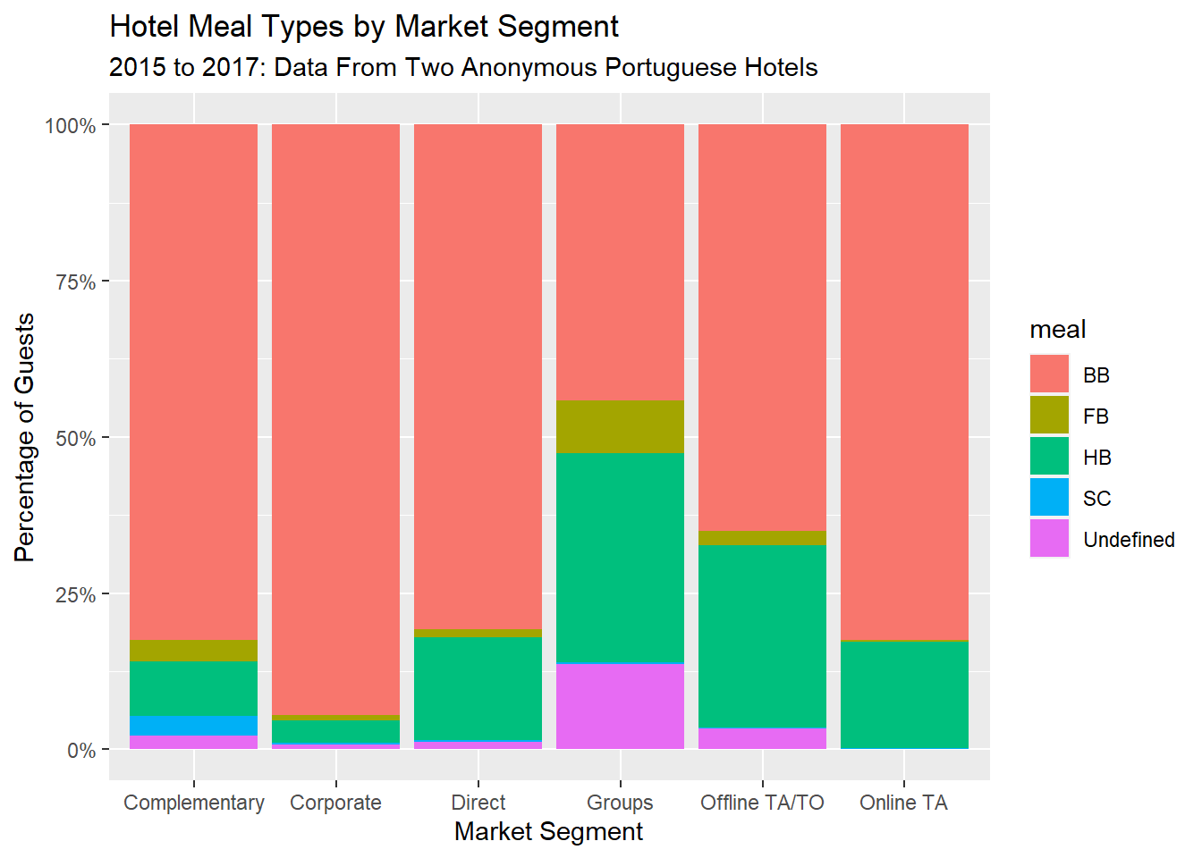
Now, I can make a 100% stacked bar graph plot that accurately represents portions of a whole.
by_country %>%ggplot(aes(fill=meal, y=adults, x=market_segment)) +geom_bar(position="fill", stat="identity") +labs(title ="Hotel Meal Types by Market Segment",subtitle ="2015 to 2017: Data From Two Anonymous Portuguese Hotels",x ="Market Segment",y ="Percentage of Guests") +scale_y_continuous(labels = scales::percent)
At a glance, this graph suggests that:
Corporate customers are mostly only getting Bed & Breakfast, not the other inclusive meal packages other market segments get. Stingy, or smart?
The “groups” market segment gets all-inclusive meals (Full Board - FB) most often. Maybe they are using the hotel as a conference space and are therefore inside it all day.
Offline travel agents seem to be more likely to bundle a hotel meal in with their itinerary.
One criticism
This plot isn’t much better than a pie chart in my opinion, because it makes the “Complementary” and “Corporate” market segments look the same [by area]. People are used to seeing regular bar graphs, not 100% stacked bar graphs, so it isn’t immediately obvious that this is a percentage bar
Source Code
---title: "Challenge 6"author: "Steve O'Neill"description: "Visualizing Time and Relationships"date: "08/23/2022"df-print: pagedformat: html: toc: true code-copy: true code-tools: true df-paged: truecategories: - challenge_6 - hotel_bookings---```{r}#| label: setup#| warning: false#| message: falselibrary(tidyverse)library(ggplot2)library(readxl)library(lubridate)knitr::opts_chunk$set(echo =TRUE, warning=FALSE, message=FALSE)```- hotel_bookings ⭐⭐⭐⭐The `air_bnb` dataset is interesting but really does not provide a good foundation for time analysis. Its only time information is the most recent date a review was left. A review doesn't necessarily have any bearing on when a place was rented \[users can wait to submit for 14 days\], and then you still only get one data point.Much more potent for time analysis is the `hotel_bookings` dataset.```{r}hotel_bookings <-read_csv("_data/hotel_bookings.csv")hotel_bookings```I covered this dataset in Challenge 2, so some of my analysis is already done.The data was originally published in the journal [Hospitality Management](https://www.sciencedirect.com/science/article/pii/S2352340918315191). It describes two hotels - one 'city' and one 'resort'-style - in Portugal.It is important to know that this dataset includes bookings that arrived and those which were canceled. Each row many observations about a single booking, including:- Customer information (Are they associated with a corporation or group? Do they bring kids?)- Booking information (How many times do they change their reservation?)- Rate information (What is the average daily rate, or ADR?)...Along with much other information. The **ADR** is calculated by dividing the sum of all lodging transactions by the total number of staying nights:$ADR$ = $\frac{Room Revenue}{Rooms Sold}$Using `summarytools`, we can see right away that:- The data was collected between 2015 and 2017- August is the most popular month- Guests bringing children are uncommon - less than 1%```{r}print(summarytools::dfSummary(hotel_bookings,varnumbers =FALSE,plain.ascii =FALSE, style ="grid", graph.magnif =0.70, valid.col =FALSE),method ='render',table.classes ='table-condensed')```### Trade-specific termsThere are some terms used that must be clarified for legibility:| Term | Meaning ||------|--------------------------------------|| TA | Travel Agent || TO | Tour Operator (distribution channel) || HB | Half Board (breakfast + other meal) || FB | Full Board (3 meals a day) || SC | Self-catering |### Sanity checksOne thing I noticed is that arrival date is separated into three columns, even though `reservation_status_date` is already formatted as yyyy-mm-dd.This is resolved with Lubridate *and* the built-in variable `month-name`, used to get a number from the month name (e.g. "7" from July).```{r}hotel_bookings <- hotel_bookings %>%mutate(arrival_date =make_date(arrival_date_year,match(arrival_date_month, month.name),arrival_date_day_of_month))hotel_bookings```With two date variables pulled out, I can now create intervals based on them. Sadly, time intervals are not well-supported in ggplot (or I'm just missing something.)```{r}hotel_bookings <- hotel_bookings %>%mutate(booking_interval =interval(arrival_date, reservation_status_date))hotel_bookings```## Time Dependent VisualizationHere is the most straightforward graph possible, plotting average daily rate against time. But it doesn't show things responsibly:```{r}hotel_bookings %>%ggplot(aes(x=arrival_date, y=adr)) +geom_line()```Obviously this graph is misleading. The hotel is filling tons of rooms at once. The graph looks to be plotting lines on top of each other, so we only get to see the largest single booking for any given day. That's why the "one crazy night" outlier - the \$4500 stay - is so prominently featured.We also need to filter out everything except real "Check-Outs" to avoid looking at canceled reservations:```{r}hotel_bookings %>%group_by(arrival_date) %>%filter(str_detect(reservation_status, "Check-Out")) %>%summarise(adr =sum(adr))```I want to compare the earnings of these two hotels, actually:```{r}resort_hotel_adr <- hotel_bookings %>%filter(str_detect(hotel, "Resort Hotel")) %>%group_by(arrival_date) %>%filter(str_detect(reservation_status, "Check-Out")) %>%summarise(adr =sum(adr))city_hotel_adr <- hotel_bookings %>%filter(str_detect(hotel, "City Hotel")) %>%group_by(arrival_date) %>%filter(str_detect(reservation_status, "Check-Out")) %>%summarise(adr =sum(adr))```I'll graph one. Because there are a few outliers, a trend line helps the eye:```{r}resort_hotel_adr %>%ggplot(aes(x=arrival_date, y=adr)) +geom_line(color ="indianred3", size=.7) +geom_smooth() +labs(title ="Total daily ADR (Average Daily Rate) for Anonymous Resort Hotel",subtitle ="2015 to 2017",x ="",y ="Total ADR")```Here I'll join those two dataframes, keeping everything from each (full join)```{r}adr_combined <-full_join(city_hotel_adr, resort_hotel_adr, by ="arrival_date", suffix =c("_city", "_resort"))```And now I will plot them both. This time I am adding a dollar format to the y-axis.```{r}adr_combined %>%ggplot(aes(x=arrival_date)) +geom_line(aes(y=adr_city, colour ="City Hotel")) +geom_line(aes(y=adr_resort, colour ="Resort Hotel")) +geom_smooth(aes(y=adr_city, colour ="City Hotel")) +geom_smooth(aes(y=adr_resort, colour ="Resort Hotel")) +labs(title ="Total daily ADR (Average Daily Rate) for Two Anonymous Hotels",subtitle ="2015 to 2017",x ="",y ="Total ADR",color ="Hotel") +scale_y_continuous(labels=scales::dollar_format())```## Visualizing Part-Whole RelationshipsPie charts are controversial for their tendency to misrepresent larger proportions to the human eye.Viable alternatives are donut charts, which cut out most of the middle area, But these are not always ideal for data with lots of variables.To prepare for the chart, I am going to make a new dataframe called `by_country````{r}by_country <- hotel_bookings %>%filter(str_detect(hotel, "Resort Hotel")) %>%group_by(country)by_country```Now, I can make a 100% stacked bar graph plot that accurately represents portions of a whole.```{r}by_country %>%ggplot(aes(fill=meal, y=adults, x=market_segment)) +geom_bar(position="fill", stat="identity") +labs(title ="Hotel Meal Types by Market Segment",subtitle ="2015 to 2017: Data From Two Anonymous Portuguese Hotels",x ="Market Segment",y ="Percentage of Guests") +scale_y_continuous(labels = scales::percent)```At a glance, this graph suggests that:- Corporate customers are mostly only getting Bed & Breakfast, not the other inclusive meal packages other market segments get. Stingy, or smart?- The "groups" market segment gets all-inclusive meals (Full Board - FB) most often. Maybe they are using the hotel as a conference space and are therefore inside it all day.- Offline travel agents seem to be more likely to bundle a hotel meal in with their itinerary.### One criticismThis plot isn't much better than a pie chart in my opinion, because it makes the "Complementary" and "Corporate" market segments look the same [by area]. People are used to seeing regular bar graphs, not 100% stacked bar graphs, so it isn't immediately obvious that this is a *percentage* bar