library(tidyverse)
library(ggplot2)
library(readxl)
knitr::opts_chunk$set(echo = TRUE, warning=FALSE, message=FALSE)
Challenge 6 Instructions
challenge_6
hotel_bookings
air_bnb
fed_rate
debt
usa_hh
abc_poll
Visualizing Time and Relationships
Challenge Overview
Today’s challenge is to:
- read in a data set, and describe the data set using both words and any supporting information (e.g., tables, etc)
- tidy data (as needed, including sanity checks)
- mutate variables as needed (including sanity checks)
- create at least one graph including time (evolution)
- try to make them “publication” ready (optional)
- Explain why you choose the specific graph type
- Create at least one graph depicting part-whole or flow relationships
- try to make them “publication” ready (optional)
- Explain why you choose the specific graph type
R Graph Gallery is a good starting point for thinking about what information is conveyed in standard graph types, and includes example R code.
(be sure to only include the category tags for the data you use!)
Read in data
Read in one (or more) of the following datasets, using the correct R package and command.
- debt ⭐
- fed_rate ⭐⭐
- abc_poll ⭐⭐⭐
- usa_hh ⭐⭐⭐
- hotel_bookings ⭐⭐⭐⭐
- air_bnb ⭐⭐⭐⭐⭐
debt <- read_excel('_data/debt_in_trillions.xlsx')Briefly describe the data
Tidy Data (as needed)
Is your data already tidy, or is there work to be done? Be sure to anticipate your end result to provide a sanity check, and document your work here.
Looking at the head of Data first before doing anything.
head(debt)# A tibble: 6 × 8
`Year and Quarter` Mortgage `HE Revolving` Auto …¹ Credi…² Stude…³ Other Total
<chr> <dbl> <dbl> <dbl> <dbl> <dbl> <dbl> <dbl>
1 03:Q1 4.94 0.242 0.641 0.688 0.241 0.478 7.23
2 03:Q2 5.08 0.26 0.622 0.693 0.243 0.486 7.38
3 03:Q3 5.18 0.269 0.684 0.693 0.249 0.477 7.56
4 03:Q4 5.66 0.302 0.704 0.698 0.253 0.449 8.07
5 04:Q1 5.84 0.328 0.72 0.695 0.260 0.446 8.29
6 04:Q2 5.97 0.367 0.743 0.697 0.263 0.423 8.46
# … with abbreviated variable names ¹`Auto Loan`, ²`Credit Card`,
# ³`Student Loan`Are there any variables that require mutation to be usable in your analysis stream? For example, do you need to calculate new values in order to graph them? Can string values be represented numerically? Do you need to turn any variables into factors and reorder for ease of graphics and visualization?
Document your work here.
The Year and Quarter Column is currently not useful to me the way it currently is. After doing some research, I found that there is a package called lubridate that helps clean up Dates in R. There is a function called parse_date_time which allows me to turn the ‘Year and Quarter’ column into usable dates.
library(lubridate)
debt_clean <-debt %>%
  mutate(date = parse_date_time(`Year and Quarter`,
                           orders="yq"))
As Shown below the dates look much cleaner.
debt_clean$date [1] "2003-01-01 UTC" "2003-04-01 UTC" "2003-07-01 UTC" "2003-10-01 UTC"
[5] "2004-01-01 UTC" "2004-04-01 UTC" "2004-07-01 UTC" "2004-10-01 UTC"
[9] "2005-01-01 UTC" "2005-04-01 UTC" "2005-07-01 UTC" "2005-10-01 UTC"
[13] "2006-01-01 UTC" "2006-04-01 UTC" "2006-07-01 UTC" "2006-10-01 UTC"
[17] "2007-01-01 UTC" "2007-04-01 UTC" "2007-07-01 UTC" "2007-10-01 UTC"
[21] "2008-01-01 UTC" "2008-04-01 UTC" "2008-07-01 UTC" "2008-10-01 UTC"
[25] "2009-01-01 UTC" "2009-04-01 UTC" "2009-07-01 UTC" "2009-10-01 UTC"
[29] "2010-01-01 UTC" "2010-04-01 UTC" "2010-07-01 UTC" "2010-10-01 UTC"
[33] "2011-01-01 UTC" "2011-04-01 UTC" "2011-07-01 UTC" "2011-10-01 UTC"
[37] "2012-01-01 UTC" "2012-04-01 UTC" "2012-07-01 UTC" "2012-10-01 UTC"
[41] "2013-01-01 UTC" "2013-04-01 UTC" "2013-07-01 UTC" "2013-10-01 UTC"
[45] "2014-01-01 UTC" "2014-04-01 UTC" "2014-07-01 UTC" "2014-10-01 UTC"
[49] "2015-01-01 UTC" "2015-04-01 UTC" "2015-07-01 UTC" "2015-10-01 UTC"
[53] "2016-01-01 UTC" "2016-04-01 UTC" "2016-07-01 UTC" "2016-10-01 UTC"
[57] "2017-01-01 UTC" "2017-04-01 UTC" "2017-07-01 UTC" "2017-10-01 UTC"
[61] "2018-01-01 UTC" "2018-04-01 UTC" "2018-07-01 UTC" "2018-10-01 UTC"
[65] "2019-01-01 UTC" "2019-04-01 UTC" "2019-07-01 UTC" "2019-10-01 UTC"
[69] "2020-01-01 UTC" "2020-04-01 UTC" "2020-07-01 UTC" "2020-10-01 UTC"
[73] "2021-01-01 UTC" "2021-04-01 UTC"ggplot(debt_clean, aes(x=date, y=Mortgage)) +
geom_point()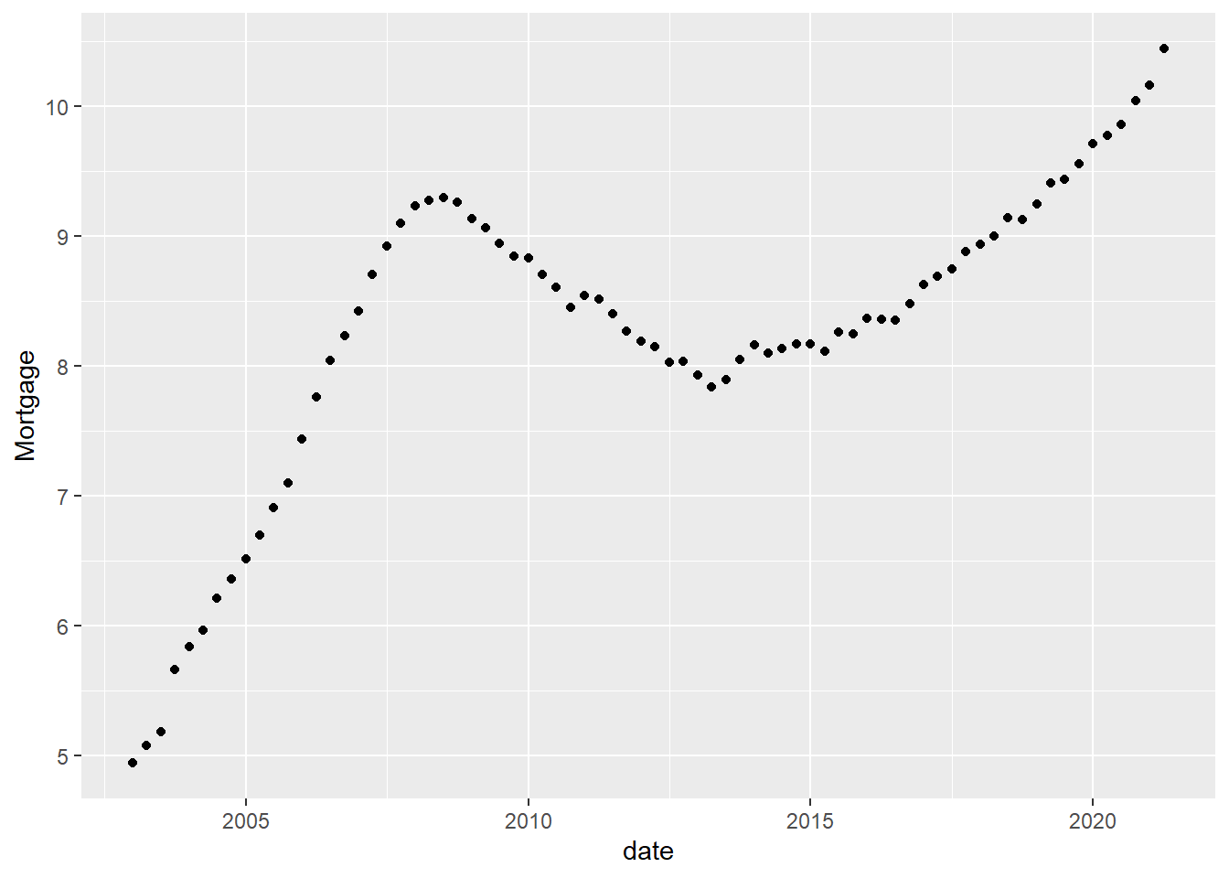
I filtered the Dates as I am interested in looking at Metrics from the Finanical Crisis.
debt_clean %>%
  filter(date< as.POSIXct("2010-01-01 01:00:00", tz="UTC"))
# A tibble: 29 × 9
`Year and Quarter` Mortgage HE Revolvin…¹ Auto …² Credi…³ Stude…⁴ Other Total
<chr> <dbl> <dbl> <dbl> <dbl> <dbl> <dbl> <dbl>
1 03:Q1 4.94 0.242 0.641 0.688 0.241 0.478 7.23
2 03:Q2 5.08 0.26 0.622 0.693 0.243 0.486 7.38
3 03:Q3 5.18 0.269 0.684 0.693 0.249 0.477 7.56
4 03:Q4 5.66 0.302 0.704 0.698 0.253 0.449 8.07
5 04:Q1 5.84 0.328 0.72 0.695 0.260 0.446 8.29
6 04:Q2 5.97 0.367 0.743 0.697 0.263 0.423 8.46
7 04:Q3 6.21 0.426 0.751 0.706 0.33 0.41 8.83
8 04:Q4 6.36 0.468 0.728 0.717 0.346 0.423 9.04
9 05:Q1 6.51 0.502 0.725 0.71 0.364 0.394 9.21
10 05:Q2 6.70 0.528 0.774 0.717 0.374 0.402 9.49
# … with 19 more rows, 1 more variable: date <dttm>, and abbreviated variable
# names ¹`HE Revolving`, ²`Auto Loan`, ³`Credit Card`, ⁴`Student Loan`
# ℹ Use `print(n = ...)` to see more rows, and `colnames()` to see all variable namesOne thing that I am interested in looking at is the rates of Mortgage Debt and what levels it had especially during the financial crisis. As shown below the Mortgage Debt is limited to the Financial Crisis Years is indeed high but not as high as it was in 2020.
Time Dependent Visualization
debt_clean %>%
  filter(date< as.POSIXct("2010-01-01 01:00:00", tz="UTC")) %>%
  ggplot(aes(x=date, y=Mortgage)) +
  geom_point()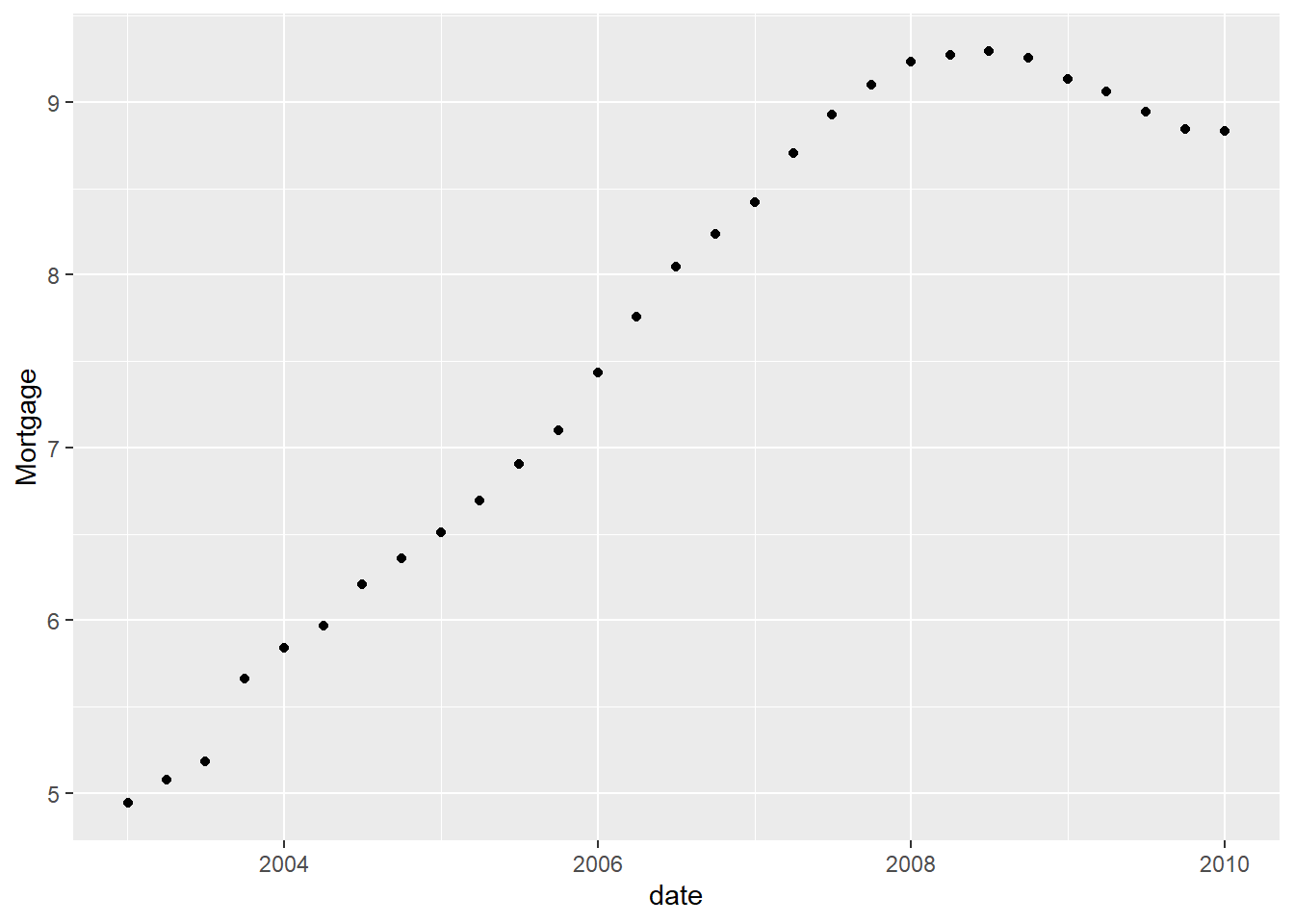
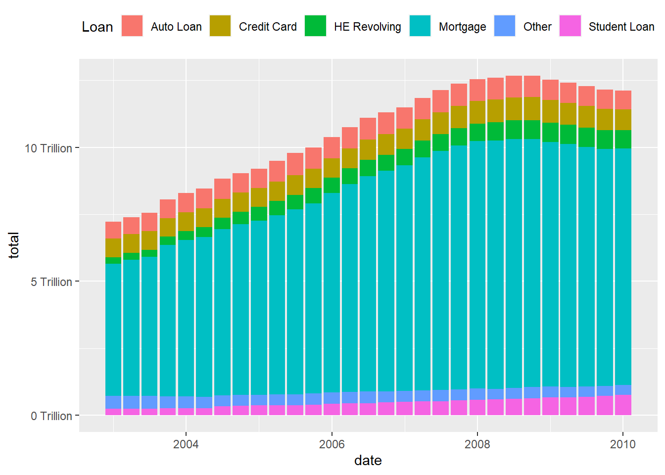
Visualizing Part-Whole Relationships
What if I Compare it to other Debts during the Financial Crisis.
debt_clean<-debt_clean%>%
  pivot_longer(cols = Mortgage:Other,
               names_to = "Loan",
               values_to = "total")%>%
  select(-Total)%>%
  mutate(Loan = as.factor(Loan))
As graphed below, it seems that Mortgage debt was the greatest amount of Debt during the Financial Crisis .
debt_clean %>%
  filter(date< as.POSIXct("2010-01-01 01:00:00", tz="UTC")) %>%
  ggplot(aes(x=date, y=total, fill=Loan)) +
  geom_bar(position="stack", stat="identity") +
  scale_y_continuous(labels = scales::label_number(suffix = " Trillion"))+
  theme(legend.position = "top") +
  guides(fill = guide_legend(nrow = 1))