library(tidyverse)
library(ggplot2)

knitr::opts_chunk$set(echo = TRUE, warning=FALSE, message=FALSE)
Challenge 7 Instructions
challenge_7
hotel_bookings
australian_marriage
air_bnb
eggs
abc_poll
faostat
us_hh
Visualizing Multiple Dimensions
Challenge Overview
Today’s challenge is to:
- read in a data set, and describe the data set using both words and any supporting information (e.g., tables, etc)
- tidy data (as needed, including sanity checks)
- mutate variables as needed (including sanity checks)
- Recreate at least two graphs from previous exercises, but introduce at least one additional dimension that you omitted before using ggplot functionality (color, shape, line, facet, etc) The goal is not to create unneeded chart ink (Tufte), but to concisely capture variation in additional dimensions that were collapsed in your earlier 2 or 3 dimensional graphs.
- Explain why you choose the specific graph type
- If you haven’t tried in previous weeks, work this week to make your graphs “publication” ready with titles, captions, and pretty axis labels and other viewer-friendly features
R Graph Gallery is a good starting point for thinking about what information is conveyed in standard graph types, and includes example R code. And anyone not familiar with Edward Tufte should check out his fantastic books and courses on data visualizaton.
(be sure to only include the category tags for the data you use!)
Read in data
Read in one (or more) of the following datasets, using the correct R package and command.
- eggs ⭐
- abc_poll ⭐⭐
- australian_marriage ⭐⭐
- hotel_bookings ⭐⭐⭐
- air_bnb ⭐⭐⭐
- us_hh ⭐⭐⭐⭐
- faostat ⭐⭐⭐⭐⭐
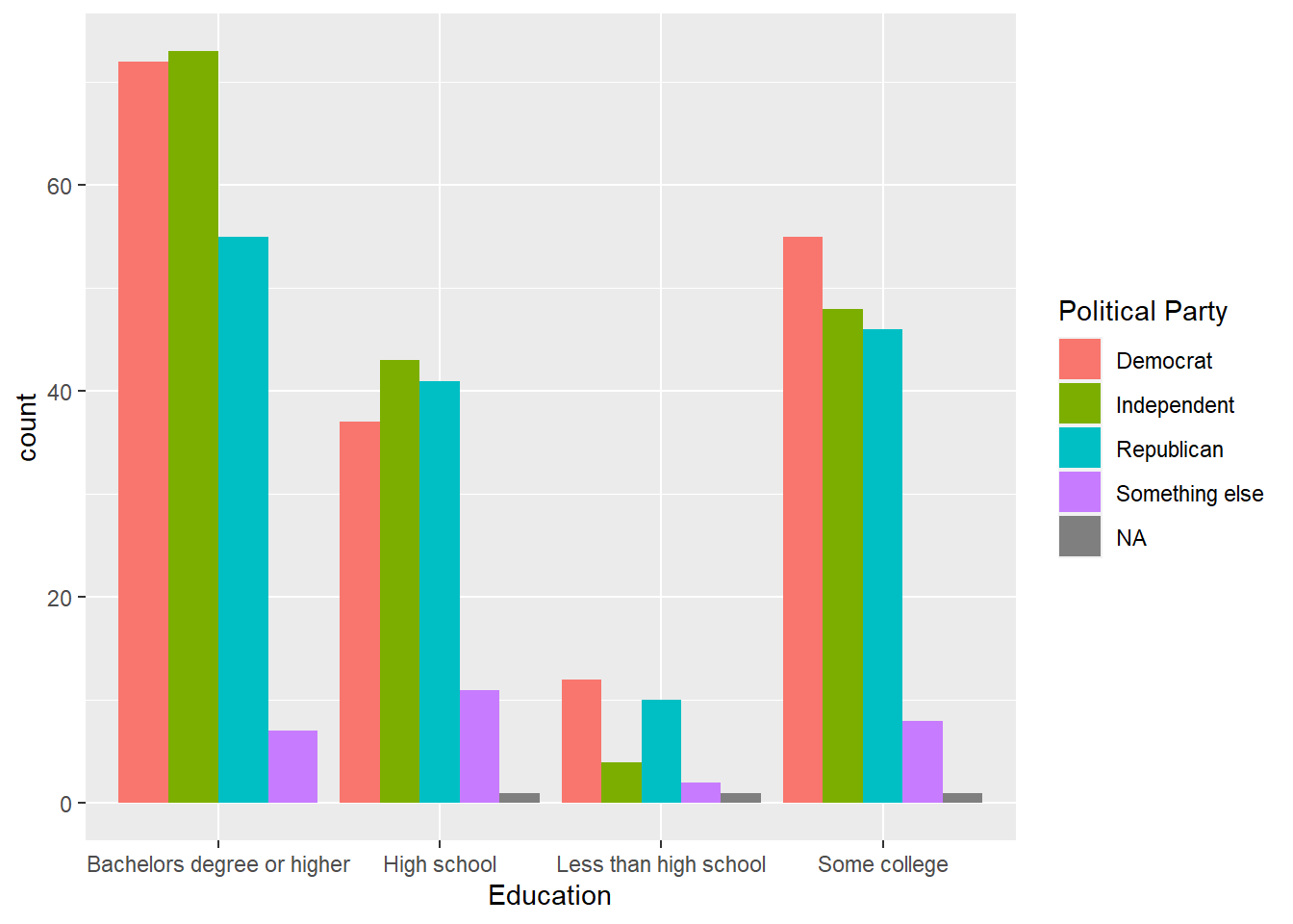
abc_poll <- read_csv("_data/abc_poll_2021.csv")Briefly describe the data
As I have worked with this dataset before, I know exactly which variables that I want to look for. $ppeducat looks at Education level of Survery Respondents and QPID looks at political party afflication. I need to clean the Data first and remove all skipped responses.
table(abc_poll$ppeducat,abc_poll$QPID)
                             A Democrat A Republican An Independent Skipped
  Bachelors degree or higher         72           55             73       0
  High school                        37           41             43       1
  Less than high school              12           10              4       1
  Some college                       55           46             48       1

                             Something else
  Bachelors degree or higher              7
  High school                            11
  Less than high school                   2
  Some college                            8
Removing all Skipped Responses and removed the word An.
abc_poll_new <- abc_poll %>%
  mutate(partyid = str_remove(QPID, "A[n]* "),
         partyid = na_if(partyid, "Skipped")) %>%
  select(-QPID)
Visualization with Multiple Dimensions
partyvseducation<-table(abc_poll_new$partyid,abc_poll_new$ppeducat)
myFrame <- as.data.frame(table(partyvseducation))
Visualization of Political Party and Education Level
party_graphic<-ggplot(abc_poll_new, aes(abc_poll_new$ppeducat, ..count..)) + geom_bar(aes(fill = abc_poll_new$partyid), position = "dodge")
print(party_graphic + labs(
  fill = "Political Party", x = "Education"
))