library(tidyverse)
library(ggplot2)

knitr::opts_chunk$set(echo = TRUE, warning=FALSE, message=FALSE)
Challenge 5
challenge_5
air_bnb
ggplot2
audrey_bertin
Basic visualization with ggplot
Challenge
For today’s challenge, I’ll be reading in the AB_NYC_2019.csv ⭐⭐⭐ dataset and producing some basic visualizations with ggplot2.
Data Overview
airbnb <- readr::read_csv("_data/AB_NYC_2019.csv")glimpse(airbnb)Rows: 48,895
Columns: 16
$ id <dbl> 2539, 2595, 3647, 3831, 5022, 5099, 512…
$ name <chr> "Clean & quiet apt home by the park", "…
$ host_id <dbl> 2787, 2845, 4632, 4869, 7192, 7322, 735…
$ host_name <chr> "John", "Jennifer", "Elisabeth", "LisaR…
$ neighbourhood_group <chr> "Brooklyn", "Manhattan", "Manhattan", "…
$ neighbourhood <chr> "Kensington", "Midtown", "Harlem", "Cli…
$ latitude <dbl> 40.64749, 40.75362, 40.80902, 40.68514,…
$ longitude <dbl> -73.97237, -73.98377, -73.94190, -73.95…
$ room_type <chr> "Private room", "Entire home/apt", "Pri…
$ price <dbl> 149, 225, 150, 89, 80, 200, 60, 79, 79,…
$ minimum_nights <dbl> 1, 1, 3, 1, 10, 3, 45, 2, 2, 1, 5, 2, 4…
$ number_of_reviews <dbl> 9, 45, 0, 270, 9, 74, 49, 430, 118, 160…
$ last_review <date> 2018-10-19, 2019-05-21, NA, 2019-07-05…
$ reviews_per_month <dbl> 0.21, 0.38, NA, 4.64, 0.10, 0.59, 0.40,…
$ calculated_host_listings_count <dbl> 6, 2, 1, 1, 1, 1, 1, 1, 1, 4, 1, 1, 3, …
$ availability_365 <dbl> 365, 355, 365, 194, 0, 129, 0, 220, 0, …This dataset has 48,895 rows and 16 columns. It contains information on different AirBnB properties located in New York City, NY.
Each row represents a single property in the city. For each property, we have the following information;
id: unique identifier for the propertyname: descriptive name shown on the AirBnB website that customers see when clicking on the propertyhost_id: unique identifier for the host of the propertyhost_name: first name of the property hostneighbourhood_group: borough name where property is locatedneighborhood: neighborhood within the burough (more detailed location)latitude/longitude: geographical coordinates of propertyroom_type: what type of property is being booked (private room in shared home, a whole home/apartment, etc)price: nightly price, presumably in USDminimum_nights: minimum length of staynumber_of_reviews: total number of reviews for the property on AirBnB so farlast_review: date of last reviewreviews_per_month: average number of reviews left for the property each monthcalculated_host_listings_count: number of listings/properties that this specific host has on AirBnB overallavailability_365: number of nights in the year that the property is available for booking on AirBnB
Room types include:
unique(airbnb$room_type)[1] "Private room" "Entire home/apt" "Shared room" All boroughs appear to be included:
unique(airbnb$neighbourhood_group)[1] "Brooklyn" "Manhattan" "Queens" "Staten Island"
[5] "Bronx" For each borough, we have the following count of neighborhoods and properties:
airbnb %>%
  group_by(neighbourhood_group) %>%
  summarize(n_properties = n(), n_neighborhoods = n_distinct(neighbourhood)) %>%
  arrange(desc(n_properties))
Most of the properties are located in Manhattan and Brooklyn, with significantly fewer in Queens, the Bronx, and Staten Island. Within each borough, we have a few dozen neighborhoods covered, so this data seems to have pretty good coverage of the city with no obvious big missing areas of data.
Tidy Data
Data is already in a tidy format, so no pivoting is necessary. Each row represents a single property, which can’t be broken down into a longer format.
However, we can mutate a few of the variables to get them into a better format for visualization. Specifically, the following variables should be turned into factors:
neighbourhood_groupneighbourhoodroom_type
There are a few other modifications that can be made (e.g. converting some doubles to integers), but they are not necessary for the purpose of this visualization.
We do this mutation below:
airbnb_tidy <- airbnb %>%
  mutate(neighbourhood_group = as_factor(neighbourhood_group),
         neighbourhood = as_factor(neighbourhood),
         room_type = as_factor(room_type))
Univariate Visualizations
For our univariate visualizations, we’ll just look at the distribution of a single variable. The main types of univariate plots are bar chart (categorical) and histogram (numeric).
Room Type
Room type is a categorical variable, so it can be displayed using a bar chart:
airbnb_tidy %>%
  ggplot(aes(x=room_type)) + geom_bar() +
  ggtitle("Number of Properties on AirBnB in NYC By Property Type") +
  ylab("# of Properties") +
  xlab("Property/Rental Type") +
  theme_minimal()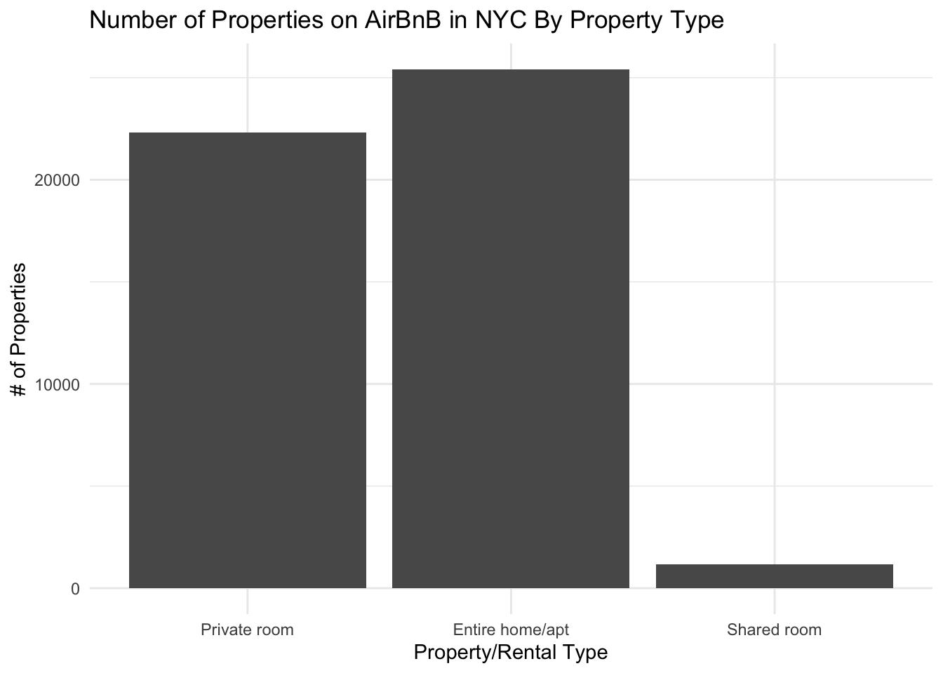
From this graph, we can see that “Entire home/apt” rentals make up the largest share of the market, with quite a few private rooms and very few shared rooms.
Price
Next, we can look at how expensive these properties are. Price is a numeric variable, so we can use a histogram to view the distribution.
airbnb_tidy %>%
  ggplot(aes(x=price)) + geom_histogram() +
  ggtitle("Distribution of Property Prices on AirBnB in NYC") +
  ylab("# of Properties") +
  xlab("Price Per Night ($)") +
  theme_minimal()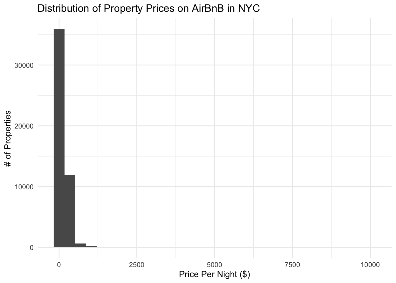
From this graph, it looks like there may be some outliers (very few, so much so that they are impossible to see) on the super high price end that make it difficult to judge the main distribution. We can create another version of this graph that’s zoomed in on the low end to get more information:
airbnb_tidy %>%
  filter(price < 1000) %>%
  ggplot(aes(x=price)) + geom_histogram(binwidth=50) +
  ggtitle("Distribution of Property Prices (UNDER $1000/night) on AirBnB in NYC") +
  ylab("# of Properties") +
  xlab("Price Per Night ($)") +
  theme_minimal()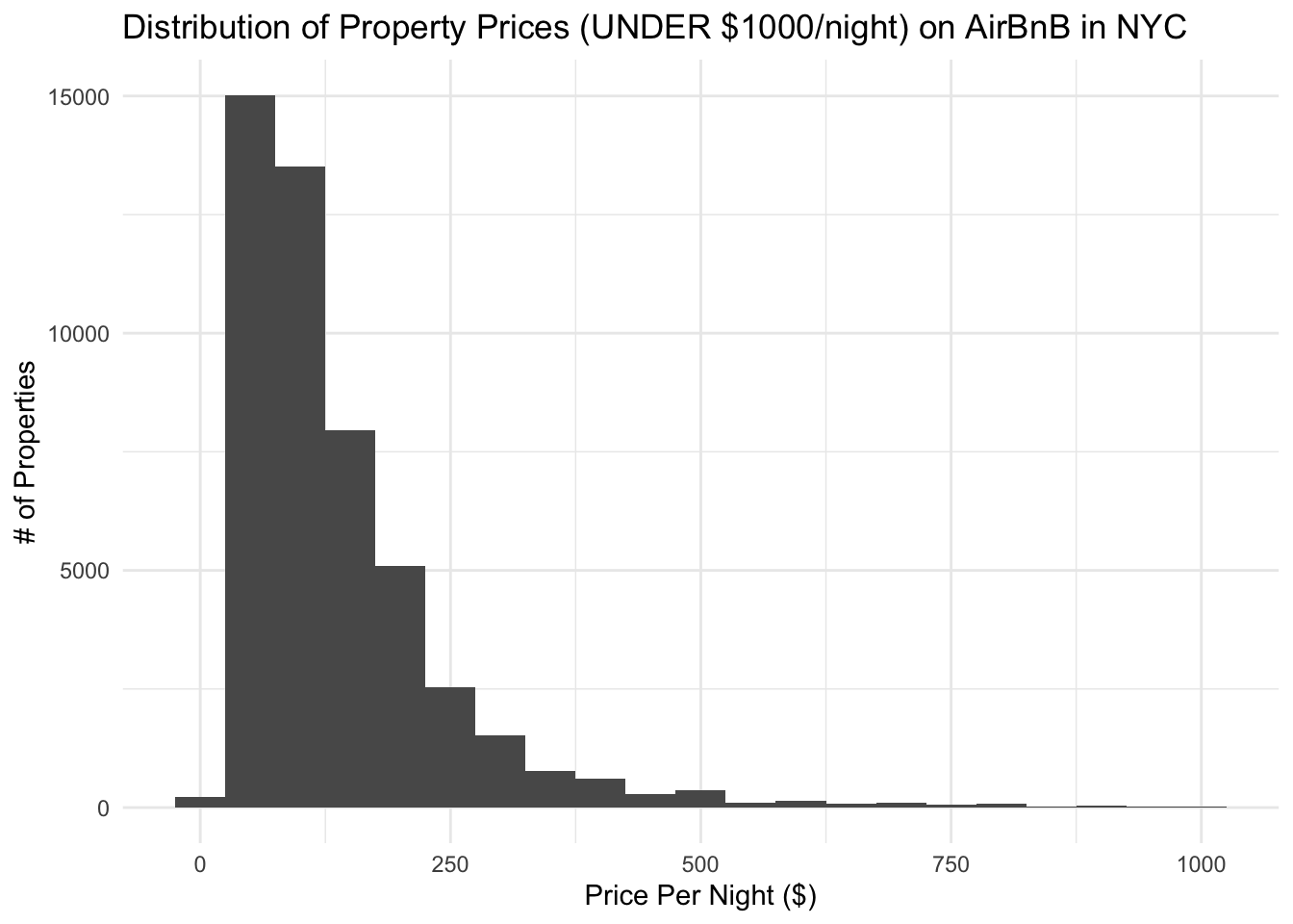
Now, we can see that most properties are below $200/night and there is a strong right tail.
Bivariate Visualizations
Next, we can create some bivariate visualizations.
Price vs Minimum Stay Length
Let’s look at how price and minimum stay length are associated. These are both numeric variables, so we’ll want a scatterplot.
airbnb_tidy %>%
  ggplot(aes(x=price, y=minimum_nights)) +
  geom_point() +
  ggtitle("Price VS Minimum Stay Length for NYC AirBnBs") +
  xlab("Price Per Night ($)") +
  ylab("Minimum Allowed Stay (# Nights)") +
  theme_minimal()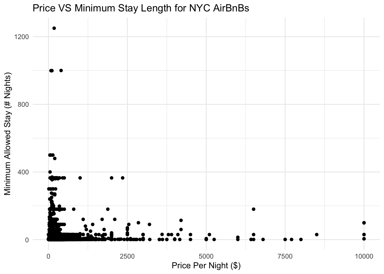
Based on this graph, we can see that there is no clear pattern between price and minimum stay length.
Price vs Property Type
What about price and room type? It is more likely that we may see a pattern here, as people will almost certainly pay more for a private room or whole apartment compared with a shared room.
airbnb_tidy %>%
  group_by(room_type) %>%
  summarize(avg_price = mean(price)) %>%
  ggplot(aes(x = room_type, y = avg_price)) +
  geom_col() +
  ggtitle("Average Nightly AirBnB Price By Property Listing Type, NYC") +
  ylab("Average Nightly Price ($)") +
  xlab("Property/Rental Type") +
  theme_minimal()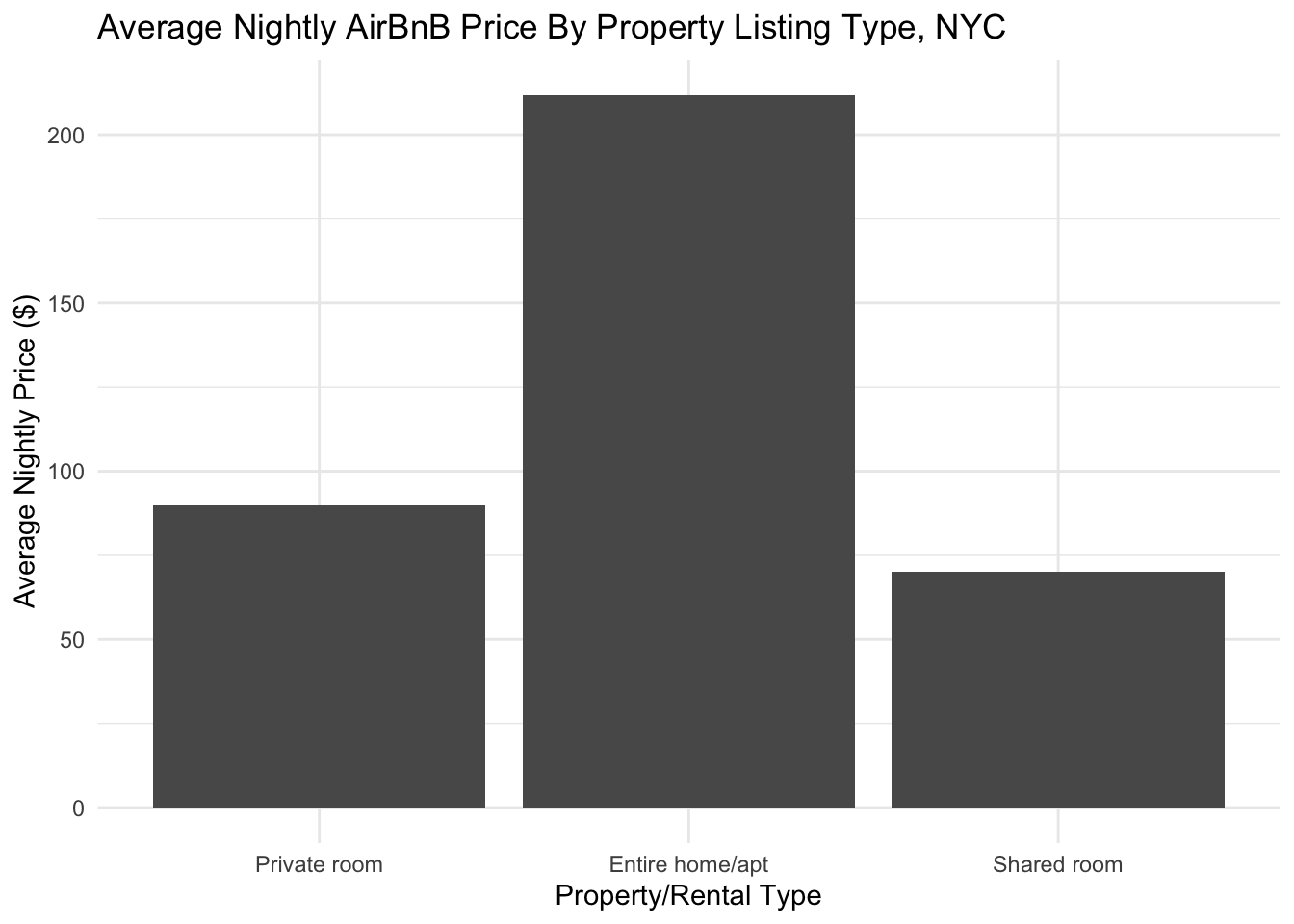
This makes sense with our intuition. Shared rooms have the lowest average price, with private rooms being a little higher. Entire homes and apartments are by far the most expensive on average, which makes sense as they offer the largest and most private spaces.