library(tidyverse)

knitr::opts_chunk$set(echo = TRUE, warning=FALSE, message=FALSE)
Challenge 7
challenge_7
air_bnb
ggplot2
audrey_bertin
Visualizing Multiple Dimensions
Challenge Overview
For today’s challenge, I’ll be continuing with the AirBnB data from challenges 5 and 6. As a reminder, an overview of this data is provided in the following sections.
The Data
airbnb <- readr::read_csv("_data/AB_NYC_2019.csv")glimpse(airbnb)Rows: 48,895
Columns: 16
$ id <dbl> 2539, 2595, 3647, 3831, 5022, 5099, 512…
$ name <chr> "Clean & quiet apt home by the park", "…
$ host_id <dbl> 2787, 2845, 4632, 4869, 7192, 7322, 735…
$ host_name <chr> "John", "Jennifer", "Elisabeth", "LisaR…
$ neighbourhood_group <chr> "Brooklyn", "Manhattan", "Manhattan", "…
$ neighbourhood <chr> "Kensington", "Midtown", "Harlem", "Cli…
$ latitude <dbl> 40.64749, 40.75362, 40.80902, 40.68514,…
$ longitude <dbl> -73.97237, -73.98377, -73.94190, -73.95…
$ room_type <chr> "Private room", "Entire home/apt", "Pri…
$ price <dbl> 149, 225, 150, 89, 80, 200, 60, 79, 79,…
$ minimum_nights <dbl> 1, 1, 3, 1, 10, 3, 45, 2, 2, 1, 5, 2, 4…
$ number_of_reviews <dbl> 9, 45, 0, 270, 9, 74, 49, 430, 118, 160…
$ last_review <date> 2018-10-19, 2019-05-21, NA, 2019-07-05…
$ reviews_per_month <dbl> 0.21, 0.38, NA, 4.64, 0.10, 0.59, 0.40,…
$ calculated_host_listings_count <dbl> 6, 2, 1, 1, 1, 1, 1, 1, 1, 4, 1, 1, 3, …
$ availability_365 <dbl> 365, 355, 365, 194, 0, 129, 0, 220, 0, …This dataset has 48,895 rows and 16 columns. It contains information on different AirBnB properties located in New York City, NY.
Each row represents a single property in the city. For each property, we have the following information;
id: unique identifier for the propertyname: descriptive name shown on the AirBnB website that customers see when clicking on the propertyhost_id: unique identifier for the host of the propertyhost_name: first name of the property hostneighbourhood_group: borough name where property is locatedneighborhood: neighborhood within the burough (more detailed location)latitude/longitude: geographical coordinates of propertyroom_type: what type of property is being booked (private room in shared home, a whole home/apartment, etc)price: nightly price, presumably in USDminimum_nights: minimum length of staynumber_of_reviews: total number of reviews for the property on AirBnB so farlast_review: date of last reviewreviews_per_month: average number of reviews left for the property each monthcalculated_host_listings_count: number of listings/properties that this specific host has on AirBnB overallavailability_365: number of nights in the year that the property is available for booking on AirBnB
Room types include:
unique(airbnb$room_type)[1] "Private room" "Entire home/apt" "Shared room" All boroughs appear to be included:
unique(airbnb$neighbourhood_group)[1] "Brooklyn" "Manhattan" "Queens" "Staten Island"
[5] "Bronx" For each borough, we have the following count of neighborhoods and properties:
airbnb %>%
  group_by(neighbourhood_group) %>%
  summarize(n_properties = n(), n_neighborhoods = n_distinct(neighbourhood)) %>%
  arrange(desc(n_properties))
Most of the properties are located in Manhattan and Brooklyn, with significantly fewer in Queens, the Bronx, and Staten Island. Within each borough, we have a few dozen neighborhoods covered, so this data seems to have pretty good coverage of the city with no obvious big missing areas of data.
Tidy Data
Data is already in a tidy format, so no pivoting is necessary. Each row represents a single property, which can’t be broken down into a longer format.
However, we can mutate a few of the variables to get them into a better format for visualization. Specifically, the following variables should be turned into factors:
neighbourhood_groupneighbourhoodroom_type
There are a few other modifications that can be made (e.g. converting some doubles to integers), but they are not necessary for the purpose of this visualization.
We do this mutation below:
airbnb_tidy <- airbnb %>%
  mutate(neighbourhood_group = as_factor(neighbourhood_group),
         neighbourhood = as_factor(neighbourhood),
         room_type = as_factor(room_type))
Additional Mutation
In challenge 6, we created a new column representing the year of last review date. We repeat this step here so that we can add onto the graph we created for challenge 6:
airbnb_tidy <- airbnb_tidy %>%
  rowwise() %>%
  mutate(year_last_review = year(last_review))
Visualization with Multiple Dimensions
In challenge 5, we created the following visualization, which shows the average price by property type. It is only two dimensional.
challenge5_bar <- airbnb_tidy %>%
  group_by(room_type, neighbourhood_group) %>%
  summarize(avg_price = mean(price)) %>%
  ggplot(aes(x = room_type, y = avg_price)) +
  geom_col() +
  ggtitle("Average Nightly AirBnB Price By Property Listing Type, NYC") +
  ylab("Average Nightly Price ($)") +
  xlab("Property/Rental Type") +
  theme_minimal()

challenge5_bar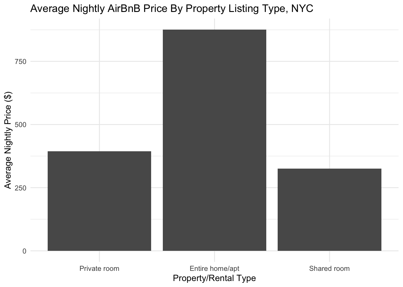
We can add another dimension by adding a facet_wrap and bringing borough name into the visualization:
challenge5_bar +
  facet_wrap(~neighbourhood_group) +
  theme(axis.text.x = element_text(angle = 90, vjust = 0.5, hjust=1)) +
  xlab(NULL)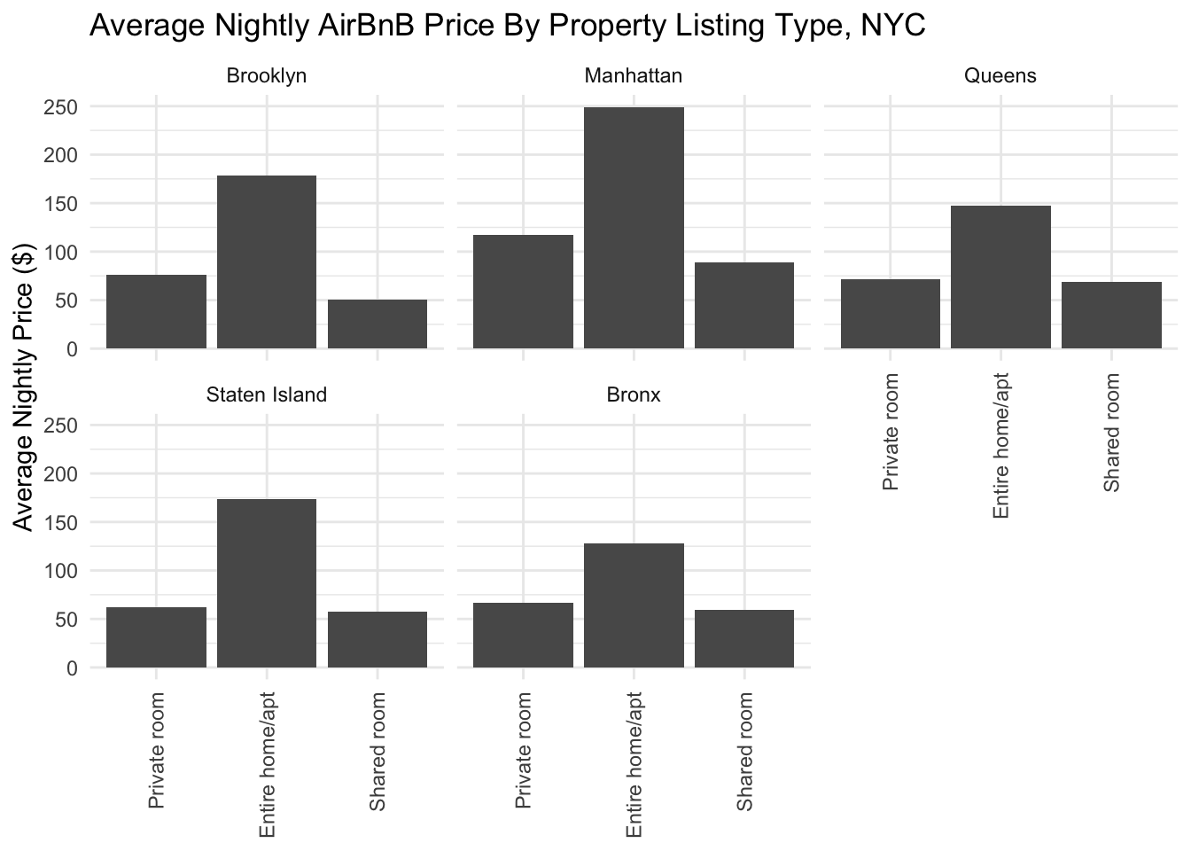
When we break it up by borough, we can now compare prices across different areas! For example, we can see that average prices for entire homes/apartments are higher in Manhattan than in the other boroughs.
We can also view this a different way, using a colored bar chart:
airbnb_tidy %>%
  group_by(room_type, neighbourhood_group) %>%
  summarize(avg_price = mean(price)) %>%
  ggplot(aes(x = room_type, y = avg_price, fill=neighbourhood_group)) +
  geom_col(position="dodge") +
  ggtitle("Average Nightly AirBnB Price By Property Listing Type, NYC") +
  ylab("Average Nightly Price ($)") +
  xlab("Property/Rental Type") +
  scale_fill_brewer(palette="Dark2")+
  theme_minimal()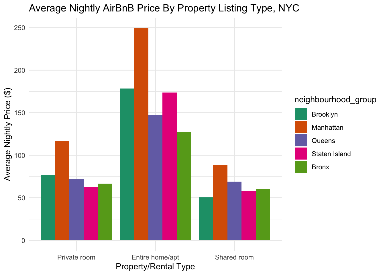
In challenge 6, we created a line graph looking at properties by year of last review:
airbnb_tidy %>%
  group_by(year_last_review) %>%
  summarize(n_properties = n_distinct(id)) %>%
  filter(!is.na(year_last_review)) %>%
  ggplot(aes(x= year_last_review, y = n_properties)) +
  geom_line() +
  xlab("Year of Last Review") +
  ylab("Number of Properties") +
  ggtitle("Number of AirBnB Properties in NYC by Date of Last Review") +
  scale_x_continuous(breaks = c(2011, 2012, 2013, 2014, 2015, 2016, 2017, 2018, 2019), labels = c("2011", "2012", "2013", "2014", "2015", "2016", "2017", "2018", "2019")) +
  theme_minimal()
We can break this down by property type, by drawing multiple lines on the same graph:
airbnb_tidy %>%
  group_by(year_last_review, room_type) %>%
  summarize(n_properties = n_distinct(id)) %>%
  filter(!is.na(year_last_review)) %>%
  ggplot(aes(x= year_last_review, y = n_properties, col=room_type)) +
  geom_line() +
  xlab("Year of Last Review") +
  ylab("Number of Properties") +
  ggtitle("Number of AirBnB Properties in NYC by Date of Last Review") +
  scale_x_continuous(breaks = c(2011, 2012, 2013, 2014, 2015, 2016, 2017, 2018, 2019), labels = c("2011", "2012", "2013", "2014", "2015", "2016", "2017", "2018", "2019")) +
  theme_minimal()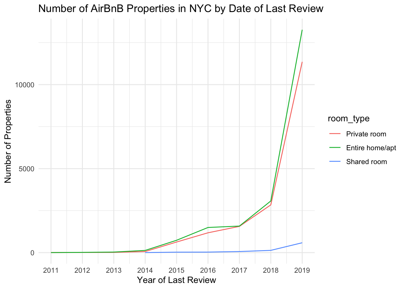
Here, we can now see that private rooms and entire homes greatly shot up in property count, but shared rooms much less so.