library(tidyverse)
library(ggplot2)

knitr::opts_chunk$set(echo = TRUE, warning=FALSE, message=FALSE)
Challenge 5
challenge_5
Tenzin Latoe
cereal
Introduction to Visualization
Challenge Overview
Today’s challenge is to:
- read in a data set, and describe the data set using both words and any supporting information (e.g., tables, etc)
- tidy data (as needed, including sanity checks)
- mutate variables as needed (including sanity checks)
- create at least two univariate visualizations
- try to make them “publication” ready
- Explain why you choose the specific graph type
- Create at least one bivariate visualization
- try to make them “publication” ready
- Explain why you choose the specific graph type
R Graph Gallery is a good starting point for thinking about what information is conveyed in standard graph types, and includes example R code.
(be sure to only include the category tags for the data you use!)
Read in data
Read in one (or more) of the following datasets, using the correct R package and command.
- cereal.csv ⭐
cereal_data <- read.csv("_data/cereal.csv")
cereal_data| Cereal | Sodium | Sugar | Type |
|---|---|---|---|
| Frosted Mini Wheats | 0 | 11 | A |
| Raisin Bran | 340 | 18 | A |
| All Bran | 70 | 5 | A |
| Apple Jacks | 140 | 14 | C |
| Captain Crunch | 200 | 12 | C |
| Cheerios | 180 | 1 | C |
| Cinnamon Toast Crunch | 210 | 10 | C |
| Crackling Oat Bran | 150 | 16 | A |
| Fiber One | 100 | 0 | A |
| Frosted Flakes | 130 | 12 | C |
| Froot Loops | 140 | 14 | C |
| Honey Bunches of Oats | 180 | 7 | A |
| Honey Nut Cheerios | 190 | 9 | C |
| Life | 160 | 6 | C |
| Rice Krispies | 290 | 3 | C |
| Honey Smacks | 50 | 15 | A |
| Special K | 220 | 4 | A |
| Wheaties | 180 | 4 | A |
| Corn Flakes | 200 | 3 | A |
| Honeycomb | 210 | 11 | C |
Briefly describe the data
dim((cereal_data))[1] 20 4head(cereal_data)| Cereal | Sodium | Sugar | Type |
|---|---|---|---|
| Frosted Mini Wheats | 0 | 11 | A |
| Raisin Bran | 340 | 18 | A |
| All Bran | 70 | 5 | A |
| Apple Jacks | 140 | 14 | C |
| Captain Crunch | 200 | 12 | C |
| Cheerios | 180 | 1 | C |
This dataset shows 20 rows and 4 columns. The four column names are: Cereal, Sodium, Sugar, and Type. There are 20 enteries of different types of cereals.
#Column names
colnames(cereal_data)
[1] "Cereal" "Sodium" "Sugar" "Type" #Types of names
unique(cereal_data$Cereal) [1] "Frosted Mini Wheats" "Raisin Bran" "All Bran"
[4] "Apple Jacks" "Captain Crunch" "Cheerios"
[7] "Cinnamon Toast Crunch" "Crackling Oat Bran" "Fiber One"
[10] "Frosted Flakes" "Froot Loops" "Honey Bunches of Oats"
[13] "Honey Nut Cheerios" "Life" "Rice Krispies"
[16] "Honey Smacks" "Special K" "Wheaties"
[19] "Corn Flakes" "Honeycomb" Tidy Data (as needed)
#checking for missing values
is.na(cereal_data)
Cereal Sodium Sugar Type
[1,] FALSE FALSE FALSE FALSE
[2,] FALSE FALSE FALSE FALSE
[3,] FALSE FALSE FALSE FALSE
[4,] FALSE FALSE FALSE FALSE
[5,] FALSE FALSE FALSE FALSE
[6,] FALSE FALSE FALSE FALSE
[7,] FALSE FALSE FALSE FALSE
[8,] FALSE FALSE FALSE FALSE
[9,] FALSE FALSE FALSE FALSE
[10,] FALSE FALSE FALSE FALSE
[11,] FALSE FALSE FALSE FALSE
[12,] FALSE FALSE FALSE FALSE
[13,] FALSE FALSE FALSE FALSE
[14,] FALSE FALSE FALSE FALSE
[15,] FALSE FALSE FALSE FALSE
[16,] FALSE FALSE FALSE FALSE
[17,] FALSE FALSE FALSE FALSE
[18,] FALSE FALSE FALSE FALSE
[19,] FALSE FALSE FALSE FALSE
[20,] FALSE FALSE FALSE FALSERunning the function above shows that there are no missing values in this data set. This data is already tidy.
Univariate Visualizations
#Geo_Col
ggplot(cereal_data, aes(x= Sugar , y=Cereal,)) +
    geom_col(fill= "mediumturquoise",
             color= "black")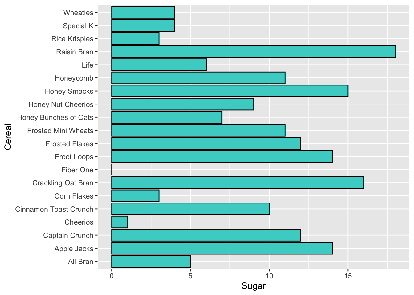
Using the ggplot() fuction, I did a simple bar graph to illustrate the sugars per serving for each type of cereal. This illustrated that Raisan Bran has the highest, while Fiber One was the lowest.
#Geom_boxplot
ggplot(cereal_data, aes(fill= Type, y=Sodium, x=Type)) +
    geom_boxplot()+guides(fill='none')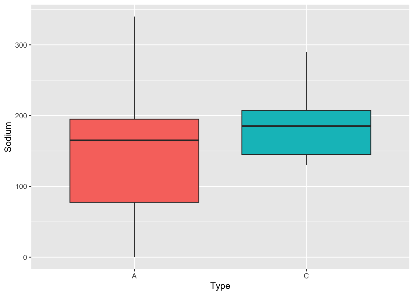
Next, the box plot illustrates how the distribution of the quantities of sodium in the data set varies based on the two different types of cereals:A or C.
Bivariate Visualization(s)
#Geom_point

ggplot(cereal_data, aes(x= Sugar , y=Sodium,
                        col=Type)) +
    geom_point()+geom_smooth(se=FALSE)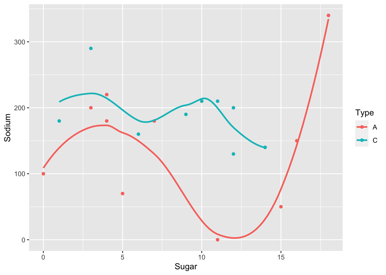
Scatter plot used to display sodium and sugar per cereal type to show the relationship between them, and smoothed to provide an estimate of the trend between the two variables.