library(tidyverse)
library(ggplot2)
library(lubridate)

knitr::opts_chunk$set(echo = TRUE, warning=FALSE, message=FALSE)
Challenge 6
challenge_6
fed_rate
Visualizing Time and Relationships
Challenge Overview
Today’s challenge is to:
- read in a data set, and describe the data set using both words and any supporting information (e.g., tables, etc)
- tidy data (as needed, including sanity checks)
- mutate variables as needed (including sanity checks)
- create at least one graph including time (evolution)
- try to make them “publication” ready (optional)
- Explain why you choose the specific graph type
- Create at least one graph depicting part-whole or flow relationships
- try to make them “publication” ready (optional)
- Explain why you choose the specific graph type
R Graph Gallery is a good starting point for thinking about what information is conveyed in standard graph types, and includes example R code.
(be sure to only include the category tags for the data you use!)
Read in data
Read in one (or more) of the following datasets, using the correct R package and command.
- fed_rate ⭐⭐
fed_rate <- read_csv("_data/FedFundsRate.csv")
head(fed_rate)
Briefly describe the data
dim(fed_rate)[1] 904 10colnames(fed_rate) [1] "Year" "Month"
[3] "Day" "Federal Funds Target Rate"
[5] "Federal Funds Upper Target" "Federal Funds Lower Target"
[7] "Effective Federal Funds Rate" "Real GDP (Percent Change)"
[9] "Unemployment Rate" "Inflation Rate" This dataset consists of 904 entries and 10 columns. The names of each column is provided above. This dataset provides federal fund rate information, GDP, Unemployment, and inflation rates from 1954 to 2017.
Tidy Data (as needed)
#count the total missing values
sum(is.na(fed_rate))
[1] 3196#new cleaned date column
fed_rate_clean <- fed_rate %>%
mutate(Date= ymd(str_c(Year, Month, Day, sep ="/"))) %>%
select(4:10, 11)
head(fed_rate_clean)To tidy the original data set, we can use lubridate to combine the seperated year, month, and day to create a new variable named “Date”. Now, the data set has a newly created “Date” column, and the total number of variables in the data set reduces from 10 to 8.
Time Dependent Visualization
ggplot(fed_rate_clean, aes(x=Date, y=fed_rate_clean$`Inflation Rate`)) +
  geom_line(color= "blue") +
  xlab("Date") +
  ylab("Inflation Rate") +
  ggtitle("Inflation Rate by Date")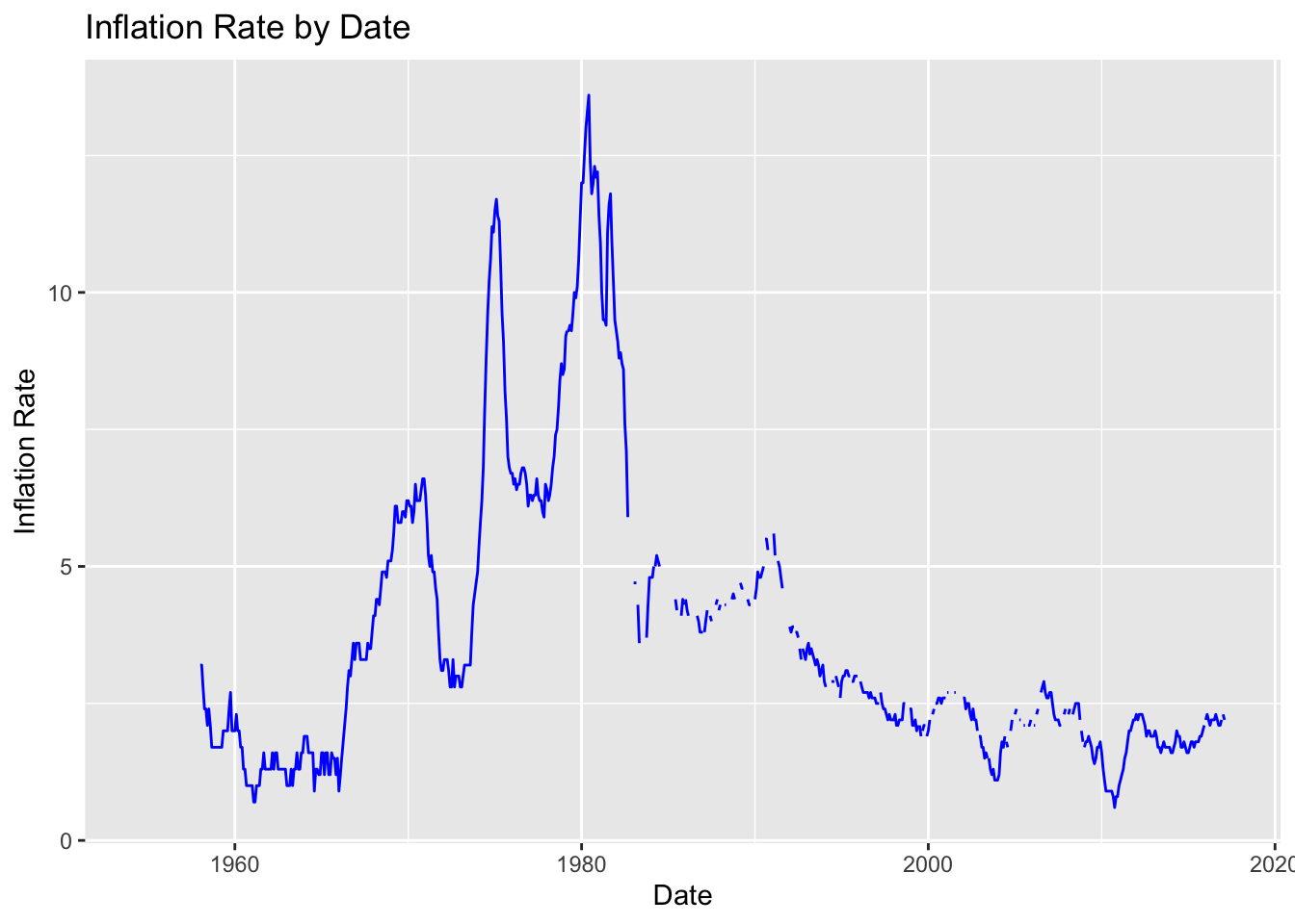
Using ggplot, I created a line plot to visualize in the inflation rate by date from 1954 to 2017. From the plot, we can see that the inflation rates were the highest between mid 1970s till early 1980s, and at it’s lowest during the 1960s, and at the start of early 2010s.
fed_rate_comp <- fed_rate_clean[!is.na(fed_rate_clean$`Inflation Rate`), ]

ggplot(fed_rate_comp, aes(x=Date, y=fed_rate_comp$`Inflation Rate`)) +
  geom_line(color= "blue") +
  xlab("Date") +
  ylab("Inflation Rate") +
  ggtitle("Inflation Rate by Date")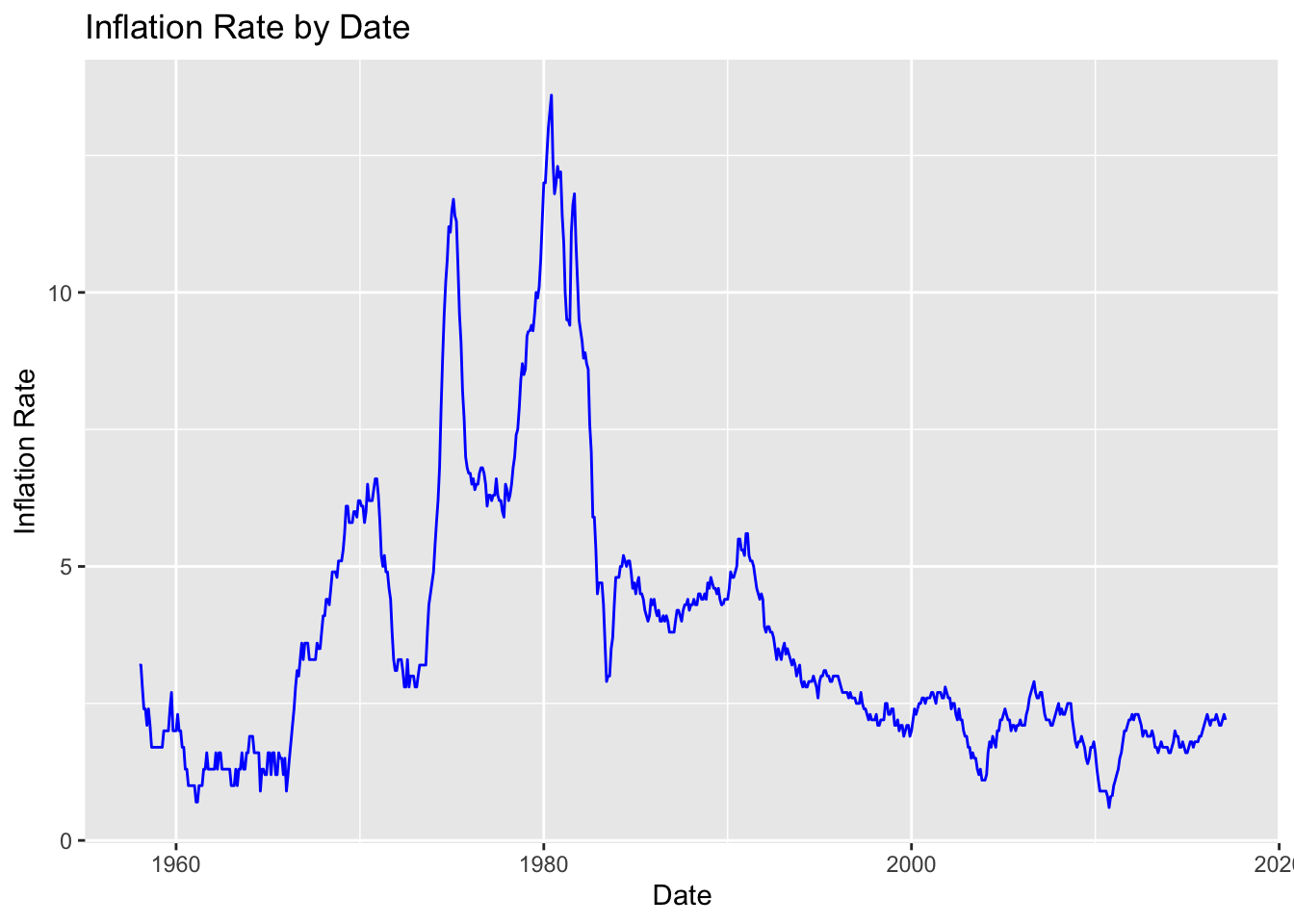
This line plot depicts the inflation from by date from 1954 to 2017, after removing all missing values. It shows similar peaks and valleys as observed above.
Visualizing Part-Whole Relationships
ggplot(fed_rate_clean, aes(x = Date)) +
  geom_line(aes(y = `Unemployment Rate`, color = "Unemployment Rate")) +
  geom_line(aes(y = `Inflation Rate`, color = "Inflation Rate")) +
  labs(x = "Date", y = "Rate", title = "Unemployment Rate vs. Inflation Rate") +
  scale_color_manual(values = c("Unemployment Rate" = "blue", "Inflation Rate" = "red")) +
  theme_minimal()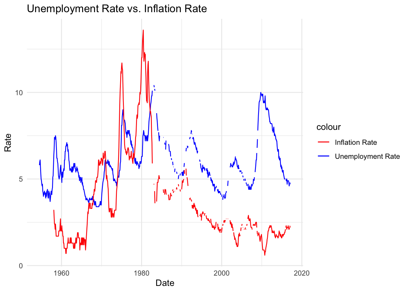
Line chart above compares the unemployment and inflation rate over time. This depicts how unemployment rate and inflation rates peaked similarly between mid 1970s till mid 1980s; however it also displayed a high unemployment rate beginning 2010, while simultaneously indicating low inflation rate.