Code
library(tidyverse)
library(dplyr)
library(ggrepel)
library(ggplot2)
library(scales)

knitr::opts_chunk$set(echo = TRUE, warning=FALSE, message=FALSE)

avocado <- read_csv("_data/avocado.csv")

avocado <- avocado %>% select(-1)
avocadoIt is a well known fact that Millenials LOVE Avocado Toast, so if a Millenial could find a city with cheap avocados, they could live out the Millenial American Dream.
This data was downloaded from Kaggle and the original data was from the Hass Avocado Board website. Hass Avocado Board describes the data on their website like below words:
Retail scan data comes directly from retailers’ cash registers based on actual retail sales of Hass avocados. Starting in 2013, the table below reflects an expanded, multi-outlet retail data set. Multi-outlet reporting includes an aggregation of the following channels: grocery, mass, club, drug, dollar and military. The Average Price (of avocados) in the table reflects a per unit (per avocado) cost, even when multiple units (avocados) are sold in bags. The Product Lookup codes (PLU’s) in the table are only for Hass avocados. Other varieties of avocados (e.g. greenskins) are not included in this table.
Some relevant columns in the dataset:
Date - The date of the observation Average Price - the average price of a single avocado per week type - conventional or organic year - the year Region - the city or region of the observation Total Volume - Total number of avocados sold 4046 - Total number of avocados with PLU 4046 sold 4225 - Total number of avocados with PLU 4225 sold 4770 - Total number of avocados with PLU 4770 sold
library(tidyverse)
library(dplyr)
library(ggrepel)
library(ggplot2)
library(scales)
knitr::opts_chunk$set(echo = TRUE, warning=FALSE, message=FALSE)
avocado <- read_csv("_data/avocado.csv")
avocado <- avocado %>% select(-1)
avocadoI read in file first and delete the first column above because it represents row number.
##Clean and Explain Dataset
clean_avocado <- avocado %>% filter(!region%in%"TotalUS") %>%
  mutate(
    type = as_factor(type),
    Year = as.character(year)
    ) %>% select(-year) %>%
  rename(c( Small = `4046`, `Large` = `4225`, `Xlarge` = `4770` , `Average Price Per Week` = `AveragePrice`, `Region`=`region`, `Type`=`type`))

clean_avocadounique(clean_avocado$Type)[1] conventional organic
Levels: conventional organicunique(clean_avocado$Year)[1] "2015" "2016" "2017" "2018"unique(clean_avocado$Region) [1] "Albany" "Atlanta" "BaltimoreWashington"
[4] "Boise" "Boston" "BuffaloRochester"
[7] "California" "Charlotte" "Chicago"
[10] "CincinnatiDayton" "Columbus" "DallasFtWorth"
[13] "Denver" "Detroit" "GrandRapids"
[16] "GreatLakes" "HarrisburgScranton" "HartfordSpringfield"
[19] "Houston" "Indianapolis" "Jacksonville"
[22] "LasVegas" "LosAngeles" "Louisville"
[25] "MiamiFtLauderdale" "Midsouth" "Nashville"
[28] "NewOrleansMobile" "NewYork" "Northeast"
[31] "NorthernNewEngland" "Orlando" "Philadelphia"
[34] "PhoenixTucson" "Pittsburgh" "Plains"
[37] "Portland" "RaleighGreensboro" "RichmondNorfolk"
[40] "Roanoke" "Sacramento" "SanDiego"
[43] "SanFrancisco" "Seattle" "SouthCarolina"
[46] "SouthCentral" "Southeast" "Spokane"
[49] "StLouis" "Syracuse" "Tampa"
[52] "West" "WestTexNewMexico" clean_avocado %>%select(Date)%>% arrange(desc(Date))I mutate the variable types to suitable ones and rename columns’ name to be clearer and also change the variable types. I change the year type to character not date because I don’t want month and day added in it and just want year. 4046 = Small avocado 4225 = Large avocado 4770 = Extra large avocado
From above, we can see this data set recorded below information:
the information from 2015 to 2018. But be careful, from the third tibble, we can see the 2 data for the year 2018 is incomplete and only recorded data from January to March.
The type of avocados only have two type: conventional and organic.
In region column, the units for each region are different. Among them, there are several names that represent collective regions, namely West, Midsouth, Northeast, SouthCentral, and Southeast and total US. So we conduct a comparative analysis of these regions. I also filter out the data that does not include “Total US”.
the size of avocados and the bag size of avocados are both have 3 types.
summary_avocado <- clean_avocado%>%
  filter(Year == "2018") %>%
  group_by(Year, Type)

summary_avocadosummary_avocado <- clean_avocado%>%
group_by(Year, Type) %>%
summarise("Average Price Per Year" = mean(`Average Price Per Week`))
summary_avocadosummary_avocado %>% ggplot(aes(x=Year, y=`Average Price Per Year`,group=`Type`, color=`Type`)) +
geom_line() +
labs(title = "The Anual Trend of Average Price in Whole Country ",
x = "Year",
y = "Average Price") +
theme_minimal() 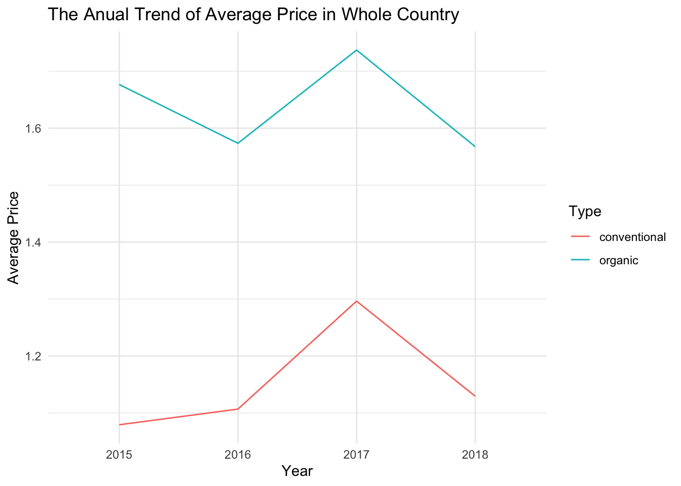
In the previous two chunks, I calculated the average prices of both avocado varieties for each year and plotted the corresponding line graphs. Please note that the price data for 2018 is only available for the months of January to March.
As everyone knows, due to inflation and increased demand, the price of avocados should be higher each year. This was the trend for conventional avocados from 2015 to 2017, but in 2018, there was a significant decrease in price. Organic avocados also experienced a significant price drop. However, data for 2018 is only available for the months of January to March, so I suspect that prices during this period might be lower compared to other months. At the same time, I also came across a statement that says “January through March is the best time of year for flavor.” So it is indeed possible that the prices for January to March are comparatively lower. However, We can further analyze the specific reasons by comparing the prices of January to March with prices from other months in different years.
Apart from that, we can also observe that the price of organic avocados has been fluctuating in these years. I believe this directly reflects the supply and demand relationship. In other words, when the price is high, fewer people will buy, causing the price to decrease. When the price decreases, more people will naturally buy, leading to another price increase. Of course, we will verify this point later on.
price_13 <- clean_avocado%>%
  mutate(month = month(Date)) %>%
  mutate(month = as.character(month)) %>%
  filter(!month %in% c("1", "2", "3")) %>%
  group_by(Year, Type) %>%
  summarise("Average Price in Apr to Dec" = mean(`Average Price Per Week`))

price_412 <- clean_avocado%>%
  mutate(month = month(Date)) %>%
  mutate(month = as.character(month)) %>%
  filter(month=="1"|month=="2"|month=="3") %>%
  group_by(Year, Type) %>%
  summarise("Average Price in Jan to Mar" = mean(`Average Price Per Week`))

price_month <- left_join(price_412, price_13,
                   by = c("Year", "Type"))

price_month <- price_month %>% pivot_longer(cols = c(`Average Price in Apr to Dec`, `Average Price in Jan to Mar`
), names_to = "Price", values_to = "value")

price_month
As shown in the tibble above, I calculated the average prices for each type during January to March and April to December each year, and plotted a comparison chart below.
price_month %>% ggplot(aes(x=Year, y= `value`, color = Price,group=Price)) +
  geom_line() +
  theme_minimal() +
  facet_wrap(~Type)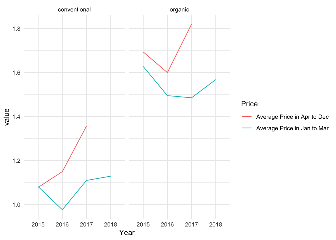
From the graph, it does appear that my guess was correct. Regardless of avocado type, the average prices during January to March are lower than those from April to December. Therefore, the lower prices in 2018 compared to other years are not actually a decrease, but rather because there is data only for January to March. Additionally, we can observe that the average price for conventional avocados in January to March of 2018 is higher than in other years, and the organic avocados show an upward trend as well. This indicates that the overall average prices in 2018 would not be higher than in other years, and there may even be a significant price increase.
The graph below shows the trend of average prices and total purchase volumes for organic avocados from January to March, from 2015 to 2018. Since we only have data for January to March in 2018, we cannot analyze the entire year but only this specific time period. However, it is still sufficient to observe the relationship between supply and demand.
 price_Jan_Mar <- clean_avocado%>%
  mutate(month = month(Date)) %>%
  mutate(month = as.character(month)) %>%
  filter(month=="1"|month=="2"|month=="3") %>%
  group_by(Year, Type) %>%
  summarise("Average Price in 1-3" = mean(`Average Price Per Week`)) %>%
  filter(Type=="organic") %>%
  ggplot(aes(x=Year, y= `Average Price in 1-3`,group=Type)) +
  geom_line() +
  geom_point() +
  labs(title = "The Anual trend of Average Price of Organic Avocado \n from Jun to March in Whole Country ",
       x = "Year",
       y = "Average Price")+
  theme_minimal()

Vol_Jan_Mar <- clean_avocado %>%
  mutate(month = month(Date)) %>%
  mutate(month = as.character(month)) %>%
  filter(month=="1"|month=="2"|month=="3") %>%
  group_by(Year, Type) %>%
  summarise(Total_volume = sum(`Total Volume`)) %>%
  filter(Type=="organic") %>%
  ggplot(aes(x = Year, y = Total_volume, group= Type)) +
  geom_point() +
  geom_line() +
  labs(title = "The Anual trend of Total Purchase Volume of Organic Avocado \n from January to March",
       x = "Year",
       y = "Total Volume") +
  theme_minimal()

price_Jan_Mar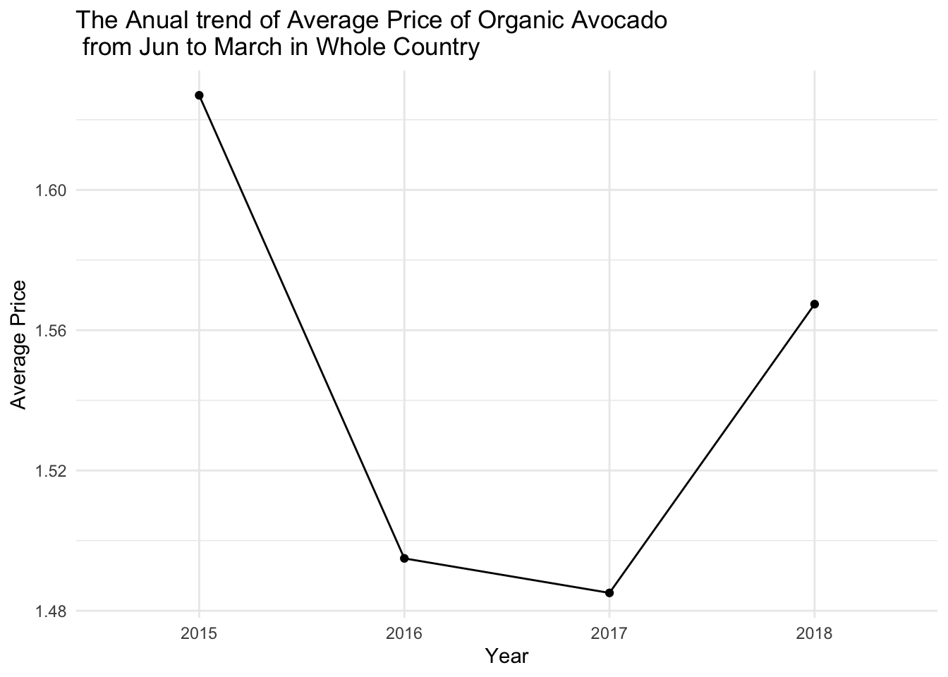
Vol_Jan_Mar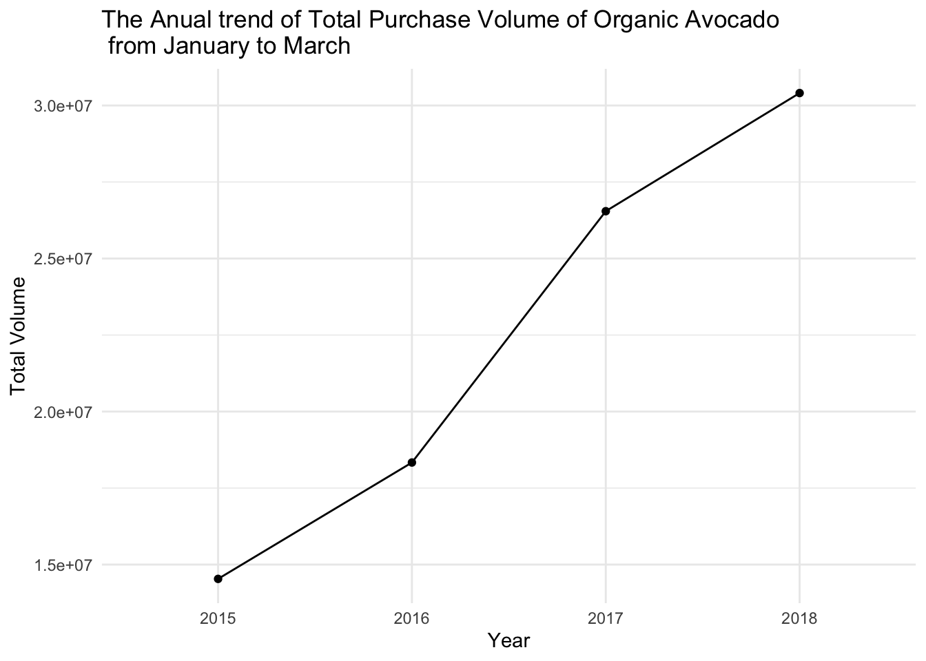
From these two graphs, it is evident that organic avocado prices continued to decline from 2015 to 2017, and there was indeed a significant increase in purchase volume during that period. Although there was a substantial price increase in 2018, the purchase volume still continued to grow from 2017 to 2018, albeit at a slower pace. This can be understood as follows: as prices increase, the purchase volume tends to decrease. However, due to the growing demand for avocados and an expanding consumer base, the purchase volume still increases, although at a slower rate.
Above, we mentioned that the data for 2018 is incomplete. Therefore, here I would like to predict the possible state of the data for the rest of 2018. According to the data of prices and purchase quantities from 2015 to March 2018, I trained three models to predict the data from April to December 2018. After training the model (see reference), I selected a relatively accurate model to predict the subsequent data. The following is an analysis of the predicted data.
avo_predic <- read_csv("_data/avocado_prediction2018.csv")

avo_predic <- avo_predic %>% mutate(month = as.character(month),
                                    Year = as.character(Year))

aa <- clean_avocado%>%
  select(Year,Type,`Total Volume`, `Average Price Per Week`,Date) %>%
  mutate(month = month(Date)) %>%
  mutate(month = as.character(month)) %>%
  mutate(month = fct_relevel(month, c("1", "2", "3", "4", "5","6","7","8","9","10","11","12"))) %>%
  group_by( Year, month,Type)%>%
  summarise(Average_price = mean( `Average Price Per Week` ),
            Total_volume = sum(`Total Volume`)) #%>% filter(!Year%in%"2018")

avo_predic2 <- merge(avo_predic, aa,all=T)

avo_predic2 <- avo_predic2 %>% mutate(month = fct_relevel(month, c("1", "2", "3", "4", "5","6","7","8","9","10","11","12")))%>%mutate(date = str_c(month , Year , sep=" " ), date = my(date)) %>% arrange(date)
avo_predic2 %>% select(-c(Year,month))
In the above chunk, I imported the data for the year 2018 and merged it with the original data. The table above displays all the data. It includes the average price and total volume of each type and each month.
avo_predic2 %>% group_by( Year,Type)%>%
  summarise(Average_price = mean( `Average_price` ),
            Total_volume = sum(`Total_volume`)) %>%
  ggplot(aes(x = Year, y = Total_volume,group= Type, color = Type)) +
  geom_point() +
  geom_line() +
  labs(title = "The Annual Trend of Total Valume in Whole Country ",
       x = "Year",
       y = "Total Valoume") +
theme_minimal() 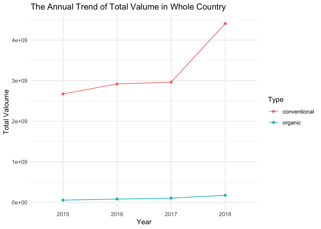
From our predicted values, it can be seen that the purchase volume of both types of avocados, conventional and organic, shows an increasing trend in 2018. Especially for conventional avocados, the increase in purchase volume is much higher compared to previous years. This is quite reasonable because 2018 was a year with a relatively good economic state, and as people’s living standards improve, they tend to pursue a better quality of life. Avocados, being a nutritious and healthy food, naturally experience an increase in demand.
avo_predic2 %>%
  ggplot(aes(x = date, y = Total_volume,group= Type, color = Type)) +
  geom_line() +
  labs(title = "The month trend of Total Valume in Whole Country ",
       x = "Year",
       y = "Total Valoume") +
  theme_minimal() +
  scale_x_date(date_breaks = '1 year', date_labels = "%b-%Y")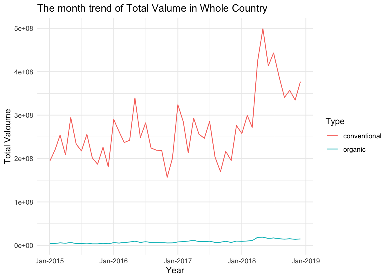
avo_predic2 %>%
  ggplot(aes(x = date, y = Average_price,group= Type, color = Type)) +
  geom_line() +
  labs(title = "The month trend of Average Pirce in Whole Country ",
       x = "Year",
       y = "Total Valoume") +
  theme_minimal() +
  scale_x_date(date_breaks = '1 year', date_labels = "%b-%Y")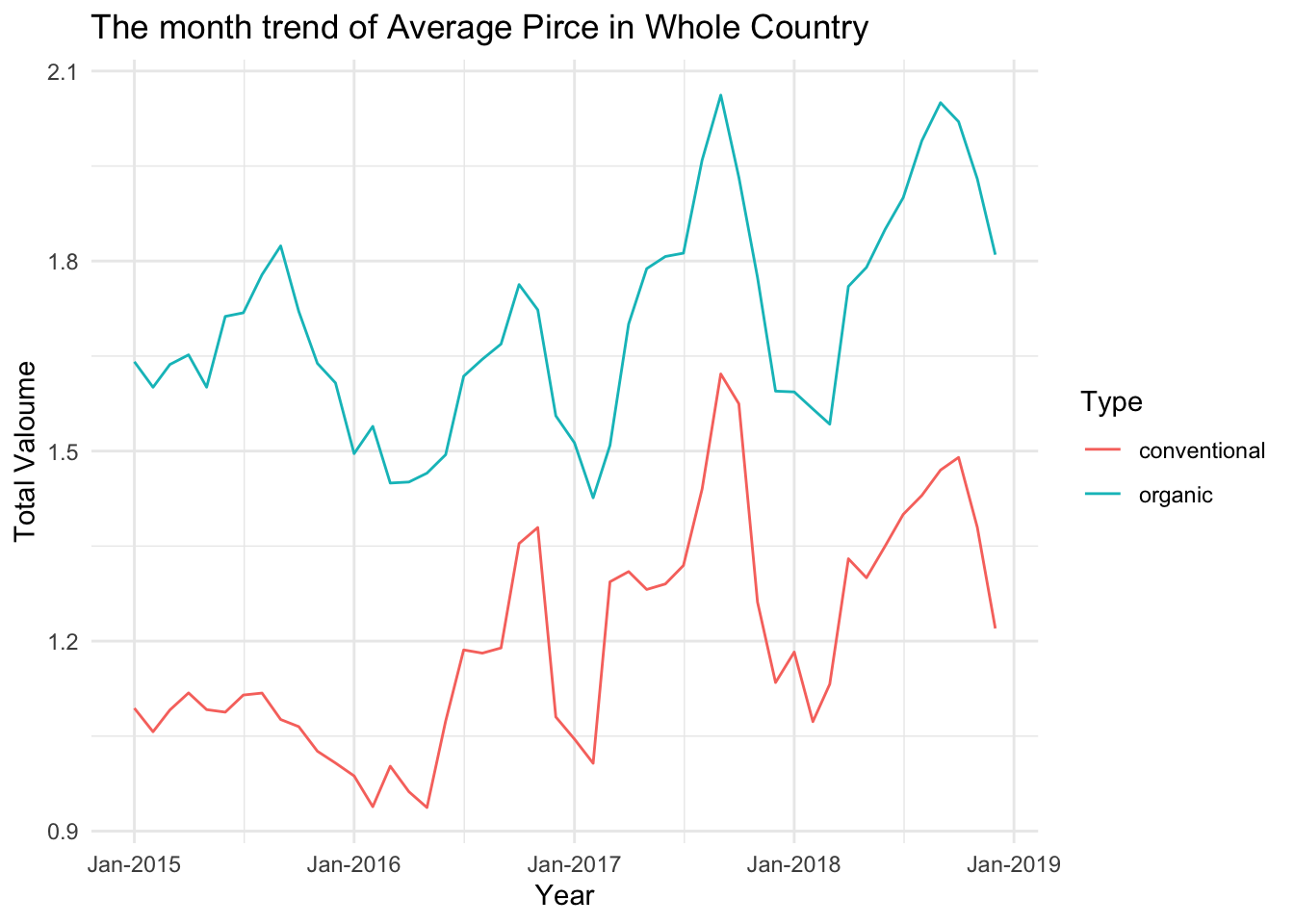
From the first graph above, it can be observed that the purchase volume of conventional avocados fluctuates greatly between each month, particularly experiencing significant ups and downs from late 2016 to early 2017. In early 2018, the purchase volume showed a steady increase. Although there are still substantial fluctuations afterwards, the overall purchase volume remains higher than the previous years. Looking at the prices of conventional avocados, the fluctuations were the smallest in 2015. The prices showed an upward trend in 2016 and 2017. However, our predicted prices for 2018 indicate a certain degree of decrease, especially during the months of January to March where the prices were extremely low.
The purchase volume of organic avocados, in contrast to conventional avocados, remains relatively stable. However, the increase in its price is not significantly smaller compared to conventional avocados. This implies that the demand for organic avocados is indeed relatively low, to the extent that the price increase is not enough to affect the changes in purchase volume.
Due to the significantly lower demand for organic avocados compared to conventional ones, we will only analyze conventional avocados below.
size <- clean_avocado %>%
  select(Small, Large, Xlarge,Type) %>% group_by(Type) %>%
  summarise("sumsmall" = sum(`Small`),
            "sumlarge" = sum(`Large`),
            "sumxlarge" = sum(`Xlarge`)) %>%
  pivot_longer(cols = -Type, names_to = "size", values_to = "value") %>%
  mutate(size = as_factor(size))

sizesize %>% filter(Type=="conventional") %>%
ggplot(aes(x=size, y=value))+
geom_bar(position="stack", stat="identity") +
theme_minimal() +
labs(title = " The Total Purchase Volumes for Each Size of Conventional Avocados \n from 2015 to 2018 ",
x = "Size",
y = "Total Valoume") +
scale_x_discrete(labels=c('Small', 'Large', 'Extra Large'))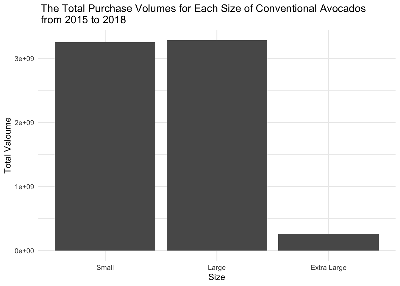
size %>% filter(Type=="organic") %>%
  ggplot(aes(x=size, y=value))+
  geom_bar(position="stack", stat="identity") +
  theme_minimal() +
  labs(title = " The Total Purchase Volumes for Each Size of Organic Avocados \n from 2015 to 2018 ",
       x = "Size",
       y = "Total Valoume") +
  scale_x_discrete(labels=c('Small', 'Large', 'Extra Large'))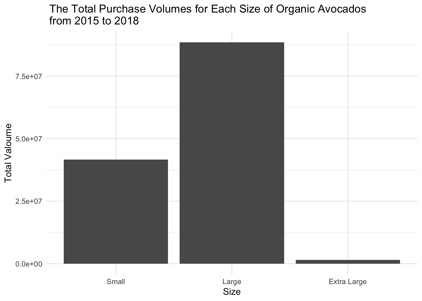
From this graph, we can observe the relationship between type and size. Regardless of the type, the quantities of large and small sizes are still significantly higher than extra-large size. Friends who have eaten avocados know that avocados provide a strong feeling of satiety, so it’s possible that extra-large avocados may not be finished. Therefore, it is natural for the quantity of large and small avocados purchased to be much higher than the quantity of extra-large avocados.
For conventional avocados, the purchasing quantity for small size is slightly higher than large size while for organic avocados, the purchasing quantity for large size is greater than that of small size and it is even twice as that of small size.
Below, I calculated the purchase volume of avocados of different sizes and the purchase volume of bagged avocados in the aggregated regions, and plotted graphs.
size <- clean_avocado %>% filter(Region== "West"| Region=="Midsouth" | Region=="Northeast" | Region=="SouthCentral"| Region=="Southeast") %>% group_by(Region, Type, ) %>%
  summarise(
    small = sum(`Small`),
    large = sum(`Large`),
    xlarge = sum(`Xlarge`)) %>%
  pivot_longer(cols = c(`small`, `large`,`xlarge`), names_to = "size", values_to = "sizevalue")

bags <- clean_avocado %>%
  filter(Region== "West"| Region=="Midsouth" | Region=="Northeast" | Region=="SouthCentral"| Region=="Southeast") %>%
  group_by(Region, Type, ) %>%
  summarise(
    smallbag = sum(`Small Bags`),
    largebag = sum(`Large Bags`),
    xlargebag = sum(`XLarge Bags`)) %>%
  pivot_longer(cols = c(`smallbag`, `largebag`,`xlargebag`), names_to = "bags", values_to = "bagvalue")

sizebagssize %>% filter(!Type%in%"organic" ) %>%
filter(!size%in%"xlarge" ) %>%
ggplot(aes(x=size, y= sizevalue, fill= Region, group= Region)) +
geom_bar(position="stack", stat="identity") +
theme_minimal() +
labs(title = " The Total Purchase Volumes for Each Size of Conventional Avocados\n in Each Region from 2015 to 2018 ",
x = "Size",
y = "Total Valoume") +
scale_x_discrete(labels=c('Small', 'Large', 'Extra Large'))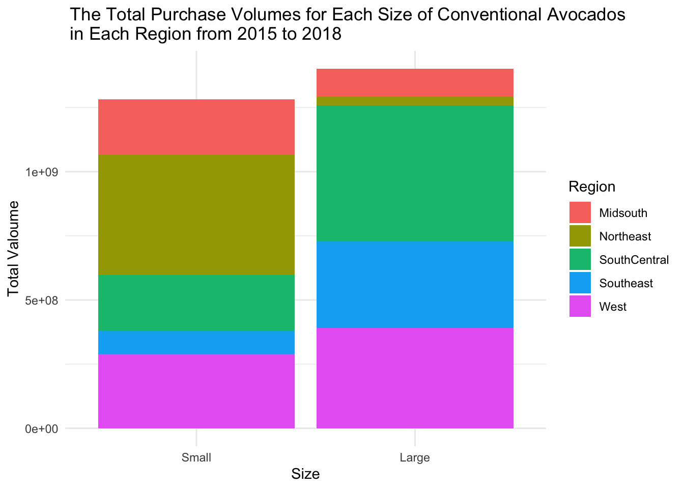
As mentioned earlier, the total purchase volume of extra-large avocados is very low, so in the graph, we will only analyze large and small avocados. From the graph, we can see that the West and SouthCentral regions have the highest total purchase volumes. Additionally, the SouthCentral region contributes the most to the purchase volume of large-sized avocados, followed by the West region. The Northeast region has the highest purchase volume for small-sized avocados.
bags %>% filter(!Type%in%"organic" ) %>%
  ggplot(aes(x=bags, y= bagvalue, fill= Region, group= Region)) +
  geom_bar(position="stack", stat="identity") +
  theme_minimal() +
  labs(title = " The Total Purchase Volumes for Each Size of Bags of Conventional Avocados \n in Each from 2015 to 2018 ",
       x = "Size",
       y = "Total Valoume") +
  scale_x_discrete(labels=c('Small', 'Large', 'Extra Large'))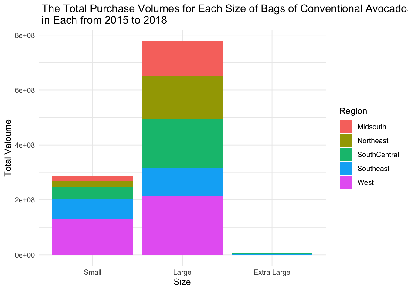
From the graph, it is evident that regardless of the region, the purchase quantity of extra-large bags is significantly lower compared to the other two sizes. This is because avocados are not easily stored, and even when refrigerated, they can spoil quickly. As a result, people tend to prefer purchasing large and small-sized bags of avocados. Additionally, we can observe that in every region, the quantity of large-sized bags is much higher than that of small bags, indicating a high demand for avocados.
Furthermore, for large-sized bags, the West region contributes the most, while the Southeast region contributes the least. The other three regions have similar contributions.
The United States is one of the major avocado-producing countries, with specific regions known for avocado production. The main production areas of avocados in America include California, Florida, Texas. Indeed, they are located in areas with a warmer climate in the southern parts. However, we can still compare its prices with those of other cities, which will allow us to examine whether there is a relationship between the distance from the origin and the prices. I have selected a few cities, ranging from nearest to farthest from California, namely Denver, Chicago, Columbus, Philadelphia, Boston and Portland. These cities are relatively far from the other two avocado production areas. I also choose LosAngeles to represent California Beacuse other regions are all cities.
price_dis <- clean_avocado %>%
   filter(Region=="LosAngeles"|Region=="Denver"|Region=="Chicago"|Region=="Columbus"|Region=="Philadelphia"|Region=="Boston"|Region=="Portland") %>%
  pivot_longer(cols = c(`Small`, `Large`,`Xlarge`), names_to = "size", values_to = "sizevalue") %>%
  mutate(Region = fct_relevel(Region, c("LosAngeles", "Denver", "Chicago", "Columbus", "Philadelphia","Boston","Portland"))) %>%
  arrange(Region) %>%
  group_by(Region,Type) %>%
  summarise(
    Price=mean(`Average Price Per Week`)
  )

price_disprice_dis %>% ggplot(aes(x=Region, y= Price, fill= Region, group= Region)) +
geom_bar(position="stack", stat="identity")+
facet_wrap(~Type) +
theme_minimal() +
labs(title = " The Relationship Between the Average Pirce of Avocados and Regions ",
y = "Average Price")+
theme(axis.text.x = element_text(angle = 20))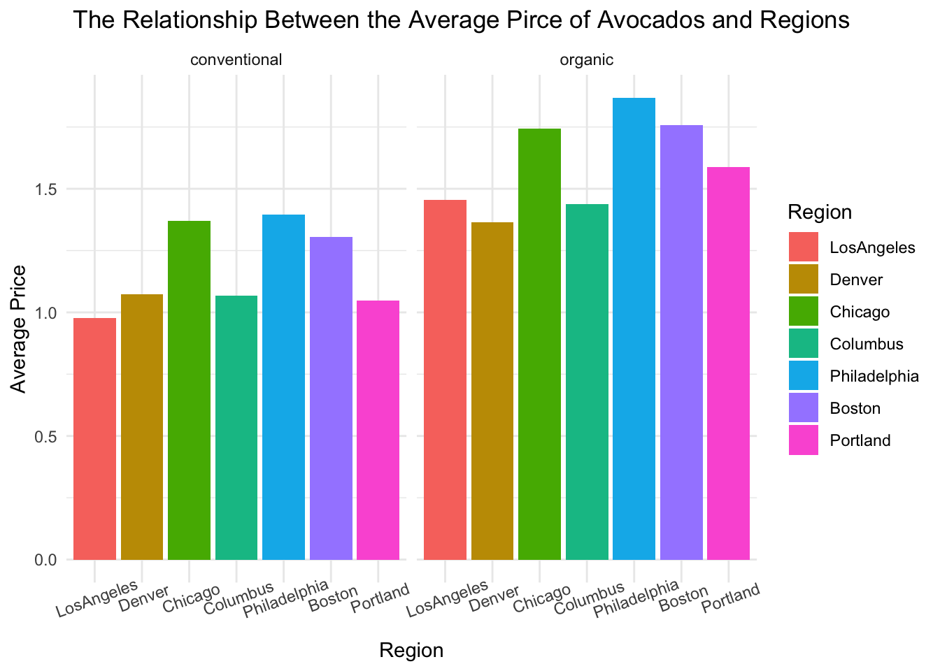
This graph is quite interesting. For conventional avocados, there does appear to be an upward price trend from Los Angeles to Chicago. However, there is a sudden decrease in price in Columbus. If we exclude Columbus and focus on the other cities, there is an increase in price from Los Angeles to Philadelphia. However, there is a downward trend in price from Philadelphia to Portland. For organic avocados, Columbus still has the lowest price. There is still a downward trend from Philadelphia to Portland. However, the prices of cities closer to California have fluctuated, like Denver which has a slightly lower price compared to LosAngeles. The price of avocados is indeed influenced by factors beyond just distance, including the local economy, cost of living, and demand. Therefore, the significantly lower price in Columbus must have other reasons, perhaps indicating a relatively lower demand in the area.
Additionally, we can also examine the differences in avocado purchase volumes among these cities. Below is the box plot for the Total Volume Per Week of Conventional Avocados in each region.
clean_avocado %>%
  filter(Region=="LosAngeles"|Region=="Denver"|Region=="Chicago"|Region=="Columbus"|Region=="Philadelphia"|Region=="Boston"|Region=="Portland") %>%
  pivot_longer(cols = c(`Small`, `Large`,`Xlarge`), names_to = "size", values_to = "sizevalue") %>%
  mutate(Region = fct_relevel(Region, c("LosAngeles", "Denver", "Chicago", "Columbus", "Philadelphia","Boston","Portland"))) %>%
  filter(Type=="conventional") %>%
  arrange(Region) %>%
  ggplot(aes(x = Region,
           y = `Total Volume`)) +
  geom_boxplot() +
  theme_minimal() +
  labs(title = " Total Volume Per Week of Conventional Avocados by Region ",
       y = "Average Price")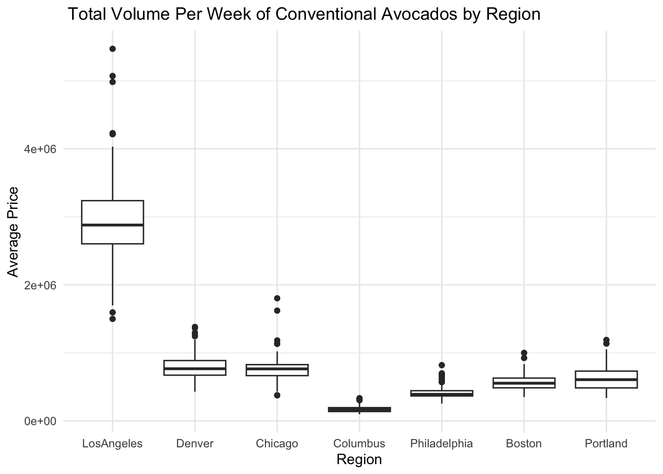
This graph displays the 25th percentile, median, and 75th percentile of a distribution. The whiskers (vertical lines) capture roughly 99% of a normal distribution, and observations outside this range are plotted as points representing outliers.
We can clearly see that the purchase volume in Los Angeles is significantly higher than in other cities, and there is a large difference in purchase volumes between the upper and lower ends. The purchase volume in Columbus is indeed the lowest, and compared to other cities, its range of purchase volumes is not very pronounced. The data points are concentrated together, indicating a relatively consistent purchase volume in Columbus. From Los Angeles to Chicago, the purchase volume gradually decreases, while from Philadelphia to Portland, the purchase volume gradually increases. I believe this corresponds directly to the price trends. Compared to Los Angeles, the purchase volumes in other cities are relatively stable, primarily clustered around the median.
In this project, I aimed to analyze a dataset related to avocado price and purchased volume from 2015 to 2018. The primary objectives were to extract meaningful insights, identify patterns, and present the findings in a visually appealing manner. I leveraged the power of R and its libraries, such as ggplot and dplyr, to clean, transform, and analyze the data. The project involved several stages, including data preprocessing, exploratory data analysis, statistical modeling, and visualization.
January to March is the peak season for avocado production. During this time, avocado prices are relatively lower and the taste is better. Avocado enthusiasts can indulge in buying avocados to their heart’s content.
I am very eager to predict the data for the period from April to December 2018, including prices, purchase volume, and so on. However, the dataset as a whole has a very small amount of data, so the accuracy of the estimated results is limited. But I believe that this estimation is still relatively accurate. Based on the final results, the price trends for the two types of avocados in 2018 are similar to those in 2017, with overall average prices remaining relatively stable. However, the overall purchase quantity in 2018 has significantly increased. Therefore, it is reasonable to believe that the concept of a healthy lifestyle and healthy diet is becoming more widespread, and people are paying more attention to nutritional balance. As a result, the demand for avocados has sharply increased. However, due to the relatively high price of avocados, the increase in organic purchases is comparatively smaller.
One obvious problem with this dataset is that the units for ‘region’ are different. Some are cities, some are states, and there are even aggregated areas. This leads to duplicated data and confusion. Additionally, it is not easy to determine the specific unit of each region, especially for analysts or myself. I believe that clarifying the divisions of regions would be beneficial for analyzing the data.
4.This dataset has a relatively small sample size, spanning only a little over three years. This limitation can result in less accurate analysis and hinders the ability to predict future trends effectively.
A basic understanding of R Programming: This project provided an excellent opportunity to enhance my programming skills in R. I gained a basic understanding of the language’s syntax, data structures, and built-in functions. I became familiar with packages like tidyr and ggplot, which facilitated efficient data manipulation.
During the learning in this course, I learned data preprocessing techniques: Preparing the dataset for analysis was a crucial step. I learned how to handle missing values, remove duplicates, and handle outliers effectively. Techniques like data imputation and feature scaling were employed to ensure the reliability of the subsequent analysis.
Exploratory data analysis: it is a significant aspect of the project, allowing me to uncover hidden patterns and relationships within the dataset. By utilizing various visualization techniques, such as scatter plots, histograms, and box plots, I gained some valuable insights into the distribution of variables, correlations, and potential outliers.
Data cleaning and wrangling: The dataset contained inconsistencies, missing values, and outliers, which posed challenges during the preprocessing stage. Dealing with these issues required careful consideration and domain knowledge to ensure accurate and reliable results. Especially when it comes to modifying time variables and the syntax of certain statements, as well as how to use more concise methods to write statements, I don’t have a very strong grasp of them. In my future studies, I should focus on strengthening my practice in this area.
Selecting appropriate visualizations: Choosing the most effective visualizations to represent the data was a challenging task. I had to consider the nature of the variables and the story I wanted to convey. Experimentation and feedback helped me refine my visualization choices and effectively communicate the findings. From my entire project, it is evident that my ability to choose appropriate visualizations is relatively weak. I only utilized a few basic visualizations because I often find myself unsure about what aspects of the dataset to analyze. Due to my limited programming experience in the past, I believe I have completed the current stage of learning. However, moving forward, I need to become more sensitive to the data and become more proficient and accurate in using visualizations.
Model tranning: Due to my limited capabilities, I have not learned any effective methods to predict future data in R. So I sought the help of my boyfriend. He taught me how to write a data training model and helped me with modifications in Python. In the end, we successfully predicted the data for 2018. Model training is a big challenge for me. If I want to become proficient in data science in the future, I definitely need to learn how to predict future data more accurately. So, I will also learn how to use R language to select suitable models for data prediction.
Regional distribution map: I attempted to create a regional distribution map, but I failed. All the tutorials I looked at require state or FIPS codes to display the regional distribution. However, my data includes a lot of aggregated or city-level data, which would require me to manually input all the data, which is clearly impractical. Currently, I haven’t found a suitable method to create such a clear and concise distribution map, so in the future, I will need to learn how to create an informative distribution map.
Time Management: As with any project, time management played a crucial role. Balancing the various project stages, such as data preprocessing, analysis, and visualization, was demanding. Adhering to a structured timeline and prioritizing tasks will help me overcome this challenge.
Hass Avocado Boardhttps://hassavocadoboard.com.
Justin Kiggins.(2018). Avocado Prices:2015-2015. Kaggle. https://www.kaggle.com/datasets/neuromusic/avocado-prices.
Wickham, H., & Grolemund, G. (2016). R for data science: Visualize, model, transform, tidy, and import data. https://r4ds.had.co.nz.
R Core Team (2023). R: A Language and Environment for Statistical Computing. R Foundation for Statistical Computing, Vienna, Austria. https://www.R-project.org/.
Rob Kabacoff. Data Visualization with R. https://rkabacoff.github.io/datavis/.
Wickham, H. (2019). Advanced R, Second Edition. CRC Press.
R for Epidemiology. https://www.r4epi.com.
Xiangdong Xie, Shuqi Hong. non Linear Regression. https://github.com/Shuqihong/DASS/blob/main/nonLinearRegression.ipynb.