| Country [character] |
| 1. Afghanistan |
| 2. Albania |
| 3. Algeria |
| 4. Andorra |
| 5. Angola |
| 6. Antigua and Barbuda |
| 7. Argentina |
| 8. Armenia |
| 9. Australia |
| 10. Austria |
| [ 185 others ] |
|
| 1 |
( |
0.5% |
) |
| 1 |
( |
0.5% |
) |
| 1 |
( |
0.5% |
) |
| 1 |
( |
0.5% |
) |
| 1 |
( |
0.5% |
) |
| 1 |
( |
0.5% |
) |
| 1 |
( |
0.5% |
) |
| 1 |
( |
0.5% |
) |
| 1 |
( |
0.5% |
) |
| 1 |
( |
0.5% |
) |
| 185 |
( |
94.9% |
) |
|
 |
0 (0.0%) |
| Density (P/Km2) [numeric] |
| Mean (sd) : 356.8 (1982.9) |
| min ≤ med ≤ max: |
| 2 ≤ 89 ≤ 26337 |
| IQR (CV) : 181 (5.6) |
|
137 distinct values |
 |
0 (0.0%) |
| Abbreviation [character] |
| 1. AD |
| 2. AE |
| 3. AF |
| 4. AG |
| 5. AL |
| 6. AM |
| 7. AO |
| 8. AR |
| 9. AT |
| 10. AU |
| [ 178 others ] |
|
| 1 |
( |
0.5% |
) |
| 1 |
( |
0.5% |
) |
| 1 |
( |
0.5% |
) |
| 1 |
( |
0.5% |
) |
| 1 |
( |
0.5% |
) |
| 1 |
( |
0.5% |
) |
| 1 |
( |
0.5% |
) |
| 1 |
( |
0.5% |
) |
| 1 |
( |
0.5% |
) |
| 1 |
( |
0.5% |
) |
| 178 |
( |
94.7% |
) |
|
|
7 (3.6%) |
| Agricultural Land( %) [character] |
| 1. 17.40% |
| 2. 2.70% |
| 3. 23.10% |
| 4. 23.30% |
| 5. 25.60% |
| 6. 26.30% |
| 7. 28.70% |
| 8. 31.10% |
| 9. 32.40% |
| 10. 33.30% |
| [ 158 others ] |
|
| 3 |
( |
1.6% |
) |
| 2 |
( |
1.1% |
) |
| 2 |
( |
1.1% |
) |
| 2 |
( |
1.1% |
) |
| 2 |
( |
1.1% |
) |
| 2 |
( |
1.1% |
) |
| 2 |
( |
1.1% |
) |
| 2 |
( |
1.1% |
) |
| 2 |
( |
1.1% |
) |
| 2 |
( |
1.1% |
) |
| 167 |
( |
88.8% |
) |
|
 |
7 (3.6%) |
| Land Area(Km2) [numeric] |
| Mean (sd) : 689624.4 (1921609) |
| min ≤ med ≤ max: |
| 0 ≤ 119511 ≤ 17098240 |
| IQR (CV) : 500427.8 (2.8) |
|
194 distinct values |
 |
1 (0.5%) |
| Armed Forces size [numeric] |
| Mean (sd) : 159274.9 (380628.8) |
| min ≤ med ≤ max: |
| 0 ≤ 31000 ≤ 3031000 |
| IQR (CV) : 131000 (2.4) |
|
105 distinct values |
 |
24 (12.3%) |
| Birth Rate [numeric] |
| Mean (sd) : 20.2 (9.9) |
| min ≤ med ≤ max: |
| 5.9 ≤ 18 ≤ 46.1 |
| IQR (CV) : 17.4 (0.5) |
|
170 distinct values |
 |
6 (3.1%) |
| Calling Code [numeric] |
| Mean (sd) : 360.5 (323.2) |
| min ≤ med ≤ max: |
| 1 ≤ 255.5 ≤ 1876 |
| IQR (CV) : 424.2 (0.9) |
|
182 distinct values |
 |
1 (0.5%) |
| Capital/Major City [character] |
| 1. Abu Dhabi |
| 2. Abuja |
| 3. Accra |
| 4. Addis Ababa |
| 5. Algiers |
| 6. Amman |
| 7. Amsterdam |
| 8. Andorra la Vella |
| 9. Ankara |
| 10. Antananarivo |
| [ 182 others ] |
|
| 1 |
( |
0.5% |
) |
| 1 |
( |
0.5% |
) |
| 1 |
( |
0.5% |
) |
| 1 |
( |
0.5% |
) |
| 1 |
( |
0.5% |
) |
| 1 |
( |
0.5% |
) |
| 1 |
( |
0.5% |
) |
| 1 |
( |
0.5% |
) |
| 1 |
( |
0.5% |
) |
| 1 |
( |
0.5% |
) |
| 182 |
( |
94.8% |
) |
|
|
3 (1.5%) |
| Co2-Emissions [numeric] |
| Mean (sd) : 177799.2 (838790.3) |
| min ≤ med ≤ max: |
| 11 ≤ 12303 ≤ 9893038 |
| IQR (CV) : 61580 (4.7) |
|
184 distinct values |
 |
7 (3.6%) |
| CPI [numeric] |
| Mean (sd) : 190.5 (397.9) |
| min ≤ med ≤ max: |
| 99 ≤ 125.3 ≤ 4583.7 |
| IQR (CV) : 43.4 (2.1) |
|
175 distinct values |
 |
17 (8.7%) |
| CPI Change (%) [character] |
| 1. 1.80% |
| 2. 2.80% |
| 3. 2.60% |
| 4. 0.80% |
| 5. 1.00% |
| 6. 1.40% |
| 7. 1.60% |
| 8. 2.10% |
| 9. 2.30% |
| 10. 0.40% |
| [ 76 others ] |
|
| 7 |
( |
3.9% |
) |
| 7 |
( |
3.9% |
) |
| 6 |
( |
3.4% |
) |
| 5 |
( |
2.8% |
) |
| 5 |
( |
2.8% |
) |
| 5 |
( |
2.8% |
) |
| 5 |
( |
2.8% |
) |
| 5 |
( |
2.8% |
) |
| 5 |
( |
2.8% |
) |
| 4 |
( |
2.2% |
) |
| 125 |
( |
69.8% |
) |
|
 |
16 (8.2%) |
| Currency-Code [character] |
| 1. EUR |
| 2. XOF |
| 3. USD |
| 4. XCD |
| 5. XAF |
| 6. AUD |
| 7. CHF |
| 8. AED |
| 9. AFN |
| 10. ALL |
| [ 123 others ] |
|
| 23 |
( |
12.8% |
) |
| 8 |
( |
4.4% |
) |
| 6 |
( |
3.3% |
) |
| 6 |
( |
3.3% |
) |
| 5 |
( |
2.8% |
) |
| 4 |
( |
2.2% |
) |
| 2 |
( |
1.1% |
) |
| 1 |
( |
0.6% |
) |
| 1 |
( |
0.6% |
) |
| 1 |
( |
0.6% |
) |
| 123 |
( |
68.3% |
) |
|
 |
15 (7.7%) |
| Fertility Rate [numeric] |
| Mean (sd) : 2.7 (1.3) |
| min ≤ med ≤ max: |
| 1 ≤ 2.2 ≤ 6.9 |
| IQR (CV) : 1.9 (0.5) |
|
139 distinct values |
 |
7 (3.6%) |
| Forested Area (%) [character] |
| 1. 0.00% |
| 2. 12.60% |
| 3. 32.70% |
| 4. 33.20% |
| 5. 43.10% |
| 6. 0.10% |
| 7. 0.20% |
| 8. 0.50% |
| 9. 0.80% |
| 10. 1.10% |
| [ 151 others ] |
|
| 3 |
( |
1.6% |
) |
| 3 |
( |
1.6% |
) |
| 3 |
( |
1.6% |
) |
| 3 |
( |
1.6% |
) |
| 3 |
( |
1.6% |
) |
| 2 |
( |
1.1% |
) |
| 2 |
( |
1.1% |
) |
| 2 |
( |
1.1% |
) |
| 2 |
( |
1.1% |
) |
| 2 |
( |
1.1% |
) |
| 163 |
( |
86.7% |
) |
|
 |
7 (3.6%) |
| Gasoline Price [character] |
| 1. $0.71 |
| 2. $0.92 |
| 3. $1.16 |
| 4. $0.98 |
| 5. $1.12 |
| 6. $0.40 |
| 7. $0.80 |
| 8. $0.83 |
| 9. $0.90 |
| 10. $0.91 |
| [ 91 others ] |
|
| 6 |
( |
3.4% |
) |
| 5 |
( |
2.9% |
) |
| 5 |
( |
2.9% |
) |
| 4 |
( |
2.3% |
) |
| 4 |
( |
2.3% |
) |
| 3 |
( |
1.7% |
) |
| 3 |
( |
1.7% |
) |
| 3 |
( |
1.7% |
) |
| 3 |
( |
1.7% |
) |
| 3 |
( |
1.7% |
) |
| 136 |
( |
77.7% |
) |
|
 |
20 (10.3%) |
| GDP [character] |
| 1. $1,050,992,593 |
| 2. $1,119,190,780,753 |
| 3. $1,185,728,677 |
| 4. $1,228,170,370 |
| 5. $1,258,286,717,125 |
| 6. $1,340,389,411 |
| 7. $1,392,680,589,329 |
| 8. $1,394,116,310,769 |
| 9. $1,425,074,226 |
| 10. $1,637,931,034 |
| [ 183 others ] |
|
| 1 |
( |
0.5% |
) |
| 1 |
( |
0.5% |
) |
| 1 |
( |
0.5% |
) |
| 1 |
( |
0.5% |
) |
| 1 |
( |
0.5% |
) |
| 1 |
( |
0.5% |
) |
| 1 |
( |
0.5% |
) |
| 1 |
( |
0.5% |
) |
| 1 |
( |
0.5% |
) |
| 1 |
( |
0.5% |
) |
| 183 |
( |
94.8% |
) |
|
|
2 (1.0%) |
| Gross primary education enrollment (%) [character] |
| 1. 100.90% |
| 2. 104.00% |
| 3. 100.00% |
| 4. 100.20% |
| 5. 100.30% |
| 6. 100.40% |
| 7. 101.90% |
| 8. 103.20% |
| 9. 106.20% |
| 10. 106.40% |
| [ 131 others ] |
|
| 4 |
( |
2.1% |
) |
| 4 |
( |
2.1% |
) |
| 3 |
( |
1.6% |
) |
| 3 |
( |
1.6% |
) |
| 3 |
( |
1.6% |
) |
| 3 |
( |
1.6% |
) |
| 3 |
( |
1.6% |
) |
| 3 |
( |
1.6% |
) |
| 3 |
( |
1.6% |
) |
| 3 |
( |
1.6% |
) |
| 156 |
( |
83.0% |
) |
|
 |
7 (3.6%) |
| Gross tertiary education enrollment (%) [character] |
| 1. 10.20% |
| 2. 11.60% |
| 3. 12.80% |
| 4. 14.10% |
| 5. 23.70% |
| 6. 63.90% |
| 7. 65.60% |
| 8. 82.00% |
| 9. 88.20% |
| 10. 9.00% |
| [ 161 others ] |
|
| 3 |
( |
1.6% |
) |
| 2 |
( |
1.1% |
) |
| 2 |
( |
1.1% |
) |
| 2 |
( |
1.1% |
) |
| 2 |
( |
1.1% |
) |
| 2 |
( |
1.1% |
) |
| 2 |
( |
1.1% |
) |
| 2 |
( |
1.1% |
) |
| 2 |
( |
1.1% |
) |
| 2 |
( |
1.1% |
) |
| 162 |
( |
88.5% |
) |
|
 |
12 (6.2%) |
| Infant mortality [numeric] |
| Mean (sd) : 21.3 (19.5) |
| min ≤ med ≤ max: |
| 1.4 ≤ 14 ≤ 84.5 |
| IQR (CV) : 26.7 (0.9) |
|
144 distinct values |
 |
6 (3.1%) |
| Largest city [character] |
| 1. S���� |
| 2. Abidjan |
| 3. Accra |
| 4. Addis Ababa |
| 5. Algiers |
| 6. Almaty |
| 7. Amman |
| 8. Amsterdam |
| 9. Andorra la Vella |
| 10. Antananarivo |
| [ 178 others ] |
|
| 2 |
( |
1.1% |
) |
| 1 |
( |
0.5% |
) |
| 1 |
( |
0.5% |
) |
| 1 |
( |
0.5% |
) |
| 1 |
( |
0.5% |
) |
| 1 |
( |
0.5% |
) |
| 1 |
( |
0.5% |
) |
| 1 |
( |
0.5% |
) |
| 1 |
( |
0.5% |
) |
| 1 |
( |
0.5% |
) |
| 178 |
( |
94.2% |
) |
|
 |
6 (3.1%) |
| Life expectancy [numeric] |
| Mean (sd) : 72.3 (7.5) |
| min ≤ med ≤ max: |
| 52.8 ≤ 73.2 ≤ 85.4 |
| IQR (CV) : 10.5 (0.1) |
|
134 distinct values |
 |
8 (4.1%) |
| Maternal mortality ratio [numeric] |
| Mean (sd) : 160.4 (233.5) |
| min ≤ med ≤ max: |
| 2 ≤ 53 ≤ 1150 |
| IQR (CV) : 173 (1.5) |
|
114 distinct values |
 |
14 (7.2%) |
| Minimum wage [character] |
| 1. $0.41 |
| 2. $2.00 |
| 3. $0.01 |
| 4. $0.05 |
| 5. $0.09 |
| 6. $0.23 |
| 7. $0.24 |
| 8. $0.25 |
| 9. $0.27 |
| 10. $0.29 |
| [ 104 others ] |
|
| 3 |
( |
2.0% |
) |
| 3 |
( |
2.0% |
) |
| 2 |
( |
1.3% |
) |
| 2 |
( |
1.3% |
) |
| 2 |
( |
1.3% |
) |
| 2 |
( |
1.3% |
) |
| 2 |
( |
1.3% |
) |
| 2 |
( |
1.3% |
) |
| 2 |
( |
1.3% |
) |
| 2 |
( |
1.3% |
) |
| 128 |
( |
85.3% |
) |
|
 |
45 (23.1%) |
| Official language [character] |
| 1. English |
| 2. French |
| 3. Spanish |
| 4. Arabic |
| 5. Portuguese |
| 6. German |
| 7. None |
| 8. Russian |
| 9. Swahili |
| 10. Italian |
| [ 67 others ] |
|
| 31 |
( |
16.0% |
) |
| 25 |
( |
12.9% |
) |
| 19 |
( |
9.8% |
) |
| 18 |
( |
9.3% |
) |
| 7 |
( |
3.6% |
) |
| 4 |
( |
2.1% |
) |
| 4 |
( |
2.1% |
) |
| 4 |
( |
2.1% |
) |
| 4 |
( |
2.1% |
) |
| 3 |
( |
1.5% |
) |
| 75 |
( |
38.7% |
) |
|
 |
1 (0.5%) |
| Out of pocket health expenditure [character] |
| 1. 15.20% |
| 2. 36.70% |
| 3. 40.50% |
| 4. 10.20% |
| 5. 12.50% |
| 6. 14.80% |
| 7. 16.90% |
| 8. 17.60% |
| 9. 18.30% |
| 10. 19.60% |
| [ 150 others ] |
|
| 3 |
( |
1.6% |
) |
| 3 |
( |
1.6% |
) |
| 3 |
( |
1.6% |
) |
| 2 |
( |
1.1% |
) |
| 2 |
( |
1.1% |
) |
| 2 |
( |
1.1% |
) |
| 2 |
( |
1.1% |
) |
| 2 |
( |
1.1% |
) |
| 2 |
( |
1.1% |
) |
| 2 |
( |
1.1% |
) |
| 165 |
( |
87.8% |
) |
|
 |
7 (3.6%) |
| Physicians per thousand [numeric] |
| Mean (sd) : 1.8 (1.7) |
| min ≤ med ≤ max: |
| 0 ≤ 1.5 ≤ 8.4 |
| IQR (CV) : 2.6 (0.9) |
|
152 distinct values |
 |
7 (3.6%) |
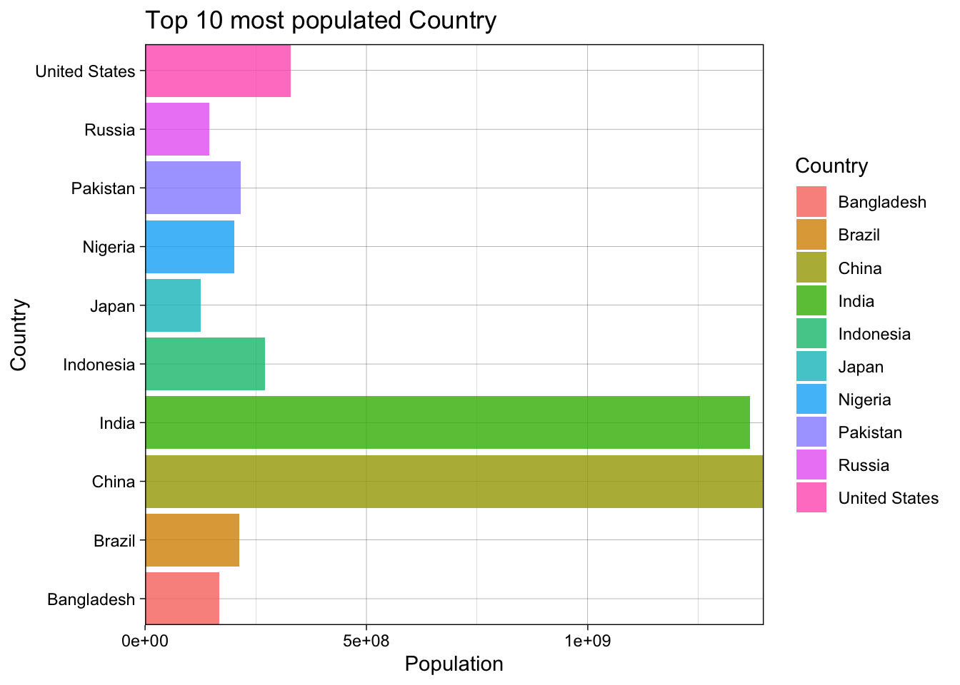
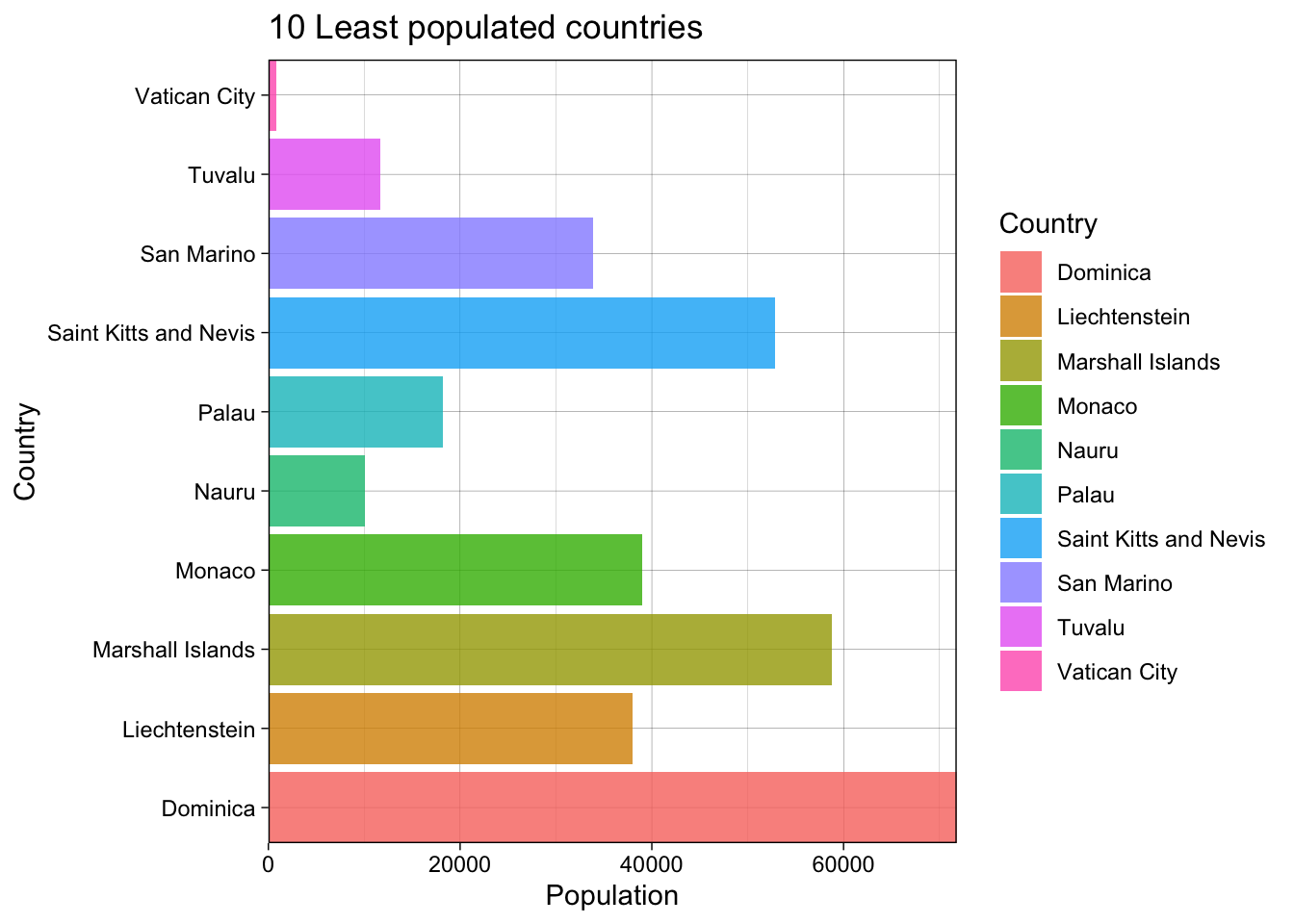
| Population [numeric] |
| Mean (sd) : 39381164 (145092392) |
| min ≤ med ≤ max: |
| 836 ≤ 8826588 ≤ 1397715000 |
| IQR (CV) : 26622812 (3.7) |
|
194 distinct values |
 |
1 (0.5%) |
| Population: Labor force participation (%) [character] |
| 1. 65.10% |
| 2. 68.80% |
| 3. 72.00% |
| 4. 46.40% |
| 5. 52.90% |
| 6. 53.60% |
| 7. 56.50% |
| 8. 59.10% |
| 9. 59.50% |
| 10. 59.70% |
| [ 135 others ] |
|
| 3 |
( |
1.7% |
) |
| 3 |
( |
1.7% |
) |
| 3 |
( |
1.7% |
) |
| 2 |
( |
1.1% |
) |
| 2 |
( |
1.1% |
) |
| 2 |
( |
1.1% |
) |
| 2 |
( |
1.1% |
) |
| 2 |
( |
1.1% |
) |
| 2 |
( |
1.1% |
) |
| 2 |
( |
1.1% |
) |
| 153 |
( |
86.9% |
) |
|
 |
19 (9.7%) |
| Tax revenue (%) [character] |
| 1. 19.50% |
| 2. 10.20% |
| 3. 13.60% |
| 4. 14.20% |
| 5. 18.60% |
| 6. 20.10% |
| 7. 23.00% |
| 8. 0.00% |
| 9. 10.10% |
| 10. 10.80% |
| [ 109 others ] |
|
| 4 |
( |
2.4% |
) |
| 3 |
( |
1.8% |
) |
| 3 |
( |
1.8% |
) |
| 3 |
( |
1.8% |
) |
| 3 |
( |
1.8% |
) |
| 3 |
( |
1.8% |
) |
| 3 |
( |
1.8% |
) |
| 2 |
( |
1.2% |
) |
| 2 |
( |
1.2% |
) |
| 2 |
( |
1.2% |
) |
| 141 |
( |
83.4% |
) |
|
 |
26 (13.3%) |
| Total tax rate [character] |
| 1. 36.60% |
| 2. 49.70% |
| 3. 22.20% |
| 4. 30.10% |
| 5. 30.60% |
| 6. 31.60% |
| 7. 32.60% |
| 8. 33.20% |
| 9. 36.20% |
| 10. 37.00% |
| [ 146 others ] |
|
| 4 |
( |
2.2% |
) |
| 3 |
( |
1.6% |
) |
| 2 |
( |
1.1% |
) |
| 2 |
( |
1.1% |
) |
| 2 |
( |
1.1% |
) |
| 2 |
( |
1.1% |
) |
| 2 |
( |
1.1% |
) |
| 2 |
( |
1.1% |
) |
| 2 |
( |
1.1% |
) |
| 2 |
( |
1.1% |
) |
| 160 |
( |
87.4% |
) |
|
 |
12 (6.2%) |
| Unemployment rate [character] |
| 1. 4.59% |
| 2. 11.85% |
| 3. 2.46% |
| 4. 3.32% |
| 5. 3.47% |
| 6. 4.11% |
| 7. 4.20% |
| 8. 4.34% |
| 9. 5.36% |
| 10. 5.56% |
| [ 154 others ] |
|
| 3 |
( |
1.7% |
) |
| 2 |
( |
1.1% |
) |
| 2 |
( |
1.1% |
) |
| 2 |
( |
1.1% |
) |
| 2 |
( |
1.1% |
) |
| 2 |
( |
1.1% |
) |
| 2 |
( |
1.1% |
) |
| 2 |
( |
1.1% |
) |
| 2 |
( |
1.1% |
) |
| 2 |
( |
1.1% |
) |
| 155 |
( |
88.1% |
) |
|
 |
19 (9.7%) |
| Urban_population [numeric] |
| Mean (sd) : 22304543 (75430501) |
| min ≤ med ≤ max: |
| 5464 ≤ 4678104 ≤ 842933962 |
| IQR (CV) : 13750278 (3.4) |
|
190 distinct values |
 |
5 (2.6%) |
| Latitude [numeric] |
| Mean (sd) : 19.1 (24) |
| min ≤ med ≤ max: |
| -40.9 ≤ 17.3 ≤ 65 |
| IQR (CV) : 35.6 (1.3) |
|
194 distinct values |
 |
1 (0.5%) |
| Longitude [numeric] |
| Mean (sd) : 20.2 (66.7) |
| min ≤ med ≤ max: |
| -175.2 ≤ 21 ≤ 178.1 |
| IQR (CV) : 56.2 (3.3) |
|
194 distinct values |
 |
1 (0.5%) |