library(tidyverse)
library(readr)
library(here)
library(lubridate)
library(ggplot2)

knitr::opts_chunk$set(echo = TRUE, warning=FALSE, message=FALSE)
Challenge 6: Visualizing Time and Relationships
challenge_6
air_bnb
jocelyn_lutes
Time and Relationship Visualizations for the Airbnb dataset
Challenge Overview
Today’s challenge is to:
- read in a data set, and describe the data set using both words and any supporting information (e.g., tables, etc)
- tidy data (as needed, including sanity checks)
- mutate variables as needed (including sanity checks)
- create at least one graph including time (evolution)
- create at least one graph depicting part-whole or flow relationships
Import Data
For this challenge, I will be using the AB_NYC dataset.
path <- here("posts", "_data", "AB_NYC_2019.csv")
df <- read_csv(path)

df
Briefly describe the data
The AB_NYC dataset, which is publically available on Kaggle, provides information about different Airbnb listings in New York City during the year 2019.
As shown in the sample of the data above, each row represents a unique Airbnb listing, and there are 16 columns that describe the listing. The available attributes (listed below) include information such as, listing name, nightly price, host name, property location and type, and customer reviews. In total, there is data for 48895 listings.
colnames(df) [1] "id" "name"
[3] "host_id" "host_name"
[5] "neighbourhood_group" "neighbourhood"
[7] "latitude" "longitude"
[9] "room_type" "price"
[11] "minimum_nights" "number_of_reviews"
[13] "last_review" "reviews_per_month"
[15] "calculated_host_listings_count" "availability_365" Tidy Data
In its raw form, each row represents a single listing and each column represents a unique attribute of the listing. Therefore, the data is already in a tidy format and will not require any pivoting.
Before utilizing the data to create visualizations, however, we should check the data for null/missing values and ensure that each column contains data of the correct type.
Null/Missing Data
df %>%
  summarise(across(everything(), ~round(mean(is.na(.x))*100))) %>%
  pivot_longer(everything()) %>%
  arrange(desc(value)) %>%
  mutate(
    col_name = name,
    pct_missing = value
  )
From the analysis above, we see that the data is mostly complete, but 21% of listings are missing data for last_review and reviews_per_month. Upon further inspection, however, we see that all of these listings have never received a customer review. Therefore, it makes sense that these attributes would be null.
df %>%
  filter(is.na(last_review) | is.na(reviews_per_month)) %>%
  summarize(min_reviews = min(number_of_reviews), mean_reviews = mean(number_of_reviews), max_reviews = max(number_of_reviews))
Data Types
Next, we will ensure that all data is classified as the correct type. The current data types of the columns are shown below:
glimpse(df)Rows: 48,895
Columns: 16
$ id <dbl> 2539, 2595, 3647, 3831, 5022, 5099, 512…
$ name <chr> "Clean & quiet apt home by the park", "…
$ host_id <dbl> 2787, 2845, 4632, 4869, 7192, 7322, 735…
$ host_name <chr> "John", "Jennifer", "Elisabeth", "LisaR…
$ neighbourhood_group <chr> "Brooklyn", "Manhattan", "Manhattan", "…
$ neighbourhood <chr> "Kensington", "Midtown", "Harlem", "Cli…
$ latitude <dbl> 40.64749, 40.75362, 40.80902, 40.68514,…
$ longitude <dbl> -73.97237, -73.98377, -73.94190, -73.95…
$ room_type <chr> "Private room", "Entire home/apt", "Pri…
$ price <dbl> 149, 225, 150, 89, 80, 200, 60, 79, 79,…
$ minimum_nights <dbl> 1, 1, 3, 1, 10, 3, 45, 2, 2, 1, 5, 2, 4…
$ number_of_reviews <dbl> 9, 45, 0, 270, 9, 74, 49, 430, 118, 160…
$ last_review <date> 2018-10-19, 2019-05-21, NA, 2019-07-05…
$ reviews_per_month <dbl> 0.21, 0.38, NA, 4.64, 0.10, 0.59, 0.40,…
$ calculated_host_listings_count <dbl> 6, 2, 1, 1, 1, 1, 1, 1, 1, 4, 1, 1, 3, …
$ availability_365 <dbl> 365, 355, 365, 194, 0, 129, 0, 220, 0, …After reviewing the data types, all are correctly classified as numeric, character, or date types. However, to make our analysis easier, we will want to convert some of the character-type columns to factors. (Note: because the name and host_name would not be useful as a factor, we will leave them as character data.)
cols_to_mutate <- c('neighbourhood_group', 'neighbourhood', 'room_type')

df <- df %>%
  mutate(across(cols_to_mutate, as_factor))

glimpse(df %>% select(cols_to_mutate))
Rows: 48,895
Columns: 3
$ neighbourhood_group <fct> Brooklyn, Manhattan, Manhattan, Brooklyn, Manhatta…
$ neighbourhood <fct> "Kensington", "Midtown", "Harlem", "Clinton Hill",…
$ room_type <fct> Private room, Entire home/apt, Private room, Entir…Time Dependent Visualization
Within this dataset, there is only one column that is related to time: last_review. This column provides the date that the last customer review was given.
To get a sense of whether or not listings in the data are currently active, we can look at how many listings received reviews across the dates in the last_review column. Because the last_review spans the time period of 2011-2019, for easier visualization, we will view the data in aggregate, by year.
df <- df %>%
  mutate(
    last_review_year = year(last_review),
  )

df %>%
  group_by(last_review_year) %>%
  tally() %>%
  arrange(last_review_year)
df %>%
filter(!is.na(last_review)) %>%
group_by(last_review_year) %>%
summarize(count = n()) %>%
ggplot(aes(last_review_year, y = count)) +
# geom_col(fill='#FF5A5F') +
geom_line() +
geom_point() +
scale_x_continuous(breaks = c(2011, 2012, 2013, 2014, 2015, 2016, 2017, 2018, 2019)) +
theme_minimal() +
labs(
title = 'Count of Listings with Most Recent Reviews Occurring in Each Year (2011-2019)',
x = 'Year',
y = 'Number of Listings'
) 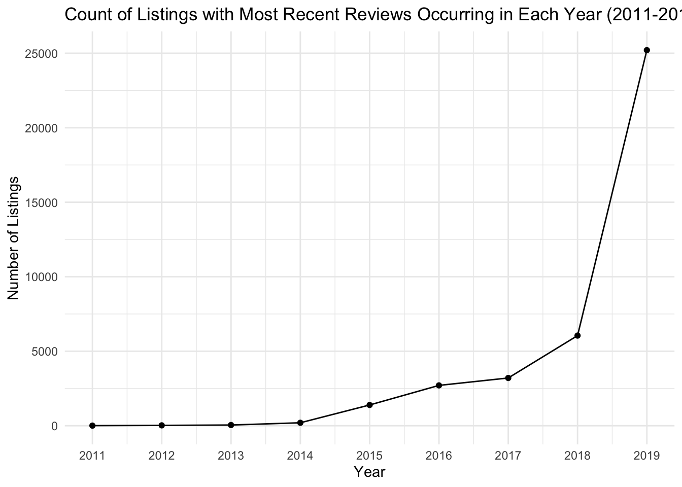
When conducting the visual analysis to explore the number of listings with their most recent review in each year, I debated between using a connected scatter plot (geom_line + geom_point) and a column graph (geom_col). The uncertainty over which type of plot would be best was because I was unsure if the data contained in last_review_year would be considered time series or cross-sectional data . From what I have learned about different data collection methods, true time series data should measure the same variable at different points in time, and a line plot can be used to show how this variable “evolves” over time. Cross-sectional data, however, observes the data at a single point in time. In our case, this data is a “snapshot” of Airbnb listings at a single point in time, and there is no way for us to know when listings were first posted. However, despite the cross-sectional nature of our data, the last_review_year does show us a timeline of when listings in our sample became “inactive”, so I have chosen to depict the data using a connected scatter plot.
Note: I could, also understand the argument that the last_review_year almost serves as a “categorical variable” that helps us understand the composition of when the listings in our data were last reviewed. Based on this reasoning, a column graph with last_review_year on the x-axis would be an adequate choice.
From the figure above, we can see that the majority of listings in our data were recently reviewed in 2019 and are likely active listings.
Part-Whole Visualization
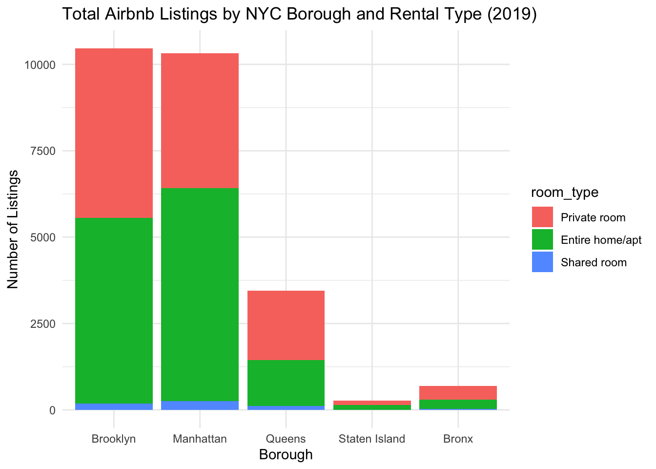
For this portion of the challenge, I am interested in how the number of reviews varies by neighbourhood_group (borough) and room_type in the year 2019. This could be helpful for identifying “hot zones” in the city, where multiple travelers are staying and reviewing properties and also give clues as to which types of properties travelers are choosing to stay at and review.
We will begin by using a stacked bar plot to look at how many total listings are in the data for each borough and rental type. A stacked bar plot is useful for this figure because it allows us to see the total number of listings by borough, and each will be color-coded by room type.
From the below plot, we can see that Brooklyn and Manhattan have the most number of Airbnb listings. Furthermore, across all boroughs, we can see that the majority of listings are for private rooms and entire homes/apartments.
df %>%
  filter(last_review_year == 2019) %>%
  group_by(neighbourhood_group, room_type) %>%
  summarize(total = n()) %>%
  ggplot(aes(x = neighbourhood_group, y = total, fill = room_type)) +
  geom_col() +
  theme_minimal() +
  labs(
    title = 'Total Airbnb Listings by NYC Borough and Rental Type (2019)',
    x = 'Borough',
    y = 'Number of Listings'
) 
Next, we can look at “occupancy” of the listings by seeing how the number of reviews varies by borough and rental type. Because there is a large discrepancy in the total number of listings for each neighborhood group, we will need to consider this when interpreting our results.
df %>%
  filter(last_review_year == 2019) %>%
  group_by(neighbourhood_group, room_type) %>%
  summarize(total_reviews = sum(number_of_reviews)) %>%
  ggplot(aes(x = neighbourhood_group, y = total_reviews, fill = room_type)) +
  geom_col() +
  theme_minimal() +
  labs(
    title = 'Total Number of Reviews by NYC Borough and Rental Type (2019)',
    x = 'Borough',
    y = 'Number of Reviews'
  )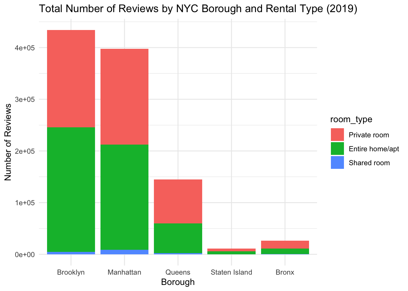
For this visual analysis, we will also use a stacked bar plot. From this plot, we can see that the total number of reviews aligns with what we would expect, given the number of listings per neighborhood. There are substantially more reviews for listings in Brooklyn and Manhattan. Furthermore, if we look at the breakdown of rental type for each borough, it is interesting to see that, despite Manhattan having more “Entire home/apt” listings than ‘Private Room’ listings, the two rental types have equal numbers of reviews. In Brooklyn, despite there being almost equal numbers of “Private home/apt” and “Private room” listings, there are slightly more reviews for “Entire home/apt” listings.