library(here)
library(glue)
library(tidyverse)
library(readr)
library(ggplot2)
library(scales)
knitr::opts_chunk$set(echo = TRUE, warning=FALSE, message=FALSE)Challenge 7: Visualizing Multiple Dimensions
challenge_7
hotel_bookings
air_bnb
jocelyn_lutes
Recreating visualizations for the Hotel Bookings and Airbnb datasets
Challenge Overview
For this challenge, I will be recreating figures from Challenge 2, which used the hotel_bookings dataset, and Challenge 6, which used the air_bnb dataset. We will import, tidy, and visualize each of the datasets separately.
Dataset 1: Hotel Bookings
Import Data
hotels_path <- here('posts', '_data', 'hotel_bookings.csv')
hotels <- read_csv(hotels_path)
hotelsDescribe Data
For my first visualization, I will use the hotel bookings dataset, which contains descriptive information for 119390 hotel bookings from the years 2015 to 2017. There are 32 columns that provide information about each booking, such as the type of hotel, arrival date, stay duration, guest information and stay history, special requests, and reservation type and status.
Tidy Data
In order to recreate the figure from Challenge 2, we will need to use the arrival_date_month and hotel columns, and for our extension, we will also use the arrival_date_year. Therefore, the first step in our data cleaning process will be to limit the large dataset to just this subset of columns.
hotels_small <- hotels %>%
select(arrival_date_month, arrival_date_year, hotel)
hotels_smallIn it’s filtered form, the data is already tidy, so before creating our visualization, we will just need to convert the arrival_date_month, arrival_date_year and hotel variables to factors. The new data types are shown below.
(Note: we will use arrival_date_year as a faceting variable here, so it will be better to graph it as a factor.)
months <- c('January', 'February', 'March', 'April', 'May', 'June', 'July', 'August', 'September', 'October', 'November', 'December')
hotels_small <- hotels_small %>%
mutate(
arrival_date_month = factor(arrival_date_month, levels = months),
arrival_date_year = factor(arrival_date_year, levels = c(2015, 2016, 2017)),
hotel = factor(hotel)
)
glimpse(hotels_small)Rows: 119,390
Columns: 3
$ arrival_date_month <fct> July, July, July, July, July, July, July, July, Jul…
$ arrival_date_year <fct> 2015, 2015, 2015, 2015, 2015, 2015, 2015, 2015, 201…
$ hotel <fct> Resort Hotel, Resort Hotel, Resort Hotel, Resort Ho…Visualization
Original Plot
Now, we are able to re-create our visualization. As a reminder, our initial graph from Challenge 2 was designed to look at the monthly variation in arrivals for the city hotel vs. the resort hotel. The plot looked like this:
hotels_small %>%
ggplot(aes(x=arrival_date_month, fill=hotel)) +
geom_bar() +
theme(axis.text.x = element_text(angle = 90, vjust = 0.5, hjust=1))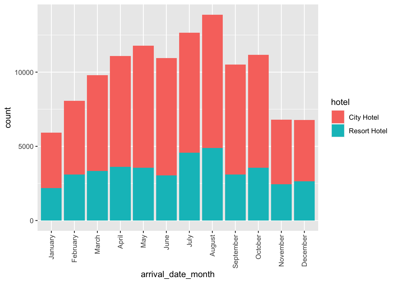
Revised Plot
For our revised version of this figure, we will continue to look at the monthly variation in arrivals for the city hotel vs. the resort hotel, but we will also facet our data by the year. Because we are visualizing how the number of bookings changes from month-to-month, we will use a connected scatter plot to show the evolution over time instead of a bar plot.
hotels_small %>%
# get grouped summary stats
group_by(arrival_date_month, arrival_date_year, hotel) %>%
summarize(count = n()) %>%
ggplot(aes(x=arrival_date_month, y=count, color=hotel, group = hotel)) +
# connected scatterplot to show change over time
geom_line() +
geom_point() +
# use facet grid to be able to specify rows vs. just wrapping
facet_grid(rows = vars(arrival_date_year)) +
theme_bw() +
labs(
title = 'Monthly Variation in Arrivals for Hotel Bookings by Year and Hotel Type',
x = 'Arrival Month',
y = 'Number of Bookings'
) +
guides(color = guide_legend(title = 'Hotel Type'))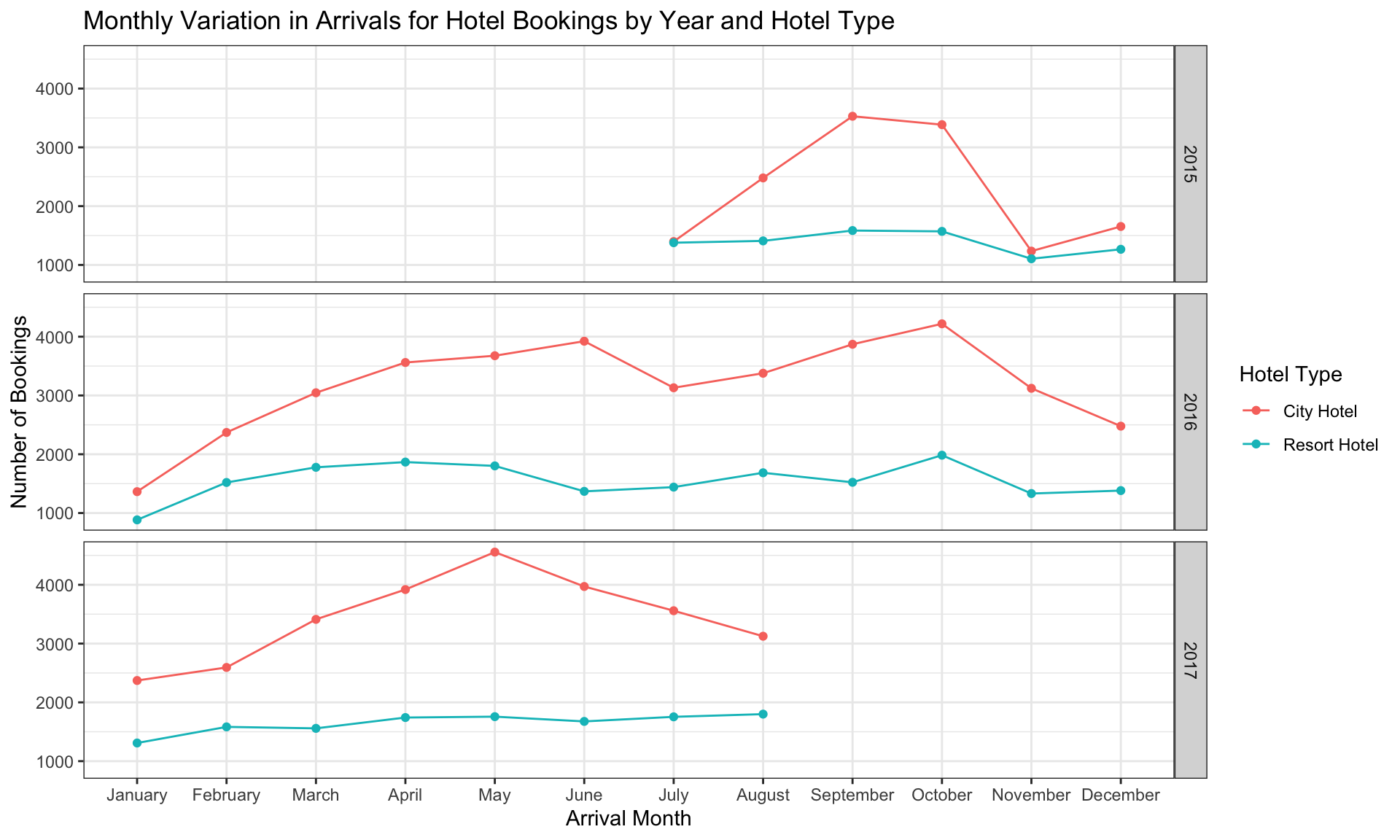
This figure is more informative than the figure from Challenge 2 for several reasons:
It allows us to very easily tell the time span covered by our data. From this figure, we can see that the data runs from July 2015 to August 2017.
In comparison to the stacked bar plot, the connected scatter plot is “cleaner” and easier to read. This makes it easier to compare the differences between the city and resort hotel and how the number of bookings vary from month to month.
Faceting by year allows us to detect trends that we couldn’t see when the data was graphed in aggregate. For example, the city hotel experienced a steep decline in bookings for arrivals in November-December 2015 and January 2016, becoming very similar to the resort hotel. This detail would have been missed if we hadn’t faceted by year.
Dataset 2: Airbnb
Import Data
airbnb_path <- here("posts", "_data", "AB_NYC_2019.csv")
airbnb <- read_csv(airbnb_path)
airbnbDescribe Data
The AB_NYC dataset, which is publicly available on Kaggle, provides information about different Airbnb listings in New York City during the year 2019.
As shown in the sample of the data above, each row represents a unique Airbnb listing, and there are 16 columns that describe the listing. The available attributes include information such as, listing name, nightly price, host name, property location and type, and customer reviews. In total, there is data for 48895 listings.
Tidy Data
In its raw form, the data is already tidy, so to clean our data, we will simply need to subset our data to the columns necessary for visualization and ensure that each is of the correct data type.
In our original visualization, we only used the last_review, room_type, and neighbourhood_group variables. For our extension, we will also engineer a binary is_active variable, to indicate if a variable has received a review in 2019 (active=True).
We will begin by selecting only the columns necessary to produce our visualization.
airbnb_small <- airbnb %>%
mutate(
last_review_year = year(last_review),
is_active = ifelse(last_review_year == 2019, T, F)) %>%
select(room_type, neighbourhood_group, last_review_year, is_active)Next, we will convert room_type and neighbourhood_group to factors. The revised data types are shown below.
factors_cols <- c('room_type', 'neighbourhood_group')
airbnb_small <- airbnb_small %>%
mutate(across(factors_cols, as.factor))
glimpse(airbnb_small)Rows: 48,895
Columns: 4
$ room_type <fct> Private room, Entire home/apt, Private room, Entir…
$ neighbourhood_group <fct> Brooklyn, Manhattan, Manhattan, Brooklyn, Manhatta…
$ last_review_year <dbl> 2018, 2019, NA, 2019, 2018, 2019, 2017, 2019, 2017…
$ is_active <lgl> FALSE, TRUE, NA, TRUE, FALSE, TRUE, FALSE, TRUE, F…Visualization
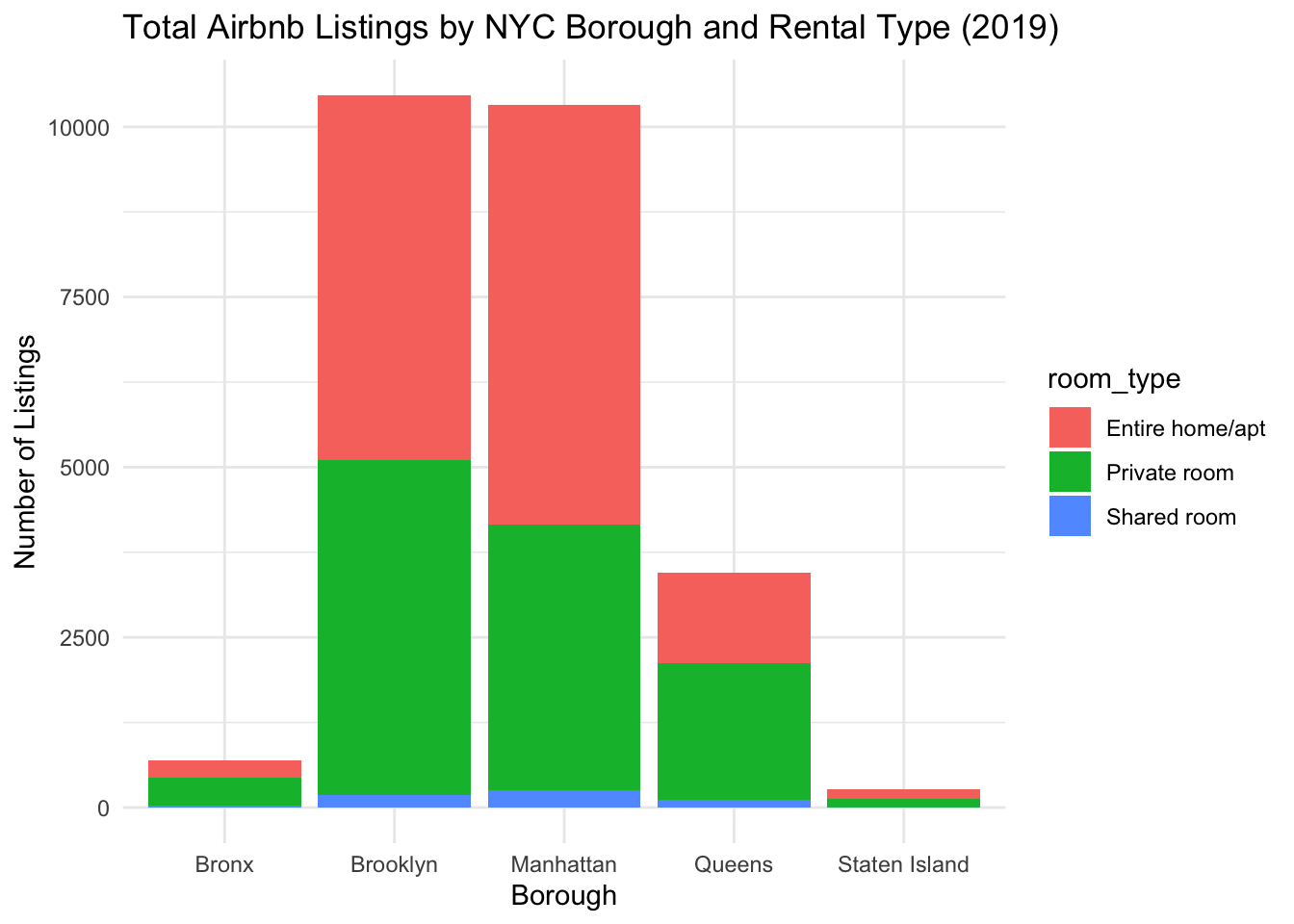
Original Plot
Now, we can once again re-create our visualization! Our initial graph from Challenge 6 displayed the number of listings that had a review in 2019 by room_type and neighbourhood_group. The plot looked like this:
airbnb_small %>%
filter(last_review_year == 2019) %>%
group_by(neighbourhood_group, room_type) %>%
summarize(total = n()) %>%
ggplot(aes(x = neighbourhood_group, y = total, fill = room_type)) +
geom_col() +
theme_minimal() +
labs(
title = 'Total Airbnb Listings by NYC Borough and Rental Type (2019)',
x = 'Borough',
y = 'Number of Listings'
) 
Revised Plot
For our revised plot, we will look at the number of listings by borough, room type, and active status. To display this information, we will use a column plot of number of listings by borough that is faceted by active status (columns) and room type (rows). I have chosen this type of plot because it is visually “clean” and allows for easy comparisons between groups.
airbnb_small %>%
# remove NA (from listings with no reviews)
filter(!is.na(is_active)) %>%
group_by(neighbourhood_group, room_type, is_active) %>%
summarize(total = n()) %>%
# recode for more descriptive labels
mutate(
is_active = factor(ifelse(is_active == T, 'Active', 'Inactive'), levels = c('Inactive', 'Active'))
) %>%
ggplot(aes(x = neighbourhood_group, y = total, fill = neighbourhood_group)) +
geom_col() +
# facet by room type & active status
facet_grid(
rows = vars(room_type),
cols = vars(is_active),
) +
theme_minimal() +
labs(
title = 'Total Active and Inactive Airbnb Listings by NYC Borough and Rental Type (2019)',
subtitle = 'Active listings are defined as having a user review in the year 2019.',
x = 'Borough',
y = 'Number of Listings'
) +
theme_bw() +
# remove fill legend; added color coding for readability only
theme(legend.position = 'none')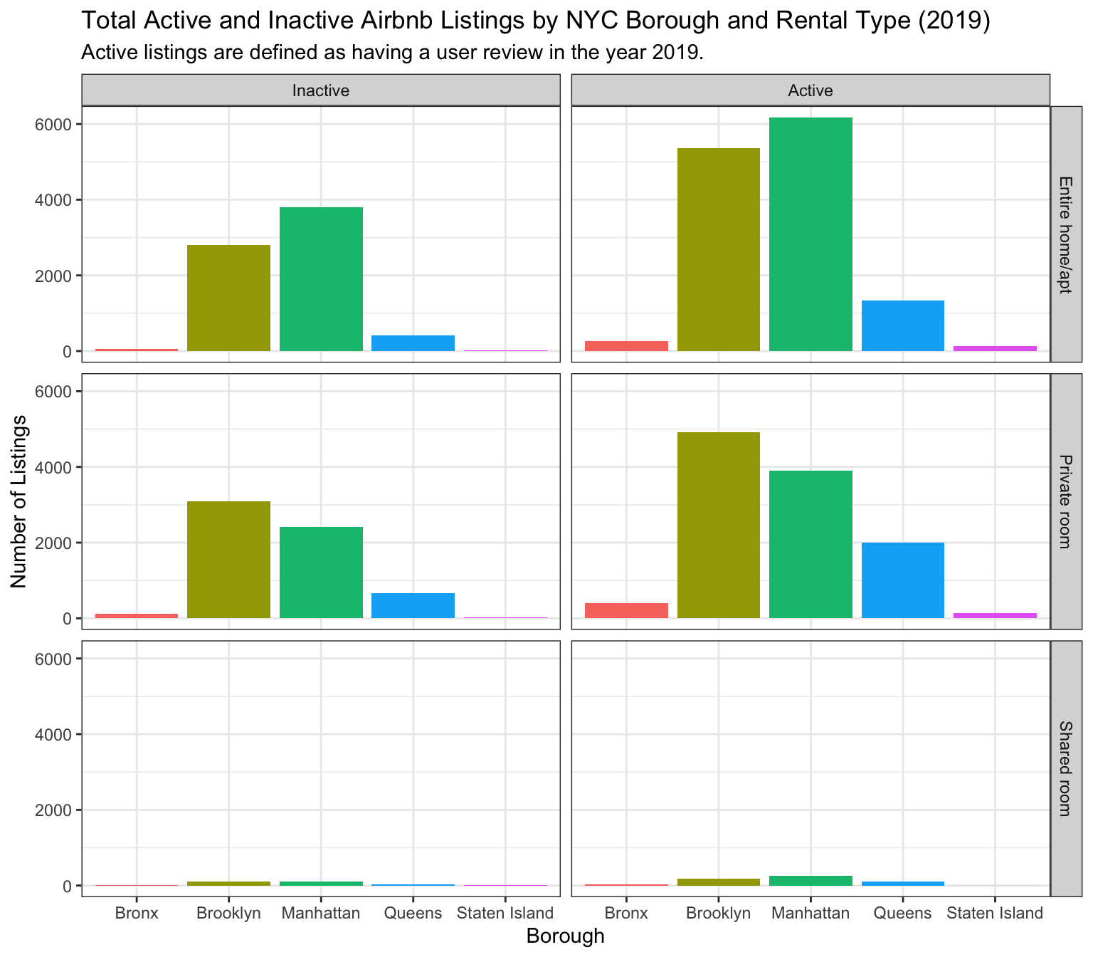
This revised figure is more informative than the original figure from Challenge 6 for several reasons:
As suggested in the feedback for Challenge 6, it is much easier to compare the differences between groups by using “dodge” column plots vs. stacked column plots.
Faceting the data by room type makes it easier to compare the number of listings per room type across the different boroughs.
By including an additional dimension, we are able to learn more about our dataset than just filtering to a single year.
For example, when looking at this plot, it is interesting to see that all of the boroughs seem to have a similar number of “shared room” listings.
Additionally, it is striking to see the the number of Airbnb listings in Brooklyn and Manhattan that did not receive a review in the year 2019!