library(tidyverse)
library(ggplot2)
library(here)
library(readr)

knitr::opts_chunk$set(echo = TRUE, warning=FALSE, message=FALSE)
Challenge 9
challenge_9
nhanes
jocelyn_lutes
Creating a function
Challenge Overview
Today’s challenge is simple. Create a function, and use it to perform a data analysis / cleaning / visualization task.
Function
For the final project, I am interested in exploring the relationship between food security and health outcomes, such as obesity, diabetes, high blood pressure, and high cholesterol. To explore how the proportion of these conditions differ by food security group, I used bar plots. When completing HW 3, making bar plots for each health condition quickly became repetitive. Rather than writing the same code over and over again, I will write a function to allow me to more easily create the same graph for different variables.
plot_prop_by_condition <- function(df, condition_col, title_label, fill_label) {
  # get total counts for each food security group
  counts_by_fs <- df %>%
    group_by(hh_food_security) %>%
    summarize(total = n())

  # make the plot
  plt <- df %>%
    group_by(!!sym(condition_col), hh_food_security) %>%
    summarize(count = n()) %>%
    left_join(counts_by_fs, by = 'hh_food_security') %>%
    mutate(percent = count/total) %>%
    ggplot(aes(x = hh_food_security, y = percent, fill = !!sym(condition_col))) +
    geom_col(position='dodge') +
    theme_minimal() +
    scale_y_continuous(labels = scales::percent) +
    labs(
      title = title_label,
      x = 'Food Security',
      y = 'Percent',
      fill = fill_label
    )

  # return the plt
  return(plt)
}
Using the Function
First, we must import our data. We will use data that has already been cleaned, but we must cast our categorical variables to factors to ensure correct ordering of bars on our graph.
Import Data
data_path <- here('posts', '_data', 'nhanes', 'nhanes_sample_clean.csv')
nhanes_clean <- read_csv(data_path)

# add bmi classification col
# cast factors back to factor
nhanes_clean <- nhanes_clean %>%
  mutate(
    bmi_class = case_when(
    bmi < 18.5 ~ 'Underweight',
    bmi >= 18.5 & bmi <= 24.9 ~ 'Normal',
    bmi >= 25.0 & bmi <= 29.9 ~ 'Overweight',
    bmi >= 30 ~ 'Obese'),
    bmi_class = factor(bmi_class, levels = c('Underweight', 'Normal', 'Overweight', 'Obese')),
    diabetes = factor(diabetes, levels = c('No', 'Borderline', 'Yes')),
    high_bp = factor(high_bp, levels = c('Yes', 'No')),
    high_cholesterol = factor(high_cholesterol, levels = c('Yes', 'No'))
    )

nhanes_clean
Create Plots
Now, we can make a plot for each of our health conditions of interest!
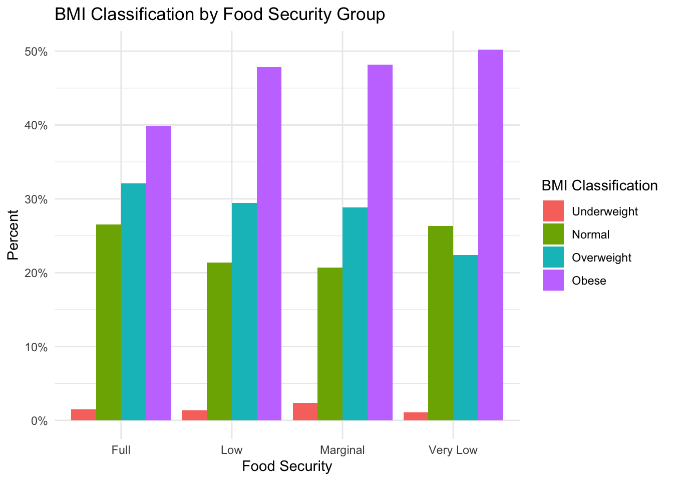
BMI
plot_prop_by_condition(
  df = nhanes_clean,
  condition_col = 'bmi_class',
  title_label = 'BMI Classification by Food Security Group',
  fill_label = 'BMI Classification'
)
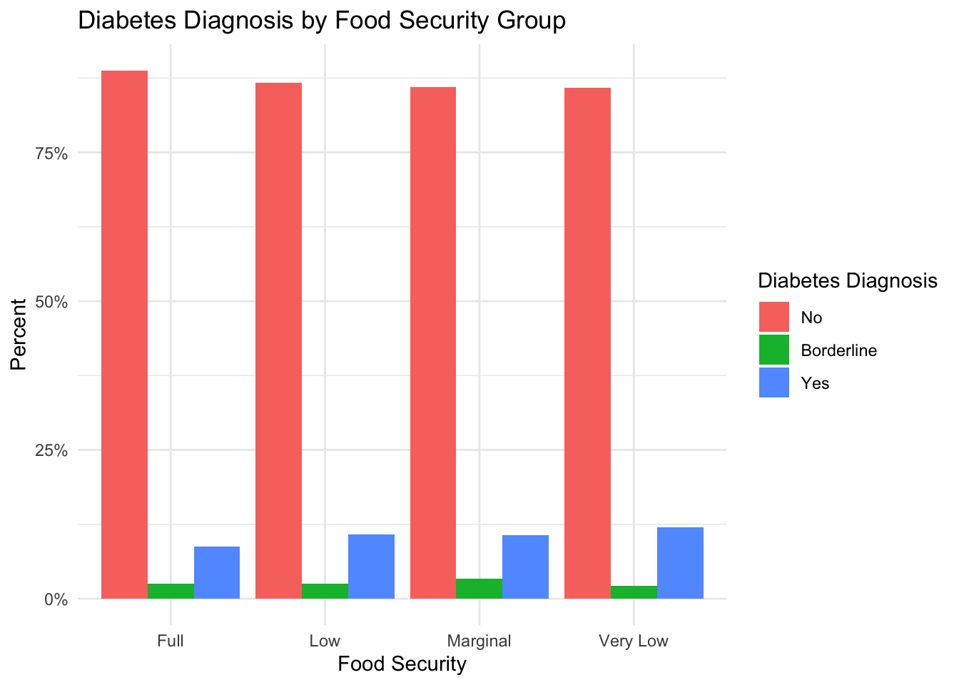
Diabetes
plot_prop_by_condition(
  df = nhanes_clean,
  condition_col = 'diabetes',
  title_label = 'Diabetes Diagnosis by Food Security Group',
  fill_label = 'Diabetes Diagnosis'
)
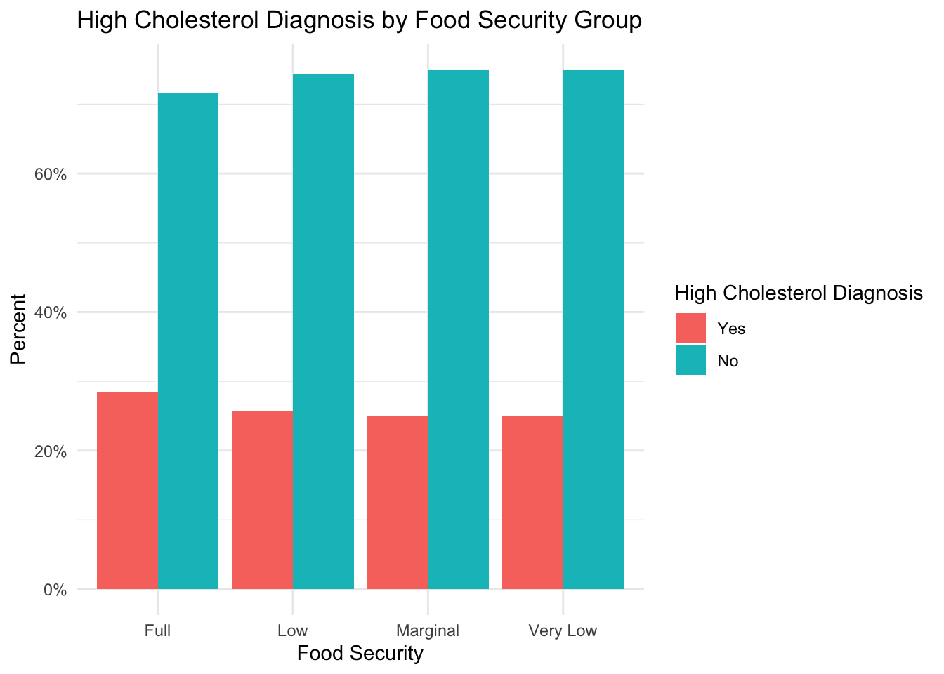
High Cholesterol
plot_prop_by_condition(
  df = nhanes_clean,
  condition_col = 'high_cholesterol',
  title_label = 'High Cholesterol Diagnosis by Food Security Group',
  fill_label = 'High Cholesterol Diagnosis'
)
High Blood Pressure
plot_prop_by_condition(
  df = nhanes_clean,
  condition_col = 'high_bp',
  title_label = 'High Blood Pressure Diagnosis by Food Security Group',
  fill_label = 'High Blood Pressure Diagnosis'
)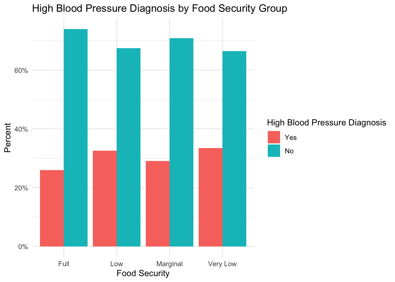
We are able to make several plots without having to re-write the entire plotting code!