Code
library(tidyverse)
library(readxl)
library(here)

knitr::opts_chunk$set(echo = TRUE, warning=FALSE, message=FALSE)library(tidyverse)
library(readxl)
library(here)
knitr::opts_chunk$set(echo = TRUE, warning=FALSE, message=FALSE)The United States has over 330 million people living on about 3.8 million squared miles of land, but the distribution of people across this vast country is not equal. As a result, each region has different demographics than other states, leading to different cultures, economic and political beliefs, ideologies, and societal components.
For this homework assignment and final project, I want to dive deeper into US state and county level data to explore how distributions in population, education level, and poverty all relate to one another. All data was pulled from the US Department of Agriculture via the US census. Although data does exist for 2021, not all datasets have this set of information, and thus we will be exploring the collected results from 2020. Three datasets have been added to the GitHub repo for the class, and the three files are Linus_US_Education.xlsx, Linus_US_PopulationEstimates.xlsx, and Linus_US_PovertyEstimates.xlsx.
As mentioned previously, there are 3 files of interest that explore population, education, and poverty. To connect all the datasets together, the Federal Information Processing Standard (a five digit number representing a unique ID for states and counties), or FIPS for short, is used as a key. To remove state totals, simply exclude observations where the FIPS value ends in “000”, such as “01000”, “02000”, etc. We also are only interested in US counties, and remove all FIPS codes greater than or equal to 72000. Also, I will treat Washington D.C. as a county rather than a state.
This dataset contains population information for US territories, states, and counties. Although there’s data from the 1990s to 2021, as mentioned before, we will only look at 2020 census data so that it can be used with other datasets. Another interesting variable is the rural-urban continuum code that was given for each county in 2013. From the US Department of Agriculture, these continuum codes are split into metropolitan (1-3) and non-metropolitan counties (4-9), leading to 9 distinct groups. Codes 1-3 represent counties in metro areas of 1 million or more people, 250K - 1 million people, or less than 250K, respectively. Codes 4 and 5 represent counties with an urban population of 20K or more, adjacent or not adjacent to a metro area, respectively. Codes 6 and 7 represent counties with an urban population of 2.5K - 20K, adjacent or not adjacent to a metro area, respectively. Finally, codes 8 and 9 represent counties with a completely rural or less than 2.5K urban population, adjacent or not adjacent to a metro area. The continuum codes provide a straightforward and guided way to group counties together for future analysis.
pop <- read_excel(here("posts", "_data", "Linus_US_data", "Linus_US_PopulationEstimates.xlsx"),
                  skip=4) %>%
  select(matches("FIPS|State|Area|Code|2020")) %>%
  rename(FIPS=1, State=2, Area_Name=3, Cont_Code=4, pop_2020=5) %>%
  filter(FIPS < 72000 & FIPS != 11000) %>%
  mutate(region_type = case_when(FIPS == "00000" ~ "national",
                                 str_detect(FIPS, "0{3}$") ~ "state",
                                 TRUE ~ "county"))

# View data
pop# dfSummary
print(summarytools::dfSummary(pop,
varnumbers=FALSE,
plain.ascii=FALSE,
style="grid",
graph.magnif = 0.70,
valid.col=FALSE),
method="render",
table.classes="table-condensed")| Variable | Stats / Values | Freqs (% of Valid) | Graph | Missing | ||||||||||||||||||||||||||||||||||||||||||||||||||||||||||
|---|---|---|---|---|---|---|---|---|---|---|---|---|---|---|---|---|---|---|---|---|---|---|---|---|---|---|---|---|---|---|---|---|---|---|---|---|---|---|---|---|---|---|---|---|---|---|---|---|---|---|---|---|---|---|---|---|---|---|---|---|---|---|
| FIPS [character] |
|
|
 |
0 (0.0%) | ||||||||||||||||||||||||||||||||||||||||||||||||||||||||||
| State [character] |
|
|
 |
0 (0.0%) | ||||||||||||||||||||||||||||||||||||||||||||||||||||||||||
| Area_Name [character] |
|
|
 |
0 (0.0%) | ||||||||||||||||||||||||||||||||||||||||||||||||||||||||||
| Cont_Code [numeric] |
|
|
 |
57 (1.8%) | ||||||||||||||||||||||||||||||||||||||||||||||||||||||||||
| pop_2020 [numeric] |
|
3136 distinct values |  |
6 (0.2%) | ||||||||||||||||||||||||||||||||||||||||||||||||||||||||||
| region_type [character] |
|
|
 |
0 (0.0%) |
Generated by summarytools 1.0.1 (R version 4.3.0)
2023-07-08
The tables above provide a quick glimpse into the dataset. Fortunately, the data is already tidy, as each row represents data at a region level (national, state, or county/city, based on the zip code). It’s interesting to note that although the data is supposedly at the county level, counties have different names in different states. For example, Alaska has many regions that are called boroughs or areas, and Louisiana’s counties are called parishes! Strangely enough, Virginia also has a few zip codes dedicated to a specific city.
As for our data, thankfully it’s clean, but there is some missing data in the population (especially concerning given that the government “should” know where people live, for better or for worse). Let’s investigate this further.
# Missing data
pop %>% filter(is.na(pop_2020))pop %>% filter(is.na(Cont_Code))The first table above contains all regions where the population was not provided. Four of the six regions are in Alaska, where it’s quite difficult to the population and is either desolate or controlled by native Alaskans. The last two regions, however, are cities in Virginia, which don’t necessarily fit into the classifications of “county”. I’m not sure why this is the case, but a quick Google search showed that these populations are very low, so I’ll assume it’s because the number was too low to track (or some government inefficiency lost the postal information somewhere).
The second table shows where there isn’t a continuum code. Regions that are not counties (IE states and the nation itself) do not have a continuum code. The remaining counties without a continuum code all are mostly in Alaska or are really small, which explains why they might not have a continuum code.
I plan to keep data with missing information, even though I will use a full join to connect all the datasets together.
Next, let’s look at county and state level data and summaries.
# Population summary statistics on the county level
pop %>%
  filter(region_type == "county") %>%  # Select only
  summarise(min_pop = min(pop_2020, na.rm=TRUE),
            q1_pop = quantile(pop_2020, 0.25, 1, na.rm=TRUE),
            mean_pop = mean(pop_2020, na.rm=TRUE),
            med_pop = median(pop_2020, na.rm=TRUE),
            q3_pop = quantile(pop_2020, 0.75, 1, na.rm=TRUE),
max_pop = max(pop_2020, na.rm=TRUE))# Graph data at the state
pop %>%
filter(region_type == "county" & pop_2020 < 250000) %>%
ggplot(aes(pop_2020)) +
geom_histogram(fill="blue", alpha=0.5) +
theme_minimal() +
labs(title="Graph 1: Distribution of US County Populations",
x="Population of a County",
y="Number of Counties",
subtitle="For county populations under 250,000")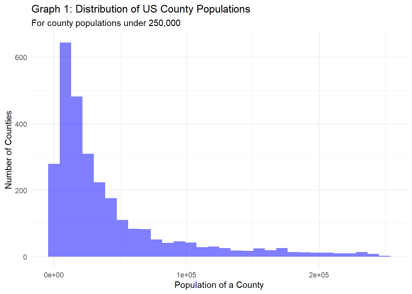
At the county level, there’s huge variance in terms of the population of a county, from a meager 64 people to a whopping 10 million people. A majority of counties have populations between 10K and 68K, and the number of counties with populations of 75K drops significantly, as evident in Graph 1. However, we see that there are still a fair number of counties with populations above 100,000.
# Population summary statistics on the state level
pop %>%
  filter(region_type == "state") %>%  # Select only
  summarise(min_pop = min(pop_2020, na.rm=TRUE),
            q1_pop = quantile(pop_2020, 0.25, 1, na.rm=TRUE),
            mean_pop = mean(pop_2020, na.rm=TRUE),
            med_pop = median(pop_2020, na.rm=TRUE),
            q3_pop = quantile(pop_2020, 0.75, 1, na.rm=TRUE),
max_pop = max(pop_2020, na.rm=TRUE))# Graph population at the state level
pop %>%
filter(region_type == "state") %>%
ggplot(aes(pop_2020)) +
geom_histogram(fill="blue", alpha=0.5) +
theme_minimal() +
labs(title="Graph 2: Distribution of US State Populations",
x="Population of a State",
y="Number of States")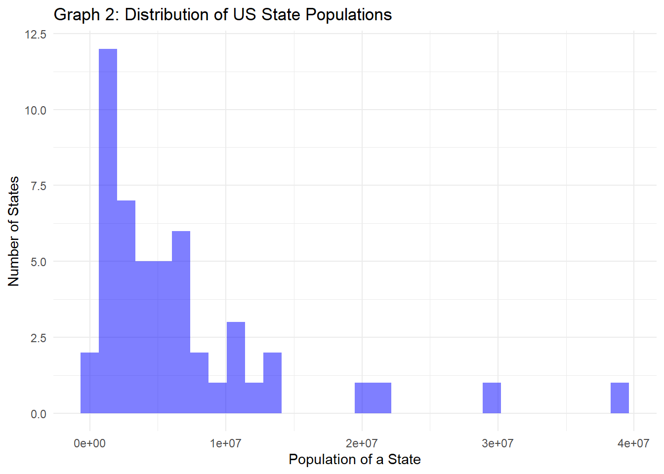
Like the county populations, state populations show high variance, with populations between 577K and 39.5 million residents. Most state populations are between 1.8 million and 7.5 million people, with the number of states with populations above 8 million people dropping significantly, as seen in Graph 2 above.
Lastly for this section, it might be helpful to see the distribution of the continuum codes for counties, as this is a great way to compare all the consolidated data.
pop %>%
  group_by(Cont_Code) %>%
  filter(!is.na(Cont_Code)) %>%
  summarise(count = n()) %>%
  mutate(freq = round(count / sum(count), 3)) %>%
  arrange(Cont_Code)
The table above shows the number and proportion of counties who fall within each continuum code. Surprisingly, the data isn’t incredibly skewed towards any particular code. The counts for metropolitan counties (codes 1-3) are pretty close to one another. For non-metropolitan counties, it’s surprising to see that codes 6 and 7 (counties with populations between 2.5K and 20K people in counties adjacent or nonadjacent to a metro area, respectively) have a greater number of counties that fall into that grouping. Code 5 (having an urban population of 20K or greater, not adjacent to a metro area) is by far the smallest group. This makes sense, as counties with a large population not next to a metropolitan area isn’t very common in the US.
For future analyses, we could group counties into metropolitan (codes 1-3) vs. non-metropolitan codes (4-9), compare codes within those two groups against one another, or compare non-metropolitan counties adjacent to (codes 4, 6, and 8) and non-adjacent to metro areas (codes 5, 7, and 9).
The education dataset is very similar to that of the population dataset, in which each observation is a zip code representing a county, state or the country. There is data from 1970 to 2021, with the 2017-2021 data all consolidated into one value. Different levels of education are tracked (didn’t receive their high school diploma, received only their high school diploma, received some bachelors or associates degree level education, or received a higher degree or above) as well as both the number and percentage of residents from a particular region that falls into each category.
# Pull in data
edu <- read_excel(here("posts", "_data", "Linus_US_data", "Linus_US_Education.xlsx"),
                  skip=3) %>%
  select(matches("21|FIPS|State|name")) %>%
  rename(FIPS=1,
         State=2,
         Area_Name=3,
         no_HS=4,
         HS_only=5,
         some_college=6,
         bach_plus=7,
         perc_no_HS=8,
         perc_HS_only=9,
         perc_some_college=10,
         perc_bach_plus=11) %>%
  filter(FIPS < 72000 & FIPS != 11000) %>%
  mutate(region_type = case_when(FIPS == "00000" ~ "national",
                                 str_detect(FIPS, "0{3}$") ~ "state",
                                 TRUE ~ "county"))

# dfSummary
print(summarytools::dfSummary(edu,
                              varnumbers=FALSE,
                              plain.ascii=FALSE,
                              style="grid",
                              graph.magnif = 0.70,
                              valid.col=FALSE),
      method="render",
table.classes="table-condensed")| Variable | Stats / Values | Freqs (% of Valid) | Graph | Missing | |||||||||||||||||||||||||||||||||||||||||||||||||||||||
|---|---|---|---|---|---|---|---|---|---|---|---|---|---|---|---|---|---|---|---|---|---|---|---|---|---|---|---|---|---|---|---|---|---|---|---|---|---|---|---|---|---|---|---|---|---|---|---|---|---|---|---|---|---|---|---|---|---|---|---|
| FIPS [character] |
|
|
 |
0 (0.0%) | |||||||||||||||||||||||||||||||||||||||||||||||||||||||
| State [character] |
|
|
 |
0 (0.0%) | |||||||||||||||||||||||||||||||||||||||||||||||||||||||
| Area_Name [character] |
|
|
 |
0 (0.0%) | |||||||||||||||||||||||||||||||||||||||||||||||||||||||
| no_HS [numeric] |
|
2610 distinct values |  |
11 (0.3%) | |||||||||||||||||||||||||||||||||||||||||||||||||||||||
| HS_only [numeric] |
|
2949 distinct values |  |
11 (0.3%) | |||||||||||||||||||||||||||||||||||||||||||||||||||||||
| some_college [numeric] |
|
2932 distinct values | |
11 (0.3%) | |||||||||||||||||||||||||||||||||||||||||||||||||||||||
| bach_plus [numeric] |
|
2805 distinct values |  |
11 (0.3%) | |||||||||||||||||||||||||||||||||||||||||||||||||||||||
| perc_no_HS [numeric] |
|
3193 distinct values |  |
11 (0.3%) | |||||||||||||||||||||||||||||||||||||||||||||||||||||||
| perc_HS_only [numeric] |
|
3194 distinct values |  |
11 (0.3%) | |||||||||||||||||||||||||||||||||||||||||||||||||||||||
| perc_some_college [numeric] |
|
3191 distinct values |  |
11 (0.3%) | |||||||||||||||||||||||||||||||||||||||||||||||||||||||
| perc_bach_plus [numeric] |
|
3193 distinct values |  |
11 (0.3%) | |||||||||||||||||||||||||||||||||||||||||||||||||||||||
| region_type [character] |
|
|
 |
0 (0.0%) |
Generated by summarytools 1.0.1 (R version 4.3.0)
2023-07-08
# View structure of dataset
edu
The tables above provide a quick glance into how the data is formatted. Some formatting will need to be done to make the data tidy. There are 11 instances where there is missing data - let’s look into this now.
edu %>%
  filter(is.na(no_HS))
We see that for 11 regions, no education data has been recorded. Many of these are Alaskan counties, which, as mentioned before, have very small populations and may be home to native Alaskans. Bedford city and Clifton Forge city are again listed with missing data, supporting the hypothesis that both cities didn’t report some crucial information, or because these cities are connected to a county, that information has already been shared.
The following code is run to make our data “tidy”.
# Make tidy
# Made tidy
edu_totals <- edu %>%
  select(c("FIPS", contains("perc"))) %>%
  pivot_longer(cols=contains("perc"),
               names_to="edu_level",
               values_to="edu_perc") %>%
  mutate(edu_level=str_remove(edu_level, "perc_"))
edu_percs <- edu %>%
  select(c("FIPS", !contains("perc"))) %>%
  pivot_longer(cols=no_HS:bach_plus,
               names_to="edu_level",
               values_to="edu_total")
edu_tidy = edu_percs %>% inner_join(edu_totals,
                          by=c("FIPS", "edu_level")) %>%
  mutate(edu_level=factor(edu_level,
                          levels=c("no_HS",
                                   "HS_only",
                                   "some_college",
                                   "bach_plus")))

# View tidy data
edu_tidy# Keep env clean
rm(edu_percs)
rm(edu_totals)# Get summary statistics for each education category on county totals
print("County level education summary statistics for residents, by county totals")[1] "County level education summary statistics for residents, by county totals"edu_tidy %>%
filter(region_type == "county") %>% # Remove states
group_by(edu_level) %>%
summarise(min_tot = min(edu_total, na.rm=TRUE),
q1_tot = quantile(edu_total, 0.25, 1, na.rm=TRUE),
mean_tot = mean(edu_total, na.rm=TRUE),
med_tot = median(edu_total, na.rm=TRUE),
q3_tot = quantile(edu_total, 0.75, 1, na.rm=TRUE),
max_tot = max(edu_total, na.rm=TRUE))# Get summary statistics for each education category on county percentages
print("County level education summary statistics for residents, by county percentages")[1] "County level education summary statistics for residents, by county percentages"edu_tidy %>%
filter(region_type == "county") %>% # Select only
group_by(edu_level) %>%
summarise(min_perc = min(edu_perc, na.rm=TRUE),
q1_perc = quantile(edu_perc, 0.25, 1, na.rm=TRUE),
mean_perc = mean(edu_perc, na.rm=TRUE),
med_perc = median(edu_perc, na.rm=TRUE),
q3_perc = quantile(edu_perc, 0.75, 1, na.rm=TRUE),
max_perc = max(edu_perc, na.rm=TRUE))# Graph proportions at county level
edu %>%
select(matches("FIPS|perc|region")) %>%
filter(region_type == "county") %>% # Remove states
pivot_longer(cols=contains("perc"), names_to="perc_type", values_to="percent") %>%
mutate(perc_type = factor(perc_type,
levels=c("perc_no_HS",
"perc_HS_only",
"perc_some_college",
"perc_bach_plus"))) %>%
ggplot(aes(x=perc_type, y=percent/100, color=perc_type, alpha = 0.8)) +
geom_violin(trim=FALSE) +
geom_boxplot(width=0.2) +
theme_minimal() +
theme(legend.position="none",
axis.text.x = element_text(angle=0)) +
labs(title="Graph 3: Distribution of Education Received for US Counties",
x="Education Level",
y="Percentage of People within a County",
fill="Education Level") +
scale_x_discrete(labels=c("No HS diploma",
"HS Diploma",
"Some higher edu",
"Received higher degree")) +
scale_y_continuous(labels=scales::percent, expand=c(0, 0), limits=c(0, NA))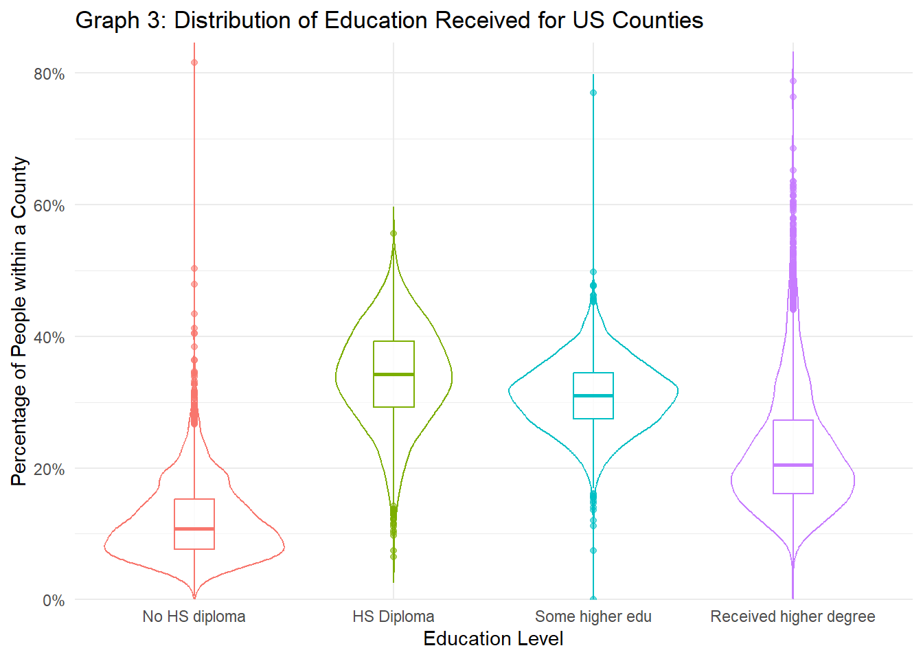
Graph 3 above shows the distributions of people who fall into each education category based on the county they live in. Because the populations for each county vary so drastically (as seen in the previous dataset), we compare the percentages for people who fall into each category for each county rather than the total count. Education differs greatly across counties, as each category has quite distinct peaks and and variability. People who have only received a high school diploma or some higher education make up the majority of the all counties’ population. Getting a college degree or higher is still somewhat rare, as we see that the peak is around 20% of a county’s population. Lastly, there’s clearly some room for improvement in terms of improving education for all, as ~10% of people in counties don’t have their high school diploma (based on the median), with about 25% of all counties having more than 15% of their population not even getting their high school diploma.
The tables above graph 3 add more insight with regards to educational levels. There are instances where some counties don’t have any residents who reported getting any form of higher education. The fact that some counties had 50% or more their residents not even receiving a high school diploma is startling. Although the group of people who have received only a high school diploma.
# Get summary statistics for each education category on state totals
print("State level education summary statistics for residents, by state totals")
[1] "State level education summary statistics for residents, by state totals"edu_tidy %>%
filter(region_type == "state") %>% # Select states
group_by(edu_level) %>%
summarise(min_tot = min(edu_total, na.rm=TRUE),
q1_tot = quantile(edu_total, 0.25, 1, na.rm=TRUE),
mean_tot = mean(edu_total, na.rm=TRUE),
med_tot = median(edu_total, na.rm=TRUE),
q3_tot = quantile(edu_total, 0.75, 1, na.rm=TRUE),
max_tot = max(edu_total, na.rm=TRUE))# Get summary statistics for each education category on state percentages
print("State level education summary statistics for residents, by percentages")[1] "State level education summary statistics for residents, by percentages"edu_tidy %>%
filter(region_type == "state") %>% # Select states
group_by(edu_level) %>%
summarise(min_perc = min(edu_perc, na.rm=TRUE),
q1_perc = quantile(edu_perc, 0.25, 1, na.rm=TRUE),
mean_perc = mean(edu_perc, na.rm=TRUE),
med_perc = median(edu_perc, na.rm=TRUE),
q3_perc = quantile(edu_perc, 0.75, 1, na.rm=TRUE),
max_perc = max(edu_perc, na.rm=TRUE))# Graph proportions at state level
edu %>%
select(matches("FIPS|perc|region")) %>%
filter(region_type == "state") %>% # Remove states
pivot_longer(cols=contains("perc"), names_to="perc_type", values_to="percent") %>%
mutate(perc_type = factor(perc_type,
levels=c("perc_no_HS",
"perc_HS_only",
"perc_some_college",
"perc_bach_plus"))) %>%
ggplot(aes(x=perc_type, y=percent/100, color=perc_type, alpha = 0.8)) +
geom_violin(trim=FALSE) +
geom_boxplot(width=0.2) +
theme_minimal() +
theme(legend.position="none",
axis.text.x = element_text(angle=0)) +
labs(title="Graph 4: Distribution of Education Received for US States",
x="Education Level",
y="Percentage of People within a State", fill="Education Level") +
scale_x_discrete(labels=c("No HS diploma",
"HS Diploma",
"Some higher edu",
"Received higher degree")) +
scale_y_continuous(labels=scales::percent, expand=c(0, 0), limits=c(0, NA))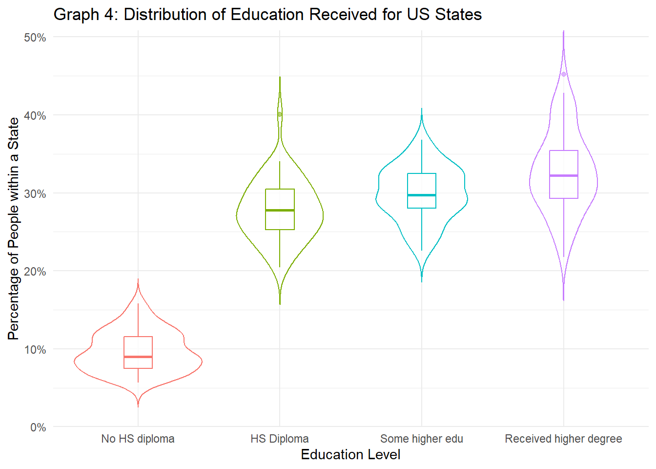
The state level data paints a slightly different picture. Americans tend to be pretty educated, as those who have at least some college education (if not more) have a higher summary statistics across the board, compared to those with only a high school diploma or lower. This is also reflected in the table showing the summary statistics for state percentages, as the categories some_college and bach_plus are greater than the two categories showing only some high school education. This suggests that at the county level, those with some higher education tend to live in very specific counties, rather than equally dispersing across the state. Because the many counties with low populations and low education rates outweigh the few counties with high populations or high education rates, county level data might skew the percentages to make residents look less educated. However, because we aggregate at the state level, populations are all combined into one group (state), telling us that at least from this perspective, Americans are more educated than what was depicted earlier. These findings are also reflected in Graph 4 above, as the median percentage for people who have received some higher education or have received a higher degree is higher for both than the median percentage for the percentage of people who have a high school diploma or didn’t finish high school.
This poverty dataset contains poverty-related statistics for 2020. Poverty, as explained on the census.gov website, is determined by first summing up a family’s total income over a given year, and then comparing that with a “poverty threshold” that is calculated by the government. This poverty threshold incorporates the size of a family and age of each member and Consumer Price Index for All Urban Consumers (CPI-U), but does not vary by geographical location.
Although this dataset contains a lot of variables (such as 90% confidence intervals for different poverty groups), we will only be looking at the total number and proportion of people living in poverty for a specific region (county, state, or nation), as well as the number and proportion of people within a certain age group (aged 0-17, 0-4, and 5-17) who are estimated to be living in poverty. This data is especially valuable and investigating poverty for minors, as theoretically investing more in minors could help reduce poverty later on.
pov <- read_excel(here("posts", "_data", "Linus_US_data", "Linus_US_PovertyEstimates.xlsx"),
                  sheet="Poverty Data 2020",
                  skip=4) %>%
  select(c(matches("FIPS|POV|MED"), "Stabr", "Area_name")) %>%
  rename(FIPS=1,
         pov_all=2,
         perc_pov_all=3,
         pov_0_17=4,
         perc_pov_0_17=5,
         pov_5_17=6,
         perc_pov_5_17=7,
         med_inc=8,
         pov_0_4=9,
         perc_pov_0_4=10,
         state_acr=11,
         area_name=12) %>%
  filter(FIPS < 72000 & FIPS != 11000) %>%
  mutate(region_type = case_when(FIPS == "00000" ~ "national",
                                 str_detect(FIPS, "0{3}$") ~ "state",
                                 TRUE ~ "county"))


# dfSummary
print(summarytools::dfSummary(pov,
                              varnumbers=FALSE,
                              plain.ascii=FALSE,
                              style="grid",
                              graph.magnif = 0.70,
                              valid.col=FALSE),
      method="render",
table.classes="table-condensed")| Variable | Stats / Values | Freqs (% of Valid) | Graph | Missing | |||||||||||||||||||||||||||||||||||||||||||||||||||||||
|---|---|---|---|---|---|---|---|---|---|---|---|---|---|---|---|---|---|---|---|---|---|---|---|---|---|---|---|---|---|---|---|---|---|---|---|---|---|---|---|---|---|---|---|---|---|---|---|---|---|---|---|---|---|---|---|---|---|---|---|
| FIPS [character] |
|
|
 |
0 (0.0%) | |||||||||||||||||||||||||||||||||||||||||||||||||||||||
| pov_all [numeric] |
|
2762 distinct values |  |
1 (0.0%) | |||||||||||||||||||||||||||||||||||||||||||||||||||||||
| perc_pov_all [numeric] |
|
286 distinct values |  |
1 (0.0%) | |||||||||||||||||||||||||||||||||||||||||||||||||||||||
| pov_0_17 [numeric] |
|
2161 distinct values |  |
1 (0.0%) | |||||||||||||||||||||||||||||||||||||||||||||||||||||||
| perc_pov_0_17 [numeric] |
|
400 distinct values |  |
1 (0.0%) | |||||||||||||||||||||||||||||||||||||||||||||||||||||||
| pov_5_17 [numeric] |
|
1927 distinct values |  |
1 (0.0%) | |||||||||||||||||||||||||||||||||||||||||||||||||||||||
| perc_pov_5_17 [numeric] |
|
385 distinct values |  |
1 (0.0%) | |||||||||||||||||||||||||||||||||||||||||||||||||||||||
| med_inc [numeric] |
|
3089 distinct values |  |
1 (0.0%) | |||||||||||||||||||||||||||||||||||||||||||||||||||||||
| pov_0_4 [numeric] |
|
51 distinct values |  |
3143 (98.4%) | |||||||||||||||||||||||||||||||||||||||||||||||||||||||
| perc_pov_0_4 [numeric] |
|
45 distinct values |  |
3143 (98.4%) | |||||||||||||||||||||||||||||||||||||||||||||||||||||||
| state_acr [character] |
|
|
 |
0 (0.0%) | |||||||||||||||||||||||||||||||||||||||||||||||||||||||
| area_name [character] |
|
|
 |
0 (0.0%) | |||||||||||||||||||||||||||||||||||||||||||||||||||||||
| region_type [character] |
|
|
 |
0 (0.0%) |
Generated by summarytools 1.0.1 (R version 4.3.0)
2023-07-08
# Remove `pov_0_4` and `perc_pov_0_4`
pov = pov %>%
  select(-c(pov_0_4, perc_pov_0_4))

# Show data
pov
The data above is shown at the zip code level, and includes the number and percent of people living in poverty for all residents, or those of a specific age bracket. One concerning factor is that there is a significant number of missing data for the number and proportion of people aged 0-4 living in poverty. This is probably due to the fact that this age group is the hardest to keep track of (as they aren’t of age to attend school yet). We will remove these two columns due to the high levels of missingness.
Let’s check the missing data.
pov %>% filter(is.na(med_inc))We see for Kalawao County in Hawaii, surprisingly, all values pertaining to poverty are missing. Because this is only one county amongst about 3,850 counties, this isn’t a big deal. I’ll leave it in so that during the join, we know it was missing information.
Lastly, our data needs to be made “tidy”, as percents and numbers should each be their own column.
# Tidy data
pov_percs <- pov %>%
  select(!contains("perc")) %>%
  pivot_longer(cols=pov_all:pov_5_17,
               names_to="age_group",
               values_to="pov_total")
pov_totals <- pov %>%
  select(c("FIPS", contains("perc"))) %>%
  pivot_longer(cols=perc_pov_all:perc_pov_5_17,
               names_to="age_group",
               values_to="pov_perc") %>%
  mutate(age_group=str_remove(age_group, "perc_"))
pov_tidy <- pov_percs %>%
  inner_join(pov_totals,
             by=c("FIPS", "age_group")) %>%
  mutate(age_group=factor(age_group,
                          levels=c("pov_all", "pov_0_17", "pov_5_17", "pov_0_4")))

# Show tidy data
pov_tidy# Clean env
rm(pov_percs)
rm(pov_totals)# County totals
print("County level summary statistics for residents living in poverty, total number")[1] "County level summary statistics for residents living in poverty, total number"pov_tidy %>%
filter(region_type == "county") %>% # Remove states
group_by(age_group) %>%
summarise(min_tot = min(pov_total, na.rm=TRUE),
q1_tot = quantile(pov_total, 0.25, 1, na.rm=TRUE),
mean_tot = mean(pov_total, na.rm=TRUE),
med_tot = median(pov_total, na.rm=TRUE),
q3_tot = quantile(pov_total, 0.75, 1, na.rm=TRUE),
max_tot = max(pov_total, na.rm=TRUE))print("County level summary statistics for residents living in poverty by percent")[1] "County level summary statistics for residents living in poverty by percent"pov_tidy %>%
filter(region_type == "county") %>% # Remove states
group_by(age_group) %>%
summarise(min_tot = min(pov_perc, na.rm=TRUE),
q1_tot = quantile(pov_perc, 0.25, 1, na.rm=TRUE),
mean_tot = mean(pov_perc, na.rm=TRUE),
med_tot = median(pov_perc, na.rm=TRUE),
q3_tot = quantile(pov_perc, 0.75, 1, na.rm=TRUE),
max_tot = max(pov_perc, na.rm=TRUE))# Graph data
pov %>%
select(matches("FIPS|perc|region")) %>%
filter(region_type=="county") %>% # Remove states
pivot_longer(cols=contains("perc"),
names_to="perc_type",
values_to="percent") %>%
mutate(perc_type = factor(perc_type,
levels=c("perc_pov_all",
"perc_pov_0_17",
"perc_pov_5_17",
"perc_pov_0_4"))) %>%
ggplot(aes(x=perc_type, y=percent/100, color=perc_type, alpha=0.8)) +
geom_violin(trim=FALSE) +
geom_boxplot(width=0.2) +
theme_minimal() +
theme(legend.position="none") +
labs(title="Graph 5: Poverty Breakdown Across Age Groups for US Counties",
subtitle="Based on proportion of people who fall within each category per county",
x="Poverty Groups (Split by Age)",
y="Percentage of Residents") +
scale_x_discrete(labels=c("All residents",
"Residents aged 0-17",
"Residents aged 5-17",
"Residents aged 0-4")) +
scale_y_continuous(labels=scales::percent, expand=c(0, 0), limits=c(0, NA))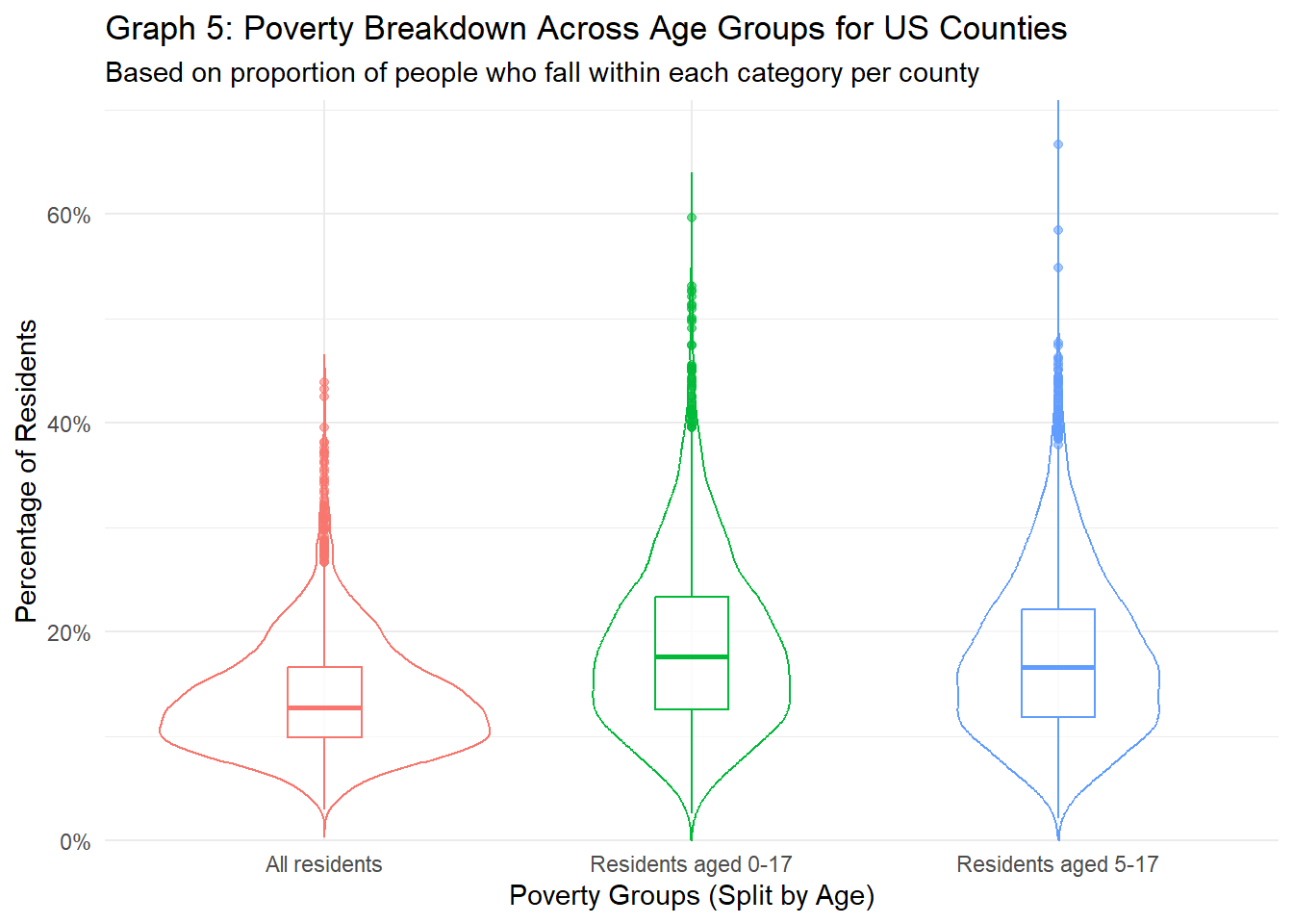
From graph 5 and tables above above, the poverty rate for all residents across counties is about 13% - much higher than I was expecting. However, it’s shocking to see that there are some counties were over 20% of the county’s population is living in poverty. Equally shocking is how the proportion of minors (aged 0-17 or 5-17) living in poverty is actually higher than that of all residents. It could be because adults living in poverty tend to have large families (as discussed on WorldVision), or that the count of adults living in poverty is underrepresented, as adults living in poverty are more likely to be houseless and thus not have access to the census survey, while children living in poverty (hopefully) are living with parents and are more likely to be included in census data. In general though, it’s scary and quite eye-opening that about 18% of all minors are living in poverty, when data is broken up at the county level.
# State totals
print("State level summary statistics for residents living in poverty, total number")
[1] "State level summary statistics for residents living in poverty, total number"pov_tidy %>%
filter(region_type == "state") %>% # Remove states
group_by(age_group) %>%
summarise(min_tot = min(pov_total, na.rm=TRUE),
q1_tot = quantile(pov_total, 0.25, 1, na.rm=TRUE),
mean_tot = mean(pov_total, na.rm=TRUE),
med_tot = median(pov_total, na.rm=TRUE),
q3_tot = quantile(pov_total, 0.75, 1, na.rm=TRUE),
max_tot = max(pov_total, na.rm=TRUE))print("State level summary statistics for residents living in poverty by percent")[1] "State level summary statistics for residents living in poverty by percent"pov_tidy %>%
filter(region_type == "state") %>% # Remove states
group_by(age_group) %>%
summarise(min_tot = min(pov_perc, na.rm=TRUE),
q1_tot = quantile(pov_perc, 0.25, 1, na.rm=TRUE),
mean_tot = mean(pov_perc, na.rm=TRUE),
med_tot = median(pov_perc, na.rm=TRUE),
q3_tot = quantile(pov_perc, 0.75, 1, na.rm=TRUE),
max_tot = max(pov_perc, na.rm=TRUE))# Graph data
pov %>%
select(matches("FIPS|perc|region")) %>%
filter(region_type=="state") %>% # Remove states
pivot_longer(cols=contains("perc"), names_to="perc_type", values_to="percent") %>%
mutate(perc_type = factor(perc_type,
levels=c("perc_pov_all",
"perc_pov_0_17",
"perc_pov_5_17",
"perc_pov_0_4"))) %>%
ggplot(aes(x=perc_type, y=percent/100, color=perc_type, alpha=0.8)) +
geom_violin(trim=FALSE) +
geom_boxplot(width=0.2) +
theme_minimal() +
theme(legend.position="none") +
labs(title="Graph 6: Poverty Breakdown Across Age Groups for US States",
subtitle="Based on proportion of people who fall within each category per state",
x="Poverty Groups (Split by Age)",
y="Percentage of Residents") +
scale_x_discrete(labels=c("All residents",
"Residents aged 0-17",
"Residents aged 5-17",
"Residents aged 0-4")) +
scale_y_continuous(labels=scales::percent, expand=c(0, 0), limits=c(0, NA))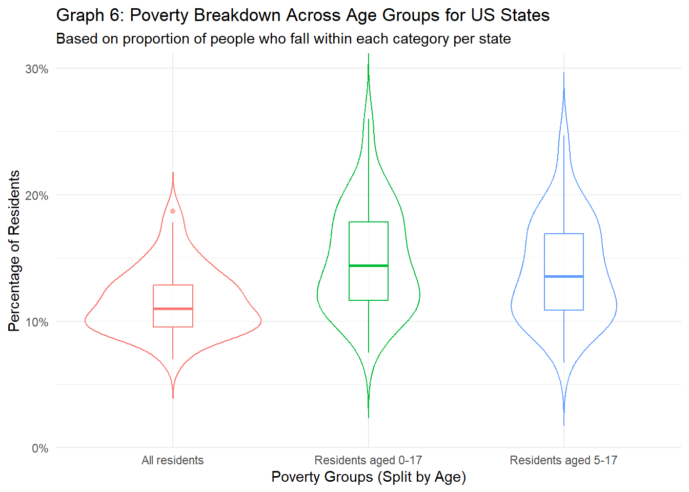
At the state level, the percentage of people living in poverty has dropped somewhat, most likely again not because of the change in numbers, but because of the reduction of counties with high poverty rates inflating the percentages. However, we still see that poverty rates for minors (aged 0-17 or aged 5-17) is higher than poverty rates for all residents of states (14.84% and 13.93% vs. 11.62%, respectively, when comparing the medians), and that there are some states where over 20% of minors (aged either 0-17 or 5-17) are living at or below poverty. The lower numbers are reflected in graph 6, as compared to graph 5, the percentages for all groups is a lot lower for the medians and quartiles. One point to add, however, is that although the percentages are generally lower, the minimums at the state level are are higher than that at the county level. This again might be one of the differences that are hidden away when aggregating data at different levels.
With data in hand, let us look into how population size, poverty rates, and education levels all relate to one another at both the county level. Our research questions are as follows:
How does the population size of a county relate to educational attainment for residents?
How does the population size of a county connect with the number and proportion of people living in poverty?
How does level of education for residents correlate with poverty in these regions?
Continuum Codes will provide deeper insight as to how these features relate to how urban / rural that county might be, incorporating other features such as population size and city-like features into this analysis.First, we’ll look at the totals for each county. Because we’re comparing two different populations, I expect to see a positive trend between population and number of people in each education group.
# Because each dataset uses different types of "tidy" data, will manually join tables for each RQ
pop_edu_tidy = pop %>%
  inner_join(edu_tidy %>%
               select(c(FIPS, edu_level, edu_total, edu_perc)), by = "FIPS")

# First, let's plot all data points on one graph
pop_edu_tidy %>%
  filter(region_type=="county" & pop_2020 <= 3000000) %>%
  ggplot(aes(x = pop_2020, y = edu_total, color = edu_level)) +
  geom_point(alpha = 0.35) +
  labs(title="Graph 7: Comparing Population with Level of Education",
       subtitle="For US counties with under 3 million residents",
       caption="From 2020 US census data",
       x = "Number of Residents in a County",
       y = "Number of Residents who Fall into that Education Group",
       color = "Highest Education Achieved") +
  scale_color_discrete(labels = c("No HS Diploma",
                                 "HS Diploma",
                                 "Some Bachelors / Associates",
                                 "Received a Bachelors+"))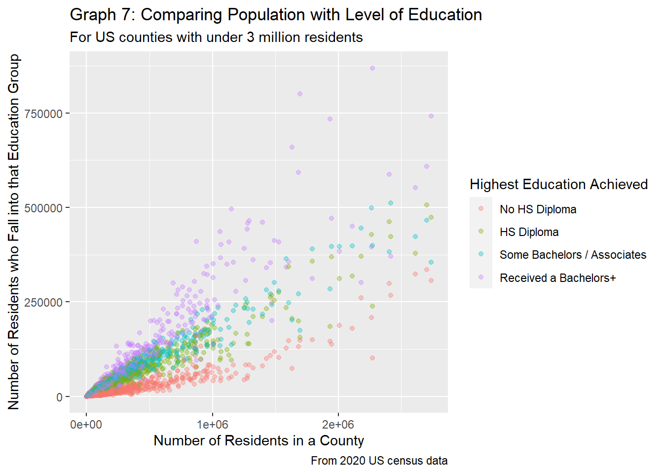
# Let's look into edu_total vs. pop_2020, faceted by edu_level
pop_edu_tidy %>%
  filter(region_type=="county" & pop_2020 <= 3000000) %>%
  ggplot(aes(x = pop_2020, y = edu_total, color = edu_level)) +
  geom_point(alpha = 0.5) +
  facet_wrap(~edu_level, labeller =
               labeller(edu_level = c("no_HS" = "No HS Diploma",
                                      "HS_only" = "Received only a HS Diploma",
                                      "some_college" = "Taken Some College or Associates Classes",
                                      "bach_plus" = "Received Bachelors Degree or More")
  )) +
  labs(title="Graph 8: Comparing Population with Level of Education",
       subtitle="For US counties with under 3 million residents",
       caption="From 2020 US census data",
       x = "Number of Residents in a County",
       y = "Number of Residents who Fall into that Education Group") +
  theme(legend.position = "none")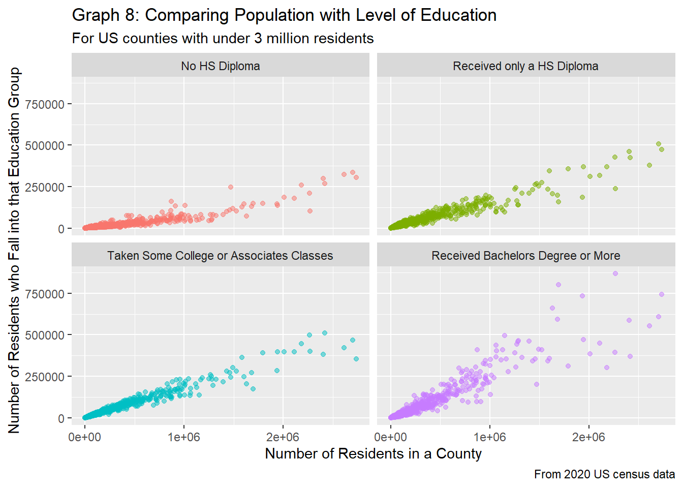
As expected, when plotting population vs. education level, we see that the number of people who fall into each education category increases as population increases. Two trends are clear from graph 7 above: 1) education groups are very close to one another when populations are low, but these groups diverge and seem to be somewhat distinct as the population increases, and 2) there seems to be a linear relationship between the population size and rate at which the number of people within each education group increases.
Graph 7 compares the county population with the highest education achieved for said residents for counties less than 3 million. 3 million was chosen because there were very few counties with populations over 3 million, and these data points gave no new insight to the trends. From graph 7, it’s pretty clear that the education groups are pretty distinct, with people not getting a high school diploma making up the smallest number of residents, and those with at least a bachelors degree at the top. The groups are somewhat distinct as well, with only the “HS Diploma” and “Some Bachelors / Associates” groups having overlap.
Graph 8 separates these groups up, and gives more insight as to the relationship between county population and highest education achieved. The number of people who don’t get a high school diploma increases the least as population increases, while the number of people who get at least a bachelors degree tends to increase the most. Those who receive only a high school diploma and those who take only some college or associates classes have about the same rate of increase, which falls in line given that the difference in these two groups might be a semester of classes (like 3 months of class).
Because this graph doesn’t tell us much about how the percentage of people who fall into each group changes, we’ll next look into the percentage of people who fall into each category.
# Let's look into edu_total vs. pop_2020, faceted by edu_level
pop_edu_tidy %>%
  filter(region_type=="county" & pop_2020 <= 2500000) %>%
  ggplot(aes(x = pop_2020, y = edu_perc / 100, color = edu_level)) +
  geom_point(alpha = 0.25) +
  labs(title="Graph 9: Comparing Population with Level of Education",
       subtitle="For US counties excluding populations > 2.5 million",
       caption="From 2020 US census data",
       x = "Number of Residents in a County",
       y = "Percentage of Residents that Fall into that Education Group",
       color = "Highest Education Achieved") +
  scale_y_continuous(labels=scales::percent) +
  scale_color_discrete(labels = c("No HS Diploma",
                                 "HS Diploma",
                                 "Some Bachelors / Associates",
                                 "Received a Bachelors+"))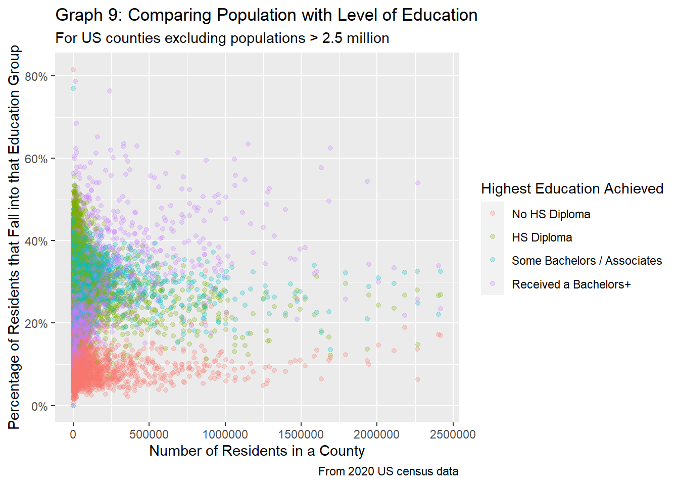
pop_edu_tidy %>%
  filter(region_type=="county" & pop_2020 <= 2500000) %>%
  ggplot(aes(x = pop_2020, y = edu_perc / 100, color = edu_level)) +
  geom_point(alpha = 0.5) +
  facet_wrap(~edu_level, labeller =
               labeller(edu_level = c("no_HS" = "No HS Diploma",
                                      "HS_only" = "Received only a HS Diploma",
                                      "some_college" = "Taken Some College or Associates Classes",
                                      "bach_plus" = "Received Bachelors Degree or More")
  )) +
  labs(title="Graph 10: Comparing Population with Level of Education",
       subtitle="For US Counties excluding populations > 2.5 million",
       caption="From 2020 US census data",
       x = "Number of Residents in a County",
       y = "Percentage of Residents that Fall into that Education Group") +
  theme(legend.position = "none") +
  scale_y_continuous(labels=scales::percent)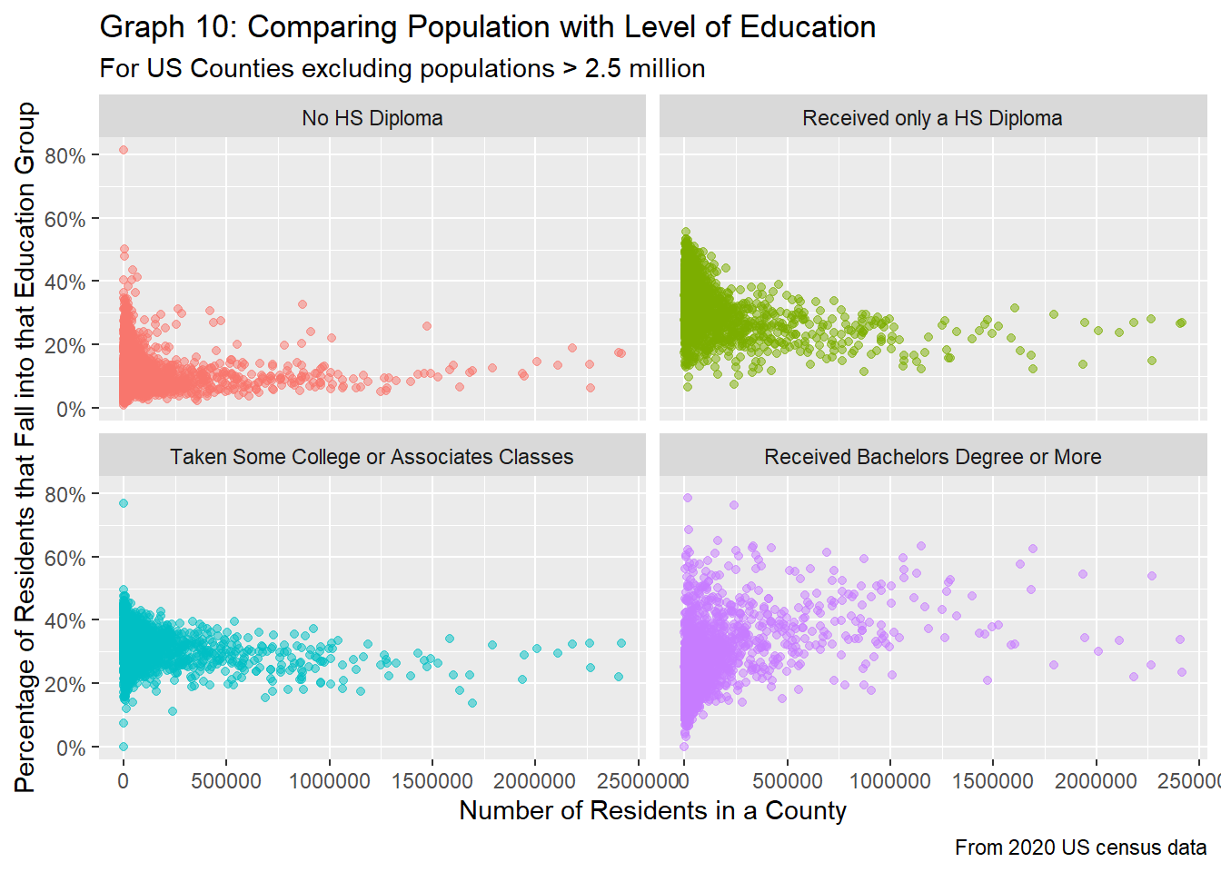
Eerily enough, for the most part, when looking at changes in the percentage of people who fall into each category, the results change dramatically. For counties with a low population, there tends to be very large fluctuations in how educated its residents are, as represented by more dispersed points at lower populations. Graph 9 clearly visualizes this, as at low populations, the percentage of people who have received at least a bachelors degree can be lower than all the other groups, while the percentage of people with less than a high school diploma make up the majority of a county’s population (or at least is significantly higher than the median). However, as the population rises, the values tend to stabilize, as exhibited by both graphs 9 and 10. Mirroring the results seen in graphs 7 and 8, the percentage of people with at least a bachelors degree tends to be the highest for counties with populations greater than 400K, followed by some bachelors or associates education overlapping those who have received at a high school diploma, and finally those who have not received a HS diploma at the very bottom.
Lastly, let’s investigate how metropolitan vs. non-metropolitan counties compare. We’ll only look at the percentage breakdowns for education, as the raw number will most likely be positive (as seen in graph 11).
pop_edu_tidy %>%
  filter(region_type == "county" & pop_2020 <= 2500000) %>%
  mutate(metro = ifelse(Cont_Code %in% c(1, 2, 3), TRUE, FALSE)) %>%
  ggplot(aes(x=pop_2020, y=edu_perc/100, color=edu_level)) +
  geom_point(alpha=0.75) +
  facet_grid(vars(edu_level), vars(metro), scales = "free_x",
             labeller = labeller(edu_level = c("no_HS" = "No HS Diploma",
                                      "HS_only" = "Only HS Diploma",
                                      "some_college" = "Some College",
                                      "bach_plus" = "College Diploma +"),
                                 metro = c("FALSE" = "Non-Metropolitan Counties", "TRUE" = "Metropolitan Counties"))) +
  labs(title="Graph TODO: Comparing Population with Level of Education of US County Residents",
       subtitle="For county populations under 2.5 million, splitting by if a county is a metropolitan",
       caption="From 2020 US census data",
       x = "Number of Residents in a County",
       y = "Percentage of Residents that Fall into that Education Group") +
  theme(legend.position = "none") +
  scale_y_continuous(labels=scales::percent)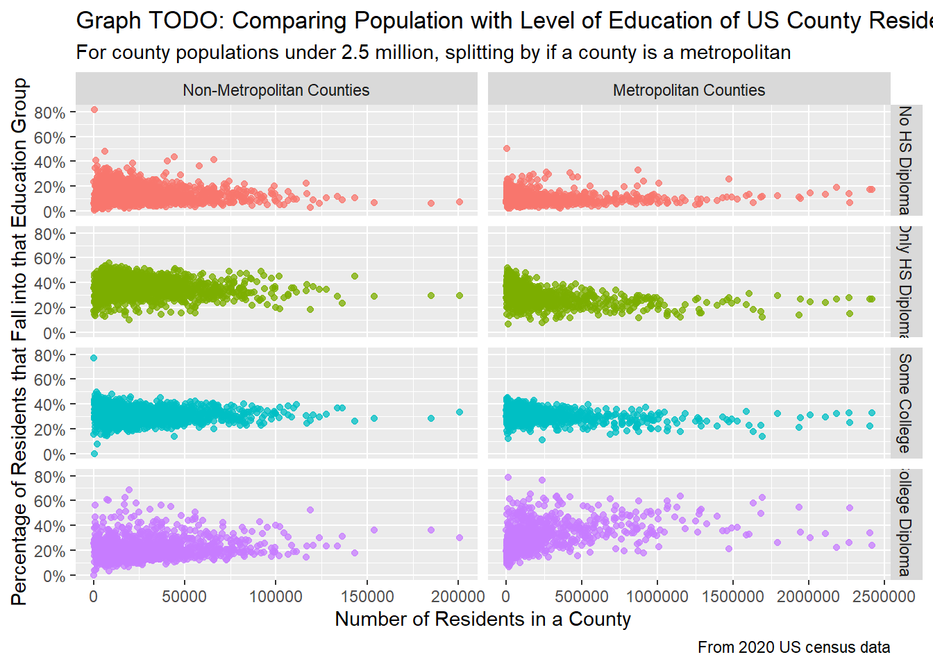
When breaking down education further by whether the county is a metropolitan or not, new trends emerge. Focusing on the metropolitan counties, for all education groups except for having a college diploma, the trend lines are slightly U-shaped (concave up), meaning that for low populations, the percentage of people who are not college educated is slightly higher, and for larger populations, the percentage actually increases. This is surprising to me because I would’ve thought that larger cities are filled with more college-educated students, but this isn’t always the case, as shown here. For non-metropolitan counties, the trend lines are mostly flat, meaning that regardless of population size for counties, on average, the percentage of people who fall into each category are about the same. The percentage of college-educated residents does seem increase ever so slightly as the population for a county increases in non-metropolitan counties.
For this section, we’ll look at the state level data to compare state population with highest education achieved. First, let’s look at
pop_edu_tidy %>%
  filter(region_type=="state") %>%
  ggplot(aes(x = pop_2020, y = edu_total, color = edu_level)) +
  geom_point(alpha = 0.35) +
  labs(title="Graph 12: Comparing Population with Level of Education",
       subtitle="For US states",
       caption="From 2020 US census data",
       x = "Number of Residents in a State",
       y = "Number of Residents who Fall into that Education Group",
       color = "Highest Education Achieved") +
  scale_color_discrete(labels = c("No HS Diploma",
                                 "HS Diploma",
                                 "Some Bachelors / Associates",
                                 "Received a Bachelors+"))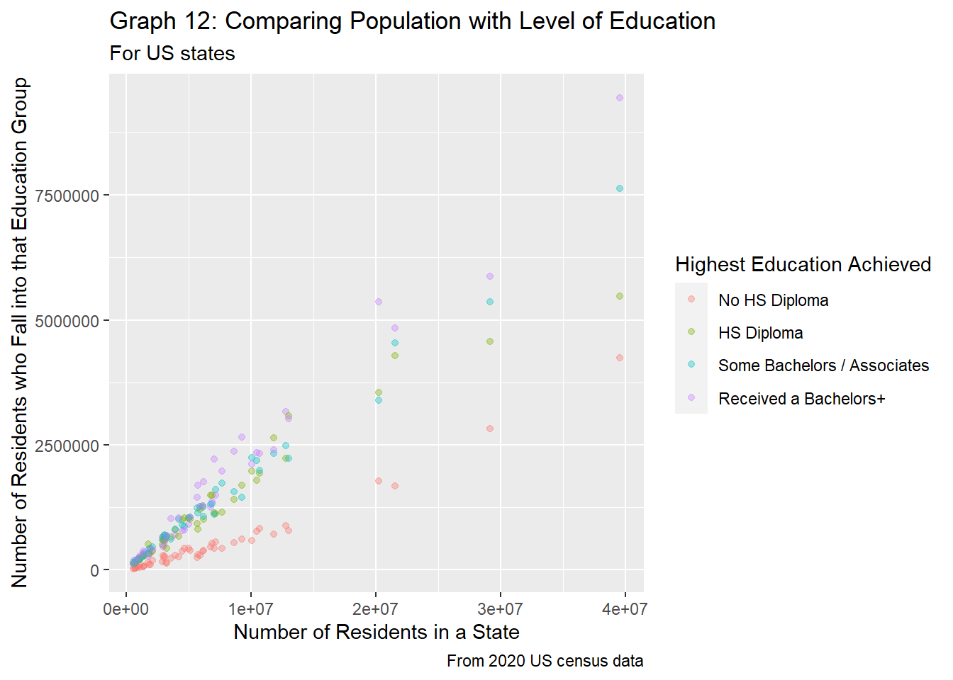
pop_edu_tidy %>%
  filter(region_type=="state") %>%
  ggplot(aes(x = pop_2020, y = edu_total, color = edu_level)) +
  geom_point(alpha = 0.35) +
  facet_wrap(~edu_level, labeller =
               labeller(edu_level = c("no_HS" = "No HS Diploma",
                                      "HS_only" = "Received only a HS Diploma",
                                      "some_college" = "Some Bachelors / Associates",
                                      "bach_plus" = "Received a Bachelors+")
               )) +
  labs(title="Graph 13: Comparing Population with Level of Education",
       subtitle="For US states",
       caption="From 2020 US census data",
       x = "Number of Residents in a State",
       y = "Number of Residents who Fall into that Education Group",
       color = "Highest Education Achieved") +
  theme(legend.position="none")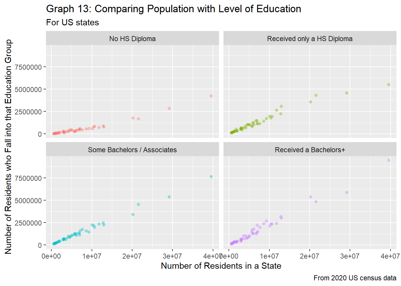
We see similar trends to that of the county level when looking at highest education achieved vs. region population in graph 12 and graph 7. Those who have not received their high school diploma make up a minority of state residents, followed by those who have only received their HS diploma, then those who have taken some higher level education, and finally those who have received at least a bachelors making up a majority of a state’s population. However, the overlap between the education groups that have received at least a high school diploma share quite a bit of overlap, especially when the population for the state is under 5 million. States with larger populations tend to have more and better colleges, so people from smaller states could go (and stay) in states with larger populations to attain their college degrees, thus leading to the distinction in educations for states with larger populations.
Graph 13 gives a better picture at how these trends might change. Unlike graph 8, graph 13 shoes that in general, the rate of change between the number of residents in a state and the number of residents who fall into each group is about the same for all groups expect for those who have not received a high school diploma. The trend lines all seem to be somewhat linear, though for larger populations (populations > 20 million), there seems to be a shift of trends, as there are more people without a high school diploma and less people who get their high school diploma than expected.
Next, let’s look at how the percentage of each education group varies per population.
# Let's look into edu_total vs. pop_2020, faceted by edu_level
pop_edu_tidy %>%
  filter(region_type=="state") %>%
  ggplot(aes(x = pop_2020, y = edu_perc / 100, color = edu_level)) +
  geom_point(alpha = 0.35) +
  labs(title="Graph 14: Comparing Population with Level of Education",
       subtitle="For US states",
       caption="From 2020 US census data",
       x = "Number of Residents in a State",
       y = "Percentage of Residents that Fall into that Education Group",
       color = "Highest Education Achieved") +
  scale_y_continuous(labels=scales::percent) +
  scale_color_discrete(labels = c("No HS Diploma",
                                 "HS Diploma",
                                 "Some Bachelors / Associates",
                                 "Received a Bachelors+"))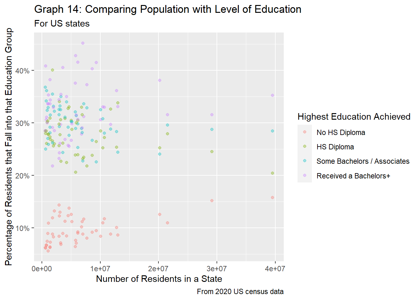
Graph 14 above shows the relationship between the percentage of residents in each education group vs. state populations. Like the county-equivalent in graph 9, we see firstly that those without a high school diploma make up the smallest percentage of residents, but as the population size increases, the percentage increases as well. Next, there is a lot of overlap between the remaining three groups, but typically, we see that those with at least a bachelors degree make up a majority of residents, followed by those who have received some college education, and lastly those who have received their high school diploma. However, for state populations under 10 million, those who have received a high school diploma and those who took some higher level classes make up about the same percentages, as they are overlap greatly in graph 14.
We’ll first look into the totals for both variables, and then look into the percentages of people living in poverty. As mentioned previously, we expect to see a positive relationship between the county population and number of people living in poverty.
# First, join data together
pop_pov_tidy = pop %>%
  inner_join(pov_tidy %>%
               select(c(FIPS, age_group, pov_total, pov_perc)),
             by = "FIPS")

# Next, graph pov_total vs. pop_2020, faceted by age_group
pop_pov_tidy %>%
  filter(region_type=="county" & pop_2020 <= 2500000) %>%
  ggplot(aes(x=pop_2020, y=pov_total, color=age_group)) +
  geom_point(alpha=0.3) +
  labs(title="Graph 15: Comparing Population with Poverty of US County Residents",
       subtitle = "For counties with less than 2.5 million residents, split by age group",
       caption="From 2020 US census data",
       x = "Number of Residents in a County",
       y = "Number of Residents who Fall into that Education Group",
       color = "Age Group") +
  theme(axis.text.x = element_text(angle=45, hjust=1)) +
  scale_color_discrete(labels = c("All Ages",
                                  "Minors Aged 0-17",
                                  "Minors Aged 5-17"))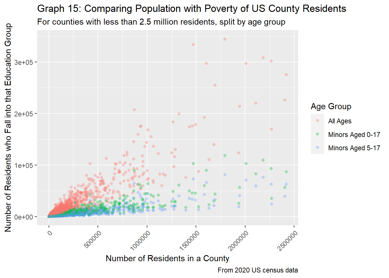
Unsurprisingly, we see that as the population rises in a county, the number of people living in poverty for all age groups increases. Similarly, we also see that there are three distinct groups in graph 15, as each group contains another (IE minors are included in the All Ages group, and those aged 5-17 are part of the group aged 0-17).
Let’s look at the percentage of people who fall into each category instead.
# Graph pov_perc vs. pop_2020, faceted by age_group
pop_pov_tidy %>%
  filter(region_type=="county" & pop_2020 <= 2500000) %>%
  ggplot(aes(x=pop_2020, y=pov_perc/100, color=age_group)) +
  geom_point(alpha=0.25) +
  labs(title="Graph 16: Comparing Population with Poverty",
       subtitle = "For US counties with populations under 2.5 million",
       caption="From 2020 US census data",
       x = "Number of Residents in a County",
       y = "Percentage of Residents who Fall into that Education Group",
       color = "Age Group") +
  theme(axis.text.x = element_text(angle=45, hjust=1)) +
  scale_y_continuous(labels=scales::percent) +
  scale_color_discrete(labels = c("All Ages",
                                  "Minors Aged 0-17",
                                  "Minors Aged 5-17"))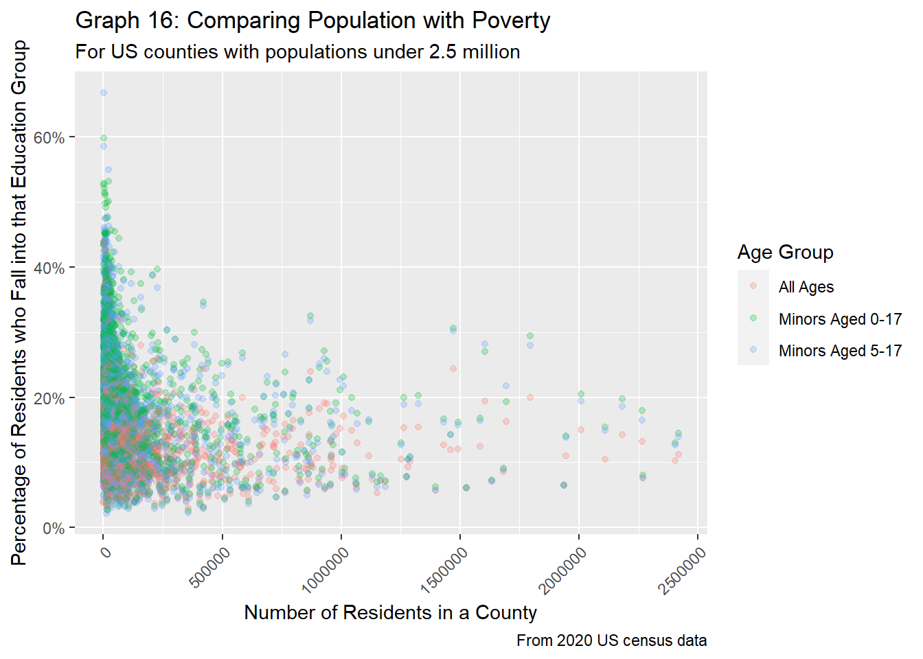
pop_pov_tidy %>%
  filter(region_type=="county" & pop_2020 <= 2500000) %>%
  ggplot(aes(x=pop_2020, y=pov_perc/100, color=age_group)) +
  geom_point(alpha=0.5) +
  facet_wrap(~age_group,
             labeller = labeller(age_group = c("pov_all" = "All Ages",
                                               "pov_0_17" = "Minors aged 0-17",
                                               "pov_5_17" = "Minors aged 5-17"))) +
  labs(title="Graph 17: Comparing Population with Poverty",
       subtitle = "For US counties with less than 2.5 million residents, split by Age Group",
       caption="From 2020 US census data",
       x = "Number of Residents in a County",
       y = "Percentage of Residents Living in Poverty") +
  theme(legend.position = "none",
        axis.text.x = element_text(angle=45, hjust=1)) +
  scale_y_continuous(labels=scales::percent)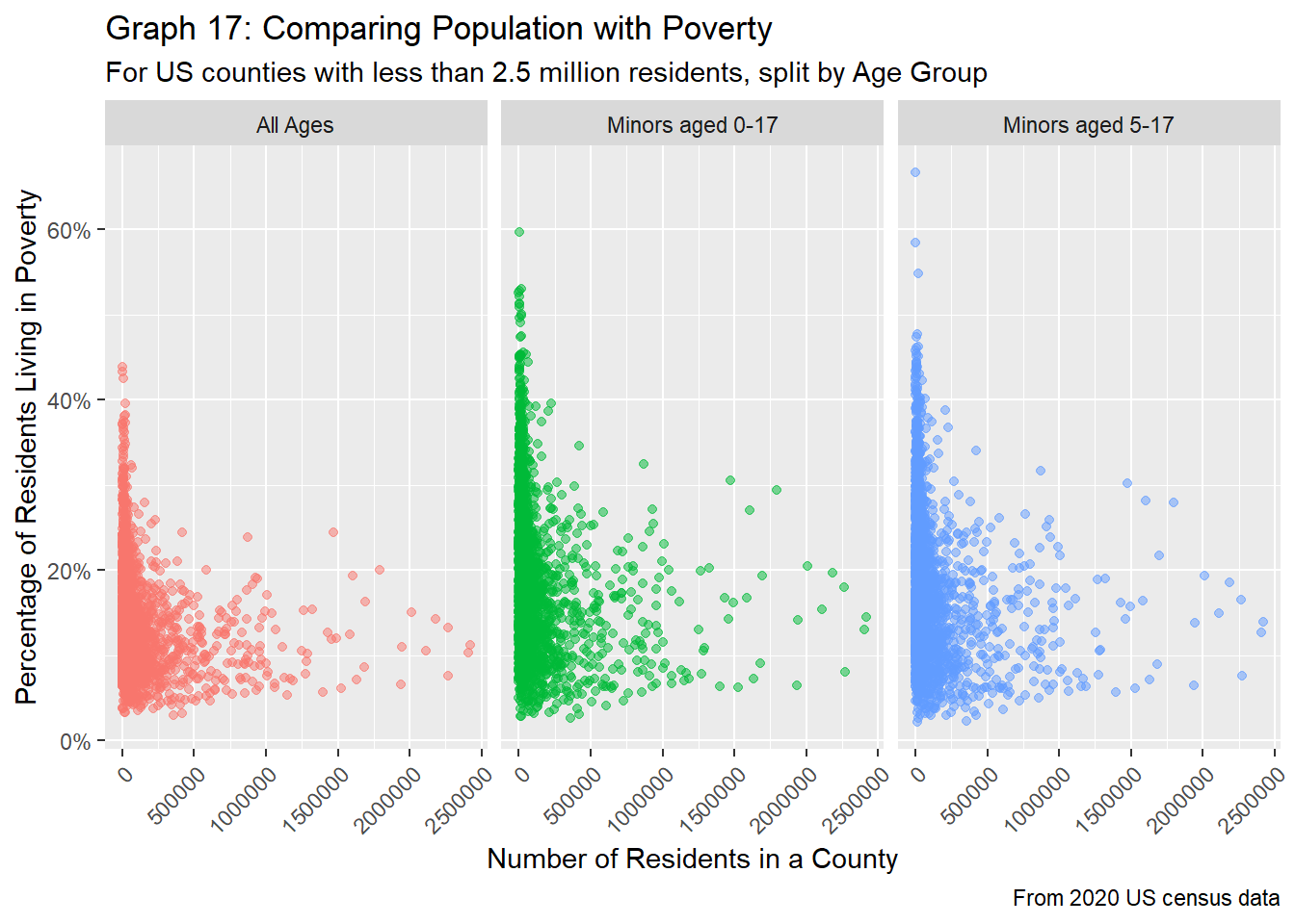
Again, in both graphs 16 and 17, we see that trends tend to follow a general U-shape, where for counties with very low populations, the percentage of people who are living in poverty is slightly higher, while counties with middling populations (about 250K to 1 million residents tend to see a decline in poverty rates. After the 1 million mark, however, the percentage of people living in poverty tends to increase. It’s interesting that for larger counties, as the population increases, poverty also increases, showing that even big cities with lots of people and wealth can still have a significant proportion of people struggling to make ends meet. Although graph 16 shows plenty of overlap between all three age age groups, from graph 17, we see that minors tend to have slightly higher poverty rates, supporting our findings from the EDA section.
Lastly, let’s see how metropolitan vs. non-metropolitan counties vary in terms of proportion of people living in poverty.
pop_pov_tidy %>%
  filter(region_type=="county" & pop_2020 <= 2500000) %>%
  mutate(metro = ifelse(Cont_Code %in% c(1, 2, 3), TRUE, FALSE)) %>%
  ggplot(aes(x=pop_2020, y=pov_perc/100, color=age_group)) +
  geom_point(alpha=0.75) +
  facet_grid(vars(age_group), vars(metro), scale="free_x",
             labeller = labeller(age_group = c("pov_all" = "All Ages",
                                               "pov_0_17" = "Minors aged 0-17",
                                               "pov_5_17" = "Minors aged 5-17"),
                                 metro = c("FALSE" = "Non-Metropolitan Counties",
                                           "TRUE" = "Metropolitan Counties"))) +
  labs(title="Graph 18: Comparing Population with Poverty of US County Residents",
       subtitle = "Populations <2.5 million residents, split by age group and metropolitan status",
       caption="From 2020 US census data",
       x = "Number of Residents in a County",
       y = "Percentage of Residents Living in Poverty") +
  theme(legend.position = "none",
        axis.text.x = element_text(angle=45, hjust=1)) +
  scale_y_continuous(labels=scales::percent)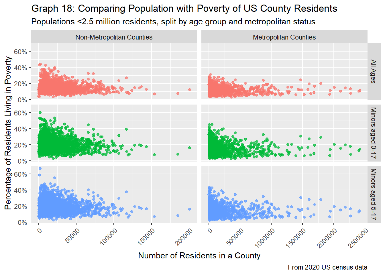
# Check numbers
pop_pov_tidy %>%
  filter(region_type == "county") %>%  # Remove states
  mutate(metro = ifelse(Cont_Code %in% c(1, 2, 3), TRUE, FALSE)) %>%
  group_by(metro, age_group) %>%
  summarise(min_tot = min(pov_perc, na.rm=TRUE),
            q1_tot = quantile(pov_perc, 0.25, 1, na.rm=TRUE),
            mean_tot = mean(pov_perc, na.rm=TRUE),
            med_tot = median(pov_perc, na.rm=TRUE),
            q3_tot = quantile(pov_perc, 0.75, 1, na.rm=TRUE),
            max_tot = max(pov_perc, na.rm=TRUE))
By splitting by whether a county is a metropolitan or not, we now see that slightly opposite trends, as depicted in graph 18. Counties that are metros show similar trends as our previous findings, where poverty rates tend to be higher for counties with very low populations, drop slightly for counties with middling populations, and increase again slightly for counties with large populations above ~1 million people. However, metropolitan counties tend to see an increase in poverty rates for counties with very low populations. Over time (after about a population size of 20K), these trend lines tend to decline. Additionally, counties that aren’t metropolitans also seem to have a greater proportion of people living in poverty, as from the table above, for all age groups, the proportion of people living in poverty is higher by about 2-4%.
Now, looking at the state level, how does population and poverty relate to one another?
pop_pov_tidy %>%
  filter(region_type=="state") %>%
  ggplot(aes(x=pop_2020, y=pov_total, color=age_group)) +
  geom_point(alpha=0.3) +
  labs(title="Graph 19: Comparing Population with Poverty of US State Residents",
       subtitle = "For US states",
       caption="From 2020 US census data",
       x = "Number of Residents in a State",
       y = "Number of People Living in Poverty",
       color = "Age Group") +
  theme(axis.text.x = element_text(angle=45, hjust=1)) +
  scale_color_discrete(labels = c("All Ages",
                                  "Minors Aged 0-17",
                                  "Minors Aged 5-17"))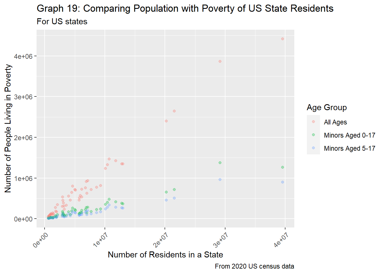
Just like graph 15, in graph 19 above, we see that each age group is quite separate from one another, and all seem to follow a linear relationship between state population and number of residents living in poverty. The rate of increase differs between each group, but this is most likely because wider age groups envelop more people, and thus the increase in poverty can be attributed to the larger population.
How does the poverty rate vary when looking at the percentage of people in a state living in poverty?
pop_pov_tidy %>%
  filter(region_type=="state") %>%
  ggplot(aes(x=pop_2020, y=pov_perc/100, color=age_group)) +
  geom_point(alpha=0.35) +
  labs(title="Graph 20: Comparing Population with Poverty",
       subtitle = "For US states",
       caption="From 2020 US census data",
       x = "Number of Residents in a County",
       y = "Percentage of Residents who Fall into that Education Group",
       color = "Age Group") +
  theme(axis.text.x = element_text(angle=45, hjust=1)) +
  scale_y_continuous(labels=scales::percent) +
  scale_color_discrete(labels = c("All Ages",
                                  "Minors Aged 0-17",
                                  "Minors Aged 5-17"))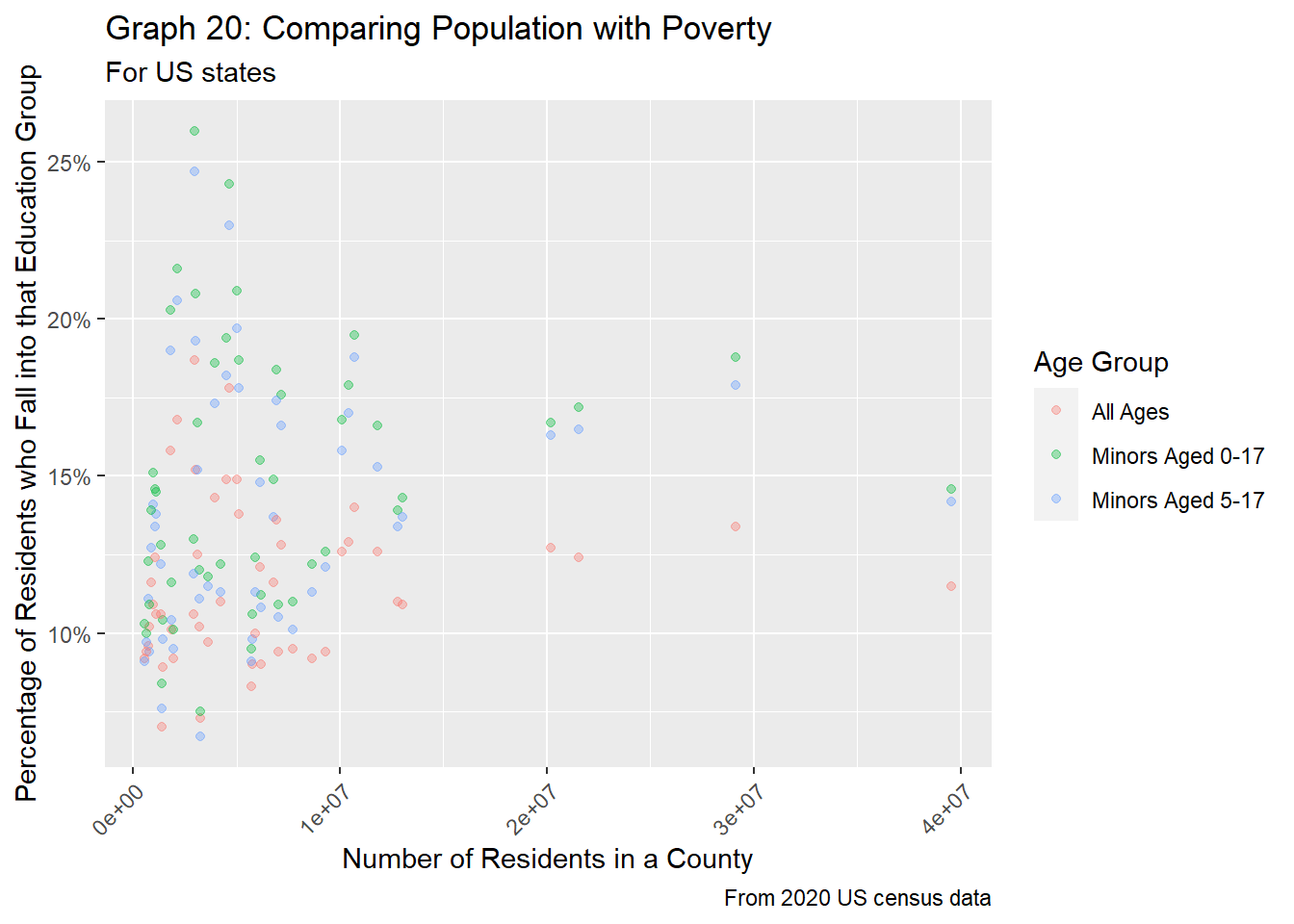
In graph 20 above, we get very similar findings as the county-level equivalent seen in graph 16. States with low populations (< 5 million residents) tend to have greater variation in the percentage of people living in poverty for all age groups, especially for minors. However, unlike graph 16, it’s a lot more clear that poverty rates for minors is slightly higher than the poverty rates all age groups, matching our findings from our initial EDA for poverty rates at the state level.
Lastly, we’ll look into how level of education correlates to poverty rates. For visualization purposes, we will only use the poverty rates and values linked to residents of all ages.
# Join tables together
df_full = pop_edu_tidy %>%
  inner_join(pov_tidy %>%
               select(c(FIPS, age_group, pov_total, pov_perc)),
             by = "FIPS")

# First, let's see how the totals relate to one another
df_full %>%
  filter(region_type == "county" &
           pop_2020 <= 2500000 &
           age_group == "pov_all") %>%
  ggplot(aes(x=pov_total, y=edu_total, color=edu_level)) +
  geom_point(alpha = 0.25) +
  labs(title = "Graph 21: Comparing Poverty with Highest Education Achieved",
       subtitle="For counties with populations under 2.5 million",
       caption="From 2020 US census data",
       x="# of People Living in Poverty",
       y="# of People w/ Specific Education Background",
       color="Education Level") +
  scale_color_discrete(labels=c("No HS Diploma",
                                "Only HS Diploma",
                                "Some College",
                                "Bachelors+"))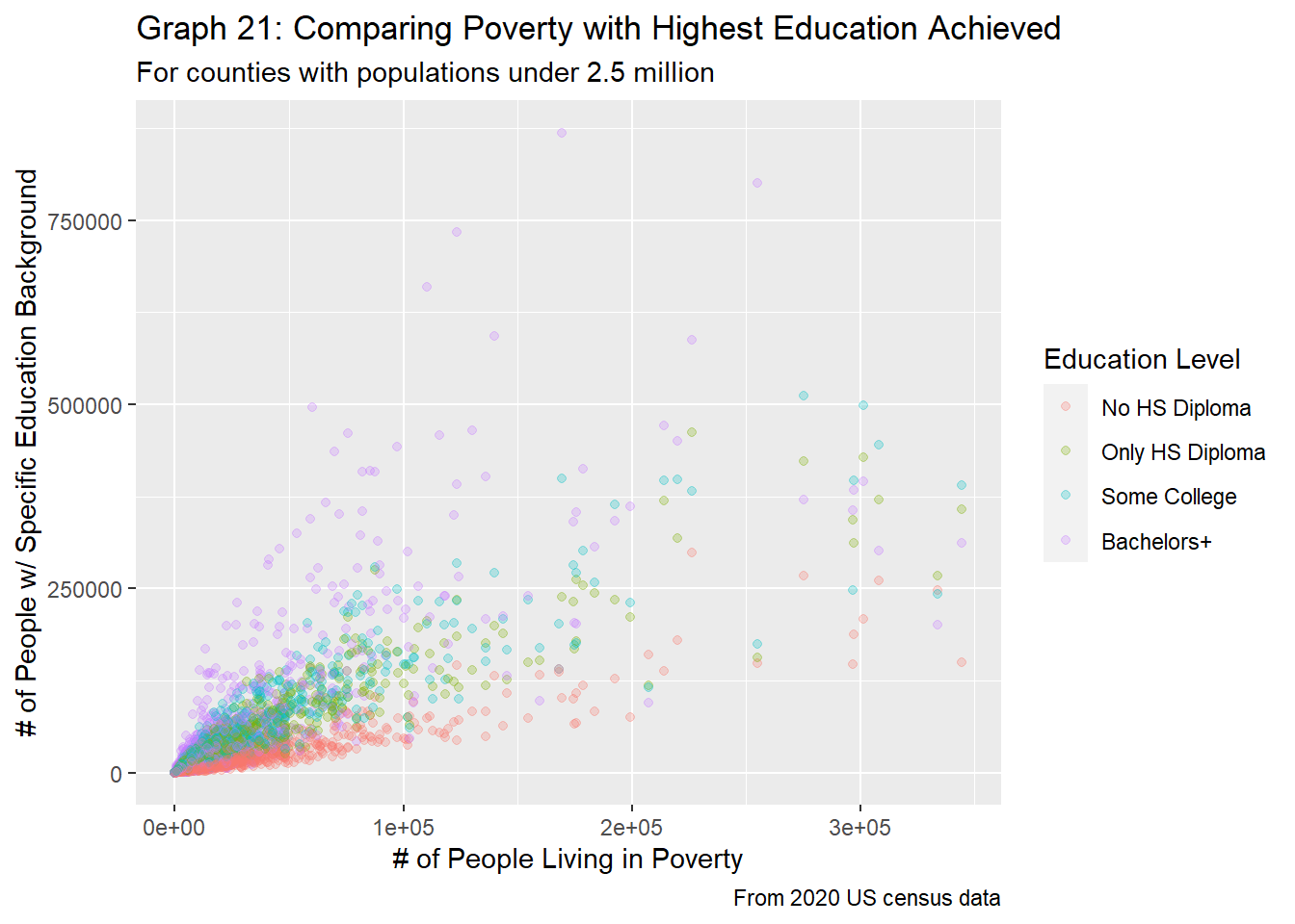
df_full %>%
  filter(region_type == "county" &
           pop_2020 <= 2500000 &
           age_group == "pov_all") %>%
  ggplot(aes(x=pov_total, y=edu_total, color=edu_level)) +
  geom_point(alpha = 0.75) +
  facet_wrap(edu_level ~ .,
             scale="free_x",
             labeller = labeller(edu_level = c("no_HS" = "No HS Diploma",
                                               "HS_only" = "Only HS Diploma",
                                               "some_college" = "Some College",
                                               "bach_plus" = "Bachelors+"))) +
  labs(title = "Graph 22: Comparing Poverty with Highest Education Achieved",
       subtitle="For counties with populations under 2.5 million, splitting by highest education achieved",
       caption="From 2020 US census data",
       x="# of People Living in Poverty",
       y="# of People w/ Specific Education Background") +
  theme(legend.position="none")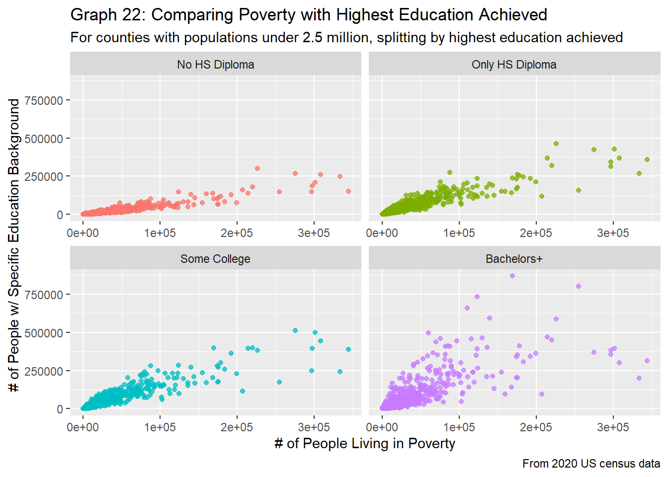
As expected, as the number of people living in poverty increases, the number of residents who fall into each category for education also increases, as evident in graphs 21 and 22. This follows the logic of the previous sections, as the greater the population the greater the number of people living in poverty, as well as the greater the number of people who fit into each category. However, some surprising relationships are still present. Firstly, we see that just like the population vs. education plot (graph 7), the education level groups are quite distinct. In general, we see that those without a high school diploma tend to make up the least number of people within a county, and those with a bachelors degree tend to make up the most of a county’s population, with the other two groups mixed in between. However, the relationship between the two variables is quite different, depending on the education group. From graph 22, we clearly see a strong linear trend between number of people living in poverty and number of people who didn’t get their HS diploma. Although the populations for people who have received their HS diploma and those that have taken some higher level courses are roughly the same, graph 21 does show that there is a slightly stronger positive relationship (as evident by the steeper slope and distinction in colors at larger populations) between the number of people living in poverty and those who taken some college courses. We see the greatest variability for those who have received a degree in higher education.
These relationships are by no means surprising. As we found in research question 2, there is a strong relationship between the population size of a county and the number of people living in poverty. Therefore, we would again expect to see a positive linear relationship between the number of people living in poverty and the number of people with various educational backgrounds, as evident in graph 21.
Next, let’s compare percentages for these two groups to get a better sense of how they might relate to one another.
# Next, compare percentages
df_full %>%
  filter(region_type == "county" &
           pop_2020 <= 2500000 &
           age_group == "pov_all") %>%
  ggplot(aes(x=pov_perc/100, y=edu_perc/100, color=edu_level)) +
  geom_point(alpha = 0.25) +
  labs(title = "Graph 23: Comparing Poverty with Highest Education Achieved",
       subtitle="For county populations under 2.5 million",
       caption="From 2020 US census data",
       x="Percentage of People Living in Poverty",
       y="Percentage of People a Specific Education Level",
       color="Education Level") +
  scale_x_continuous(labels=scales::percent) +
  scale_y_continuous(labels=scales::percent) +
  scale_color_discrete(labels=c("no_HS" = "No HS Diploma",
                                "HS_only" = "Only HS Diploma",
                                "some_college" = "Some College",
                                "bach_plus" = "Bachelors+"))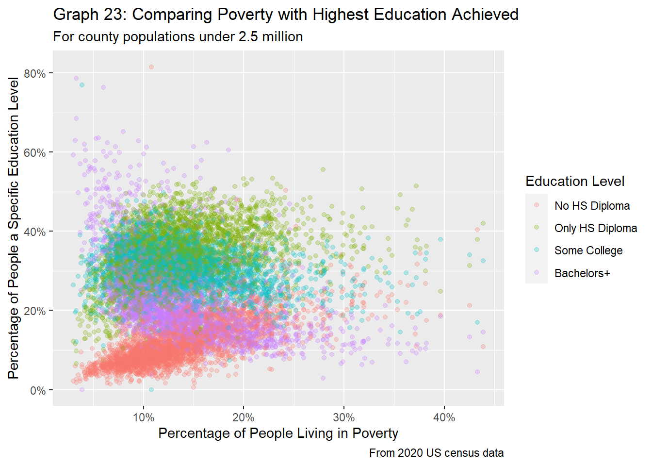
df_full %>%
  filter(region_type == "county" &
           pop_2020 <= 2500000 &
           age_group == "pov_all") %>%
  ggplot(aes(x=pov_perc/100, y=edu_perc/100, color=edu_level)) +
  geom_point(alpha = 0.75) +
  facet_wrap(edu_level ~ .,
             scale="free_x",
             labeller = labeller(edu_level = c("no_HS" = "No HS Diploma",
                                               "HS_only" = "Only HS Diploma",
                                               "some_college" = "Some College",
                                               "bach_plus" = "College Diploma +"))) +
  labs(title = "Graph 24: Comparing Poverty with Highest Education Achieved",
       subtitle="For county populations under 2.5 million, splitting by highest education achieved",
       caption="From 2020 US census data",
       x="Percentage of People Living in Poverty",
       y="Percentage of People a Specific Education Level") +
  theme(legend.position="none") +
  scale_x_continuous(labels=scales::percent) +
  scale_y_continuous(labels=scales::percent)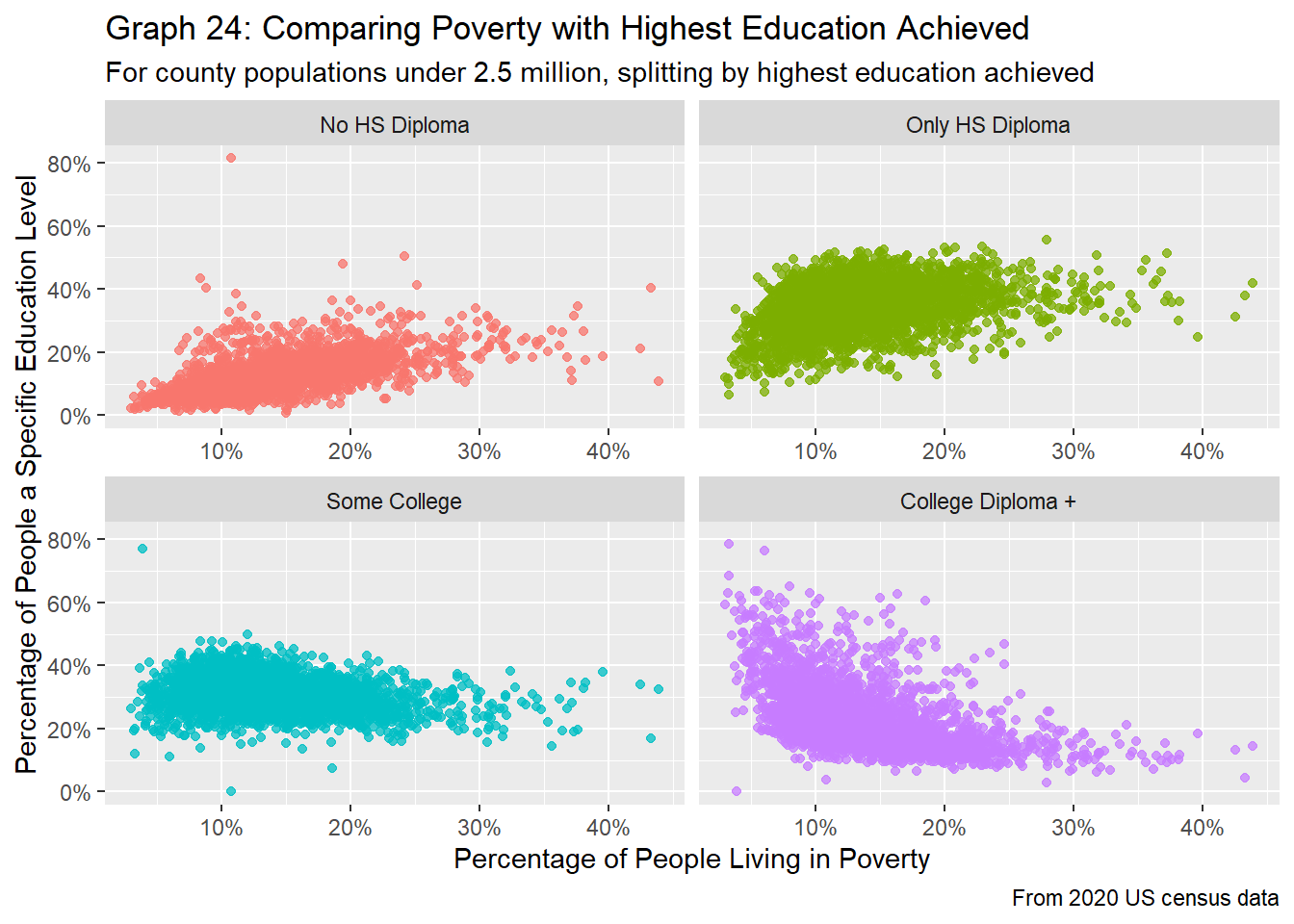
By comparing the poverty rates with the educational achievements of residents in US counties, it’s pretty clear that there’s a trend here for some education groups, as provided by graphs 23 and 24. In general, as the percentage of people living in poverty increases, the percentage of people who have gotten only a high school diploma or less education increases. On the other hand, greater poverty rates correlate to a lower proportion of people with a college diploma or more. Intuitively, this makes sense, as people with college degrees tend to earn more money than those who have only a high school diploma. Because poverty is based on one’s income, it logically makes sense that communities with high poverty tend to have more people who aren’t college educated. It is interesting that the trend line for the proportion of people who have some college experience is flat, regardless of the poverty rate. However, there doesn’t seem to be a clear relationship between the percentage of people living in poverty and the percentage of people with either a high school diploma or have taken some college courses. Generally, we see that the percentage of people who took some college classes is roughly the same, while the percentage of people who have only a high school diploma increases somewhat as poverty rate increases.
First, we’ll look into the state-level data to investigate the relationship between the number of people living in poverty and the highest education achieved by residents in the county.
df_full %>%
  filter(region_type == "state" &
           age_group == "pov_all") %>%
  ggplot(aes(x=pov_total, y=edu_total, color=edu_level)) +
  geom_point(alpha = 0.25) +
  labs(title = "Graph 25: Comparing Poverty with Highest Education Achieved",
       subtitle="For US states",
       caption="From 2020 US census data",
       x="# of People Living in Poverty",
       y="# of People w/ Specific Education Background",
       color="Education Level") +
  scale_color_discrete(labels=c("No HS Diploma",
                                "Only HS Diploma",
                                "Some College",
                                "Bachelors+"))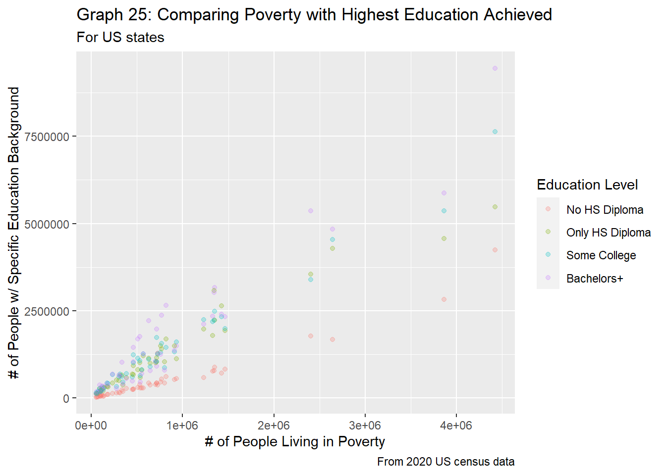
df_full %>%
  filter(region_type == "state" &
           age_group == "pov_all") %>%
  ggplot(aes(x=pov_total, y=edu_total, color=edu_level)) +
  geom_point(alpha = 0.75) +
  facet_wrap(edu_level ~ .,
             scale="free_x",
             labeller = labeller(edu_level = c("no_HS" = "No HS Diploma",
                                               "HS_only" = "Only HS Diploma",
                                               "some_college" = "Some College",
                                               "bach_plus" = "Bachelors+"))) +
  labs(title = "Graph 26: Comparing Poverty with Highest Education Achieved",
       subtitle="For US states, splitting by highest education achieved",
       caption="From 2020 US census data",
       x="# of People Living in Poverty",
       y="# of People w/ Specific Education Background") +
  theme(legend.position="none")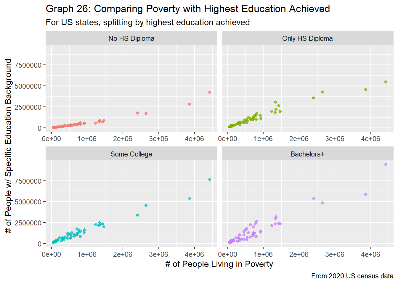
The state-level graphs mirror that of the county-level graphs, but with less variation. In graph 25, we clearly see that those with less than a high school diploma are the minority, regardless of the number of people living in poverty for that state. On the other hand, we do seem more overlap between the other education levels when plotting this data with the number of people living in poverty. If anything, this looks very similar to graph 12, when comparing a state’s population with the number of people who fall into each education group. Similarly, the slope and linear relationship between those with a HS diploma and those with some college education are almost identical.
Lastly, we’ll look at how the different percentages between education and poverty are related.
df_full %>%
  filter(region_type == "state" &
           age_group == "pov_all") %>%
  ggplot(aes(x=pov_perc/100, y=edu_perc/100, color=edu_level)) +
  geom_point(alpha = 0.35) +
  labs(title = "Graph 27: Comparing Poverty with Highest Education Achieved",
       subtitle="For US states",
       caption="From 2020 US census data",
       x="Percentage of People Living in Poverty",
       y="Percentage of People a Specific Education Level",
       color="Education Level") +
  scale_x_continuous(labels=scales::percent) +
  scale_y_continuous(labels=scales::percent) +
  scale_color_discrete(labels=c("no_HS" = "No HS Diploma",
                                "HS_only" = "Only HS Diploma",
                                "some_college" = "Some College",
                                "bach_plus" = "Bachelors+"))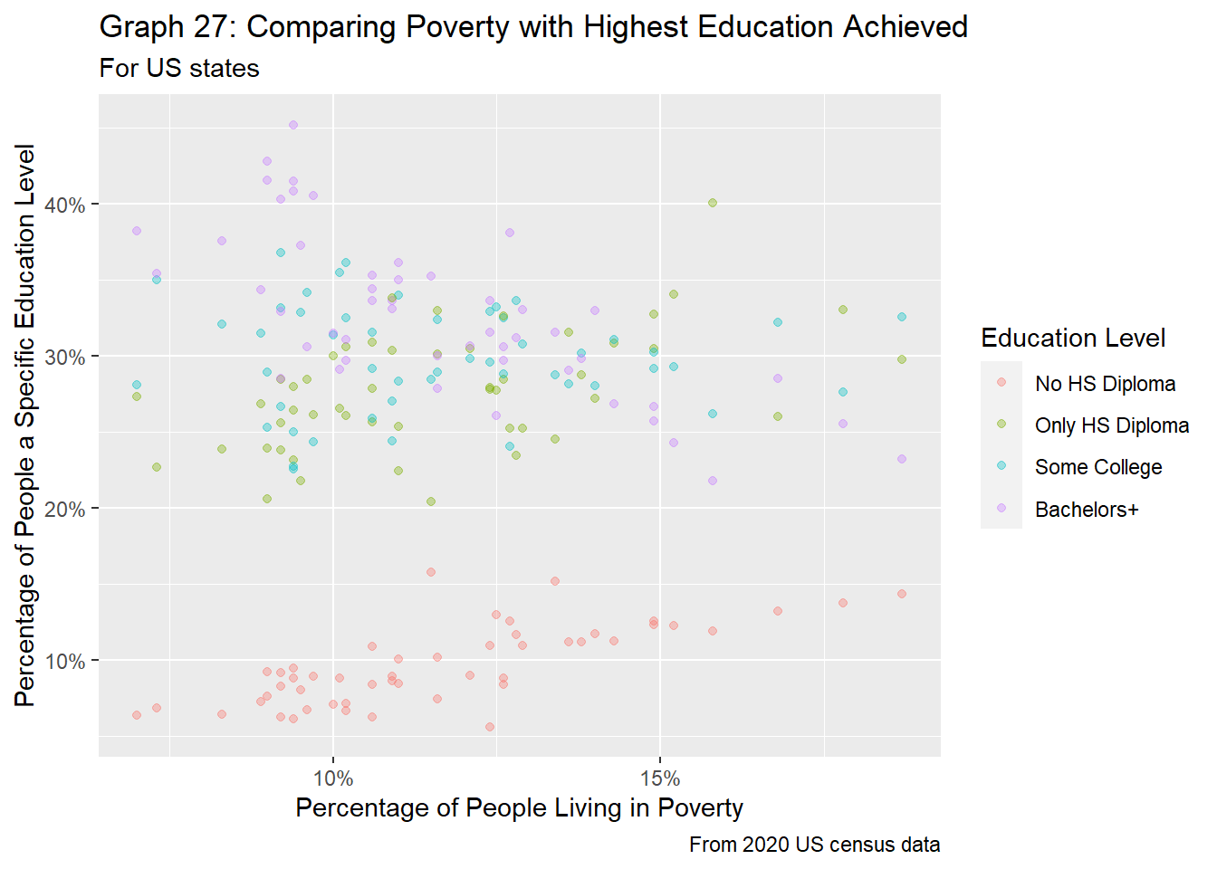
df_full %>%
  filter(region_type == "state" &
           age_group == "pov_all") %>%
  ggplot(aes(x=pov_perc/100, y=edu_perc/100, color=edu_level)) +
  geom_point(alpha = 0.75) +
  facet_wrap(edu_level ~ .,
             scale="free_x",
             labeller = labeller(edu_level = c("no_HS" = "No HS Diploma",
                                               "HS_only" = "Only HS Diploma",
                                               "some_college" = "Some College",
                                               "bach_plus" = "College Diploma +"))) +
  labs(title = "Graph 28: Comparing Poverty with Highest Education Achieved",
       subtitle="For US states splitting by highest education achieved",
       caption="From 2020 US census data",
       x="Percentage of People Living in Poverty",
       y="Percentage of People a Specific Education Level") +
  theme(legend.position="none") +
  scale_x_continuous(labels=scales::percent) +
  scale_y_continuous(labels=scales::percent)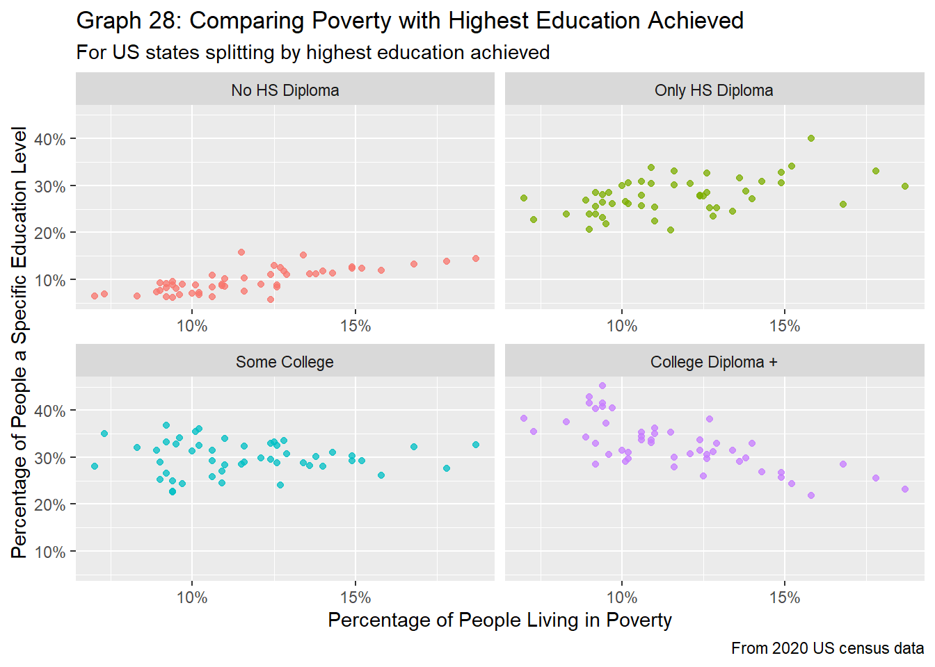
Like the findings at the county level, there are some distinct trends between education and poverty for states. From graphs 27 and 28, as poverty rates increase within the state, the percentage of people without a high school diploma increases as well, while the percentage of people with at least a college diploma decreases. The percentage of people with some college education stays roughly the same, and the percentage of people who have a high school diploma seems to increase slightly with poverty rates. Compared to graphs 23 and 24, graphs 27 and 28 show a less noisy, more succinct picture of the relationships between poverty rates and highest level of education achieved. Again, this is on par with expectations, as people with college degrees tend to make more money, and thus less likely to be living in poverty.
For this paper, we set out to find how state and county populations relate to poverty rates and the education of their residents. Our findings show that there indeed are relationships between all these variables, but we cannot make claims as to why these instances occur. The following sections give a brief summary about our discoveries.
At both the state and county levels, in general, smaller populations tend to see more variation how educated residents are. Although the population for those who have not received a high school diploma tends to be the smallest, we see that as the number of residents increase, the percentage of people who fall into this category actually increases slightly. On the other hand, although the group of people who have received at least a bachelors degree generally make up the majority of the population, especially for small counties, this number and percentage is often very small, showing the disparity in the education levels for those who live in big counties vs. rural or less population regions of the US.
In general, poverty rates for minors are slightly higher than the group encompassing all ages. When looking at state-level data, poverty rates tend to be slightly lower, supporting the belief that some counties with small populations and high poverty rates inflate the distributions when looking at the county level. There is also greater variation in poverty rates for lower populations (for both counties and states), but the rates tend to stabilize for medium to large counties.
Unsurprisingly, how educated a population is and the number of people living in poverty has a strong relationship. There is a strong positive linear relationship between poverty rates and the number of people who don’t have a high school diploma. Similarly, there’s a negative relationship between poverty rates and the number of people who have at least a bachelors degree.
This report only shows a snapshot of the information provided. In future iterations, it would be interesting to see how demographics have shifted in the United States. Specifically, visualizing some time series graphs and visualizing changes in relationships between populous counties and shifts in education or poverty would be helpful.
Similarly, showcasing this data on a map could be beneficial, as plotting major cities to connect county and state data could prove beneficial.
Like many other datasets having to deal with census information, we assume that the data provided is correct. Because census information is filled out and submitted by households, it’s very likely that some at-risk groups (such as houseless people, those moving between places, or people working many hours and unable to respond to their mail) are not included in this data. As a result, metrics such as education levels or poverty might be better than reality.
Lastly, it’s important to note the distinction between correlation and causation. Although our data might show interesting links between variables, because each county and state have their own legislation, programs, systems, etc., there are many confounding variables not included in this analysis that might explain why we see specific trends.
Grolemund, G., & Wickham, H. (2017). R for Data Science. O’Reilly Media.
R Core Team (2021). R: A language and environment for statistical computing. R Foundation for Statistical Computing, Vienna, Austria. URL https://www.R-project.org/.
Rupnarain, K. (2020a, July 13). Why do the poor have large families?. World Vision Canada. https://www.worldvision.ca/stories/why-do-the-poor-have-large-families
Rural-urban continuum codes. USDA ERS - Rural-Urban Continuum Codes. (n.d.). https://www.ers.usda.gov/data-products/rural-urban-continuum-codes/
U.S. and World Population Clock. United States Census Bureau. (n.d.). https://www.census.gov/popclock/
US Census Bureau. (2021, December 16). State area measurements and internal point coordinates. Census.gov. https://www.census.gov/geographies/reference-files/2010/geo/state-area.html
US Census Bureau. (2023, January 30). How the Census Bureau Measures Poverty. Census.gov. https://www.census.gov/topics/income-poverty/poverty/guidance/poverty-measures.html