Generated by summarytools 1.0.1 (R version 4.3.0) 2023-07-01
# Interesting that there are lots of missing data, let's check how many units have no reviewsdata %>%filter(number_of_reviews ==0) %>%nrow() # This supports my previous hyptheses
[1] 10052
Briefly describe the data
As mentioned in previous datasets, this data is probably a collection of all Airbnbs in New York City in 2019, and includes variables such as cost, availability, the neighborhood for where the Airbnb is located, the room type, IDs for both the location and host, and various review information.
# 3 unique values, convert to factorsdata$room_type <-factor(data$room_type)# Convert `last_review` into yearly groups, factors for room_type, and change price to be data <- data %>%mutate(last_rev_year =year(last_review),room_type =factor(room_type),price_grouped =ifelse(price >=500, 500, price))
Our data seems to already be tidy! Each row represents an Airbnb location, as every location has its own id. Other columns include the place’s name, the host_id for the host of the location, the neighborhood_group and neighborhood the place is located in NYC, the latitude and longitude for the Airbnb, the room_type of the Airbnb, price and minimum_nights that describe the specifics for booking the location, date of last_review, approximate reviews_per_month, the calculated_host_listings_count, and availability_365 for the Airbnb for the year. There are 48,895 rows and 16 columns. Some additional steps were taken above to make it “tidier”, but is simply converting string columns into factors.
While there are some missing data (such as the name, host_name, last_review, and reviews_per_month). It’s interesting though that the review related columns are both missing 10,052 rows, or 20.26% of all observations. This is probably because these units have never been rented out or are new, so customers have not left any reviews yet. My suspicions are supported because 10,052 rows have number_of_reviews as 0.
Visualization with Multiple Dimensions
Graph 1: Facet Wrap for Year of Last Review
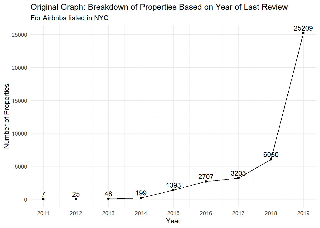
In challenge 6, I looked into the number of properties with a review from a specific year, creating a time series line plot showing how the number changes over time. This is done by counting the number of properties where their last_review was from a specific year.
# Original graphdata %>%group_by(last_rev_year) %>%filter(!is.na(last_rev_year)) %>%summarise(num_props =n_distinct(id)) %>%ggplot(aes(x=last_rev_year, y=num_props)) +geom_line() +geom_point() +geom_text(aes(x=last_rev_year, y=num_props, label=num_props), vjust=-0.5) +theme_minimal() +labs(title="Original Graph: Breakdown of Properties Based on Year of Last Review",subtitle="For Airbnbs listed in NYC",x="Year",y="Number of Properties") +scale_x_continuous(breaks=2011:2019, labels=2011:2019)
The graph above was the original graph visualizing the number of properties where their last review was from a specific year. Below, we’ll break this up now by the neighborhood_group, and use facet_wrap to show each borough.
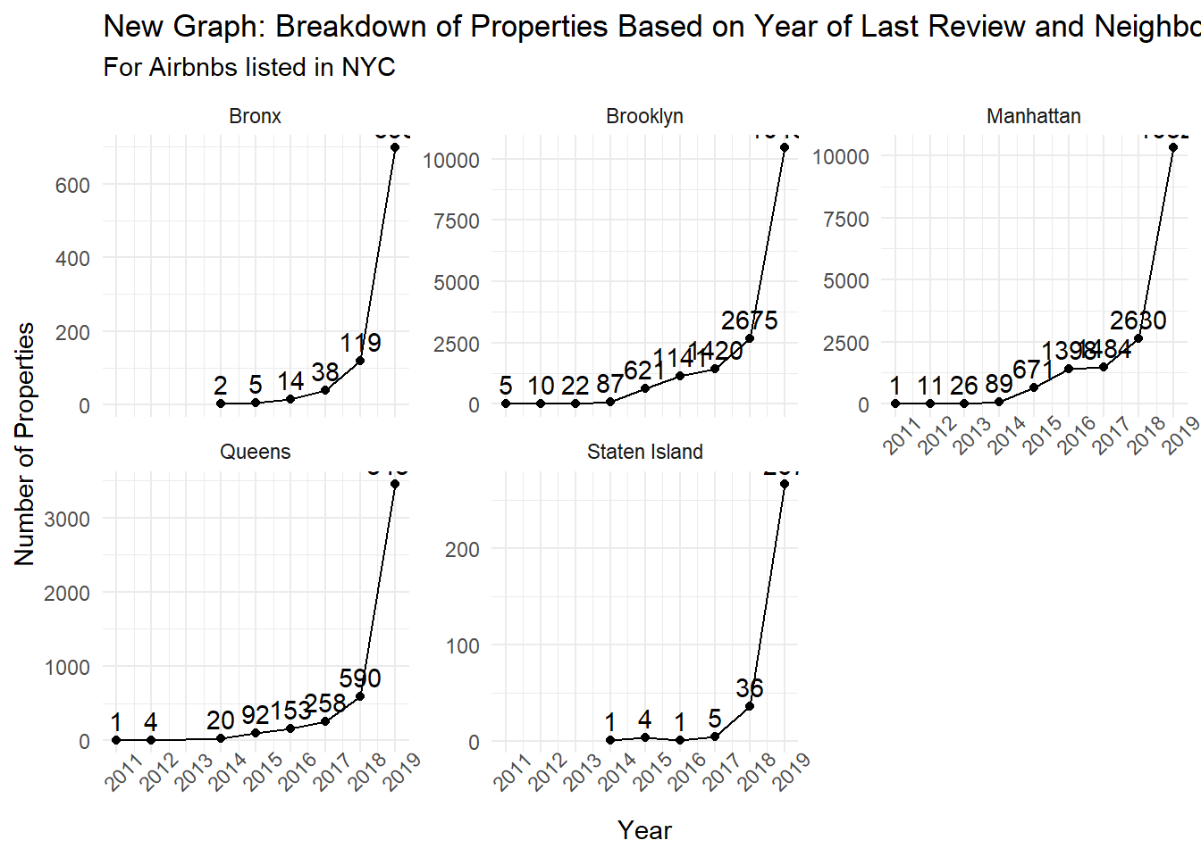
data %>%group_by(last_rev_year, neighbourhood_group) %>%filter(!is.na(last_rev_year)) %>%summarise(num_props =n_distinct(id)) %>%ggplot(aes(x=last_rev_year, y=num_props)) +geom_line() +geom_point() +geom_text(aes(x=last_rev_year, y=num_props, label=num_props), vjust=-0.5) +facet_wrap(~neighbourhood_group, scales="free_y") +theme_minimal() +labs(title="New Graph: Breakdown of Properties Based on Year of Last Review and Neighborhood Group",subtitle="For Airbnbs listed in NYC",x="Year",y="Number of Properties") +scale_x_continuous(breaks=2011:2019, labels=2011:2019) +theme(axis.text.x =element_text(angle=45))
The graph above shows the new graph, which uses facet_wrap to visualize how the number of properties with their last review in a specific year can vary slightly based on their neighborhood_group. Across the board, we see that 2019 has the most number of properties with the latest review, which makes sense considering that most Airbnbs are active and this data was collected in 2019. However, it’s clear that Manhattan and Brooklyn have a lot more Airbnbs (and thus a lot more reviews), as the number of last reviews and the scales are quite a bit larger than other places. Staten Island and the Bronx seem to be less popular, as overall they have less total reviews.
Line graphs make sense to visualize time-series data, and I chose to remove the set y-axis because the goal of this visualization is to show how the trends are similar, rather than compare the raw number of reviews. The number of reviews for each year and neighborhood_group can be found above the points as well.
Plotting Airbnb Locations with Average Price per Night
Instead of replicating a graph of the past, I thought it would be interesting to create an interactive map of all the Airbnbs and their average nightly prices. This way, someone can zoom in/out of the different locations, with the size and/or of the bubble representing cost.
The goal of the interactive plot above was to visualize expensive Airbnbs (price > $1000) in NYC. However, I was facing issues with the mapview package (a known problem, as shown here) that wouldn’t visualize the base NYC map. As as result, we can see the properties, but now how it relates back to the NYC geography. From the summary table, you can see that Manhattan and Brooklyn have the most expensive Airbnbs, as there are 172 and 54 Airbnbs in Manhattan and Brooklyn, respectively, that cost more than $1000/night. The nice part about mapview (if it functions properly) is that you can interact with the map, and click on points to see the data associated with that point.
Source Code
---title: "Challenge 7 Solution - Airbnb Visualizations"author: "Linus Jen"description: "Visualizing Multiple Dimensions"date: "6/22/2023"format: html: toc: true code-copy: true code-tools: true df-print: pagedcategories: - challenge_7 - air_bnb - Linus Jen---```{r}#| label: setup#| warning: false#| message: falselibrary(tidyverse)library(ggplot2)library(here)library(mapview)knitr::opts_chunk$set(echo =TRUE, warning=FALSE, message=FALSE)```## Read in dataFor this challenge, I will be using the `AB_NYC_2019.csv` file to recreate graphs from Challenges 5 & 6.```{r}data <-read_csv(here("posts", "_data", "AB_NYC_2019.csv"))# View headhead(data)# dfSummaryprint(summarytools::dfSummary(data,varnumbers=FALSE,plain.ascii=FALSE,style="grid",graph.magnif =0.70,valid.col=FALSE),method="render",table.classes="table-condensed")# Interesting that there are lots of missing data, let's check how many units have no reviewsdata %>%filter(number_of_reviews ==0) %>%nrow() # This supports my previous hyptheses```### Briefly describe the dataAs mentioned in previous datasets, this data is probably a collection of all Airbnbs in New York City in 2019, and includes variables such as cost, availability, the neighborhood for where the Airbnb is located, the room type, IDs for both the location and host, and various review information.```{r}# 3 unique values, convert to factorsdata$room_type <-factor(data$room_type)# Convert `last_review` into yearly groups, factors for room_type, and change price to be data <- data %>%mutate(last_rev_year =year(last_review),room_type =factor(room_type),price_grouped =ifelse(price >=500, 500, price))```Our data seems to already be tidy! Each row represents an Airbnb location, as every location has its own `id`. Other columns include the place’s `name`, the `host_id` for the host of the location, the `neighborhood_group` and `neighborhood` the place is located in NYC, the `latitude` and `longitude` for the Airbnb, the `room_type` of the Airbnb, `price` and `minimum_nights` that describe the specifics for booking the location, date of `last_review`, approximate `reviews_per_month`, the `calculated_host_listings_count`, and `availability_365` for the Airbnb for the year. There are 48,895 rows and 16 columns. Some additional steps were taken above to make it "tidier", but is simply converting string columns into factors.While there are some missing data (such as the `name`, `host_name`, `last_review`, and `reviews_per_month`). It’s interesting though that the review related columns are both missing 10,052 rows, or 20.26% of all observations. This is probably because these units have never been rented out or are new, so customers have not left any reviews yet. My suspicions are supported because 10,052 rows have `number_of_reviews` as 0.## Visualization with Multiple Dimensions### Graph 1: Facet Wrap for Year of Last ReviewIn challenge 6, I looked into the number of properties with a review from a specific year, creating a time series line plot showing how the number changes over time. This is done by counting the number of properties where their `last_review` was from a specific year.```{r}# Original graphdata %>%group_by(last_rev_year) %>%filter(!is.na(last_rev_year)) %>%summarise(num_props =n_distinct(id)) %>%ggplot(aes(x=last_rev_year, y=num_props)) +geom_line() +geom_point() +geom_text(aes(x=last_rev_year, y=num_props, label=num_props), vjust=-0.5) +theme_minimal() +labs(title="Original Graph: Breakdown of Properties Based on Year of Last Review",subtitle="For Airbnbs listed in NYC",x="Year",y="Number of Properties") +scale_x_continuous(breaks=2011:2019, labels=2011:2019)```The graph above was the original graph visualizing the number of properties where their last review was from a specific year. Below, we'll break this up now by the `neighborhood_group`, and use `facet_wrap` to show each borough.```{r}data %>%group_by(last_rev_year, neighbourhood_group) %>%filter(!is.na(last_rev_year)) %>%summarise(num_props =n_distinct(id)) %>%ggplot(aes(x=last_rev_year, y=num_props)) +geom_line() +geom_point() +geom_text(aes(x=last_rev_year, y=num_props, label=num_props), vjust=-0.5) +facet_wrap(~neighbourhood_group, scales="free_y") +theme_minimal() +labs(title="New Graph: Breakdown of Properties Based on Year of Last Review and Neighborhood Group",subtitle="For Airbnbs listed in NYC",x="Year",y="Number of Properties") +scale_x_continuous(breaks=2011:2019, labels=2011:2019) +theme(axis.text.x =element_text(angle=45))```The graph above shows the new graph, which uses `facet_wrap` to visualize how the number of properties with their last review in a specific year can vary slightly based on their `neighborhood_group`. Across the board, we see that 2019 has the most number of properties with the latest review, which makes sense considering that most Airbnbs are active and this data was collected in 2019. However, it's clear that Manhattan and Brooklyn have a lot more Airbnbs (and thus a lot more reviews), as the number of last reviews and the scales are quite a bit larger than other places. Staten Island and the Bronx seem to be less popular, as overall they have less total reviews.Line graphs make sense to visualize time-series data, and I chose to remove the set y-axis because the goal of this visualization is to show how the trends are similar, rather than compare the raw number of reviews. The number of reviews for each year and `neighborhood_group` can be found above the points as well.### Plotting Airbnb Locations with Average Price per NightInstead of replicating a graph of the past, I thought it would be interesting to create an interactive map of all the Airbnbs and their average nightly prices. This way, someone can zoom in/out of the different locations, with the size and/or of the bubble representing cost.```{r}mapviewOptions(fgb=FALSE, georaster =FALSE)data %>%filter(price >1000) %>%mapview(., xcol="latitude", ycol="longitude", zcol="price")# Check boroughsdata %>%filter(price >1000) %>%group_by(neighbourhood_group) %>%summarise(n_exp =n_distinct(id))```The goal of the interactive plot above was to visualize expensive Airbnbs (`price` > \$1000) in NYC. However, I was facing issues with the `mapview` package (a known problem, as shown [here](https://github.com/r-spatial/mapview/issues/153)) that wouldn't visualize the base NYC map. As as result, we can see the properties, but now how it relates back to the NYC geography. From the summary table, you can see that Manhattan and Brooklyn have the most expensive Airbnbs, as there are 172 and 54 Airbnbs in Manhattan and Brooklyn, respectively, that cost more than \$1000/night. The nice part about `mapview` (if it functions properly) is that you can interact with the map, and click on points to see the data associated with that point.