library(tidyverse)
library(ggplot2)
library(naniar)

knitr::opts_chunk$set(echo = TRUE, warning=FALSE, message=FALSE)
Challenge 5 Submission
air_bnb
Introduction to Visualization
Challenge Overview
R Graph Gallery is a good starting point for thinking about what information is conveyed in standard graph types, and includes example R code.
(be sure to only include the category tags for the data you use!)
Read in data
The dataset I chose to read in was the AB_NYC_2019 one.
- AB_NYC_2019.csv ⭐⭐⭐
As we can see it provides some various information such as the neighborhood it is in, the price per night, and the type of room.
People looking at this data will also be able to see information about the lister, like their name and the number of listings that host has.
ab_nyc_2019 <- read_csv("_data/AB_NYC_2019.csv")

ab_nyc_2019
# A tibble: 48,895 × 16
id name host_id host_name neighbourhood_group neighbourhood latitude
<dbl> <chr> <dbl> <chr> <chr> <chr> <dbl>
1 2539 Clean & q… 2787 John Brooklyn Kensington 40.6
2 2595 Skylit Mi… 2845 Jennifer Manhattan Midtown 40.8
3 3647 THE VILLA… 4632 Elisabeth Manhattan Harlem 40.8
4 3831 Cozy Enti… 4869 LisaRoxa… Brooklyn Clinton Hill 40.7
5 5022 Entire Ap… 7192 Laura Manhattan East Harlem 40.8
6 5099 Large Coz… 7322 Chris Manhattan Murray Hill 40.7
7 5121 BlissArts… 7356 Garon Brooklyn Bedford-Stuy… 40.7
8 5178 Large Fur… 8967 Shunichi Manhattan Hell's Kitch… 40.8
9 5203 Cozy Clea… 7490 MaryEllen Manhattan Upper West S… 40.8
10 5238 Cute & Co… 7549 Ben Manhattan Chinatown 40.7
# ℹ 48,885 more rows
# ℹ 9 more variables: longitude <dbl>, room_type <chr>, price <dbl>,
# minimum_nights <dbl>, number_of_reviews <dbl>, last_review <date>,
# reviews_per_month <dbl>, calculated_host_listings_count <dbl>,
# availability_365 <dbl>Briefly describe the data
Tidy Data (as needed)
After reading over the data, I did not see anything that needed to be tidied. It looks that the variable types and entries were good.
One set of calculations I will look to do is minimum stay cost. This involves taking the price per night (price) and multiplying it by the minimum number of nights (minimum nights). This is a good metric to see what the base cost of these places are.
ab_nyc_2019 <- ab_nyc_2019 %>%
  mutate(`minimum_cost`= `price`*`minimum_nights`)

ab_nyc_2019
# A tibble: 48,895 × 17
id name host_id host_name neighbourhood_group neighbourhood latitude
<dbl> <chr> <dbl> <chr> <chr> <chr> <dbl>
1 2539 Clean & q… 2787 John Brooklyn Kensington 40.6
2 2595 Skylit Mi… 2845 Jennifer Manhattan Midtown 40.8
3 3647 THE VILLA… 4632 Elisabeth Manhattan Harlem 40.8
4 3831 Cozy Enti… 4869 LisaRoxa… Brooklyn Clinton Hill 40.7
5 5022 Entire Ap… 7192 Laura Manhattan East Harlem 40.8
6 5099 Large Coz… 7322 Chris Manhattan Murray Hill 40.7
7 5121 BlissArts… 7356 Garon Brooklyn Bedford-Stuy… 40.7
8 5178 Large Fur… 8967 Shunichi Manhattan Hell's Kitch… 40.8
9 5203 Cozy Clea… 7490 MaryEllen Manhattan Upper West S… 40.8
10 5238 Cute & Co… 7549 Ben Manhattan Chinatown 40.7
# ℹ 48,885 more rows
# ℹ 10 more variables: longitude <dbl>, room_type <chr>, price <dbl>,
# minimum_nights <dbl>, number_of_reviews <dbl>, last_review <date>,
# reviews_per_month <dbl>, calculated_host_listings_count <dbl>,
# availability_365 <dbl>, minimum_cost <dbl>Univariate Visualizations
Here we’re doing a simple visualization just to see what the distribution of minimum stay cost is. As expected it seems that most are well under 1000, but there are still plenty of options over 2000.
I chose the histogram, as it is a good representation of distributions and easy to understand.
ggplot(ab_nyc_2019, aes(x=`minimum_cost`)) +
  geom_histogram(bins=60) +
  scale_x_continuous(limits = c(0, 7000)) +
  ggtitle("Minimum Cost") +
  labs(y = "Number of Apartments", x = "Minimum Cost Per Listing")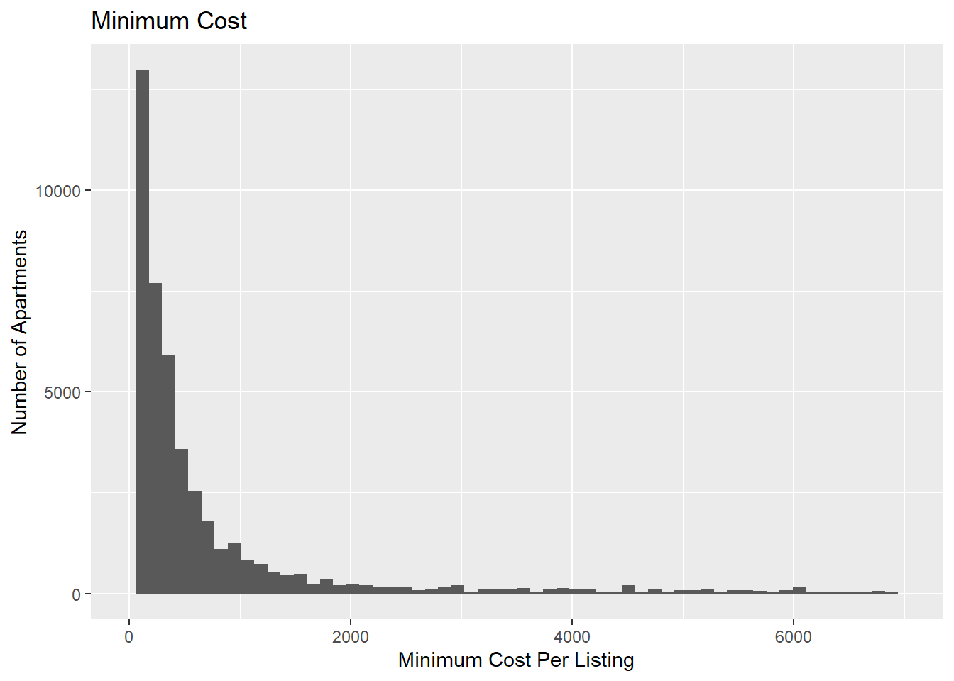
Bivariate Visualization(s)
Next, to compare two variables we will look at another histogram that compares the average cost per night with which neighborhood group the place is listed in.
This allows use to observer a few things. One, we can see a majority of all listings are in Brooklyn and Manhattan. Also, we can see that most of the listings are right around 125-150 per night. Another observation is that Queens apartments seem to be on the cheaper side with Staten Island, whereas Brooklyn and Manhattan ae on the pricer side. Continuing with this we can see that even though most of the listings for Manhattan are around that $150 mark, there are plenty that creep into that more expensive range.
I chose a geom_bar for similar reasons to the first univariate graph, it is easy to read and allows easy coloring based on a group which allows for easy analysis.
ggplot(ab_nyc_2019, aes(x=`price`, fill=`neighbourhood_group`)) +
  geom_bar(width=25) +
  scale_x_continuous(limits = c(0, 1000)) +
  ggtitle("Price per Night Divided by Each Neighborhood Group") +
  labs(y = "Number of Apartments", x = "Cost per Night", fill = "Neighborhood Group")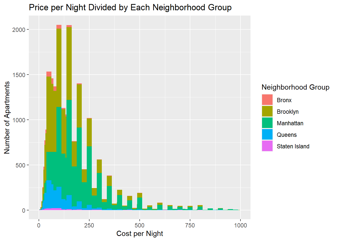
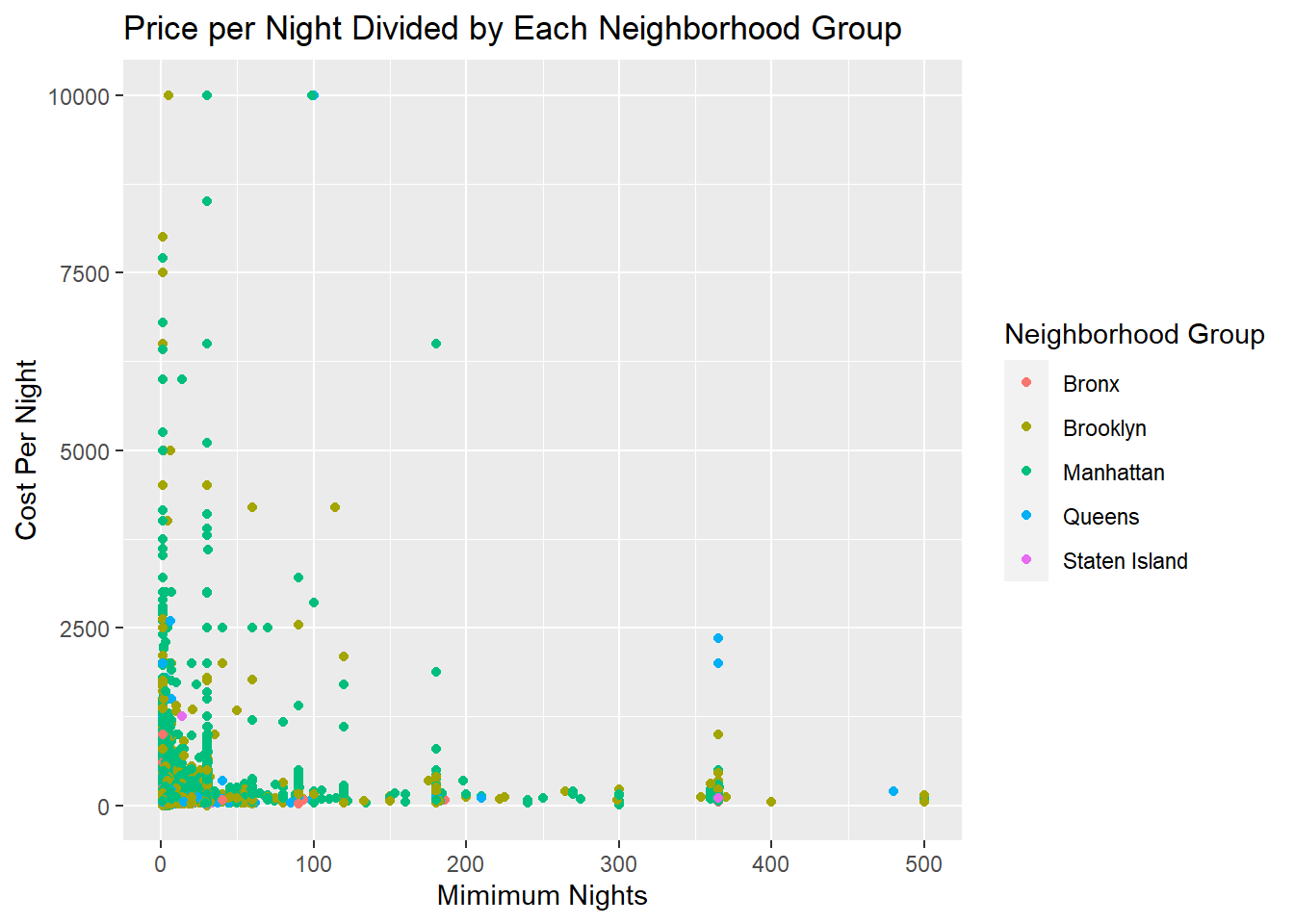
The second plot I chose was Minimum Nights versus Cost per Night
As we cab see below, there are no correlations (or at least none that I can pick out). The only generalization I can make is that it seems most of the data has mimimum nights less than 100 and they each cost less than $2500 per night.
I chose a point plot because I wanted to see if there was correlation between the two variables. I through in neighborhood group to allow for more advanced observations to be made.
ggplot(ab_nyc_2019, aes(x=`minimum_nights`, y=`price`, color=`neighbourhood_group`)) +
  geom_point() +
  scale_x_continuous(limits = c(0, 500)) +
  ggtitle("Price per Night Divided by Each Neighborhood Group") +
  labs(y = "Cost Per Night", x = "Mimimum Nights", color = "Neighborhood Group")