library(tidyverse)
library(ggplot2)

knitr::opts_chunk$set(echo = TRUE, warning=FALSE, message=FALSE)Challenge 7 Submission
challenge_7
air_bnb
Visualizing Multiple Dimensions
Read in data
I am re-using the Airbnb data from my Challenge 5 Submission so I can elaborate on the plots.
- air_bnb ⭐⭐⭐
ab_nyc_2019 <- read_csv("_data/AB_NYC_2019.csv")

ab_nyc_2019
# A tibble: 48,895 × 16
id name host_id host_name neighbourhood_group neighbourhood latitude
<dbl> <chr> <dbl> <chr> <chr> <chr> <dbl>
1 2539 Clean & q… 2787 John Brooklyn Kensington 40.6
2 2595 Skylit Mi… 2845 Jennifer Manhattan Midtown 40.8
3 3647 THE VILLA… 4632 Elisabeth Manhattan Harlem 40.8
4 3831 Cozy Enti… 4869 LisaRoxa… Brooklyn Clinton Hill 40.7
5 5022 Entire Ap… 7192 Laura Manhattan East Harlem 40.8
6 5099 Large Coz… 7322 Chris Manhattan Murray Hill 40.7
7 5121 BlissArts… 7356 Garon Brooklyn Bedford-Stuy… 40.7
8 5178 Large Fur… 8967 Shunichi Manhattan Hell's Kitch… 40.8
9 5203 Cozy Clea… 7490 MaryEllen Manhattan Upper West S… 40.8
10 5238 Cute & Co… 7549 Ben Manhattan Chinatown 40.7
# ℹ 48,885 more rows
# ℹ 9 more variables: longitude <dbl>, room_type <chr>, price <dbl>,
# minimum_nights <dbl>, number_of_reviews <dbl>, last_review <date>,
# reviews_per_month <dbl>, calculated_host_listings_count <dbl>,
# availability_365 <dbl>Briefly describe the data
The data presented is information about Airbnb listings in New York. It runs through the typical information about each listing including the name of the listing, the hosts name, some location data, and finally plenty of booking information (including price, nights, etc.)
Tidy Data (as needed)
As I previously mentioned, I did not need to tidy any of the data.
The only mutation that I made, was the calculation of minimum nights cost. My idea behind this was to add an additional comparison metric that took into account what property is the cheapest AND which one has the lowest minimum stay cost. This is done by multiplying the minimum nights and the price per night variables.
ab_nyc_2019 <- ab_nyc_2019 %>%
  mutate(`minimum_cost`= `price`*`minimum_nights`)

ab_nyc_2019
# A tibble: 48,895 × 17
id name host_id host_name neighbourhood_group neighbourhood latitude
<dbl> <chr> <dbl> <chr> <chr> <chr> <dbl>
1 2539 Clean & q… 2787 John Brooklyn Kensington 40.6
2 2595 Skylit Mi… 2845 Jennifer Manhattan Midtown 40.8
3 3647 THE VILLA… 4632 Elisabeth Manhattan Harlem 40.8
4 3831 Cozy Enti… 4869 LisaRoxa… Brooklyn Clinton Hill 40.7
5 5022 Entire Ap… 7192 Laura Manhattan East Harlem 40.8
6 5099 Large Coz… 7322 Chris Manhattan Murray Hill 40.7
7 5121 BlissArts… 7356 Garon Brooklyn Bedford-Stuy… 40.7
8 5178 Large Fur… 8967 Shunichi Manhattan Hell's Kitch… 40.8
9 5203 Cozy Clea… 7490 MaryEllen Manhattan Upper West S… 40.8
10 5238 Cute & Co… 7549 Ben Manhattan Chinatown 40.7
# ℹ 48,885 more rows
# ℹ 10 more variables: longitude <dbl>, room_type <chr>, price <dbl>,
# minimum_nights <dbl>, number_of_reviews <dbl>, last_review <date>,
# reviews_per_month <dbl>, calculated_host_listings_count <dbl>,
# availability_365 <dbl>, minimum_cost <dbl>Visualization with Multiple Dimensions
First Visualization
The first visualization I am doing is editing my Price per Night by Each Neighbordhood Group. As suggested by Sean, I will by trying to utilize the facet_wrap function to split the histogram across panels.
ggplot(ab_nyc_2019, aes(x=`price`,fill=`neighbourhood_group`)) +
  geom_bar(width=25) +
  scale_x_continuous(limits = c(0, 1000)) +
  ggtitle("Price per Night Divided by Each Neighborhood Group") +
  labs(y = "Number of Apartments", x = "Cost per Night", fill="Neighborhood Group") +
  facet_wrap(~neighbourhood_group)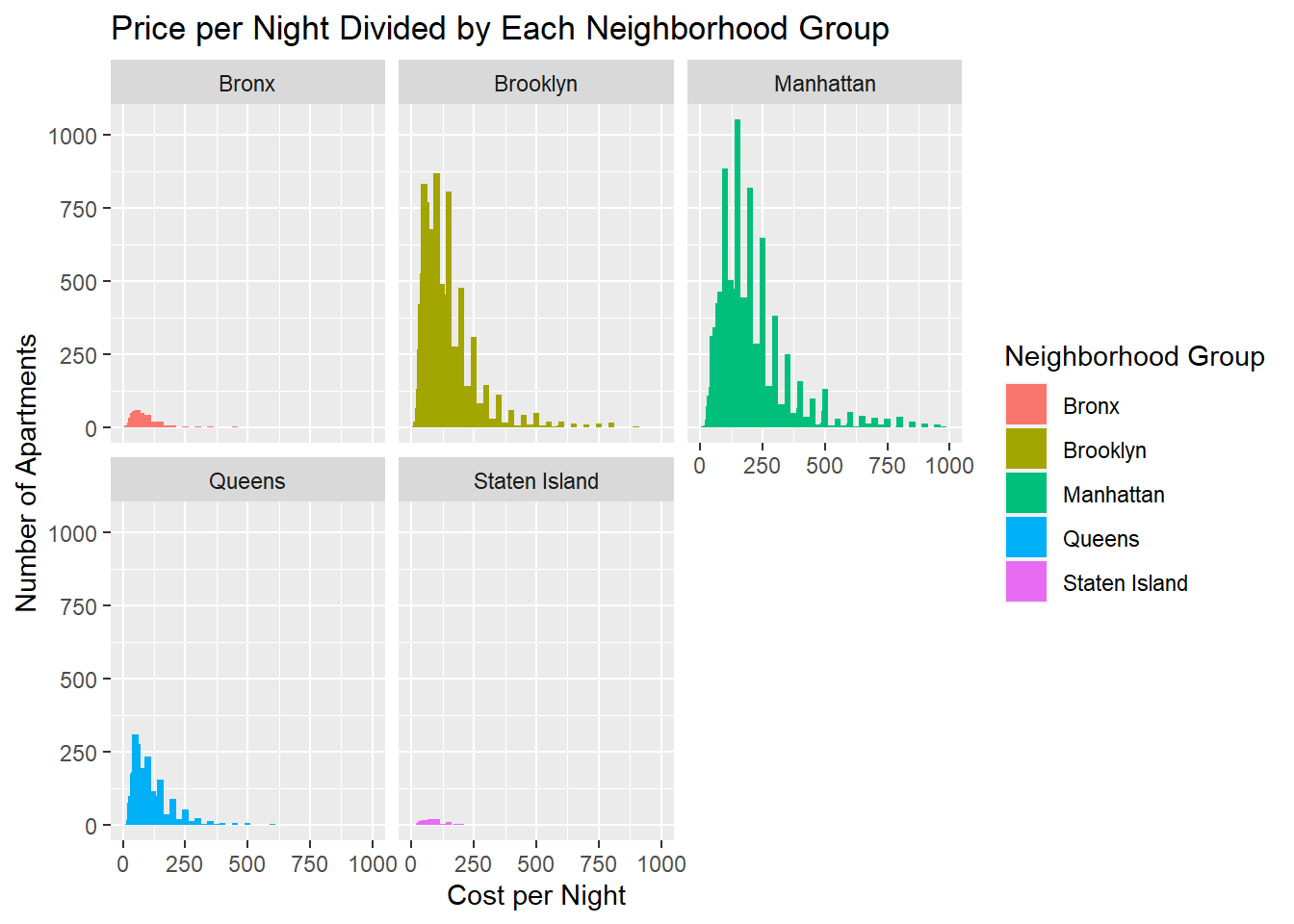
Above we can see, instead of stacking all the data in one graph, we break them up into five separate plots which really allow the comparison.
I chose to use a bar graph because I wanted to emphasize the quantity at each price entry. This gives the viewer a much better understanding at the amount of each unlike a line graph. I also believe a line graph would show a variable through time where as these entries are price independent.
Second Visualization
The second graph I wanted to recreate was the Number of Nights Versus Cost Per Night graph with a distinction of each Neighbourhood Group. Here, I wanted to adjust the plot size and the transparency as suggested to give the viewer an easier time to view
# Adding custom color pallete
cbp2 <- c("#000000", "#009E73", "#FF0000", "#0072B2", "#00FF00")

ggplot(ab_nyc_2019, aes(x=`minimum_nights`, y=`price`, color=`neighbourhood_group`)) +
  geom_point(size=1, alpha=0.5) +
  scale_x_continuous(limits = c(0, 500)) +
  ggtitle("Minimum Nights Versus Cost per Night") +
  labs(y = "Cost Per Night", x = "Mimimum Nights", color = "Neighborhood Group") +
  scale_colour_manual(values = cbp2)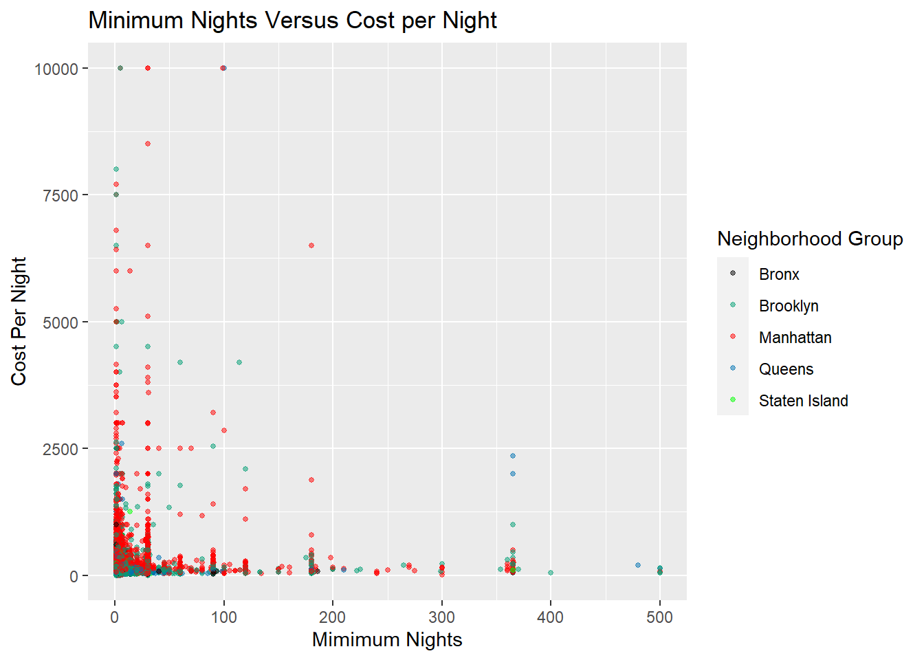
I used a scatter plot here because I did not want to count how many fell into each group, but rather see if there was correlation or a trend with the three variables at hand. The main two variables I wanted to compare were Cost Per Night and Minimum Cost, but still wanted to see if Neighborhood Group had any effect.
I chose not to use facet_wrap() because I did not want to focus on the Neighborhood Group distinction but rather the other two variables as I mentioned. Also, I realized the previous color scheme I was using was a bit hard to read, so I preloaded my own colors into the chart.