Code
library(tidyverse)
library(dplyr)
library(ggrepel)
library(ggplot2)

knitr::opts_chunk$set(echo = TRUE, warning=FALSE, message=FALSE)

avocado <- read_csv("_data/avocado.csv")

avocado <- avocado %>% select(-1)
avocadoThe table below represents weekly 2015 - 2018 retail scan data for National retail volume (units) and price. Retail scan data comes directly from retailers’ cash registers based on actual retail sales of Hass avocados.
Some relevant columns in the dataset:
Date - The date of the observation Average Price - the average price of a single avocado per week type - conventional or organic year - the year Region - the city or region of the observation Total Volume - Total number of avocados sold 4046 - Total number of avocados with PLU 4046 sold 4225 - Total number of avocados with PLU 4225 sold 4770 - Total number of avocados with PLU 4770 sold
library(tidyverse)
library(dplyr)
library(ggrepel)
library(ggplot2)
knitr::opts_chunk$set(echo = TRUE, warning=FALSE, message=FALSE)
avocado <- read_csv("_data/avocado.csv")
avocado <- avocado %>% select(-1)
avocadoI read in file first and delete the first column because it represents row number.
clean_avocado <- avocado %>%
  mutate(
    type = as_factor(type),
    Year = as.character(year)
    ) %>% select(-year) %>%
  rename(c( Small = `4046`, `Large` = `4225`, `Xlarge` = `4770` , `Average Price Per Week` = `AveragePrice`, `Region`=`region`, `Type`=`type`))

clean_avocadounique(clean_avocado$Type)[1] conventional organic
Levels: conventional organicunique(clean_avocado$Year)[1] "2015" "2016" "2017" "2018"unique(clean_avocado$Region) [1] "Albany" "Atlanta" "BaltimoreWashington"
[4] "Boise" "Boston" "BuffaloRochester"
[7] "California" "Charlotte" "Chicago"
[10] "CincinnatiDayton" "Columbus" "DallasFtWorth"
[13] "Denver" "Detroit" "GrandRapids"
[16] "GreatLakes" "HarrisburgScranton" "HartfordSpringfield"
[19] "Houston" "Indianapolis" "Jacksonville"
[22] "LasVegas" "LosAngeles" "Louisville"
[25] "MiamiFtLauderdale" "Midsouth" "Nashville"
[28] "NewOrleansMobile" "NewYork" "Northeast"
[31] "NorthernNewEngland" "Orlando" "Philadelphia"
[34] "PhoenixTucson" "Pittsburgh" "Plains"
[37] "Portland" "RaleighGreensboro" "RichmondNorfolk"
[40] "Roanoke" "Sacramento" "SanDiego"
[43] "SanFrancisco" "Seattle" "SouthCarolina"
[46] "SouthCentral" "Southeast" "Spokane"
[49] "StLouis" "Syracuse" "Tampa"
[52] "TotalUS" "West" "WestTexNewMexico" clean_avocado %>%select(Date)%>% arrange(desc(Date))I mutate the variable types to suitable ones and rename columns’ name to be clearer and also change the variable types. I change the year type to character not date because I don’t want month and day added in it and just want year. 4046 = Small avocado 4225 = Large avocado 4770 = Extra large avocado
From here, we can see this data set recorded below information:
the information from 2015 to 2018. But be careful, from the third tibble, we can see the 2 data for the year 2018 is incomplete and only recorded data from January to March.
The type of avocados only have two type: conventional and organic.
In region column, the units for each region are different, for example, “west”, which includes multiple cities such as Boston. Moreover, the population density varies in each city. Hence, for the upcoming analysis, I will not be comparing each region.
the size of avocados and the bag size of avocados are both have 3 types.
summary_avocado <- clean_avocado%>%
  filter(Year == "2018") %>%
  group_by(Year, Type)

summary_avocadosummary_avocado <- clean_avocado%>%
group_by(Year, Type) %>%
summarise("Average Price Per Year" = mean(`Average Price Per Week`))
summary_avocadosummary_avocado %>% ggplot(aes(x=Year, y=`Average Price Per Year`,group=`Type`, color=`Type`)) +
geom_line() +
labs(title = "The trend of Average Price Per Year in Whole Country ",
x = "Year",
y = "Average Price") +
theme_minimal() +
geom_text_repel(aes(label = `Average Price Per Year`), size=3, vjust=-.5)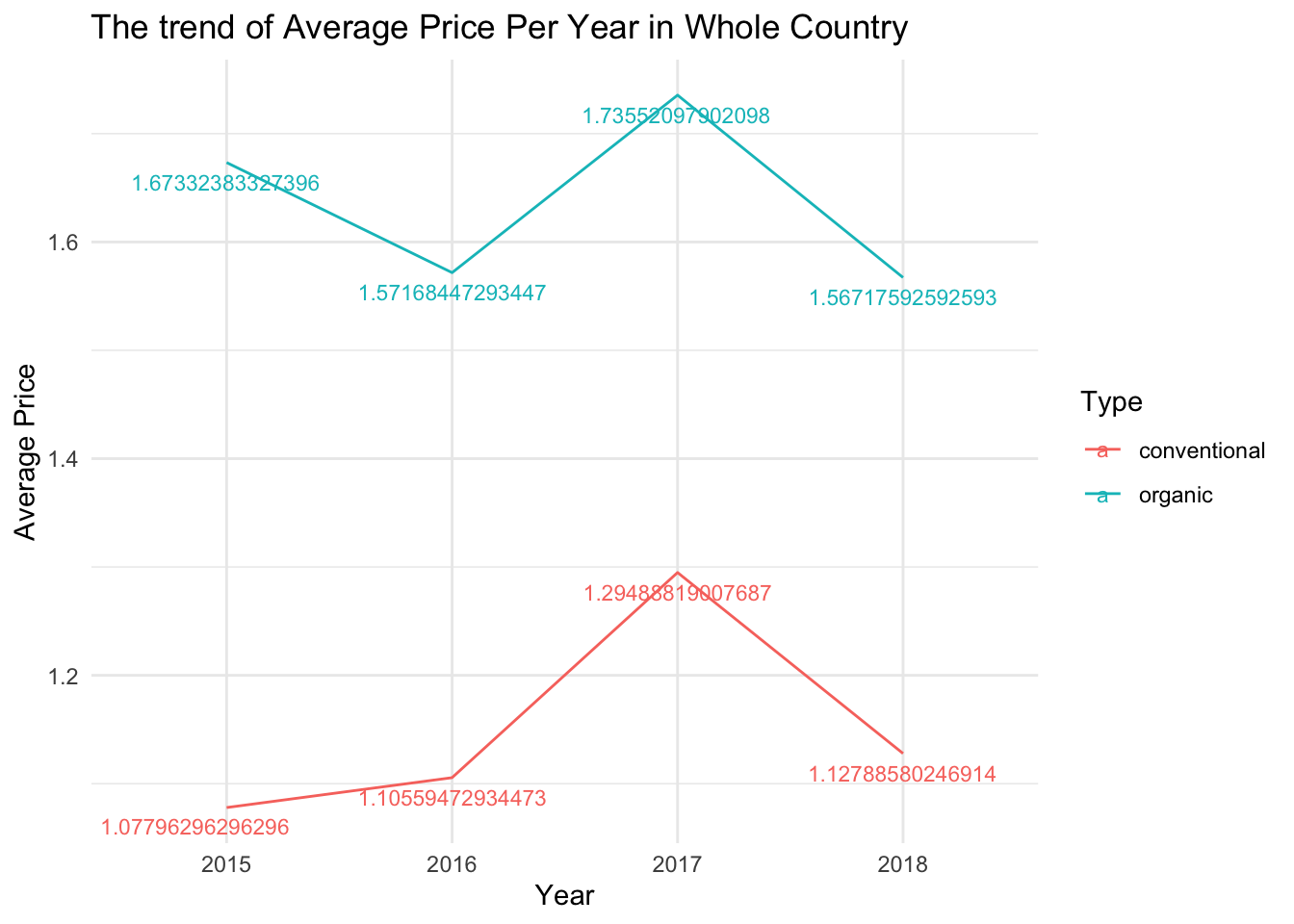
Here’s the annual trend of both type avocados in the whole country. It is evident that organic avocados are more expensive than conventional ones, which is no doubt about it. However, it’s obvious that the price of organic avocados decreased from 2015 to 2016 but that of conventional avocados increased. The trend from 2016 onwards has been the same: an initial increase followed by a decrease.
There is an interesting phenomenon where the price of conventional avocados, regardless of whether it is rising or falling, is still slightly higher in 2018 compared to 2015. This can be easily understood as a result of inflation; avocado prices naturally tend to rise. Additionally, with the increase in demand, price hikes are inevitable. However, in the case of organic avocados, the price in 2018 is nearly 10 cents lower compared to 2015. I speculate that this could be due to the higher cost of organic avocados and the relatively low purchasing quantity, leading to a tendency for price reduction. However, since our data for 2018 only goes up to March, it is possible that the incomplete data might have resulted in an incomplete picture. In other words, the prices for January to March might be lower compared to other months. At the same time, I also came across a statement that says “January through March is the best time of year for flavor.” So it is indeed possible that the prices for January to March are comparatively lower. However, we can compare the prices from January to March of other years to further determine the specific reasons.
# temp <- clean_avocado%>%
#   filter(Year == "2018") %>%
#   mutate(month = month(Date)) %>%
#   mutate(month = as.character(month))%>%arrange(month) %>% filter(month=="1"|month=="2"|month=="3")
#
# unique(temp$month)
#
# count(temp,month)
#
#  sum(is.na(temp$month))
# tabulate(temp$month)


 clean_avocado%>%
  mutate(month = month(Date)) %>%
  mutate(month = as.character(month)) %>%
  filter(month=="1"|month=="2"|month=="3") %>%
  group_by(Year, Type) %>%
  summarise("Average Price in 1-3" = mean(`Average Price Per Week`)) %>%
  ggplot(aes(x=Year, y= `Average Price in 1-3`,group=Type,color=Type)) +
  geom_line() +
  geom_point() +
  geom_text_repel(aes(label = `Average Price in 1-3`), size=3, vjust=-.5) +
  labs(title = "The trend of Average Price from Jun to March Per Year in Whole Country ",
       x = "Year",
       y = "Average Price")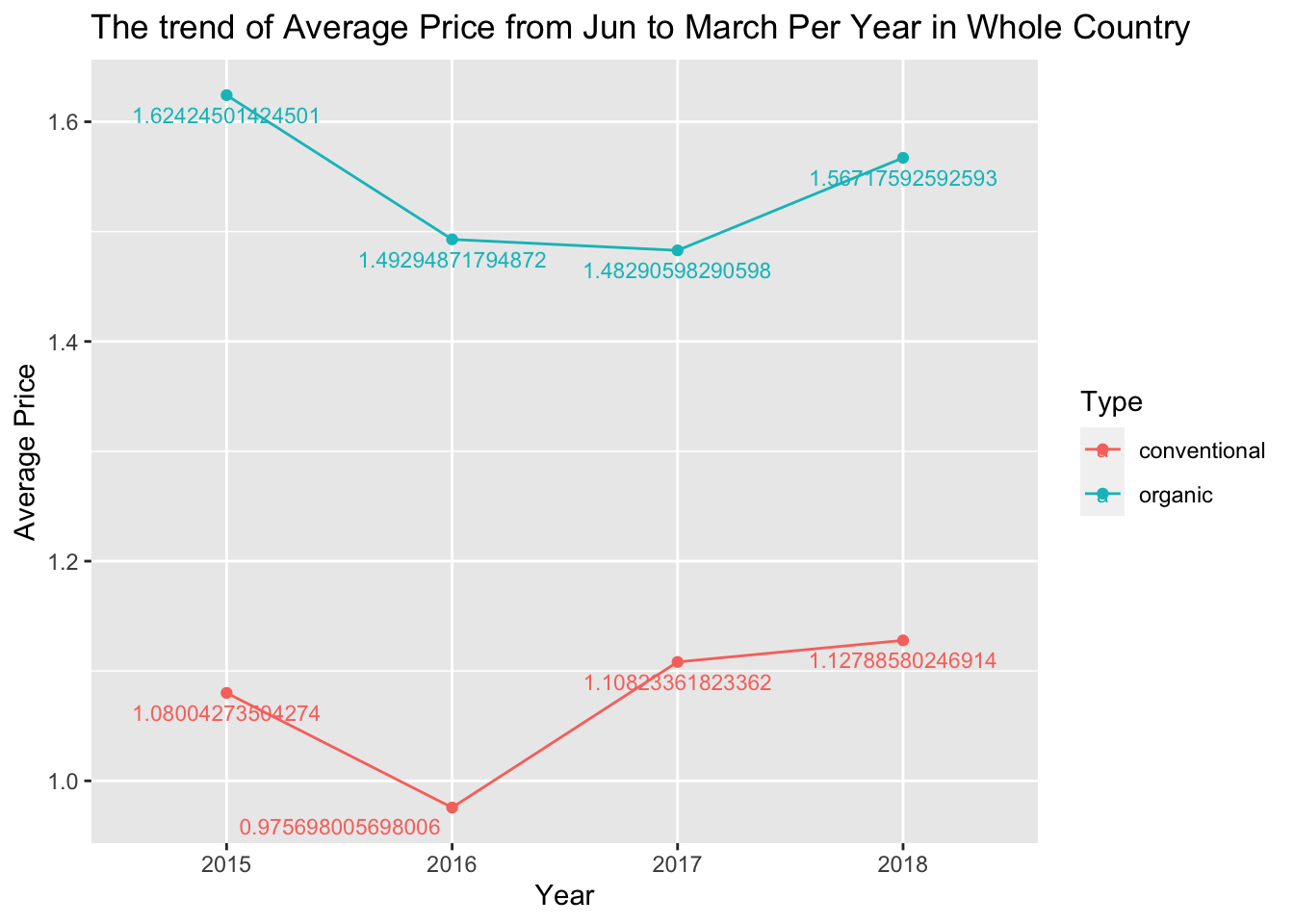
clean_avocado%>%
  mutate(month = month(Date)) %>%
  mutate(month = as.character(month)) %>%
  filter(month=="1"|month=="2"|month=="3") %>%
  group_by(Year, Type) %>%
  summarise("total volume" = sum(`Total Volume`)) %>%
  ggplot(aes(x=Year, y= `total volume`,group=Type,color=Type)) +
  geom_line() +
  geom_point() +
  geom_text_repel(aes(label = `total volume`), size=3, vjust=-.5) +
  labs(title = "The trend of Total Volume from Jun to March Per Year in Whole Country ",
       x = "Year",
       y = "Total Volume")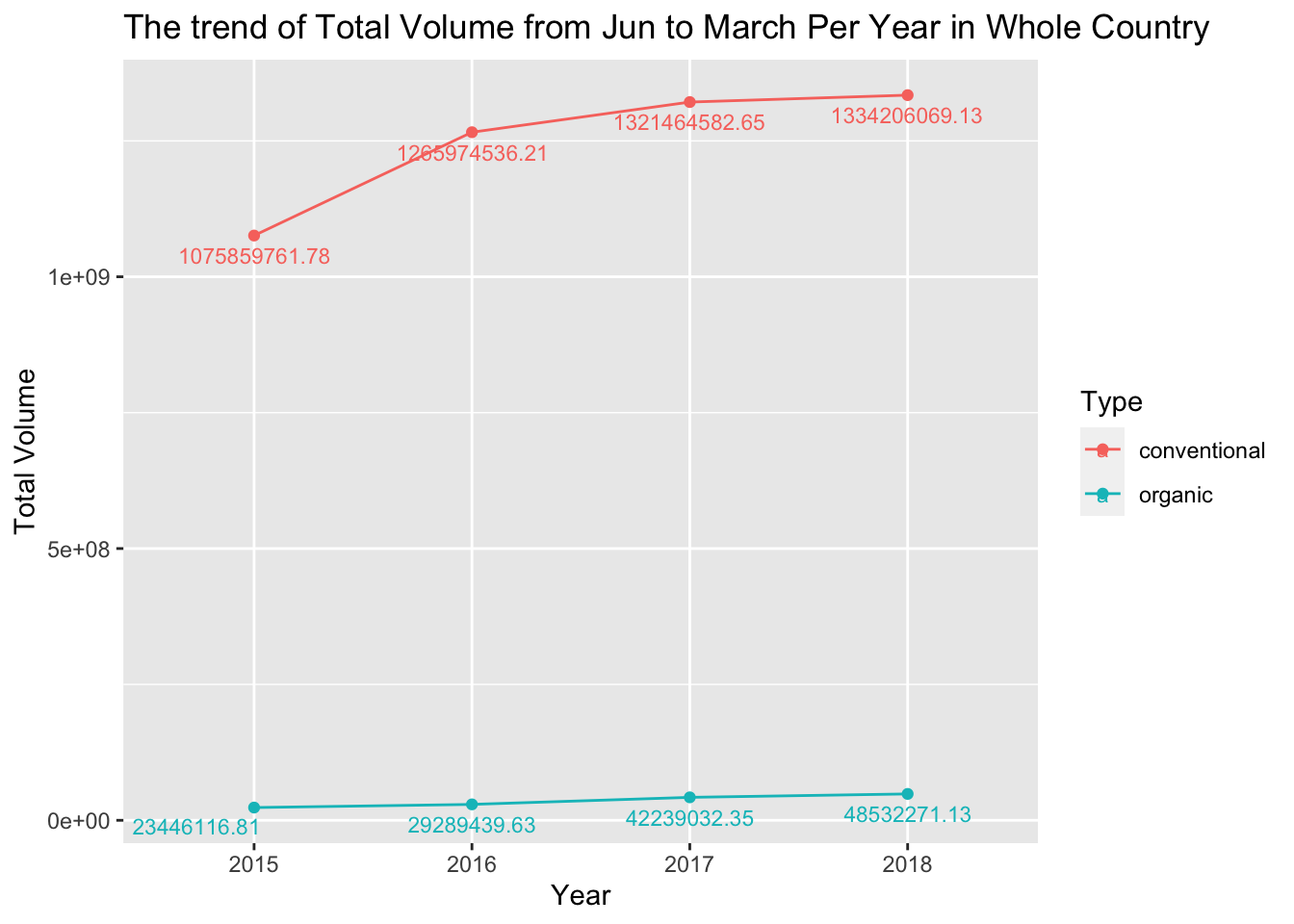
From the above two charts, we can see that there is a certain relationship between the purchasing quantity and the price from January to March, but the relationship may not be significant. In the period from January to March of 2015 to 2016, there was a significant decrease in the price of conventional avocados, and the purchasing quantity did indeed show a substantial increase. However, after 2016, the price of conventional avocados continued to rise, while the purchasing quantity still increased but to a lesser extent.
clean_avocado%>%
  mutate(month = month(Date)) %>%
  mutate(month = as.character(month)) %>%
  filter(month=="1"|month=="2"|month=="3") %>%
  group_by(Year, Type) %>%
  summarise("Average Price in 1-3" = mean(`Average Price Per Week`)) %>%
  ggplot(aes(x=Year, y= `Average Price in 1-3`,group=Type,color=Type)) +
  geom_line() +
  geom_point() +
  geom_text_repel(aes(label = `Average Price in 1-3`), size=3, vjust=-.5) +
  labs(title = "The trend of Average Price from Jun to March Per Year in Whole Country ",
       x = "Year",
       y = "Average Price")
total_volume <-clean_avocado %>% group_by(Year, Type) %>%
  summarise(Total_volume = sum(`Total Volume`))

total_volume <-total_volume%>%
  mutate(Total_volume = replace(Total_volume, Total_volume%/%1 == 1334206069, 5053904733),
         Total_volume = replace(Total_volume, Total_volume%/%1 ==48532271, 208486943))


total_volume
As we mentioned earlier, the data for 2018 only goes up to March. Therefore, I used linear regression in an external software to calculate the expected values for the entire year of 2018, and I replaced the original values in the table with these values.
total_volume %>%
  ggplot(aes(x = Year, y = Total_volume,group= Type, color = Type)) +
  geom_point() +
  geom_line() +
  geom_text_repel(aes(label = `Total_volume`), size=3, vjust=-.5) +
  labs(title = "The annual trend of Total Valoume in Whole Country ",
       x = "Year",
       y = "Total Valoume")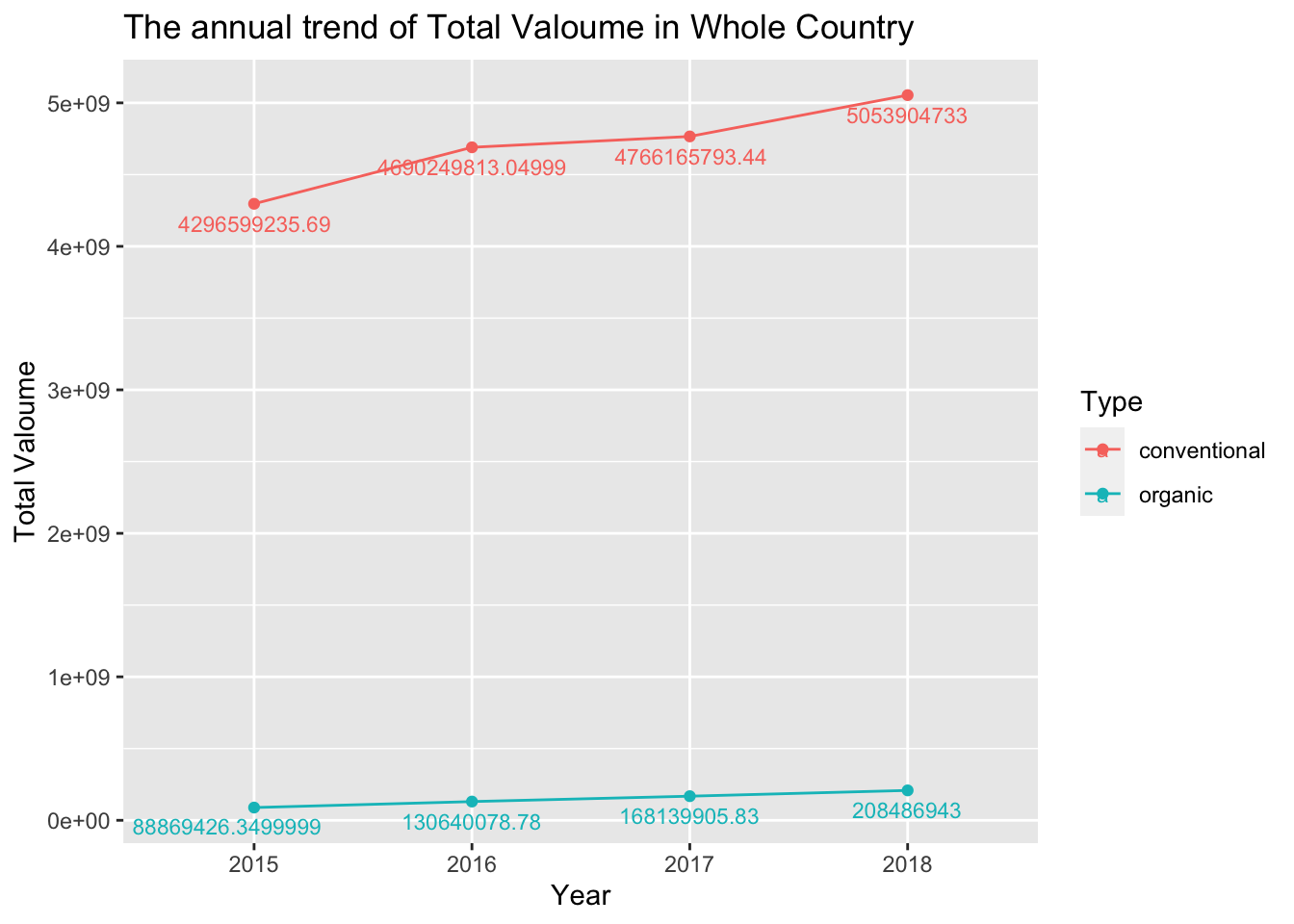
Regardless of whether prices are rising or falling, the overall purchasing quantity is increasing year by year. This indicates that the demand for avocados is growing, and the target audience is becoming more extensive.
Although we can clearly see price fluctuations from last graph, in numerical terms, the changes are typically just a few cents. In other words, the variations are quite small. Therefore, in terms of purchasing quantity, the increase in organic avocado purchases between 2015 and 2016 is not significantly higher than conventional avocados. This is because the overall price of organic avocados remains higher compared to conventional ones.
clean_avocado %>%
  select(Year, `Small Bags`, `Large Bags`, `XLarge Bags`) %>%
  group_by(Year) %>%
  summarise("sumsmall" = sum(`Small Bags`),
            "sumlarge" = sum(`Large Bags`),
            "sumxlarge" = sum(`XLarge Bags`)) %>% pivot_longer(cols = -Year, names_to = "bags", values_to = "value") %>%
  mutate(value = replace(value, value%/%1 == 360741367, 1442965472),
         value = replace(value, value%/%1 ==123583987, 494335952),
         value = replace(value, value%/%1 ==7210591, 28842368)) %>%
  ggplot(aes(x=Year, y=value, group=`bags`, color = `bags`)) +
  geom_line()+
  geom_text_repel(aes(label = `value`), size=3, vjust=-.5)+
  labs(title = "The annual trend of Total Bag Valoume in Whole Country ",
       x = "Year",
y = "Total Valoume") 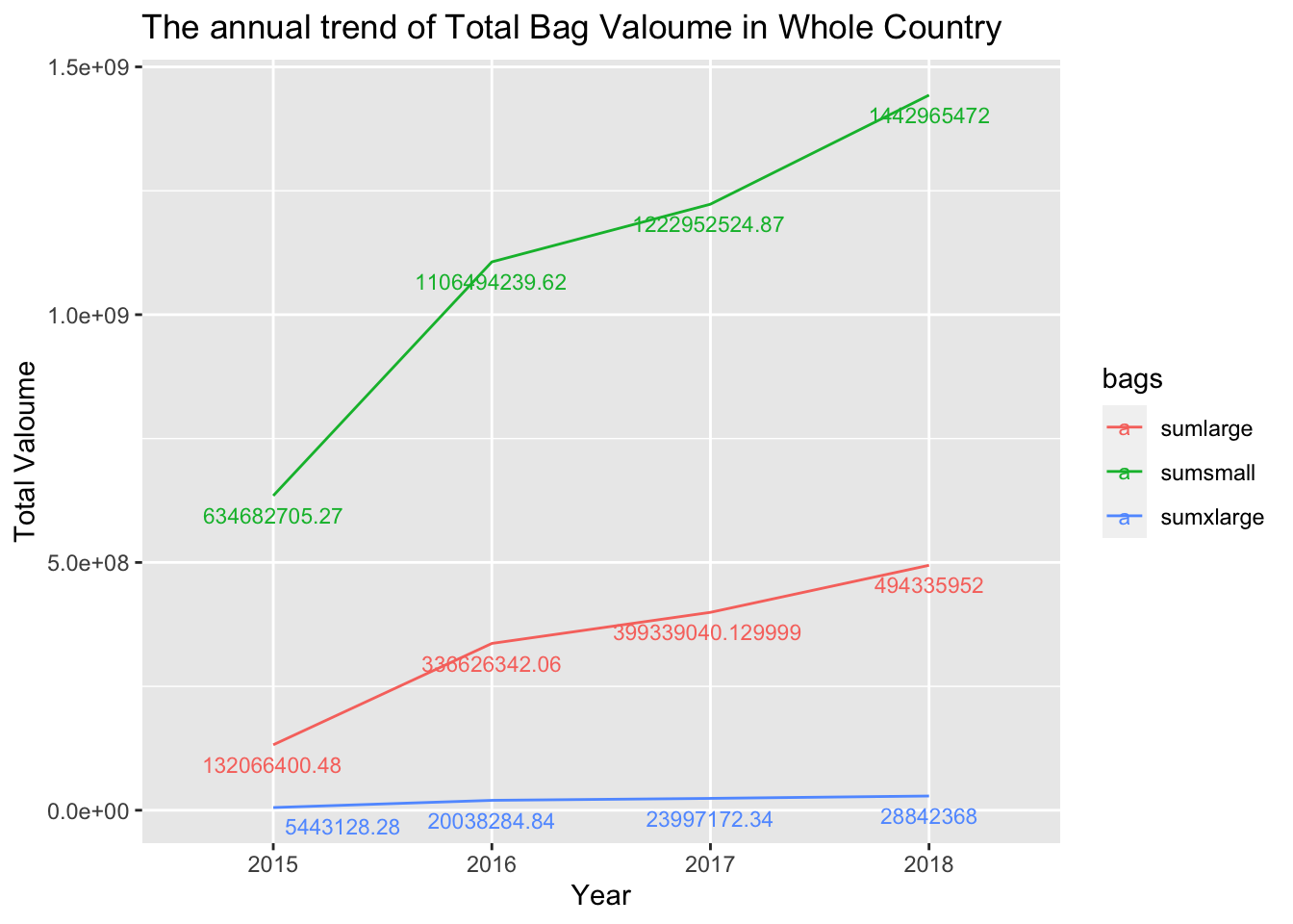
As a result, it is evident that the quantity of purchases for small bags is the highest, while the quantity for extra-large bags is the lowest. This is quite reasonable because avocados are perishable and not easy to store, so most people prefer to buy small bags.
clean_avocado %>%
  select(Year, `Small`, `Large`, `Xlarge`) %>%
  group_by(Year) %>%
  summarise("sumsmall" = sum(`Small`),
            "sumlarge" = sum(`Large`),
            "sumxlarge" = sum(`Xlarge`)) %>% ungroup() %>%
  pivot_longer(cols = -Year, names_to = "size", values_to = "value") %>%
  mutate(value = replace(value, value%/%1 == 460499734, 1841998936),
         value = replace(value, value%/%1 ==407758674, 1631034696),
         value = replace(value, value%/%1 ==22932594, 91730380)) %>%
  ggplot(aes(x=Year, y=value, group= size ,color = size)) +
  geom_line() +
  geom_text_repel(aes(label = `value`), size=3, vjust=-.5) +
  labs(title = "The annual trend of Total Valoume in Whole Country ",
       x = "Year",
       y = "Total Valoume")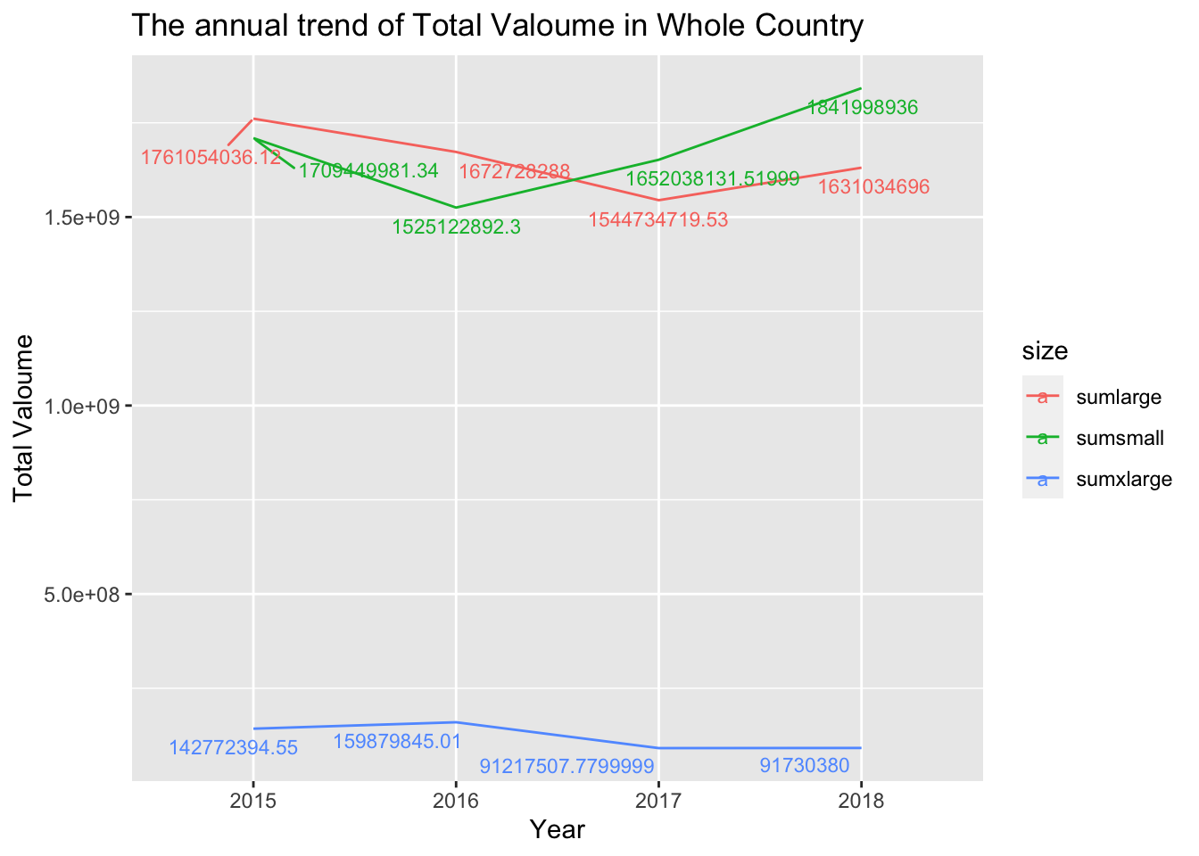
It is evident that people also prefer small and large-sized avocados, while the selection of extra-large-sized ones is significantly less. It is well known that avocados have a strong satiating effect, so most people may not be able to finish a whole extra-large-sized avocado. Furthermore, the purchasing quantity of small-sized avocados, and even in the subsequent years, is higher compared to large-sized avocados, let alone extra-large-sized ones.
clean_avocado %>%
  select(Small, Large, Xlarge,Type) %>% group_by(Type) %>%
  summarise("sumsmall" = sum(`Small`),
            "sumlarge" = sum(`Large`),
            "sumxlarge" = sum(`Xlarge`)) %>%
  pivot_longer(cols = -Type, names_to = "size", values_to = "value") %>%
  ggplot(aes(x=size, y=value, fill=Type))+
  geom_bar(position="stack", stat="identity") +
  facet_wrap(~Type) +
  geom_text(aes(label = value), size=2.3, vjust=-.5)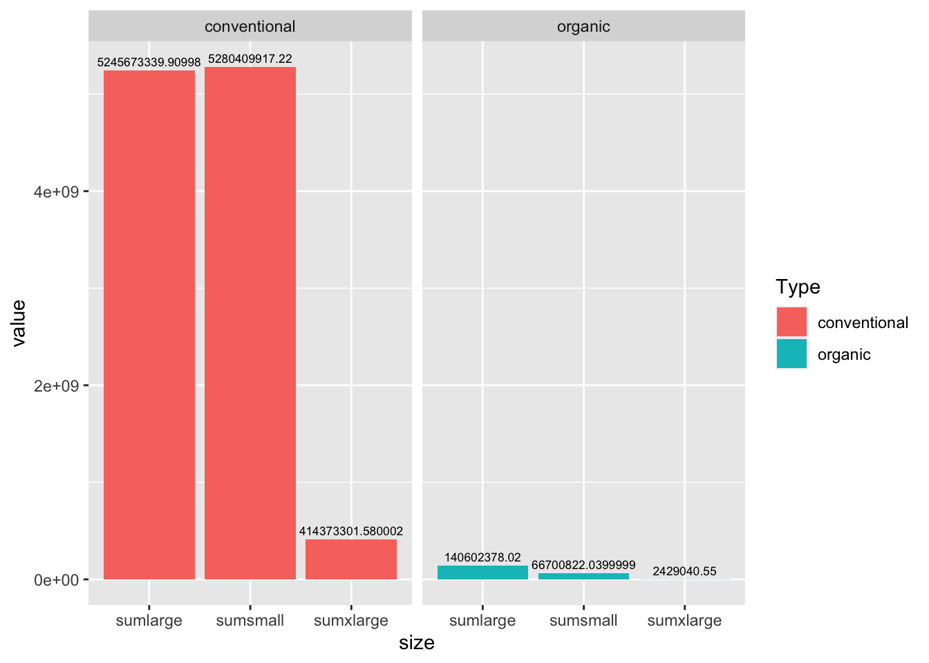
From this graph, we can observe the relationship between type and size. First of all, regardless of the type, the quantities of large and small sizes are still significantly higher than extra-large size. For conventional avocados, the purchasing quantity for small size is slightly higher than large size. However, for organic avocados, the purchasing quantity for large size is greater than that of small size, and it is even more than double the quantity of small size.
#Conclusion Currently, my main focus is analyzing this dataset from a temporal perspective. I am still learning more advanced chart creation techniques, and in the final project, I plan to include some more complex graphs, such as categorical vs. categorical charts and separate analysis for different regions.
This table is about the general things which are the average value of price, total volume and total bags in each year. I will plot some graphs about this table in the future.
From this table, I will focus on below information in the future.
This is what I think of now, and I will continue to update it in the future.