Code
library(tidyverse)
knitr::opts_chunk$set(echo = TRUE, warning=FALSE, message=FALSE)Suyash Bhagwat
June 29, 2023
The emphasis in this homework is on exploratory data analysis using both graphics and statistics. It is intended to be a rough draft of your project.
You should build on your prior homework - incorporating any feedback and adjusting the code and text as needed.These homeworks are intended to be cumulative. Therefore, while it is fine to switch datasets, you will need to include all of the information from HW2 for your new (or old) dataset in this hw submission as well.
Include descriptive statistics (e.g, mean, median, and standard deviation for numerical variables, and frequencies and/or mode for categorical variables.
Include relevant visualizations using ggplot2 to complement these descriptive statistics. Be sure to use faceting, coloring, and titles as needed. Each visualization should be accompanied by descriptive text that highlights:the variable(s) used what questions might be answered with the visualizations what conclusions you can draw.
Use group_by() and summarise() to compute descriptive stats and/or visualizations for any relevant groupings. For example, if you were interested in how average income varies by state, you might compute mean income for all states combined, and then compare this to the range and distribution of mean income for each individual state in the US.
Identify limitations of your visualization, such as: What questions are left unanswered with your visualizations, What about the visualizations may be unclear to a naive viewer, How could you improve the visualizations for the final project.
Read in one (or more) of the following datasets, using the correct R package and command.
Ans: For HW3 and for my Final Project I am going to use the hotel_bookings.csv data set that is already provided to us in the _data folder. This data set is challenging since it is a large data set with 119390 rows and 32 columns and has difficulty rating of 4-star.
Rows: 119,390
Columns: 32
$ hotel <chr> "Resort Hotel", "Resort Hotel", "Resort…
$ is_canceled <dbl> 0, 0, 0, 0, 0, 0, 0, 0, 1, 1, 1, 0, 0, …
$ lead_time <dbl> 342, 737, 7, 13, 14, 14, 0, 9, 85, 75, …
$ arrival_date_year <dbl> 2015, 2015, 2015, 2015, 2015, 2015, 201…
$ arrival_date_month <chr> "July", "July", "July", "July", "July",…
$ arrival_date_week_number <dbl> 27, 27, 27, 27, 27, 27, 27, 27, 27, 27,…
$ arrival_date_day_of_month <dbl> 1, 1, 1, 1, 1, 1, 1, 1, 1, 1, 1, 1, 1, …
$ stays_in_weekend_nights <dbl> 0, 0, 0, 0, 0, 0, 0, 0, 0, 0, 0, 0, 0, …
$ stays_in_week_nights <dbl> 0, 0, 1, 1, 2, 2, 2, 2, 3, 3, 4, 4, 4, …
$ adults <dbl> 2, 2, 1, 1, 2, 2, 2, 2, 2, 2, 2, 2, 2, …
$ children <dbl> 0, 0, 0, 0, 0, 0, 0, 0, 0, 0, 0, 0, 0, …
$ babies <dbl> 0, 0, 0, 0, 0, 0, 0, 0, 0, 0, 0, 0, 0, …
$ meal <chr> "BB", "BB", "BB", "BB", "BB", "BB", "BB…
$ country <chr> "PRT", "PRT", "GBR", "GBR", "GBR", "GBR…
$ market_segment <chr> "Direct", "Direct", "Direct", "Corporat…
$ distribution_channel <chr> "Direct", "Direct", "Direct", "Corporat…
$ is_repeated_guest <dbl> 0, 0, 0, 0, 0, 0, 0, 0, 0, 0, 0, 0, 0, …
$ previous_cancellations <dbl> 0, 0, 0, 0, 0, 0, 0, 0, 0, 0, 0, 0, 0, …
$ previous_bookings_not_canceled <dbl> 0, 0, 0, 0, 0, 0, 0, 0, 0, 0, 0, 0, 0, …
$ reserved_room_type <chr> "C", "C", "A", "A", "A", "A", "C", "C",…
$ assigned_room_type <chr> "C", "C", "C", "A", "A", "A", "C", "C",…
$ booking_changes <dbl> 3, 4, 0, 0, 0, 0, 0, 0, 0, 0, 0, 0, 0, …
$ deposit_type <chr> "No Deposit", "No Deposit", "No Deposit…
$ agent <chr> "NULL", "NULL", "NULL", "304", "240", "…
$ company <chr> "NULL", "NULL", "NULL", "NULL", "NULL",…
$ days_in_waiting_list <dbl> 0, 0, 0, 0, 0, 0, 0, 0, 0, 0, 0, 0, 0, …
$ customer_type <chr> "Transient", "Transient", "Transient", …
$ adr <dbl> 0.00, 0.00, 75.00, 75.00, 98.00, 98.00,…
$ required_car_parking_spaces <dbl> 0, 0, 0, 0, 0, 0, 0, 0, 0, 0, 0, 0, 0, …
$ total_of_special_requests <dbl> 0, 0, 0, 0, 1, 1, 0, 1, 1, 0, 0, 0, 3, …
$ reservation_status <chr> "Check-Out", "Check-Out", "Check-Out", …
$ reservation_status_date <date> 2015-07-01, 2015-07-01, 2015-07-02, 20…Ans: The code for cleaning the hotel_booking data set is given below:
hotel is_canceled
0 0
lead_time arrival_date_year
0 0
arrival_date_month arrival_date_week_number
0 0
arrival_date_day_of_month stays_in_weekend_nights
0 0
stays_in_week_nights adults
0 0
children babies
4 0
meal country
0 0
market_segment distribution_channel
0 0
is_repeated_guest previous_cancellations
0 0
previous_bookings_not_canceled reserved_room_type
0 0
assigned_room_type booking_changes
0 0
deposit_type agent
0 0
company days_in_waiting_list
0 0
customer_type adr
0 0
required_car_parking_spaces total_of_special_requests
0 0
reservation_status reservation_status_date
0 0 Also there are a few rows in the data set where no adult or there are children with no adults that have checked in. Now babies and children can’t check-in on their own so we will remove those entries from the data set.
This covers most of the preliminary data cleaning for HW2 and Final Project. As I start working on the Final Project, I’m sure I’ll run into more issues and will need to do some further data cleaning.
Ans: After cleaning the data set above we can now see that it has 118,987 rows and 32 columns.
Rows: 118,987
Columns: 32
$ hotel <chr> "Resort Hotel", "Resort Hotel", "Resort…
$ is_canceled <dbl> 0, 0, 0, 0, 0, 0, 0, 0, 1, 1, 1, 0, 0, …
$ lead_time <dbl> 342, 737, 7, 13, 14, 14, 0, 9, 85, 75, …
$ arrival_date_year <dbl> 2015, 2015, 2015, 2015, 2015, 2015, 201…
$ arrival_date_month <chr> "July", "July", "July", "July", "July",…
$ arrival_date_week_number <dbl> 27, 27, 27, 27, 27, 27, 27, 27, 27, 27,…
$ arrival_date_day_of_month <dbl> 1, 1, 1, 1, 1, 1, 1, 1, 1, 1, 1, 1, 1, …
$ stays_in_weekend_nights <dbl> 0, 0, 0, 0, 0, 0, 0, 0, 0, 0, 0, 0, 0, …
$ stays_in_week_nights <dbl> 0, 0, 1, 1, 2, 2, 2, 2, 3, 3, 4, 4, 4, …
$ adults <dbl> 2, 2, 1, 1, 2, 2, 2, 2, 2, 2, 2, 2, 2, …
$ children <dbl> 0, 0, 0, 0, 0, 0, 0, 0, 0, 0, 0, 0, 0, …
$ babies <dbl> 0, 0, 0, 0, 0, 0, 0, 0, 0, 0, 0, 0, 0, …
$ meal <chr> "BB", "BB", "BB", "BB", "BB", "BB", "BB…
$ country <chr> "PRT", "PRT", "GBR", "GBR", "GBR", "GBR…
$ market_segment <chr> "Direct", "Direct", "Direct", "Corporat…
$ distribution_channel <chr> "Direct", "Direct", "Direct", "Corporat…
$ is_repeated_guest <dbl> 0, 0, 0, 0, 0, 0, 0, 0, 0, 0, 0, 0, 0, …
$ previous_cancellations <dbl> 0, 0, 0, 0, 0, 0, 0, 0, 0, 0, 0, 0, 0, …
$ previous_bookings_not_canceled <dbl> 0, 0, 0, 0, 0, 0, 0, 0, 0, 0, 0, 0, 0, …
$ reserved_room_type <chr> "C", "C", "A", "A", "A", "A", "C", "C",…
$ assigned_room_type <chr> "C", "C", "C", "A", "A", "A", "C", "C",…
$ booking_changes <dbl> 3, 4, 0, 0, 0, 0, 0, 0, 0, 0, 0, 0, 0, …
$ deposit_type <chr> "No Deposit", "No Deposit", "No Deposit…
$ agent <chr> "NULL", "NULL", "NULL", "304", "240", "…
$ company <chr> "NULL", "NULL", "NULL", "NULL", "NULL",…
$ days_in_waiting_list <dbl> 0, 0, 0, 0, 0, 0, 0, 0, 0, 0, 0, 0, 0, …
$ customer_type <chr> "Transient", "Transient", "Transient", …
$ adr <dbl> 0.00, 0.00, 75.00, 75.00, 98.00, 98.00,…
$ required_car_parking_spaces <dbl> 0, 0, 0, 0, 0, 0, 0, 0, 0, 0, 0, 0, 0, …
$ total_of_special_requests <dbl> 0, 0, 0, 0, 1, 1, 0, 1, 1, 0, 0, 0, 3, …
$ reservation_status <chr> "Check-Out", "Check-Out", "Check-Out", …
$ reservation_status_date <date> 2015-07-01, 2015-07-01, 2015-07-02, 20…Ans: Looking at the hotel_bookings data set we can try to answer many of the exploratory research questions. They are:
What is the preferred hotel type for guests (City hotel vs Resort hotel)?
Hotel bookings are usually seasonal in nature. Which month has the highest booking rate/revenue?
Which countries have the highest number of incoming guests?
What is the average length of stay per booking? Average number of guests per booking?
Which months have the highest rate of cancellations?
Finding correlation between the numerical data columns (e.g. ADR vs number of guests) to get useful insights.
This is just a preliminary list of the exploratory questions. As I start working on the Final Project, I’ll discover more research questions that I can add to this list.
The exhaustive table of the mean, median and standard deviation is given in the summary dataframe below. Some important statistics that we can see from the table below is that the lead_time_mean is 104.07, adults_median staying is 2, the mean of the Average Daily Rate($) is 102.01, and the median of the Average Daily Rate is 95.
For the categorical variables, we can find the frequency table. We can also see that there are two different types of hotels; Resort hotels and City hotels. The number of City Hotels is almost twice that of the Resort hotels.
City Hotel Resort Hotel
78940 40047 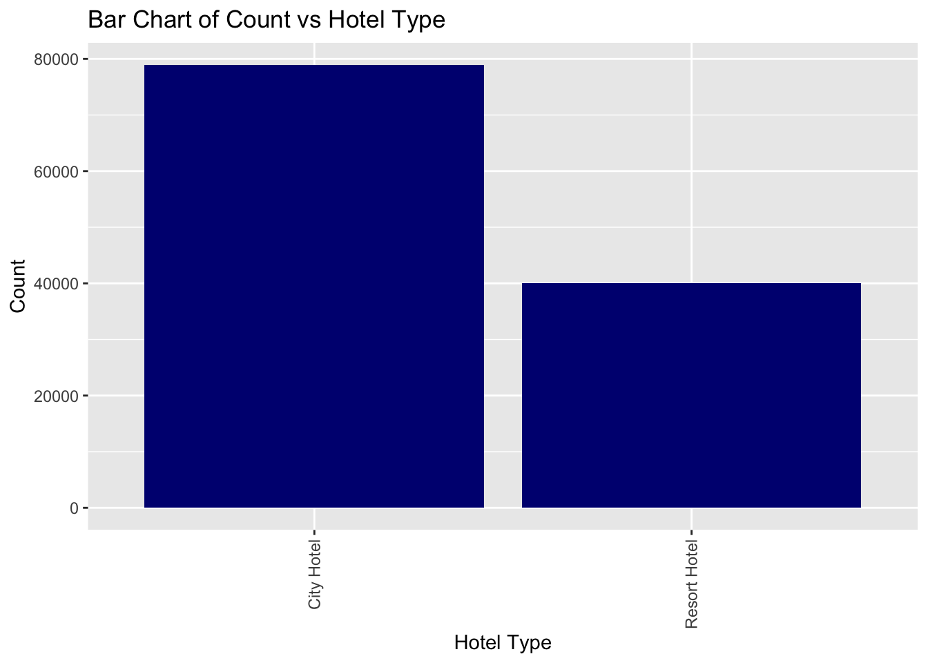
We can also get an idea of the number of reservations that are successfully checked-out vs canceled vs No-show. Looking at the data we can say that a significant chunk of the reservations are checked out followed by canceled. No-show only accounts for a small fraction of the total reservations.
df1$Percentage <- df1$Freq / sum(df1$Freq)
df1$Label <- paste0(df1$Var1, " (", scales::percent(df1$Percentage), ")")
# Create the pie chart
pie_reservation <- ggplot(df1, aes(x = "", y = Percentage, fill = Label)) +
geom_bar(width = 1, stat = "identity") +
coord_polar("y", start = 0) +
theme_void() +
theme(legend.position = "right") +
labs(x = NULL, y = NULL, fill = NULL,
title = "Pie Chart of Reservation Status for Hotel Bookings")
pie_reservation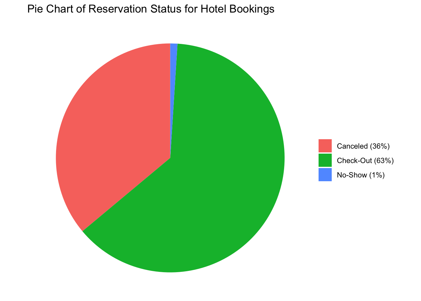
Similarly, we can analyze the meal type by creating a table and plotting a bar chart. From the plot shown below, we can see that BB meal is the most popular among guests followed by HB and SC.
BB FB HB SC Undefined
92020 798 14454 10546 1169 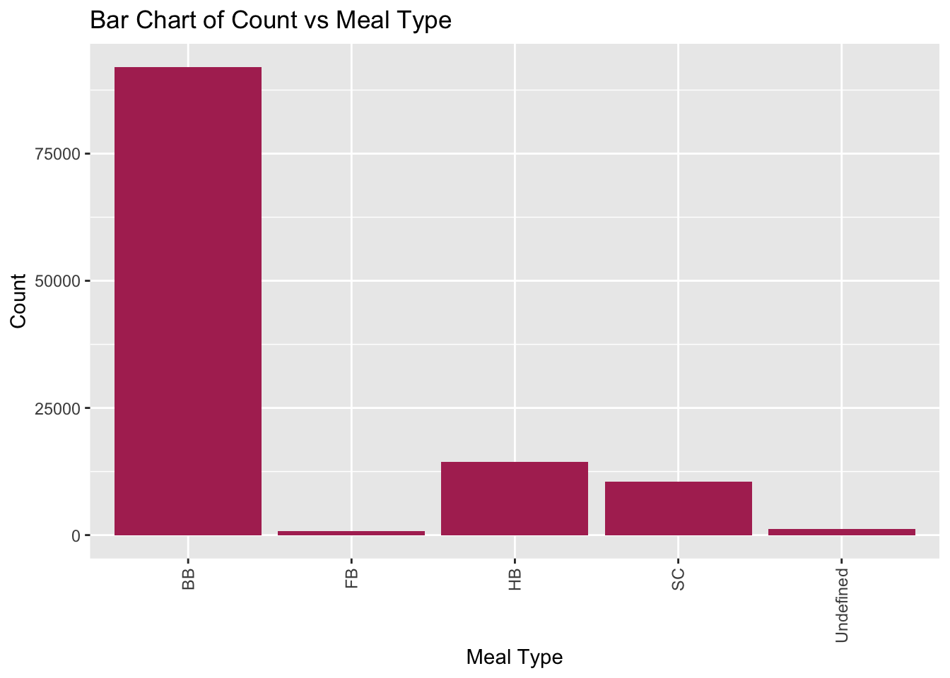
Next, we look at the market segment which is responsible for the hotel bookings. I have restructured the table to be converted into a tibble, so that it can be used to plot the pie chart given below.
From the pie chart below, we can conclude that roughly half (47.25%) of all the hotel bookings are done via the online TA (Travel Agent). This includes websites like Expedia, and hotels.com. The next major segment is the offline TA (20.32%), which may include bookings done by a human travel agent or in-person bookings. Aviation, Complementary, Corporate, Direct and Groups together contribute to around 1/3 of the total market share.
df$Percentage <- df$Freq / sum(df$Freq)
df$Label <- paste0(df$Var1, " (", scales::percent(df$Percentage), ")")
# Create the pie chart
pie<- ggplot(df, aes(x = "", y = Percentage, fill = Label)) +
geom_bar(width = 1, stat = "identity") +
coord_polar("y", start = 0) +
theme_void() +
theme(legend.position = "right") +
labs(x = NULL, y = NULL, fill = NULL,
title = "Pie Chart of Market Segment for Hotel Bookings")
pie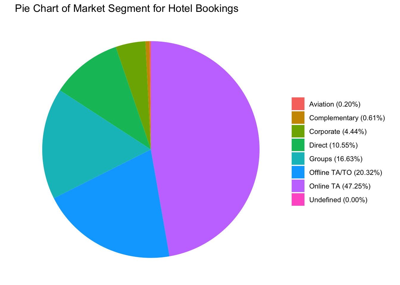
Looking at yet another categorical variable, we can see that the most popular room type among guests is type A. The next in order is type D, E, F. One important point to note is that the room type A is popular compared to the next few room types by a significant margin. In fact, the number of bookings for room type A are greater than the sum of all the other room types combined.
A B C D E F G H I K L
73983 1972 2370 25306 7798 3751 2548 712 359 187 1 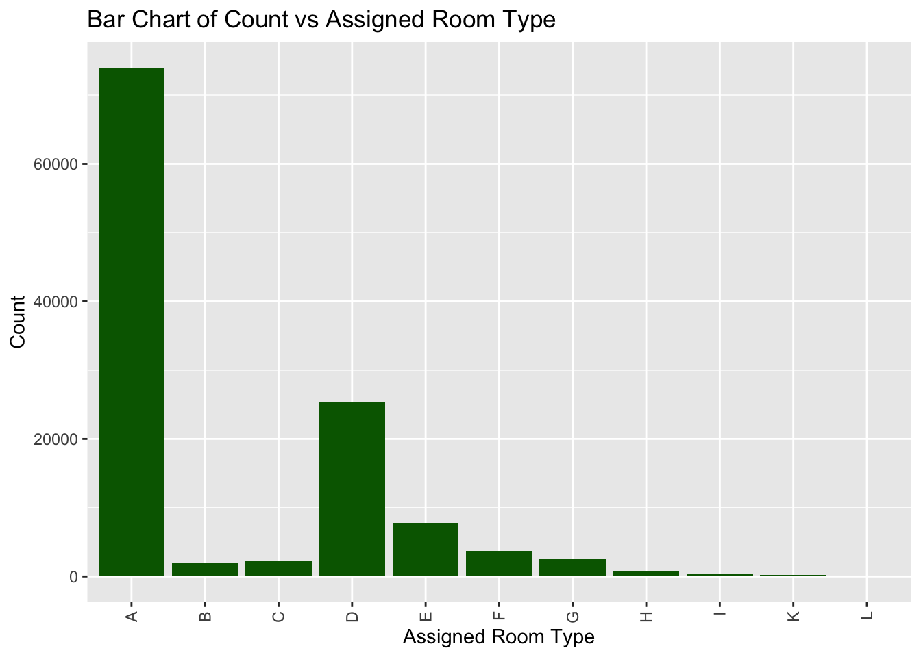
Shown below, is the bar chart for the customer type variable. As we can see, the majority of the customer are of the ‘Transient’ type.
Contract Group Transient Transient-Party
4071 573 89337 25006 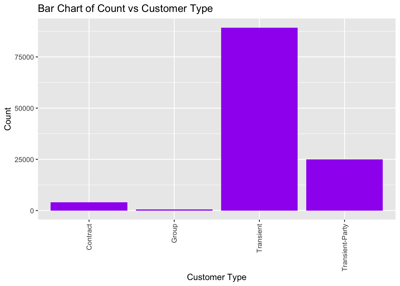
We can also get an idea of the nationality of the different guest by looking at the list of countries below:
Based on the data above of the top 15 countries (arranged in desc order), the top 3 countries are Portugal(PRT), Great Britain(GBR) and France (FRA).
This is visualized in the plot given below:
data_country <- data_hotels %>% group_by(country) %>% summarise(booking_count = n()) %>% arrange(desc(booking_count))
top_n(data_country,15,booking_count) %>%
ggplot(aes(x = reorder(country,booking_count), y = booking_count)) +
geom_bar(stat = "identity", width = 0.25, fill="navyblue")+
coord_flip()+
ylab('Number of Guests')+
xlab('Nationality')+
ggtitle('Guests by Country') +
labs(fill='Hotel type')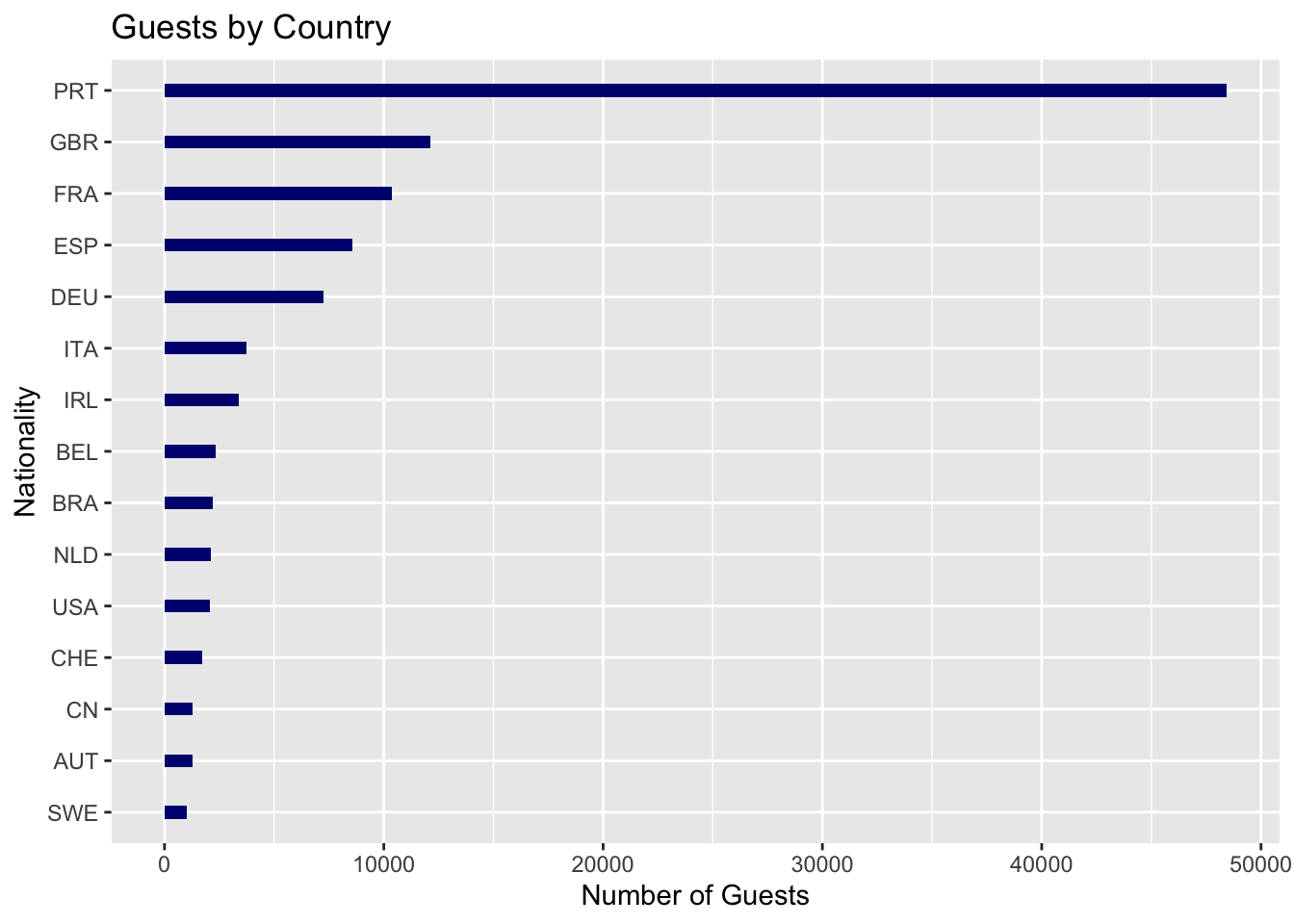
Lastly, the histogram plot below shows the average daily rate (in $) for all the different hotels faceted by the hotel type. Looking at the density plot below, we can conclude that the city hotels have a bimodal distribution around 60-100 USD. This means that there are some cheaper hotels that are for 60, but there are a few expensive ones that rent for 100 USD. On the other hand, for resort hotels the distribution is much more smooth with a maximum density around 50 USD. From this we can conclude that, on an average, city hotels are more expensive to rent as compared to resort style hotels. This makes sense since resort hotels are usually located on the outskirts of a city where the land is cheaper and there is more space to build a large resort style hotel. City hotels, on the other hand, are built in/near the city downtown where the real estate is much more expensive.
Ans:The charts and plots shown above cover most of the basic descriptive statistics for the hotel_bookings dataset. But for the final project, I will try to come up with more complex data visualization methods given in the R graph gallery (https://r-graph-gallery.com/index.html).
---
title: "HW 3 Submission"
author: "Suyash Bhagwat"
description: "Homework 3: Descriptive Statistics and Exploratory Data Analysis"
date: "6/29/2023"
format:
html:
df-print: paged
toc: true
code-fold: true
code-copy: true
code-tools: true
categories:
- hw3
- hotel_bookings.csv
---
```{r}
#| label: setup
#| warning: false
#| message: false
library(tidyverse)
knitr::opts_chunk$set(echo = TRUE, warning=FALSE, message=FALSE)
```
## Homework Overview
The emphasis in this homework is on exploratory data analysis using both graphics and statistics. It is intended to be a rough draft of your project.
You should build on your prior homework - incorporating any feedback and adjusting the code and text as needed.These homeworks are intended to be cumulative. Therefore, while it is fine to switch datasets, you will need to include all of the information from HW2 for your new (or old) dataset in this hw submission as well.
1) Include descriptive statistics (e.g, mean, median, and standard deviation for numerical variables, and frequencies and/or mode for categorical variables.
2) Include relevant visualizations using ggplot2 to complement these descriptive statistics. Be sure to use faceting, coloring, and titles as needed. Each visualization should be accompanied by descriptive text that highlights:the variable(s) used what questions might be answered with the visualizations what conclusions you can draw.
3) Use group_by() and summarise() to compute descriptive stats and/or visualizations for any relevant groupings. For example, if you were interested in how average income varies by state, you might compute mean income for all states combined, and then compare this to the range and distribution of mean income for each individual state in the US.
4) Identify limitations of your visualization, such as: What questions are left unanswered with your visualizations, What about the visualizations may be unclear to a naive viewer, How could you improve the visualizations for the final project.
## Read in data
Read in one (or more) of the following datasets, using the correct R package and command.
- hotel_bookings.csv
**Ans:** For HW3 and for my Final Project I am going to use the hotel_bookings.csv data set that is already provided to us in the _data folder. This data set is challenging since it is a large data set with 119390 rows and 32 columns and has difficulty rating of 4-star.
```{r}
data_hotels <- read_csv("_data/hotel_bookings.csv")
data_hotels
glimpse(data_hotels)
```
## Clean the data
**Ans:** The code for cleaning the hotel_booking data set is given below:
```{r}
colSums(is.na(data_hotels))
```
Also there are a few rows in the data set where no adult or there are children with no adults that have checked in. Now babies and children can't check-in on their own so we will remove those entries from the data set.
```{r}
data_hotels <- data_hotels %>% filter(data_hotels$adults != 0)
```
This covers most of the preliminary data cleaning for HW2 and Final Project. As I start working on the Final Project, I'm sure I'll run into more issues and will need to do some further data cleaning.
## Narrative about the data
**Ans:** After cleaning the data set above we can now see that it has 118,987 rows and 32 columns.
```{r}
glimpse(data_hotels)
```
## Identify potential research questions
**Ans:** Looking at the hotel_bookings data set we can try to answer many of the exploratory research questions. They are:
1) What is the preferred hotel type for guests (City hotel vs Resort hotel)?
2) Hotel bookings are usually seasonal in nature. Which month has the highest booking rate/revenue?
3) Which countries have the highest number of incoming guests?
4) What is the average length of stay per booking? Average number of guests per booking?
5) Which months have the highest rate of cancellations?
6) Finding correlation between the numerical data columns (e.g. ADR vs number of guests) to get useful insights.
This is just a preliminary list of the exploratory questions. As I start working on the Final Project, I'll discover more research questions that I can add to this list.
## Descriptive Statistics
The exhaustive table of the mean, median and standard deviation is given in the summary dataframe below. Some important statistics that we can see from the table below is that the lead_time_mean is 104.07, adults_median staying is 2, the mean of the Average Daily Rate($) is 102.01, and the median of the Average Daily Rate is 95.
```{r}
summary <- data_hotels %>% summarize(across(everything(), list(mean = mean, median = median, sd = sd), na.rm = TRUE))

summary
```
For the categorical variables, we can find the frequency table. We can also see that there are two different types of hotels; Resort hotels and City hotels. The number of City Hotels is almost twice that of the Resort hotels.
```{r}
table(data_hotels$hotel)
ggplot(data_hotels, aes(hotel)) + geom_bar(fill = "navyblue")+labs(x = "Hotel Type", y = "Count", title = "Bar Chart of Count vs Hotel Type") +theme(axis.text.x = element_text(angle = 90, vjust = 0.5, hjust=1))
```
We can also get an idea of the number of reservations that are successfully checked-out vs canceled vs No-show. Looking at the data we can say that a significant chunk of the reservations are checked out followed by canceled. No-show only accounts for a small fraction of the total reservations.
```{r}
df1<- as_tibble(as.data.frame(table(data_hotels$reservation_status)))
df1
df1$Percentage <- df1$Freq / sum(df1$Freq)
df1$Label <- paste0(df1$Var1, " (", scales::percent(df1$Percentage), ")")

# Create the pie chart
pie_reservation <- ggplot(df1, aes(x = "", y = Percentage, fill = Label)) +
  geom_bar(width = 1, stat = "identity") +
  coord_polar("y", start = 0) +
  theme_void() +
  theme(legend.position = "right") +
  labs(x = NULL, y = NULL, fill = NULL,
       title = "Pie Chart of Reservation Status for Hotel Bookings")

pie_reservation
```
Similarly, we can analyze the meal type by creating a table and plotting a bar chart. From the plot shown below, we can see that BB meal is the most popular among guests followed by HB and SC.
```{r}
table(data_hotels$meal)
ggplot(data_hotels, aes(meal)) + geom_bar(fill = "maroon")+labs(x = "Meal Type", y = "Count", title = "Bar Chart of Count vs Meal Type") +theme(axis.text.x = element_text(angle = 90, vjust = 0.5, hjust=1))
```
Next, we look at the market segment which is responsible for the hotel bookings. I have restructured the table to be converted into a tibble, so that it can be used to plot the pie chart given below.
```{r}
df<- as_tibble(as.data.frame(table(data_hotels$market_segment)))
df
```
From the pie chart below, we can conclude that roughly half (47.25%) of all the hotel bookings are done via the online TA (Travel Agent). This includes websites like Expedia, and hotels.com. The next major segment is the offline TA (20.32%), which may include bookings done by a human travel agent or in-person bookings. Aviation, Complementary, Corporate, Direct and Groups together contribute to around 1/3 of the total market share.
```{r}
df$Percentage <- df$Freq / sum(df$Freq)
df$Label <- paste0(df$Var1, " (", scales::percent(df$Percentage), ")")

# Create the pie chart
pie<- ggplot(df, aes(x = "", y = Percentage, fill = Label)) +
  geom_bar(width = 1, stat = "identity") +
  coord_polar("y", start = 0) +
  theme_void() +
  theme(legend.position = "right") +
  labs(x = NULL, y = NULL, fill = NULL,
       title = "Pie Chart of Market Segment for Hotel Bookings")

pie
```
Looking at yet another categorical variable, we can see that the most popular room type among guests is type A. The next in order is type D, E, F. One important point to note is that the room type A is popular compared to the next few room types by a significant margin. In fact, the number of bookings for room type A are greater than the sum of all the other room types combined.
```{r}
table(data_hotels$assigned_room_type)
ggplot(data_hotels, aes(assigned_room_type)) + geom_bar(fill = "darkgreen")+labs(x = "Assigned Room Type", y = "Count", title = "Bar Chart of Count vs Assigned Room Type") +theme(axis.text.x = element_text(angle = 90, vjust = 0.5, hjust=1))
```
Shown below, is the bar chart for the customer type variable. As we can see, the majority of the customer are of the 'Transient' type.
```{r}
table(data_hotels$customer_type)
ggplot(data_hotels, aes(customer_type)) + geom_bar(fill = "purple")+labs(x = "Customer Type", y = "Count", title = "Bar Chart of Count vs Customer Type") +theme(axis.text.x = element_text(angle = 90, vjust = 0.5, hjust=1))
```
We can also get an idea of the nationality of the different guest by looking at the list of countries below:
```{r}
data_hotels %>%
  group_by(country)%>%
  summarise(num=n())%>%
  arrange(desc(num))
```
Based on the data above of the top 15 countries (arranged in desc order), the top 3 countries are Portugal(PRT), Great Britain(GBR) and France (FRA).
This is visualized in the plot given below:
```{r}
data_country <- data_hotels %>% group_by(country) %>%  summarise(booking_count = n()) %>% arrange(desc(booking_count))
top_n(data_country,15,booking_count) %>%
  ggplot(aes(x = reorder(country,booking_count), y = booking_count)) +
  geom_bar(stat = "identity", width = 0.25, fill="navyblue")+
 coord_flip()+
   ylab('Number of Guests')+
  xlab('Nationality')+
  ggtitle('Guests by Country') +
  labs(fill='Hotel type')
```
Lastly, the histogram plot below shows the average daily rate (in $) for all the different hotels faceted by the hotel type. Looking at the density plot below, we can conclude that the city hotels have a bimodal distribution around 60-100 USD. This means that there are some cheaper hotels that are for 60, but there are a few expensive ones that rent for 100 USD. On the other hand, for resort hotels the distribution is much more smooth with a maximum density around 50 USD. From this we can conclude that, on an average, city hotels are more expensive to rent as compared to resort style hotels. This makes sense since resort hotels are usually located on the outskirts of a city where the land is cheaper and there is more space to build a large resort style hotel. City hotels, on the other hand, are built in/near the city downtown where the real estate is much more expensive.
```{r}
ggplot(data_hotels, aes(adr)) +
  geom_histogram(aes(y = ..density..), alpha = 0.7) +
  geom_density(alpha = 0.2, fill="red") + xlim(0,300) +labs(x="Average Daily Rate($)",y="Density",title="Histogram Density of Average Daily Rate(ADR)") + facet_wrap(~hotel)
```
## Limitations of my visualization
**Ans:**The charts and plots shown above cover most of the basic descriptive statistics for the hotel_bookings dataset. But for the final project, I will try to come up with more complex data visualization methods given in the R graph gallery (https://r-graph-gallery.com/index.html).