library(tidyverse)
library(ggplot2)
library(RColorBrewer)
library(readxl)
knitr::opts_chunk$set(echo = TRUE, warning=FALSE, message=FALSE)
Challenge 6 Submission
challenge_6
debt
Visualizing Time and Relationships
Challenge Overview
Today’s challenge is to:
- read in a data set, and describe the data set using both words and any supporting information (e.g., tables, etc)
- tidy data (as needed, including sanity checks)
- mutate variables as needed (including sanity checks)
- create at least one graph including time (evolution)
- try to make them “publication” ready (optional)
- Explain why you choose the specific graph type
- Create at least one graph depicting part-whole or flow relationships
- try to make them “publication” ready (optional)
- Explain why you choose the specific graph type
R Graph Gallery is a good starting point for thinking about what information is conveyed in standard graph types, and includes example R code.
(be sure to only include the category tags for the data you use!)
Read in data
Read in one (or more) of the following datasets, using the correct R package and command.
- debt ⭐
dataset <- read_excel("_data/debt_in_trillions.xlsx")
dataset
Briefly describe the data
Ans: The debt_in_trillions.xlsx data set is a tibble of size 74 rows x 8 cols and list out the different types of debt(credit card debt, auto loan etc) over the time period from 2003 Q1 - 2021 Q2.
Tidy Data (as needed)
Is your data already tidy, or is there work to be done? Be sure to anticipate your end result to provide a sanity check, and document your work here.
Ans: Yes, the data is in a tidy format since each variable has it’s own column, each observation has it’s own row and each value has it’s own cell.
Are there any variables that require mutation to be usable in your analysis stream? For example, do you need to calculate new values in order to graph them? Can string values be represented numerically? Do you need to turn any variables into factors and reorder for ease of graphics and visualization?
Document your work here.
Ans: Yes, we need to separate the Year and Quarter column into Year, Quarter and then convert the Year into a numerical column. The code for conversion is given below:
dataset <- dataset %>% separate(`Year and Quarter`, into = c('Year', 'Quarter'), sep = ":") %>% mutate(Year = as.numeric(paste0('20', Year)))

dataset
Time Dependent Visualization
Ans: The time dependent plot is given below. I have grouped the data by ‘Year’ and then taking the mean of the four quarter for each year. The total debt is plotted against time in the plot given below. The reason for choosing the time-dependent plot is so that the relation between the total debt and number of years can be visualized. I also took the average over all four quarters in a year to make the plot easier to understand.
dataset_grouped <- dataset %>% group_by(Year) %>% summarise_all(mean)

ggplot(dataset_grouped, aes(x=Year, y=Total)) +
  geom_line( color="steelblue") +
  geom_point() +
  labs(x="Time in years",y="Total Debt in trillions($)",title = "Total Debt in trillions($) vs Time in years", subtitle = "This chart displays the total debt (in trillion $) over the years") +
  theme(axis.text.x=element_text(angle=60, hjust=1))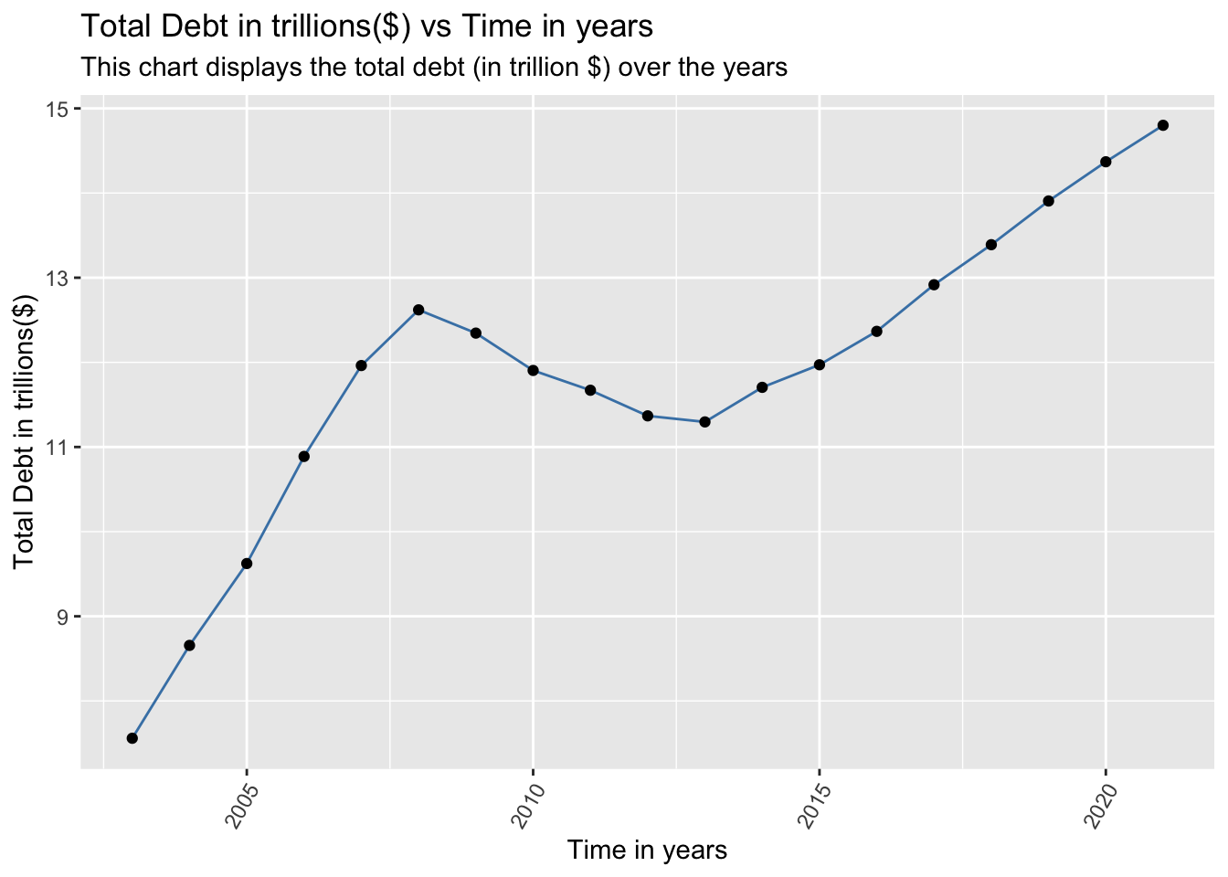
Visualizing Part-Whole Relationships
Ans: To visualize the part-whole relationship, I have created a stacked area chart given below. This plot splits out each debt type (given in the legend) and then plots it against the time (in years). The reason to choose a stacked area chart is that it effectively displays the debt, split by each debt type over the years. A stacked bar chart can also be used here, but it would be messy since we will have 19 bars (one for each year from 2003-2021). Hence, in this case, using a stacked area chart is aesthetically better using a stacked bar chart.
dataset_Ungrouped <- ungroup(dataset_grouped)

dataset_pivoted <- pivot_longer(dataset_Ungrouped, `Mortgage`:`Other`, names_to = "Debt Type", values_to = "Value")

ggplot(dataset_pivoted, aes(x=Year, y=Value, fill=`Debt Type`)) +
    geom_area() + labs(x="Time in years",y="Debt in trillions($)",title = "Stacked Debt in trillions($) vs Time in years") + theme(axis.text.x=element_text(angle=60, hjust=1))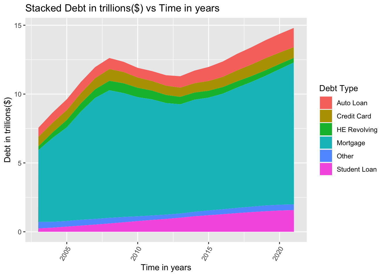
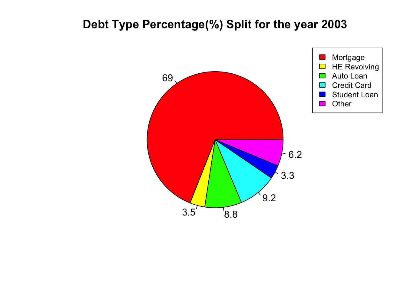
We can also used a pie chart to visualize the split between the different debt types. For this, we first need to slice the data set for a particular year (for e.g. 2003) and then we can construct the pie chart given in the code below. The reason for choosing a pie chart is that it is very good at displaying percentage splits in the data. For e.g. looking at the pie chart below, we can visually conclude that almost 2/3 of all the total debt comes from mortgage. The remaining 1/3 is split between the other debt types. Hence a pie chart is a powerful way of presenting percentage split data.
data_2003 <- dataset_pivoted %>% slice(1:6)  %>% select(`Debt Type`:Value)

x <-  data_2003$Value
labels <- data_2003$`Debt Type`

piepercent<- round(100*x/sum(x), 1)

pie(x, labels = piepercent, main = "Debt Type Percentage(%) Split for the year 2003",col = rainbow(length(x)))
legend("topright", labels, cex = 0.8,
   fill = rainbow(length(x)))