library(tidyverse)
library(ggplot2)
library(readxl)

knitr::opts_chunk$set(echo = TRUE, warning=FALSE, message=FALSE)
Challenge 5
challenge_5
railroads
cereal
air_bnb
pathogen_cost
australian_marriage
public_schools
usa_households
Introduction to Visualization
Challenge Overview
Today’s challenge is to:
- read in a data set, and describe the data set using both words and any supporting information (e.g., tables, etc)
- tidy data (as needed, including sanity checks)
- mutate variables as needed (including sanity checks)
- create at least two univariate visualizations
- try to make them “publication” ready
- Explain why you choose the specific graph type
- Create at least one bivariate visualization
- try to make them “publication” ready
- Explain why you choose the specific graph type
R Graph Gallery is a good starting point for thinking about what information is conveyed in standard graph types, and includes example R code.
(be sure to only include the category tags for the data you use!)
Read in data
Read in one (or more) of the following datasets, using the correct R package and command.
- cereal.csv ⭐
- Total_cost_for_top_15_pathogens_2018.xlsx ⭐
- Australian Marriage ⭐⭐
- AB_NYC_2019.csv ⭐⭐⭐
- StateCounty2012.xls ⭐⭐⭐
- Public School Characteristics ⭐⭐⭐⭐
- USA Households ⭐⭐⭐⭐⭐
cereal<-read.csv("_data/cereal.csv")
cereal%>%
  arrange(desc(cereal$Sugar))
Cereal Sodium Sugar Type
1 Raisin Bran 340 18 A
2 Crackling Oat Bran 150 16 A
3 Honey Smacks 50 15 A
4 Apple Jacks 140 14 C
5 Froot Loops 140 14 C
6 Captain Crunch 200 12 C
7 Frosted Flakes 130 12 C
8 Frosted Mini Wheats 0 11 A
9 Honeycomb 210 11 C
10 Cinnamon Toast Crunch 210 10 C
11 Honey Nut Cheerios 190 9 C
12 Honey Bunches of Oats 180 7 A
13 Life 160 6 C
14 All Bran 70 5 A
15 Special K 220 4 A
16 Wheaties 180 4 A
17 Rice Krispies 290 3 C
18 Corn Flakes 200 3 A
19 Cheerios 180 1 C
20 Fiber One 100 0 Around(max(cereal$Sodium) - min(cereal$Sodium))/30[1] 11.33333Briefly describe the data
The data set identifies several types of commercial cereals by their sodium level, sugar level, and “type” (a letter, the meaning of which is unclear).
Tidy Data (as needed)
The data appears to be tidied already. I will create univariate graphs of Sugar content, then Sodium content, and a Bivariate graph (scatter plot) with both Sugar and Sodium factored in.
The range of Sugar content varies from 0 to 18, so I’ll create 9 bins. This will place 2 observations in each bin. For Sodium, I’ll use 10 bins.
Univariate Visualizations
I chose a basic histogram for the univariate plots. I thought it demonstrated the relationship between count and variable in an orderly and simple way.
ggplot(cereal, aes(Sugar)) + geom_histogram(bins = 6) + labs(x = "Sugar (in grams)")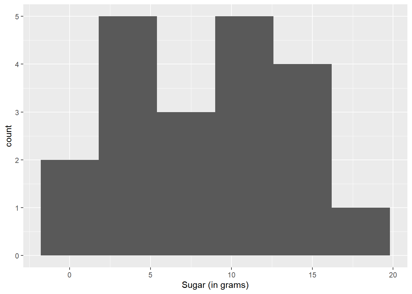
ggplot(cereal, aes(Sodium)) + geom_histogram(bins = 10) + labs(x = "Sodium (in grams)")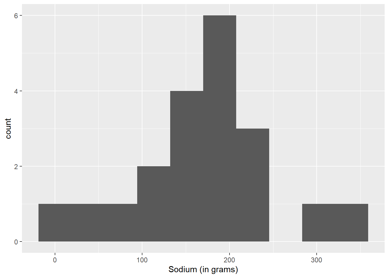
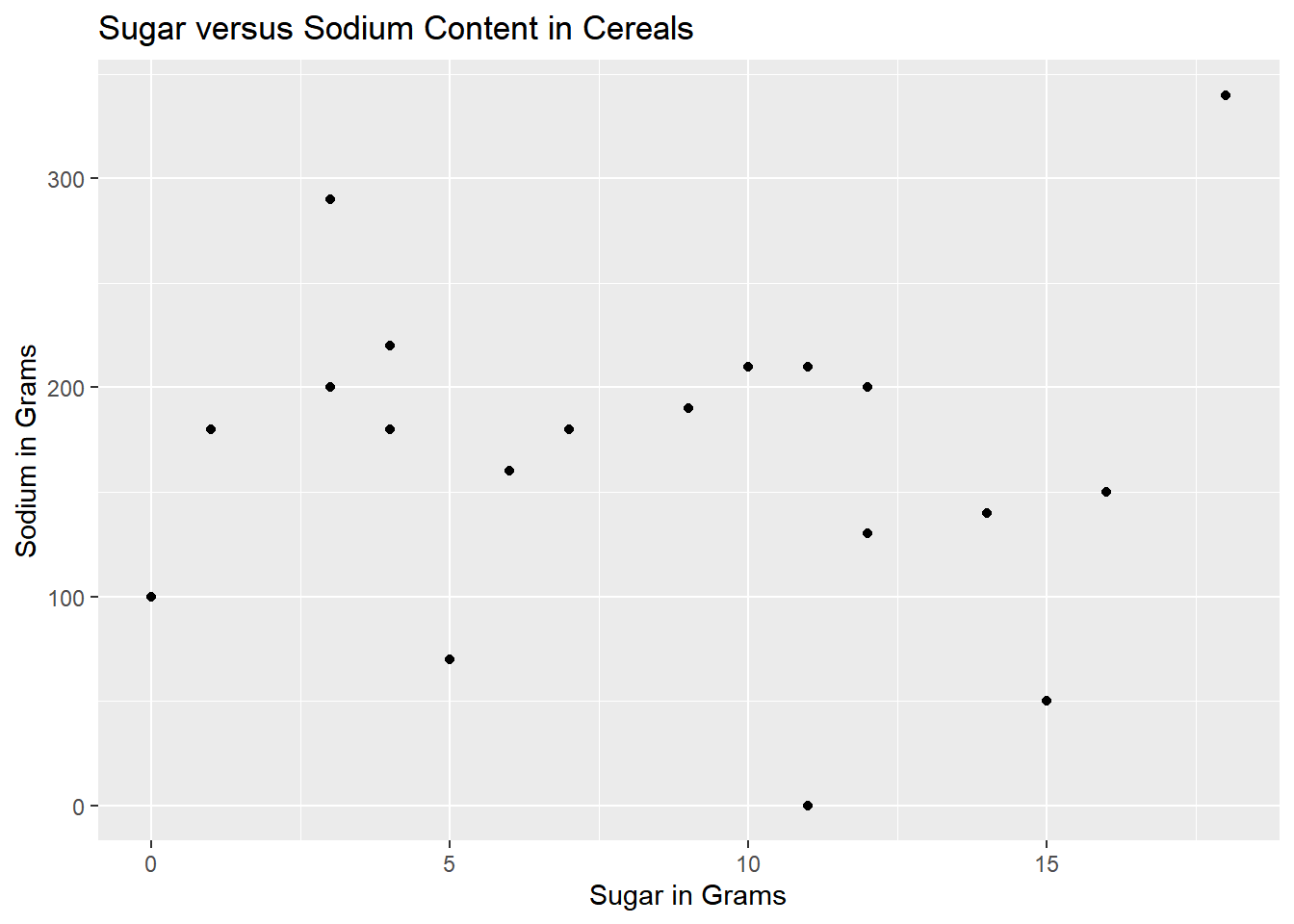
Bivariate Visualization(s)
The following is a scatter plot, which I chose because it takes the focus from the cereal names and places it solely on the sodium/sugar relationship.
ggplot(cereal, aes(Sugar, Sodium)) + geom_point() + labs(title = "Sugar versus Sodium Content in Cereals", x = "Sugar in Grams", y = "Sodium in Grams")